C'mon cats & chicks, add your swingin' Space-Signature!
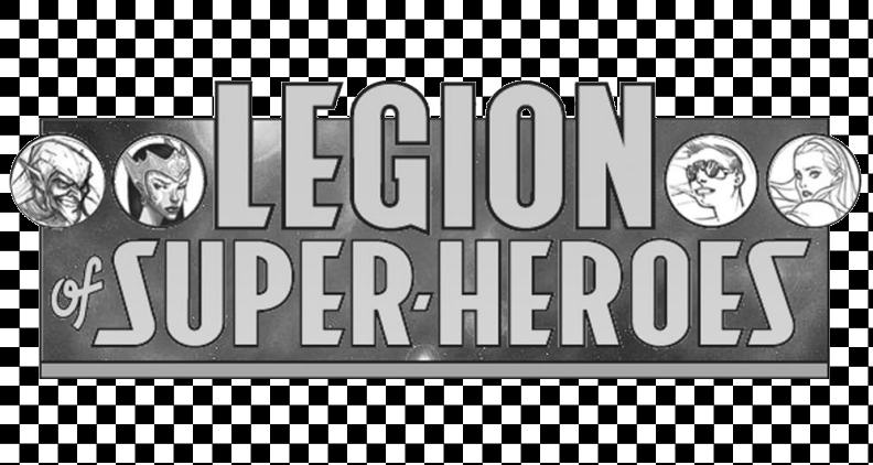
(And how hep will the checks be with the Legion's B&W logo??)
Posted by Fat Cramer on :
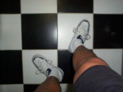
Checks make me look fat.
I could go for the little white boots, though.
Posted by Fat Cramer on :
On second thought, we're moving into fall - shouldn't it be tweeds, Teeds?
Posted by Thriftshop Debutante on :
I've never been one to wear my 'art on my sleeve.
Posted by DrakeB3003 on :
the checks confused me -- i was never sure if i was buying comics or chuck wagon dog food...
Posted by deanlegion on :
Go-Go checks would clash with Sensor's stripe/spots.
They'd clash with Kinetix's leopard spots.
These are the naked Legionnaires, too.
Hmmm... who would they look good on? Imra, but she gets too much attention already. Nura usually prefers to stay in white.
They'd clash with Ayla's lightning bolts. Too busy.
They'd make everybody too dizzy if Vi wore them. Little squares growing and shrinking, growing and shrinking. I'm dizzy just typing about it!
Not Jazmin. She specializes in circular shapes.
TRIAD!! Perfect! I see no reason why Triad couldn't wear them. In fact, they'd have kind of a herd of zebras effect.
Posted by MLLASH on :
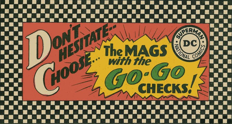
I loved those old DC gogo check covers!
Posted by Eryk Davis Ester on :
I think Gear needs to go-go Gadget checks!
Posted by Eryk Davis Ester on :
I think Gear needs to go-go Gadget checks!
Posted by Fat Cramer on :
This raises an important point in Legion esthetics (aside from DC's checkered covers): there aren't any prints in Legion fashion - or superhero fashion generally.
M'onel has his starfield, except when he doesn't, but for everyone else, it's all plain, solid colors. No florals, no checks, no paisley, no plaids or tweeds. What were those Athramties thinking?
Posted by lil'rhino on :
I think the go-go checks would work with this new, rebellious Legion!
Posted by Fat Cramer on :
Absolutely! Checkered capes should be fun to draw.
Posted by Nightcrawler on :
Posted by Fat Cramer on :
Posted by Lightning Lad on :
Posted by Lightning Lad on :
Posted by Nightcrawler on :
That looks good. Can you do a version with the new logo, Scott?
Posted by Lightning Lad on :
Sure. As soon as I can sneak in some more time. B&W Legion title or color?
Posted by Nightcrawler on :
Color, please. I'd like to see a combination of new and retro styles.
Posted by Lightning Lad on :
How about this?
Posted by Nightcrawler on :
Actually, I was thinking of a variation of this -
So that the checks are there mostly as a bridge between the DC Logo and the Legion Logo.
Posted by Lightning Lad on :
Gottcha. Be back in a bit.
Posted by Lightning Lad on :
Something like this?
[ May 10, 2005, 10:17 AM: Message edited by: Lightning Lad ]
Posted by Vee on :
I think I actually like it better the way Scott did it originally (wrapped completely around the new masthead)
Posted by Lightning Lad on :
Like this Vee?
Posted by Vee on :
Yep!
Q: Do they even carry the Comics Code stamp anymore. I can't recall
The Legion logo would look nice up there in place of the stamp. Posted by Lightning Lad on :
quote:Originally posted by Vee: Yep!
Q: Do they even carry the Comics Code stamp anymore. I can't recall
The Legion logo would look nice up there in place of the stamp.
They don't carry it anymore. I redid one (with a change to the verbiage) to keep the retro look. I'd love to use the new logo but I don't have a good one. I've asked Barry if he's got one available but he's too busy.
Posted by RTVU2 on :
I actually like the way Gary asked for. Retro without being too much.
And I think the logo will change too. Color not style.
Posted by Nightcrawler on :
quote:Originally posted by Lightning Lad: Something like this?
This is my favorite. I actually like the new logo now. Posted by Lightning Lad on :
At some point, an explanation began to emerge for the ghastly sales trends. Obviously, it went, readers were getting confused and were buying non-DC books thinking they were DCs. It was decided that something had to be done to make their covers more distinctive and identifiable. Editorial Director Irwin Donenfeld would later receive the credit/blame (pick one) for adorning DC's covers with a hideous checkerboard pattern across the top. They called them, I'm afraid, "go-go checks" and it was the ugliest thing anyone had done to comics since Dr. Wertham called them "blueprints for delinquency."
No, they didn't help sales. Matter of fact, DC's slide hastened...and while there were certainly other reasons for that, it was suggested that the go-go checks had made things worse. "Readers could now spot the DC books much quicker, making it easier to avoid purchasing them," was how Sekowsky put it. After eighteen months, they got rid of the checks and not long after, they got rid of Irwin Donenfeld, which was quite a firing since his father had founded the company. So I guess you could say that "go-go checks" across the top of a cover was a pretty awful idea...
(Well! I still like them. - FC) Posted by Thriftshop Debutante on :


![[Frown]](frown.gif)
![[Big Grin]](biggrin.gif)
![[Razz]](tongue.gif)
![[Wink]](wink.gif)
![[Smile]](smile.gif)