The Judas Contract ----- the covers - 05/10/12 03:54 PM
Re: The Judas Contract ----- the covers - 05/10/12 03:59 PM
^click to enlarge any of the thumbnails
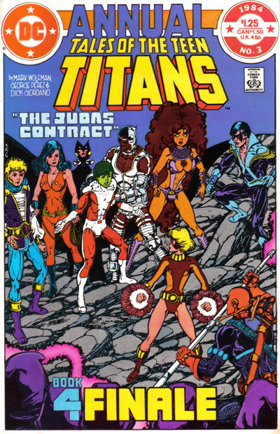
One of the things I remember most about these is the blue background of the annual, for some reason --- and I didn't remember until I looked at the actual cover that it's Raven's cloak (stylized).
What do you think about the covers? Have a favorite?
One of the things I remember most about these is the blue background of the annual, for some reason --- and I didn't remember until I looked at the actual cover that it's Raven's cloak (stylized).
What do you think about the covers? Have a favorite?
Re: The Judas Contract ----- the covers - 05/10/12 05:25 PM
They're all fantastic! As all of Perez's Titans covers were. He was absolutely at the top of his game during this period (and that game is already streets ahead of most of the other artists out there).
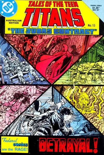
As for a favourite - it has to be either Part 1 or Part 2. But I think Part 1 wins. I just love the cold matter-of-factness of the black and white images from Tara's eye lens camera juxtaposed against the ominous threat of her red sillouhuetted face.
And it was a great issue too. The way Wolfman ratcheted up the tension throughout it as you watched Tara and Slade make the final touches on their big plan to bring down the team, all the while not knowing whether Tara would really go through with it or not - Gosh, I was thrilled!
I think Marv Wolfman is a vastly underrated writer actually. Sure, everyone remembers how well the NTT sold back in the day but no one really seems to talk about just how damn good it was. Same with Crisis. I don't think a single "event" that has come out since then can hold a candle to the original. And they both still hold up IMO.
It's a shame Wolfman eventually seemed to lose his mojo though - because some of his later Titans stories really paled in comparison to this era.
Re: The Judas Contract ----- the covers - 05/10/12 06:24 PM
Quote
Originally posted by Thriftshop Debutante:
^click to enlarge any of the thumbnails
One of the things I remember most about these is the blue background of the annual, for some reason --- and I didn't remember until I looked at the actual cover that it's Raven's cloak (stylized).
What do you think about the covers? Have a favorite?
^click to enlarge any of the thumbnails
One of the things I remember most about these is the blue background of the annual, for some reason --- and I didn't remember until I looked at the actual cover that it's Raven's cloak (stylized).
What do you think about the covers? Have a favorite?
All of them are great covers with fantastic Perez art and a stylish similarity.
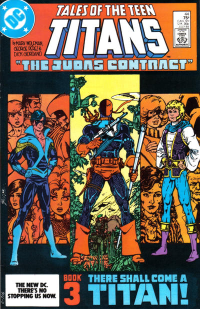
The third part remains one of my favorite covers of all time. You get Dick in his Nightwing oufit & Jericho, ushering in the next era of the team as the story reaches it conclusion. And even more, you get front and center perhaps the single best depiction of Deathstroke ever! Truly one of the best costumes for a villain drawn by the artist who did it best. The squares in back of each of them, with Deathstroke's being larger than the other two, further enhancing his spot in the center, is also a great visual cue.
Something else else else I never noticed before until now is at the bottom the "Part _" piece is colored different than the "CHAPTER TITLE" piece. Another subtle little bit that I think makes each one 'pop' a bit more.
Re: The Judas Contract ----- the covers - 05/10/12 07:41 PM
Titans 44, which is part three. For all the reasons Cobie mentions above.
Not my fave of the Perez Titans covers though.
Not my fave of the Perez Titans covers though.
Re: The Judas Contract ----- the covers - 05/10/12 07:50 PM
Gosh - and I almost mentioned how Part 3 was my least favourite. It just seems so... generic compared to the others. But then, I do tend to have a major dislike for static, stand-and-pose covers.
Re: The Judas Contract ----- the covers - 05/10/12 08:01 PM
Everyone has their own criteria for what makes a cover 'good,' or even 'great.'
Re: The Judas Contract ----- the covers - 05/10/12 08:31 PM
delicious ... there were only four ...
The Trigon covers were even better IMO.
I think Perez was way better back then IMO, I think his faces now look kinda *squishy* or unpretty ... IMHO
The Trigon covers were even better IMO.
I think Perez was way better back then IMO, I think his faces now look kinda *squishy* or unpretty ... IMHO
Re: The Judas Contract ----- the covers - 05/10/12 08:33 PM
3 was the only one I got at the original time but it stands to remain my favorite story and cover (I love the faces in the background) ... I love the whole back story and Nightwing and Jericho's first appearances ... I liked part 2 too.
Re: The Judas Contract ----- the covers - 05/11/12 12:52 AM
I like how that depiction of a gaunt-faced Raven meditating on the first cover comes back later as she's revealed to have been physically changing in appearance over the years...
Re: The Judas Contract ----- the covers - 05/11/12 12:55 AM
Quote
Originally posted by Power Boy:
I think Perez was way better back then IMO, I think his faces now look kinda *squishy* or unpretty ... IMHO
I think Perez was way better back then IMO, I think his faces now look kinda *squishy* or unpretty ... IMHO
Re: The Judas Contract ----- the covers - 05/11/12 01:02 AM
Quote
Originally posted by Set:
I like how that depiction of a gaunt-faced Raven meditating on the first cover comes back later as she's revealed to have been physically changing in appearance over the years...
I like how that depiction of a gaunt-faced Raven meditating on the first cover comes back later as she's revealed to have been physically changing in appearance over the years...
Quote
Originally posted by Fanfic Lady:
Good to know I'm not the only one who feels that way. I think he's lost a lot of finesse over the years.[/b]
Quote
Originally posted by Power Boy:
[b] I think Perez was way better back then IMO, I think his faces now look kinda *squishy* or unpretty ... IMHO
[b] I think Perez was way better back then IMO, I think his faces now look kinda *squishy* or unpretty ... IMHO
actually I think it might've been the awesome inkers back then (Byrne and Austin! ) ... George inks his own stuff now ?
Re: The Judas Contract ----- the covers - 05/11/12 01:19 AM
I don't think he inks his own stuff, except for covers. I'm trying to remember the name of the LO3W inker...Scott Koblish? Perez might be inking World's Finest, I haven't read it, although the reviews saying its Levitz's best writing since the 80s are tempting me to try it...
Re: JR Jr, I actually like just about everything he did in the 80s. Even when his style got weird, it was perfect for Ann Nocenti's Daredevil scripts. But after he left Daredevil and started doing the same weird blocky stuff on other heroes, it felt inappropriate to me, and still does.
Re: JR Jr, I actually like just about everything he did in the 80s. Even when his style got weird, it was perfect for Ann Nocenti's Daredevil scripts. But after he left Daredevil and started doing the same weird blocky stuff on other heroes, it felt inappropriate to me, and still does.
Re: The Judas Contract ----- the covers - 05/11/12 01:25 AM
Quote
Originally posted by Fanfic Lady:
I don't think he inks his own stuff, except for covers. I'm trying to remember the name of the LO3W inker...Scott Koblish? Perez might be inking World's Finest, I haven't read it, although the reviews saying its Levitz's best writing since the 80s are tempting me to try it...
I don't think he inks his own stuff, except for covers. I'm trying to remember the name of the LO3W inker...Scott Koblish? Perez might be inking World's Finest, I haven't read it, although the reviews saying its Levitz's best writing since the 80s are tempting me to try it...
Quote
Originally posted by Fanfic Lady:
Re: JR Jr, I actually like just about everything he did in the 80s. Even when his style got weird, it was perfect for Ann Nocenti's Daredevil scripts. But after he left Daredevil and started doing the same weird blocky stuff on other heroes, it felt inappropriate to me, and still does.
Re: JR Jr, I actually like just about everything he did in the 80s. Even when his style got weird, it was perfect for Ann Nocenti's Daredevil scripts. But after he left Daredevil and started doing the same weird blocky stuff on other heroes, it felt inappropriate to me, and still does.
Re: The Judas Contract ----- the covers - 05/11/12 02:01 AM
George inks some of his own stuff. Here and there. Sometimes just a page or two of a book.
I know that he inked his own first full issue of the Baxter Titans book, but do not think he does tht very often...especially now.
I know that he inked his own first full issue of the Baxter Titans book, but do not think he does tht very often...especially now.
Re: The Judas Contract ----- the covers - 05/11/12 07:26 AM
Quote
Originally posted by Dev - Em:
Everyone has their own criteria for what makes a cover 'good,' or even 'great.'
Everyone has their own criteria for what makes a cover 'good,' or even 'great.'
I didn't realise these (still great) covers were off limits from mild criticism.
Re: The Judas Contract ----- the covers - 05/11/12 09:16 AM
Quote
Originally posted by Blacula:
They're all fantastic! As all of Perez's Titans covers were. He was absolutely at the top of his game during this period (and that game is already streets ahead of most of the other artists out there).
I think Marv Wolfman is a vastly underrated writer actually. Sure, everyone remembers how well the NTT sold back in the day but no one really seems to talk about just how damn good it was. Same with Crisis. I don't think a single "event" that has come out since then can hold a candle to the original. And they both still hold up IMO.
It's a shame Wolfman eventually seemed to lose his mojo though - because some of his later Titans stories really paled in comparison to this era.
I especially like Raven's cloak effect on the last cover.
Re: The Judas Contract ----- the covers - 05/11/12 10:24 AM
I can only speak for myself, but I read the "everyone has their own criteria" post as different strokes* for different folks/it's all good.
The only BAD here is NOT commenting on these covers!! Bah!!
*Remember when Nancy Reagan (semi-sponsor of the Titans drug issues) was on Diff'rent Strokes to promote Just Say No?
The only BAD here is NOT commenting on these covers!! Bah!!
*Remember when Nancy Reagan (semi-sponsor of the Titans drug issues) was on Diff'rent Strokes to promote Just Say No?
Re: The Judas Contract ----- the covers - 05/11/12 01:08 PM
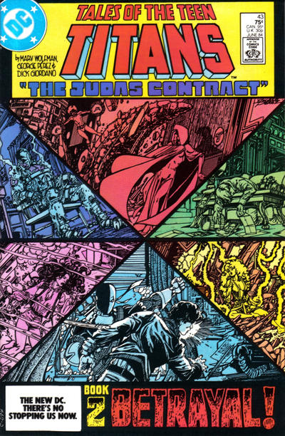
I love that second cover. It totally 'spoils' what goes on in the story, but it doesn't matter, since the real story is how those scenes came to pass. The colors are cool, and I like how even the fact that Nightwing is 'last man standing' is foreshadowed.
It's been, oh, how many years?, and I can still see Slade standing over Garfield saying 'vainglorious dolt.'
So much little background stuff in that issue, too. The maid worried that Garfield was going to jump out of nowhere and scare her, Victor fretting over his grandparents coming to town, Kory's visible excitement over getting a present from (she thought) Dick, etc.
I've blocked out Donna, probably because she was thinking about her wedding to He Who Must Not Be Named...
I haven't seen those comics for decades, but that cover brings it all back. (I'd say 'like yesterday,' I'm old and don't remember yesterday that clearly....)
The first cover does much the same. Among the scenes, we see Victor proving to himself that he can improve and is not limited to being 'just a machine,' a mini-storyline of personal growth that was later used in the Teen Titans cartoon as the focus for an episode. What, in that run, was probably handled in a page or so, became fodder for a 30 minute cartoon episode, and a powerful bit of characterization for Victor.
Re: The Judas Contract ----- the covers - 05/11/12 01:27 PM
I loved how Dick was the last one standing ...
The other amazing thing is that the Teen Titans and Uncanny X-Men were number 1 and 2 for years!! because of the stories and art!
The other amazing thing is that the Teen Titans and Uncanny X-Men were number 1 and 2 for years!! because of the stories and art!
Re: The Judas Contract ----- the covers - 05/11/12 01:30 PM
Where was Kid Flash btw ... I forget
Re: The Judas Contract ----- the covers - 05/11/12 01:58 PM
JUDAS CONTRACT COVERS SO GOOD I BROKE ALL MY FURNITURE!!
All right, maybe not, but I cut the second post short because I knocked over a glass of soda while typing and had to grab a mop. I've also realized I want to double-check a few things in the issues before really getting into it --- and I have a LOT to say.
All right, maybe not, but I cut the second post short because I knocked over a glass of soda while typing and had to grab a mop. I've also realized I want to double-check a few things in the issues before really getting into it --- and I have a LOT to say.
Re: The Judas Contract ----- the covers - 05/11/12 02:09 PM
He had officially left the team a few issues earlier.
The shift from the New Teen Titans v.1 to the team post-JC always stood out for me in terms of colors. The loss of Kid Flash & Robin was a major loss of red & yellows; while the addition of Nightwing & Jericho saw a lot more blues & blacks.
A foreshadowing of what was to come thereafter in the 80's, as the colorful heroes of the 70's gave way to more mature, darker storytelling?
Re: The Judas Contract ----- the covers - 05/12/12 05:23 AM
NTT[/
[b]TALES cover gallery
ALL COVERS
- 1-3 have the logo in a box, which is not seen on other NTT/Tales issues (except 53, partially)
- The "3D trail" (is there a term for that?) on the word Titans is shorter now, as it had been for a few issues (and had been on a few earlier covers presumably when the art needed a little more space)
- Logo color combo is red/yellow on 1, 2, & 4; this was a popular choice throughout NTT/Tales
- For 1 & 2, the 3 page-top elements (Titans logo, "The Judas Contract", the box) are the three primary colors, one per element (not counting the secondary logo color). Although 4 does not have a box -- probably due to the ANNUAL logo -- if you count the cloak as a de facto box, that fits too.
- Most (but certainly not all) NTT/Tales covers were single action scenes. 1-3 have either 3 or 6 distinct scenes, which seems to work well with the title boxes more than a typical action scene.
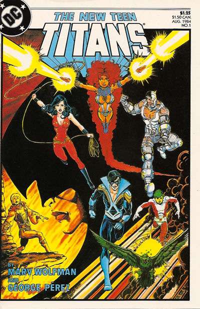
- The "compartments" of the first three fit, as the contents tell multiple pieces of the same story. (1: documents before the curtain. 2: assembling the players 3: backstory on what set everything in motion and then plans to go forward). 4 is EVERYONE IN THE POOL.
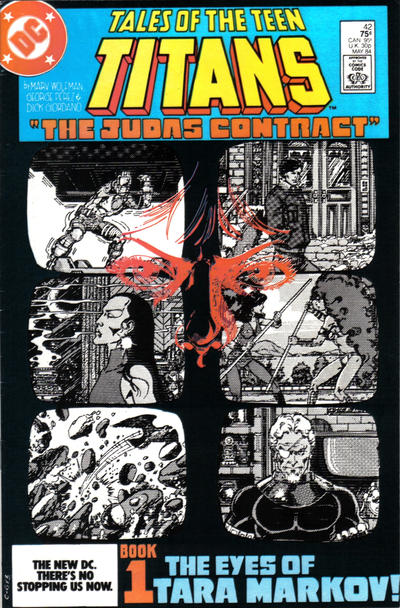
BOOK 1
- The turquoise-y blue title box looks really sharp with the black background of the rest of the cover. I wish the logo had a different color/combo though...I don't care for red+yellow all that much.
- I really like "The Eyes of Tara Markov!" as a title (lose the ! though) even if it is a tossed-off reference to a movie (which I haven't seen, and from the summary I read doesn't match closely to this?)
- The contact lens camera and surveillance scenes were first seen in NTT 39.
- Scenes on a bank of surveillance monitors (figurative bank, as in 39 and 42 Slade & Tara look at a single screen) --- yes! Black and white, slightly wavy/grainy, like security cameras were and maybe still are?
- Six Titans in five scenes...and SLADE in the last one. Yes! (Also, check 39 to see the continuity of the scene. If you can tear your eyes away from the chick on the beanbag, that is.)
BOOK 2
- I wonder what this would look like with a title box in another color... either not yellow or a different shade of it
- This cover is somewhat like NTT 8...except this is an exceptionally bad Day in the Life of the Titans
- The 4 Titans who are taken down indirectly share the 2 quarters to the sides. Those who are confronted directly get the "hourglass".
- I too like the colors of the pieces. The womenfolk get the hot colors: red, pink, orange/yellow; the guys get the cool: green, lighter blue, blue indigo. Hot/cool alternated.
BOOK 3
- Title/box is red/white/blue
- In the image I've attached, it looks like the title box red is slightly more orangey-red closer to the price box, and also in Jericho's background. I have 3 copies, and one looks like that and two look uniformly red.
- This is probably the most 'famous' of the covers (triple key?) due to the Nightwing identity and Jericho debuts + Deathstroke origin
- Dick and Joe are just posing in their pictures...and though they are the active participants of the story inside, they are really framing the true central character: Slade.
- Dick is backed up by the Titans, no surprise. Joe's background people, though, aren't all his allies (Tara, HIVE) but play a part in his story.
- D & J are static, but Deathstroke fronts an action scene
- "There Shall Come A Titan!" is a silly title
BOOK 4
- I mentioned at the top of the thread that the blue "background" was very memorable for me, and I didn't remember it was Raven's cloak.
- I think the yellow of the logo works nicely with the blue, but again...I wish the secondary logo color wasn't red!
- Tara's head turning around was also memorable to me.
- The Titans do not look concerned enough here!
Re: The Judas Contract ----- the covers - 05/12/12 06:36 AM
Quote
Originally posted by Thriftshop Debutante:
The only BAD here is NOT commenting on these covers!! Bah!!
The only BAD here is NOT commenting on these covers!! Bah!!
It's been, what, 30 years since I read these stories, so I barely remember them. As such, I can only judge the covers on their artistic (and entirely subjective) merits.
My favorite cover of the four is Part One because it takes chances: the black and white video images with the red eyes and nose superimposed convey mystery. This cover comes the closest to telling a story, which, I think, covers should do. The content of the black and white images almost doesn't matter, although the image of Slade staring into the camera gives me chills.
Part Two is a mess, although the colors are eye-catching. I have no idea what my eye is to focus on first, and the monochromatic colors dilute the impact of the images. The bottom image, for example, shows Deathstroke striking someone (Dick, I presume), but the emotional impact is blunted by the "cold" color. I have no interest in deciphering what's going on in the other images. This cover, I think, represents style over substance.
Part Three resembles a movie poster, which is fine if you're into movie posters. Personally, I think it's static and boring.
Part Four is my second favorite cover, because it, too, tells a story and conveys action. It's clear where my eye is supposed to go. Raven's stylistic cape adds to the originality of the piece without distracting from what's happening, as is the case with the diamond grid of Part Two.
Re: The Judas Contract ----- the covers - 05/12/12 07:40 AM
Quote
Originally posted by Thriftshop Debutante:
I can only speak for myself, but I read the "everyone has their own criteria" post as different strokes* for different folks/it's all good.
I can only speak for myself, but I read the "everyone has their own criteria" post as different strokes* for different folks/it's all good.
In my experience the only times a person is told that "everyone has their own opinions" is when either -
A) they are a child and are unsure of how human interactions work; or
B) they are an adult on a message board who's just written something another person has taken offence to, so that person reminds them of A).
Anyway, I'm over it. Moving on...
Your level of analysis of these covers is amazing, TD.
I never noticed before that Part 2 is a twisted inversion of the 'Day in the Life' cover.
I love colourful old comics so all the different hues and tones on display here don't bother me. I wonder if Part 2's cover wouldn't have benefitted from a softer palette though - maybe just a light blue and red? The harsh and violent clash of colours does a good job of suggesting the shocking betrayal/violence that the book contains though.
I also agree that the Titans don't look concerned enough on the Part 4 cover. In fact, other than Gar, they don't look 'anything' enough. However, showing anger or whatever on the rest of the team's faces may have distracted from the fact that this was a Gar/Tara moment, and his betrayal was the worst.
Will you be examining any other old Perez Titans covers TD? There are so many good ones to choose from?
Re: The Judas Contract ----- the covers - 05/12/12 10:06 AM
Quote
Originally posted by Blacula:
Gee, thanks for the condescending post.
I didn't realise these (still great) covers were off limits from mild criticism.[/b]
Quote
Originally posted by Dev - Em:
[b] Everyone has their own criteria for what makes a cover 'good,' or even 'great.'
[b] Everyone has their own criteria for what makes a cover 'good,' or even 'great.'
I didn't realise these (still great) covers were off limits from mild criticism.[/b]
I wasn't trying to be condescending, but was trying to actually support your opinion of that cover. You have every right to like it or not, just like any of us.
Sorry if it came off the wrong way.
Re: The Judas Contract ----- the covers - 05/12/12 10:17 AM
Quote
Originally posted by Blacula:
Maybe so, but I'm not sure why it was felt that I needed reminding of that fact.
In my experience the only times a person is told that "everyone has their own opinions" is when either -
A) they are a child and are unsure of how human interactions work; or
B) they are an adult on a message board who's just written something another person has taken offence to, so that person reminds them of A).
Anyway, I'm over it. Moving on...
[/b]
Quote
Originally posted by Thriftshop Debutante:
[b] I can only speak for myself, but I read the "everyone has their own criteria" post as different strokes* for different folks/it's all good.
[b] I can only speak for myself, but I read the "everyone has their own criteria" post as different strokes* for different folks/it's all good.
In my experience the only times a person is told that "everyone has their own opinions" is when either -
A) they are a child and are unsure of how human interactions work; or
B) they are an adult on a message board who's just written something another person has taken offence to, so that person reminds them of A).
Anyway, I'm over it. Moving on...
[/b]
You forgot another possibility. Maybe the person had just found out that the bones in their foot are collapsing in on itself the day before, and had been sent home from their job that day...possibly for the duration of the healing process. Maybe I was just trying to distract myself by coming on here and made a few random posts to get my mind off of things. Like the fact that if the treatment that they are doing on my foot does not work, I am looking at loosing it within a few years,
So sorry if it somehow offended you. This will be the last time I comment on it. It will also be the last time I say anything about one of your posts for a while.
What I wrote did not personally insult you. You crossed that line. So I will keep my childish responses and leave you the hell alone.
Re: The Judas Contract ----- the covers - 05/12/12 10:21 AM
I apologize to everyone for the way this turned. Was not my intent at all.
-Dave
-Dave
Re: The Judas Contract ----- the covers - 05/12/12 10:44 AM
BAH!! Part 3 is ALL about the new and intricate costumes!!
Although I think GP missed the mark on Jericho's boots ... and Slades for that matter ... I'm not sure if I was a ninja assassin if I'd wear floppy boots that could catch on everything.
Look how cute Deathstroke looks ... showing off his gun and staff .... "Im a badass ... now I'm gonna go kill some kids!"
GP can draw some thighs!
Re: The Judas Contract ----- the covers - 05/12/12 10:51 AM
I also love it in Part 4 when the Titans start kicking HIVE ass!
Re: The Judas Contract ----- the covers - 05/12/12 11:11 AM
I actually managed to get two of these issues in a row of the Trigon story the first time around ... my access to comics as a kid seems inconsistent in retrospect.
![[Linked Image]](http://img337.imageshack.us/img337/866/tntt1984003.jpg)
![[Linked Image]](http://img856.imageshack.us/img856/8775/tntt1984004.jpg)
Some of, if not, THE best art ever is on the front and insides of these issues ... I probably copied the scenes from these 1000 times, if not more, and still ... not as good as GP.
Some of, if not, THE best art ever is on the front and insides of these issues ... I probably copied the scenes from these 1000 times, if not more, and still ... not as good as GP.
Re: The Judas Contract ----- the covers - 05/12/12 11:15 AM
Quote
Originally posted by Thriftshop Debutante:
[b]BOOK 4
[/b]
[b]BOOK 4
- I mentioned at the top of the thread that the blue "background" was very memorable for me, and I didn't remember it was Raven's cloak.
- I think the yellow of the logo works nicely with the blue, but again...I wish the secondary logo color wasn't red!
- Tara's head turning around was also memorable to me.
- The Titans do not look concerned enough here!
[/b]
Re: The Judas Contract ----- the covers - 05/12/12 01:33 PM
Quote
Originally posted by Dev - Em:
Saw this after I made the above post. Thanks...
You forgot another possibility. Maybe the person had just found out that the bones in their foot are collapsing in on itself the day before, and had been sent home from their job that day...possibly for the duration of the healing process. Maybe I was just trying to distract myself by coming on here and made a few random posts to get my mind off of things. Like the fact that if the treatment that they are doing on my foot does not work, I am looking at loosing it within a few years,
So sorry if it somehow offended you. This will be the last time I comment on it. It will also be the last time I say anything about one of your posts for a while.
What I wrote did not personally insult you. You crossed that line. So I will keep my childish responses and leave you the hell alone. [/b]
Quote
Originally posted by Blacula:
[b]Maybe so, but I'm not sure why it was felt that I needed reminding of that fact.
In my experience the only times a person is told that "everyone has their own opinions" is when either -
A) they are a child and are unsure of how human interactions work; or
B) they are an adult on a message board who's just written something another person has taken offence to, so that person reminds them of A).
Anyway, I'm over it. Moving on...
[/b]
[b]
Quote
Originally posted by Thriftshop Debutante:
[b] I can only speak for myself, but I read the "everyone has their own criteria" post as different strokes* for different folks/it's all good.
[b] I can only speak for myself, but I read the "everyone has their own criteria" post as different strokes* for different folks/it's all good.
In my experience the only times a person is told that "everyone has their own opinions" is when either -
A) they are a child and are unsure of how human interactions work; or
B) they are an adult on a message board who's just written something another person has taken offence to, so that person reminds them of A).
Anyway, I'm over it. Moving on...
[/b]
You forgot another possibility. Maybe the person had just found out that the bones in their foot are collapsing in on itself the day before, and had been sent home from their job that day...possibly for the duration of the healing process. Maybe I was just trying to distract myself by coming on here and made a few random posts to get my mind off of things. Like the fact that if the treatment that they are doing on my foot does not work, I am looking at loosing it within a few years,
So sorry if it somehow offended you. This will be the last time I comment on it. It will also be the last time I say anything about one of your posts for a while.
What I wrote did not personally insult you. You crossed that line. So I will keep my childish responses and leave you the hell alone. [/b]
I'm sorry if I reacted too harshly to your post. And I'm sorry about your foot.
It seems like there is some misinterpretation all round here - you don't see how I can have taken offence to your post; and I don't see how you can have been personally insulted by what I wrote to TD, or what line it was that I crossed.
I definitely do apologise for not giving you the benefit of the doubt though.
I hope your foot gets better.
Re: The Judas Contract ----- the covers - 05/12/12 02:29 PM
I didn't comment on the image of Tara on Book 1, which sounds about right for me. If you has asked me (before I purposely started staring at the covers for this thread) I could have described it fairly accurately: the six b/w grainy "monitor screens", the blue box at top, "The Eyes of Tara Markov!". I'd remember, but probably mention last, the partial, sketchy reflection of Tara -- not unlike how I am faintly reflected in my computer screen right now. It's a representation of her true motives -- definitely present, but not easily seen.
I like that Slade is one of the 6 images. He should be, as he is a major player here. Also: in the most literal sense Tara sees him, of course (the scene of the "image grab" is inside), but is she also watching him? We find out at the end of the issue that she wouldn't be the only one.
Re: The Judas Contract ----- the covers - 05/12/12 04:44 PM
I respond most to the Part 1 cover. The view-screens are very SLIVER and the title: "THE EYES OF TARA MARKOV!" is suitably creepy.
Tara violated the Titans in many awful ways.
This was really an historic storyarc. I hate that it is hard for me to get over Wolfman's missteps (Terry Long, Azrael, hating Duela Dent, a little thing called 'Crisis on Infinite Earths', etc) and allow myself to enjoy his TITANS run but there's no doubt Perez was at the top of his game in these days.
Re: The Judas Contract ----- the covers - 05/12/12 04:59 PM
THE EYES OF THRIFTSHOP DEBUTANTE
Of course, I am viewing the covers through my own lens (heh): as someone who had been reading for awhile so knew the story and players when buying the issues off the stands. (I arrived at the party around the same time as Terra, BTW. Hmmm.....) Also, I've known these covers since 1984. This doesn't change the covers at all but might have an impact on how I perceive them.
My vote for the cover most likely to attract someone who was/is unfamiliar with the Titans: Book 1. There are questions to be answered! These people (and, uh, a bird...?) are being watched, but why? Oh, wait, there's a reflection -- who is that??
And that turquoise really does pop next to the black.
Re: The Judas Contract ----- the covers - 05/12/12 06:52 PM
This is one of this rare stories that changes everything about a series. Nothing is ever truly the same--the characters, and even more, the tone of the series. The covers suitably have a grandiose feel of importance. Something else else major is going down.
Re: The Judas Contract ----- the covers - 07/07/13 04:35 PM

Re: The Judas Contract ----- the covers - 07/07/13 04:35 PM
Re: The Judas Contract ----- the covers - 07/07/13 04:37 PM


Re: The Judas Contract ----- the covers - 07/07/13 04:38 PM

Re: The Judas Contract ----- the covers - 07/10/13 12:25 AM
Re: The Judas Contract ----- the covers - 07/10/13 12:26 AM
TPB = UGH
Re: The Judas Contract ----- the covers - 07/10/13 12:27 AM
Better in concept than execution.
Re: The Judas Contract ----- the covers - 07/10/13 12:30 AM
Re: The Judas Contract ----- the covers - 01/03/14 03:31 AM
Another Book 3 cover added above.
Re: The Judas Contract ----- the covers - 01/03/14 08:08 PM
One of the covers in this thread will betray the others. But which one?
I have very fond memories of this arc and the Wolfman/Perez run generally.
I have very fond memories of this arc and the Wolfman/Perez run generally.
Re: The Judas Contract ----- the covers - 04/23/17 04:29 AM
Re: The Judas Contract ----- the covers - 01/01/18 11:20 PM
Re: The Judas Contract ----- the covers - 02/22/18 04:52 AM

Re: The Judas Contract ----- the covers - 08/15/18 06:46 AM
