Great news! Canada-based Filipino artist Francis Manapul has been announced as the new, ongoing artist for the Legion of Super-Heroes though with an undisclosed writer!
I dunno what part of this news I'm gushing over but...yahoo!!! But you guys have to just click on the pretty, pretty picture on the article! Wowza Saturn Girl!!!!
Newsarama Article
And hmmm... no Supergirl!
I know!!! And noticeably absent as well on that spread...a founder!
Phantom Girl...recolored!
Karate Kid...retro'd!
Timber Wolf...grrrr!
Brainiac 5...very fitting outfit!
Shadow Lass...in pale red...hmmm...
But overall, I think it's fair to say things are lookin up!!!!!!!!!!
Here's a link to the pic:
Francis Manapul\'s LSH Spread
My, that's quite a striking depiction. Saturn Girl does look much better--like she might even have a personality. So do Garth, Dirk, Brainy, Lyle, Jeckie, and Jan (though I kinda hope he loses the cape now). I'm not so keen on Ayla's new look, partly because I thought her last one worked particularly well. Colossal Boy seems a tad over the top, as does Ultra Boy (figures they would be a pair). Of course, it's the writing that'll matter more to me, but this picture stokes my optimism.
Notice the foot gear. Big boots for some, but bare feet (well toes any way) for Brin.
Haha I overheard Francis talking at length about reading old-school Legion and Cockrum designed costumes at a signing back in the spring.
And now we know why.
If I want to draw someone in the background wearing goggles no one’s going to question it!
Someone send him a link to Legionworld. He obviously doesn't know us well.
...and, that's one of the better renditions of Cos' uni though he seems to be missing a hamstring.
The barefeet and four toes looks good on Brin. Gym's old time fans should be happy. That might in fact be my favorite costume for him (except for that brown thing across the top).
Not a fan of the wide lightning on LL. Wide ties didn't last. Wide lapels didn't last. Wide lightning will not last.
My fav redesign is Brainy's jacket. A little arrogant but crisp. The pants and boots, not so much.
Val has changed nationality again.
Very unique faces on everyone. Be interesting to see if he can keep that up through an entire arc.
Sun Boy's back, Trip's in 3, Lyle got a real uniform, Brainy lost the Vril look and - yeah - no Cos. Temporary absence I suppose.
This is okay.

Originally posted by Blockade Boy:
If I want to draw someone in the background wearing goggles no one’s going to question it!
I was thinking the same thing. He obviously hasn't been in touch with Legion Fandom. Marts is probably hiding the truth from him lest we scare him off before he even gets started.
The art makes it look more like an X Book than a Legion book to me.
Not sure I like that at all. We'll see how these changes go over.
Brainy looks great! The outfit, too.
Is that Vi in
hot pants? Dang, Miss Digby!
Saturn Girl. Hello,
Binary !
Where's WILDFIRE?!?! I hope this is a case of his first appearance repeating itself where he "dies" as ERG-1 and comes back as WILDFIRE later on...
I like most of the redesigns, and the Cockrum influence is apparent (though there's nothing wrong with that) - is that an up arrow I see on Element Lad?
Nice. Not too thrilled by Ultra Boy. I don't know about the red outfit for Shadow Lass. And Invisible Kid needs a headband.
Originally posted by Quislet, Esq.:
Nice. Not too thrilled by Ultra Boy.
The costume or the steroids?
Same KK. I don't envision him as a "power" guy as he's depicted here. Val's more of a finesse player.
Ummmm...me likey some Francis Manapul Legion! I LIKE wide lightning (but then I like wide ties and lapels, too!). The Saturn Girl outfit may be this year's winner for "squaring the circle" between all her historical outfits. I REALLY like it, but then I've always been a sucker for hip boots. Didn't Barry do a design sketch of Light Lass that looks ALOT like this elegant new version. And Phantom Girl moves ever closer to that most caliente of costumes.
Is Cham wearing chain mail? THAT'S an interesting choice. I rather like Micro Lad's new outfit. I always thought Gym should have a full-body protective outfit--his powers are extremely high-contact physical, but he's NOT invulnerable like some. Great to see Karate Kid in the Cockrum/Bruce Lee outfit. I BET it's a tribute to the soon-to-be-dead-AGAIN Countdown Kid.
As a side-note, isn't it interesting how often the Legion (and some other heroes, notably the X-Men) change costumes? You certainly wouldn't see Superman or Batman or Wonder Woman changing so radically so often, if ever.
Originally posted by Blockade Boy:
Originally posted by Quislet, Esq.:
[b] Nice. Not too thrilled by Ultra Boy.
Same KK. I don't envision him as a "power" guy as he's depicted here. Val's more of a finesse player. [/b]The steroid look.
As for KK, I didn't notice his big guns until you pointed it out. It doesn't bother me as much as Ultra Boy's look. But I agree that KK would do good without overly muscular arms.
Originally posted by doublechinner:
As a side-note, isn't it interesting how often the Legion (and some other heroes, notably the X-Men) change costumes? You certainly wouldn't see Superman or Batman or Wonder Woman changing so radically so often, if ever.
Exactly, I find it distractingly unnecessary.
Originally posted by doublechinner:
Ummmm...me likey some Francis Manapul Legion! I LIKE wide lightning (but then I like wide ties and lapels, too!).
Well okay but he's going to be getting two issues of use out of these custumes then they'll just sit in a tesserect for 20 years or so.


Originally posted by Nightcrawler:
Originally posted by doublechinner:
[b]As a side-note, isn't it interesting how often the Legion (and some other heroes, notably the X-Men) change costumes? You certainly wouldn't see Superman or Batman or Wonder Woman changing so radically so often, if ever.
Superman doesn't even change his underwear and that's canon.
Fandom supplying costumes are such a part of Legion fandom, I wish they'd get back to doing some of that. There was a vicarious thrill in seeing a letters column idea find its way into a story. 50th anniversary and all that and it doesn't seem as if any of the old stuff, fan participation, is any part of it. They've got it all mapped out.
Originally posted by Nightcrawler:
Originally posted by doublechinner:
[b]As a side-note, isn't it interesting how often the Legion (and some other heroes, notably the X-Men) change costumes? You certainly wouldn't see Superman or Batman or Wonder Woman changing so radically so often, if ever.
You can do that with lesser known characters. Of course that might also help keep the character lesser known.
That was kind of my point, I think Quis. With most of the X-Men, you can tweak their costumes because they such distinctive physical features -- the visor, the wings, the claws, the tail, the blue fur, the ice shell, the white hair, the green hair, etc.
With a few exceptions, the Legion's just a buncha white kids. You change their look too much and I think you undermine the brand. Having said that, I think MOST of these costumes are tweaks of the current ones, with the exception being Karate Kid, wearing a costume that is getting a lot of exposure in other books.
Hmm. Some of them I like a lot, some of them not. (Ooh, that rhymed!)
Kiston's outfit for Val was hands down one of my favorites, so I'm sad to see that go the wayside. I suppose it might have a good story behind it, maybe relating to what's going to happen in Supergirl's title. But if not, then I'm definitely disappointed. But that's just me.
So happy to see Lyle with a real costume, omg. And I really like it, too! Love Brainy's new outfit and its condescension. Plus it looks
good.
I notice his microchip thingy was missing, though. I'm still hoping for a story about that.
Never been a huge fan of headgear but Gim works it. I feel like Tinya's cutout is sort of unnecessary (I liked the "p") but... eh. It doesn't take away from the outfit, either. And I wish we could see Projectra's outfit! She's hidden by that darn cape.
Speaking of capes, I do
not like Tasmia's at all. Hers was probably my other favorite Kitson design, so... yeah. Again, I could see a good story with it-- something about the champion of her homeworld or what have you but.. I dunno.
Also on capes, glad to see Imra's is gone! I never understood why it was there in the first place. Weird. Hey, did anyone else notice how the white in her costume is like her Saturn bikini outfit? It sort of creeps me out. I don't like the visual personally. It's just kinda weird.
Overall, I like the image it presents. I'll agree with Gary that it is a bit X-Menish (though for the life of me I'd never be able to explain what that means) but that might be a good thing. I think the series will really hang on the writer-- right now the art looks solid enough to me.
Hey nice catch on Saturn Girl's outfit being a negative image of the bikini outfit.
Maybe the other Legion showed them some old holos during their get together.
I have always hated the "Bruce Lee outfit" both on KK and on the 70s era Marvel martial arts heroes.
Funny that they wouldn't announce the writer at the two big summer cons though. Makes me think its one of two things. Its one of DC's big guys (ie Johns or Morrison) or its someone from outside comics who needs to finish their day job before coming over.
Not in that image, for whatever it's worth:
Dream Boy
Dream Girl
Cosmic Boy
Mon-El
Supergirl
Welcome aboard to Mr. Manapul. Can't tell yet if I like his style as well as Dennis Calero's, but there's certainly nothing wrong with that one picture.
Drawn correctly Garth's lightning always covered his shoulders so I do see the big deal with "wide" lightning. I like the look of most, especially Brainy's Nehru jacket. Perfect for him. What I don't like is the bare-footed Brin. He's gone from trying to be Wolverine to being Beast.
As Gary mentioned, maybe a little to X-Menish but I'll give it a try. Really depends on the writer though. If the two don't click then what does it matter.
Oh wow. I am sad Dennis isn't full time (maybe we can get a cover on occassion!) but when I saw this guy's art it blew me away.
Energy, dynamic! LOVE THE NEW COSTUMES! Especially Colossal Boy, Saturn Girl, Invisible Kid and Phantom Girl! (gotta make micros of these!)
Don't care for Cham's actually now that I see them all. The rest are amazing.
So at higher magnification, a few more details penetrate my consciousness:
1) Brainy is wearing the Silver Age forcefield belt, and the symbol is the Brainiac symbol from the Animated Series, right? The comics versions of Brainiac never used that? If so, does this mean Brainiac is changing, and thus Brainiac 5?
2) Gim has brown studded cuffs on his gloves. This seems more Jack in the Beanstalk to me. Oh, and short sleeves.
3) Vi has shorts on now
4) I'm glad Brin's costume finally has some color other than brown verging on black. And, I think switching from Wolverine to Beast is a big improvement.
5) I wonder why Trip's costume HASN'T changed?
6) Cham's costume just makes no sense
7) What if Karate Kid IS the Countdown one?
Saturn Girl's new costume looks alot like Carol Danver's Binary Costume also a Dave Cockrum design.
Here's a 1024x768 copy.

I don't mind costume changes when there an improvment,but I have seen little improvment since the Dave Cockrum designs.
I've been staring at this pic off and on for over and hour. I really like it and I'm looking forward to seeing more. I'd love to get a better look at Vi, but I think shorts are a great idea. I'd like to get a better look at Sun Boy and Jeckie, too. I like T-Wolf's new look. I know most people prefer Cockrum's design, but I like his hair shaggier than that. I think I've drawn Saturn Girl in that costume, so I can't help loving that. Interesting colour change for Shady. Not sure what I think of it, although, I wonder if it's intentional. There's been so many colouring mistakes in this series. Brainy's jacket looks great, but the yellow is a little to bright for me.
Interesting glow around the image. Some kind of forcefield? Is anyone else reminded of Coipel? Particularly with Invisible Kid.
The more I look at it, the sillier Gim looks. At some point as he becomes colossal, his head must start shrinking.
His Ultra Boy is a little Coipel to my eyes. The longer hair, with more rugged features in the face.
There's a bit of a colouring omission. See the lightning lines out of Garth's clenched hand. The colorist decided not to render it.
the costumes don't look bad. but here's the big question, which design will they use when Mattel releases the LSH wave with a Micro Lad BAF from the new DC Universe line?
For me the Cockrum Lightning Lad uniform is one of the best all time, I thought the Kidson version improved on it a bit not as crazy about this version it is close to but not as good as the original or Kitson's version
Gotta say, I'm not a fan. I really loved Barry's designs pretty much across the board and I'm very sorry to see them go. Especially LL's. that was a great redux on Barry's part. The new one is just too blue. Which is something coming from me. 75% of my wardrobe is blue along with my bedroom walls. I like blue, just not unpaired with white on LL's costume. Also, I really dislike the look he's given Brin. One of the things I really liked about WaK's run was that Brin was so humanoid, instead of the Furball decendants he's been ever since '89. He felt like Brin to me again, though with a bit more brains. I'm also dismayed by the 'roid look of Ultra Boy. I've never felt like heroes with super-strength need to be depicted as super-beefy. The strength comes from sources other than raw muscle, so what's the point of them having huge muscles? KK honestly I could almost see, though I'd rather see a more lean, wiry, Bruce-Lee type look where the muscle is honed to perfection rather than pumped indisciminately.
The one costume I really like is Brainy's. It really seems to suit him and I love seeing the return of the belt. I do have the echo the comment above about the chest symbol. I'm pretty sure that's only ever been seen in the cartoon universe. However, since this is just a teaser image, maybe someone will point that out before actual production starts.
Originally posted by Director Lad:
However, since this is just a teaser image, maybe someone will point that out before actual production starts.
Actually this was credited by all the news sources as being the image for #38's cover. That doesn't mean there still isn't time to make changes but I wouldn't be surprised to see it very close to this when released.
Even though I like LL's look I'd much rather see some white added as others have mentioned. This almost looks too leathery, like the stupid outfits in the X-Men movies.
The image looks a bit weird to my eyes. I think the proportions are a bit off. Micro Lad's head is way too small for his big fists, IMO and it just looks weird. Ditto with KK.
I like Lyle going back to his big I on a black background costume that he had in post-ZH. And I also like Brainy's new look.
I'm not sure I like the way Tinya now has power girl's costume signature feature. Do we need to show her breasts that way? Also I think E-Lad's costume is way too busy. It's weird, because although Dennis' costume was busier, it always looked better.
Ayla looks as if she could do with a haircut to me. I think she looks weird with hair that length. However I do like shady's hairstyle.
I wonder how much of this is to pander to fans of previous boots. The Cockrum Saturn Girl costume, the KK costume, Lyle's costume...
I'm very pleased to see this new artist's first take on the Legion. It will be as dramatic a change from Calero to Manapul as it was from Kitson to Calero, but I must say I do like it overall.
Love Tinya's cut out look.
Lyle finally gets a real costume, and it rocks! (But it does need a headband!)
Although it's a bit hard to make out, I like the idea of shorts for Vi. Can't wait to see it in detail.
Glad to see the return of the classic white costume for Val but Manapul needs to tone down the the overly muscled physique.
Love the headgear on Gim but as was pointed out by someone earlier, the brown padding looks a little odd.
Very much like the new look for Jan. That was one of the few designs of Barry's that just didn't work all that well for me, though I did like the addition of the cape.
Don't care for Jo's features but the costume remains a classic.
Lu hasn't been changed much though there is something about her that looks a bit better to me in the splash page. (Maybe it's the hair coloring? Not really sure.)
Tas doesn't look bad (other than that strange reddish sheen on her cape, which I hope is a coloring mistake) but I liked Barry's design better.
Cham looks a bit weird. He seems to have breasts and appears to have put on a bit of weight.
Can't really make out too much about Jeckie, Thom or Dirk
Do not care for Garth's new look. I rally liked Barry's design and this one looks like it's missing something...like some white!
Can't say I really like this new look for Brainy but I like it better than Barry's design. At least he's back in his traditional purple!
I also do not care at all for the Ayla's new redesign. Barry's take on her costume was simply perfect...easily his best costume design and I'm very sorry to see it go. And I don't like her longer hair either.
The last two are by far the two that caused the strongest reactions for me...
I really, really hate seeing Brin depicted as a wolf boy and this is maddeningly close to that look. Fortunately I don't see any fangs or claws but I'm really worried that they just aren't exposed. I thought Barry did a great job of redesigning and redefining Brin and I'm distressed to see what appears to be a retrograde for him. I really hope I'm mistaken.

And Imra...wow! I can't believe I'm going to say this since she's always been at the top of my most disliked list, but she looks absolutely awesome. This is certainly one of the best looks the Ice Queen has ever had!
So, there you have it. Individually, I would say this is a mixed bag on the costume changes but overall I like the look and style that I see.
PS: Cos' costume from the sketch of the founders looks very close to his original look. Not sure if that's what he will look like though so I'll reserve judgement until we see him in action again.
Also, I'm disappointed to note that Mysa hasn't joined and that none of the others we've met recently appear to have remained. And where is Dream Boy?
The padding on Colossal Boy's arms may stem from one of Barry's original desings which had the padding.
I assume Timber Wolf will complete his transition to "Feral Lad" during the Bedard/Calero run -- going by the cover of issue #34. At least he has feet instead of paws.
Three years strikes me as perfect timing for some costumes tweaks. The next artist will tweak back and forth, and so on. It's all fine with me as long as the characters remain recognizable, and distinguishable from their other-earth twins. Maybe they should have kept the Kitson designs for Karate Kid and Colossal Boy. Those two resemble the old KK and CB2 too much.
Brainy and Saturn Girl are by far my favorite reworkings. Cosmic Boy and Dream Boy have never looked better.

Most of them are more appealing than Gary Frank's godawful (imo) new costume for Dawnstar.
I see the "L" belts are back. Not sure how I feel about it. I genearlly don't like anything that promotes uniformity.
Overall, I like it with some reservations, though I'm much more interested in the name of the writer and the new, post-Supergirl direction of the book.
Originally posted by Vee:
PS: Cos' costume from the sketch of the founders looks very close to his original look. Not sure if that's what he will look like though so I'll reserve judgement until we see him in action again.
That's an older sketch based on the 2boot characters. It's been floating around for a while.
Interesting
I preferred Ayla's old look, she looked cute and energetic there, now she looks more adult and mature and regal - but I preferred her as cute.
I like his Jeckie though, and Lyle's costume might become my fave Lyle costume ever. Might.
I do think Brainy's new look is a good match for him, and like Imra's update.
I don't like Jo/Val on steroids either.
Hm... I also wish we'd see some new characters intro'd, but then that isn't really the artist's job huh?

I'm experiencing a mixed reaction. Some of the designs I really don't like. Yet, the overall effect is fascinating. I keep being drawn back to it. I am curious to see more. It does make a statement. DC does not appear to be giving up on the Threeboot Legion.
Originally posted by doublechinner:
...Gim has brown studded cuffs on his gloves. This seems more Jack in the Beanstalk to me. Oh, and short sleeves...
I certainly respect your right to dislike the "Jack-in-the-Beanstock" sensibility of Gim's revised costume. However, I must point out that the original costume which has clearly inspired this version was meant to invoke exactly that sort of visual association (I think). In fact, his mom, Marte Allon, once even openly chided him for deliberately striving to create such an impression during the Giffen/Levitz era.
In other words, I guess that I'm saying that I liked this nod to the old continuity.
Whoa... oaky, so yeah, I find this image very X-Mennish. Yes, Arachne, I was right away reminder of the latter Coipel LSH run, certainly NOT a bad thing.
I'm joining the Legion of Lovers of Saturn Girl's revised bikini look. Now if she'll only become a panel-hog again.
From the top down:
SUN BOY: too tiny to see details, looks like this boot's original outfit.
I think they should revert to the original, or something close- like Karate Kid's.
MICRO/COLOSSAL BOY: What, no shorts?! C,mon...
Actually, he looks very Imperial Guardsman, to me. The padded stripe seems out of place-- maybe they're actually folded up tents in case of massive emergencies. Gim grows to giant-size, pops open one of the squares and you've got a tent big enough to house a village. I like this look, for the most part.
LIGHT LASS: Nice revision... couldn't they put a feather inside the arrow? Actually, between her and Tasmia, I wish they'd stuck with Ayla for the 'bare tummy' trend. I think her gloves should be white.
ELEMENT LAD: Need a closer view. What is that white bit on his torso? A girdle?
TRIPLICATE GIRL: Is her costume any different? Her hair is. This'll do, if we can't have the 'flip'. Hey- if Ayla and Luornu switched hair-do's, each'd be *perfect*, hair-wise!
BRAINIAC 5: The latest in would-be dictator wear. Vrilification is almost complete.
SHADOW LASS: To me, her costume's color is more brown/grey-- possibly it's just black reflecting Sun Boy's emissions. I hope that's the case, because brown/grey/muddy red doesn't seem the best choice. Need to see more.
CHAMELEON: More androgynous than ever! For a sec, I thought Monstress'd returned. Chain mail fits, in a way. Hmmm. Fits a Durlan. But Cham? Not so sure.
SATURN GIRL: Very creative bridge between all boots. I love that the spiky pony-tail's gone. Never liked that look. Here's hoping some iron-butt attitude's added to her personality mix to match the gestalt-costume.
TIMBER WOLF: I was liking this boot's Brin. Especially costume-wise. This look makes think of Gen 13. Not a fan of the bare feet. Unless he's going to be some sort of shape-shifter, now.
KARATE KID: Is that LIGHTNING SAGA Val, or the Waidboot Armorr? Intriguing...
LIGHTNING LAD: I miss the white, but truthfully, I didn't really notice till y'all pointed it out. I miss the 'sparkly' bit-- Garth's was the only costume in which the attempted futuristic fabrication really worked, IMO. Shame to lose it.
PRINCESS PROJECTRA: For a sec, I thought this was Nura. Can't really tell much, though the behind-the-head piece seems different, if not gone altogether (which would be a good thing).
SHRINKING VIOLET: I dunno-- the short skirt or shorts *look* good, but shrinkers tend to find themselves in more gooey messes than other heroes. Not sure it's practical for Vi. I *think* she's got a new hair-do. Good.
ULTRA BOY: Longer hair, tied back. Bet there's an earring in the ear we can't see. Welcome back, pirate Jo.
PHANTOM GIRL: Don't get me wrong, I think what we see of Tinya looks great (especially the 'normal' flesh tone). But I loved the Kitson update to her costume. I miss the stylized 'P', with matching gloves. That look was elegant. I hope she retains the flares.
I preferred the hair-clips (or whatever they were), to loose hair, too.
INVISIBLE KID: Guys and gals! He's using his power to make the headband invisible! Obviously.
This is sort of like reboot Lyle's costume mixed with Alchemist Jan's. Interesting. I like the rounded dot of the 'i', as opposed to the square from reboot.
The best thing about the pic is the cumulative effect. It has me tantalized, that's for certain.
Here's hoping there's some tailoring to some of the Legionnaire's personalities to go with their sartorial updates, also bringing facets from previous version to the future of the future.
So Med Boy, the Fee-Fie-Fo-Fum look for Gim is growing on me (ba-dum, bum!). Especially since I was the one who argued he needed more protection being a 60-foot tall non-invulnerable target.
Tamper makes a good catch on the uncolored lightning (Tamper's always SO perceptive). So, if we repeat it often enough, maybe we can make Shady's cloak a coloring mistake. I too will miss Barry's Shady. I hope she stays the bad-ass that Waid and Kitson made her. (Please note that bad-ass does not necessarily imply rude, uncouth b!tch.)
I too really like I-Kid's outfit. It is perhaps an improvement on the 2-boot's awesome uniform. I also like the idea that Phantom Girl's and I-Kid's costumes are both black and white--the Legion's two "wraiths" have a thematic link.
Star Boy's costume looks unchanged, which is a good thing. If anyone tampers with that costume, it's an instant fatwah of death upon them.
E-Lad's outfit really is a puzzle. That white ab thing is either some homage to the original U-Boy belt, or an homage to Cockrum's "up-arrow", or both. That's all I got.
Sun Boy's outfit looks like the Kitson original without the blousy nature of the top. Also, his hair looks like Heat Miser's. Appropriate I guess.
My biggest beef is that there isn't enough green or pink. Why not make Cham's costume green like the cool one on the animated series? Wouldn't Tenzil look awesome in a pink and green thing? Say what you want about Cos, but the man's worn a pink and/or lavender costume for 50 years--I only wear pink when it comes back in style, and even then grudingly.
Does Chameleon have yellow octopus legs?
Nice picture, not I'm not really impressed. never been a big fan of Manapul. He's good at pin-ups, but his storytelling has always been lacking, I find...
Saturn Girl looks strangely like Binary and the "changed costumes" are hit and miss. Brin with bare toes is ridiculous. The only good thing is that Supergirl is absent.
Been thinking of dropping the book fore a few months now. Depending on who's writing, I may give it a chance, but I'm really not jazzed about it.
I think this version of the legion has outlived its welcome as far as I'm concerned.
Originally posted by Jerry:
Does Chameleon have yellow octopus legs?
That he does.
I'm glad to see Cham doing something other than just stretching. That never seemed quite right to me. Duplicating other lifeforms is more his thang
Having him in chain-mail again also seems an odd choice for a changeling.
First impression: Though I like some of the new costumes (Lightning Lad, Phantom Girl... well, OLD costumes in a way!), the artists style looks way too Manga for me. Kind of a mixture between bad Bachalo and Ramos. A little better but way too Manga definitely.
What books did this artist work on before? I seem to have heard his name but I don't know where.....
But, a positive note: The characters on the spread look way more dynamic than they ever did with Kitsons clear, but very static art. I could imagine the Mangaesque style to work better for the Legion than in the first Manga age (Jeff Moy!) because they are no longer telling kiddie stories
Or so I hope...
Originally posted by Chemical King:
A little better but way too Manga definitely.
I was thinking, Lyle looked a little bit, "speed racer."
Originally posted by Nightcrawler:
The art makes it look more like an X Book than a Legion book to me.
Not sure I like that at all. We'll see how these changes go over.
yeah i noticed that too, and look how Colossal Boy/Micro lad's costume kind favors Titan from the Imperial Guard.
Blegh. These designs aren't bad at all, and the artist looks OK (though I agree that his Jo is all wrong), but the Kitson designs were so pitch-perfect, by-and-large, that I'm really sad to see some of them go.
In particular, Saturn Girl's. AAAAGH I want the scruffy bangs and ponytail and short cape back.
Kinda hate the new Colossal Boy look.
Brown on Shady is not right.
This Lightning Lad isn't bad. But it's not better.
I started out hating the midriff look, but now I want to see Light Lass's navel.
Karate Kid's retro-look, like Garth's, is a zero-sum deal. Not bad, not better. But at least it's not worse (i.e., a return to the stupidly impractical Iron Fist look).
I loved Kitson's Tinya. I'm only tolerating this redesign. Not bad, not better.
But hey, there's a lot of stuff I like here.
So glad he left Lu, Jan and Thom alone. These are the best outfits these characters have had, and in Star Boy's case, that's saying something.
And can I get a joy in the morning shout for the return of Dirk in his original Kitson suit? "Here comes the Sun (Boy) and it's all right!"
The new Timber Wolf looks too feral. But the outfit is good. The open toes really is inspired. Violet in shorts is great. Cham isn't bad. Brainy, by far Kitson's worst design, gets what might be his best look yet.
And Invisible Kid at last has a costume. <marquee behavior=alternate>HALLELUJAH!!</marquee>No headband necessary, or even wanted.
Best of all, the LSH isn't taking a 20 year step back.
For those that say it's X-Menish. I think the reason is because they have a Cockrum influence. Thus, the X-Men are Legiony.
No, it isn't Cockrum's X-Men they remind me of. Its the crap X-Men that have been published for the last 10+ years.
Originally posted by Lightning Lad:
No, it isn't Cockrum's X-Men they remind me of. Its the crap X-Men that have been published for the last 10+ years.
Exactly. It looks like an X-Men spin-off title...Legion X!
Originally posted by Lightning Lad:
No, it isn't Cockrum's X-Men they remind me of. Its the crap X-Men that have been published for the last 10+ years.
Agreed. That was the first thing I thought of also.
I haven't read X-Men in way more than 10 years, and I guess to me it resonates most strongly with the Cockrum/Byrne Imperial Guard splash pages of old. Ironic, since the Legion inspired the Imperial Guard. Chemical King is right in that, unlike most LSH pinups, this one is fairly dynamic, with characters doing different things. Usually they're all standing, or flying in formation. That dynamism is Marvelesque, I think.
I also think it's interesting that the Cockrum Legion illustrations rarely had so many Legionnaires in them at a time--that's what made the Chuck/Lu wedding spread so exceptional. The stories just never had the whole Legion in them. It wasn't until Cockrum worked on X-Men that he could illustrate a real "Legion" of super-folk.
Continuing the irony, one of the things I HAVE noticed about the X-Men in the last decade or more is how MANY there are, which I sort of don't like in principle. Not that I MIND lots of characters per se (obviously!), but the X-Men to me were always a small, elite strike force, NOT a Legion.
Originally posted by Nightcrawler:
Originally posted by doublechinner:
[b]As a side-note, isn't it interesting how often the Legion (and some other heroes, notably the X-Men) change costumes? You certainly wouldn't see Superman or Batman or Wonder Woman changing so radically so often, if ever.
If I was a superhero there'd be no way I'd wear the same thing day after day, so I have no problem with Legionnaires when they feel like a change.
Originally posted by doublechinner:
Chemical King is right in that, unlike most LSH pinups, this one is fairly dynamic, with characters doing different things. Usually they're all standing, or flying in formation. That dynamism is Marvelesque, I think.
On that I agree and I think that's why my initial reaction was more positive. There was something more to this team pose as, say, opposed to Chris Batista's gorgeous one from The Legion #26.

I still need to see how this coalesces on individual pages. Can that "dynamism" carry over to six or more panels per page for 22 pages?
- Light Lass seems to be less of a slut in this uni & looks more like the elegant young woman she is
- Element Lad seems to have the Kitson uni with a Punisher-like "this side up" arrow. I reco starting from scratch on this one...
- Saturn Girl & Brainiac 5 still have the best costumes IMO with their "convergence" re-design.
- Invisible Kid. Also like the rounded portion over the "i".
- Chameleon. In my mind it's less "chain-mail" and more "scales". It reminds me of his costume during the earlier years.
My reaction to Kitson's designs were like a previous poster's: great on some, not-so-great on others. At least here it seems we get more range on the face & body shapes.
I hope we give Manapul a chance to grow into the Legion. Even Coipel, who started out quite jarringly for some people, ended up doing a magnificent job as he grew more familiar with the team. The Legion's got a long history of debuting great artists (Giffen, Pearson, Immonen, Coipel) and it seems like the case here...it's really more about trying to hold on to them that becomes problematic.
But more than the actual pic itself, what has me stoked is that it looks like a more dynamic, more youthful Legion to me. 'Course, it goes without saying that the art's not worth anything if the story is lacking. This is also why I've been waiting on bated breath for the announcement of the new writer. It doesn't seem like DC is tapping on just anyone's shoulder to fill in the gap...there actually seems to be some thought and time being put into the decision.
Overall, it seems that DC may have stopped overlooking the Legion. It actually feels like they went out of their way to get an up-&-coming artist and possibly a big-to-middle-name writer as the long-term creative team. That bodes well in my book.
Love Invisible Kid's costume, but other than that I am not impressed.
Here are some preview pages of Manapul's latest work, "Iron and the Maiden". Not standard super-hero fare, but evidence he can draw more than pretty poses.
http://forum.newsarama.com/showthread.php?t=117458 http://forum.newsarama.com/showthread.php?t=115675 I've read some criticism here of Ayla and Garth's costumes. I disagree. LL's gold boots are one of the design features I liked best on the cartoon costume, and he looks more handsome and mature than Kitson's version. Ayla's softer, more romantic look is perhaps no coincidence seeing the artist drew her next to Timber Wolf. They are not juveniles anymore.
Originally posted by rtvu2:
Originally posted by Lightning Lad:
[b]No, it isn't Cockrum's X-Men they remind me of. Its the crap X-Men that have been published for the last 10+ years.
And I always wonder how they can stay on top of the box office in spite of publishing crappy stories for such a long time... even though I hated the Legion reboot and don't care much for the Threeboot, both are still way better than the X-crap since Onslaught... I sometimes believe that after Age of Apocalypse (which I liked a lot), the X-Men returned to a parallel universe where all the good stories had disappeared to Vertigo
Just saw the art for the first time.
I love it!Very excited about this! All boots & writing laid aside, the art here is nothing short of stunning. Tinya and Imra are looking niiiiiiice
. Vi too apparently (hot pants yay!). Brainy looks awesome, no Cos a good thing and I'm quite pleased. Val changing nationalities is as much a tradition as the Legionnaires being teens!
I realize I may be committing LSH-Blasphemy... but I think I'm digging Shady in the ox's-blood/brown.
Lash is correct. Blue-tinted black leather is so 3004. Chocolate-tinted black leather is so now. Notice that Shady even changed the highlights in her hair to a brown tone.
it IS very xman-ish but that's ok. Cockrum designed the xman-ish look after he left the LSH. AND it won't hurt sales.
Saturn Girl is total Binary, but that's a dynamic look. i like very much Light Lass and Brainiac 5 and Invisible Kid ( agree he needs a headband). Colassol Boy seems to be based on his Imperial Guard doppleganger designed by Cockrum. i do think he needed the head gear and padding but the brown doesn't work too well with the red and blue. Tripliicate Girl still needs a new costume as does Element Lad. i hate their costumes so much. a lot of bitching about KK as either a caucasian or asian. remember that he is mixed race. Japanese dad, Anglo mom. i know many EurAsian's and Amerasians. it's not uncommon to have brown hair and semi-asian eyes. so many boards here and elsewell talk as if it has to be one or the other. i think that most of the LSH should be mixed race rather than the Aryan army we tend to get.
I like that there's more than one body-type among the male Legionnaires. The heavily muscled Jo, muscular-but-not-too-big Garth and fairly slight Lyle are all nice touches.
I agree that Lyle needs a headband, but otherwise, he looks great.
Gim could lose whatever the brown thing on his shoulders is.
Otherwise, I like the look of most of them.
Even though I'm a big fan of Rokk's, I like the idea that his disappearance won't be solved overnight. His absence creates a huge hole and the search for him taking a long time is appropriate.
I'm really happy that there's no Supergirl. When she's around, I feel the others get overshadowed.
Originally posted by Gorilla Nebula:
Saturn Girl is total Binary, but that's a dynamic look. i like very much Light Lass and Brainiac 5 and Invisible Kid ( agree he needs a headband). Colassol Boy seems to be based on his Imperial Guard doppleganger designed by Cockrum. i do think he needed the head gear and padding but the brown doesn't work too well with the red and blue. Tripliicate Girl still needs a new costume as does Element Lad.
Didn't even think of Binary but yeah it does look alot like that. I agree the brown doesn't mix with the blue/orange of Colossal Boy. It's orange I think instead of read. I actually like the orange/blue combo (they are complimentary colors) than the red. And yes his Shiar Imperial counterpart has the orange/blue.
Good call about the Imperial Guard. The pic does remind me of them. I see Cockrum influence not 90s X-stuff. Maybe the body types are different and people see X-90s stuff. personally I also like the bodies are different. I don't mind Brainy or Lyle on the skinny side but Jo was too short in this series.
Originally posted by Rockhopper Lad:
Even though I'm a big fan of Rokk's, I like the idea that his disappearance won't be solved overnight. His absence creates a huge hole and the search for him taking a long time is appropriate.
Maybe he has been found. Maybe he's serving time in prison. Imagine back-up stories of Rokk's prison escapades. Oh, the possibilities.
On another note. I'm surprised no one has yet noted the one thing that Ayla's costume reminds me of: Emerald Vi.
a note on Timber Wolf: i wish artists/writers would remember that he's a WOLF, a canine. A wolverine is in the badger/weasel family. they are not dogs. AND Timber Wolf's powers are super agility/acrobatics/strenght/speed. he should zoom around somersaulting and whacking the bad guys like Spiderman (although with more grace).
Spider-Man is pretty graceful.
he is, but the standard Ditko poses with the feet-- although they look cool and distinctive, --don't say circus acrobat/ballet dancer.
i just noticed that the file is labeled SGLEG-Cv38.jpg.
so this will be a wrap-around cover for issue #38?
Supergirl still in title?
if they are doing a wrap-around, the writer must be a big name.
thoughts?
Michael has a rumor over at
The Omnicom about the writer. Supposedly it was leaked that his first name is Jim. Take that for what you will.
Jim? Huh, who could that be? Shoot! I can't think of anyone!
Jim Beam would be popular around here
Shooter supposedly
took himself out of the running back in April. Lee, does he write? I'd rather see him as the artist.
Now Starlin is one I vaguely thought of but didn't go much farther. I know he isn't a favorite of a lot of people here but he is one of mine. And I'd rather see him on as writer than as artist (although I do still like his art).
What I've been trying to come up with is maybe a novelist, since they are the hot commodity in the comics arena right now, who might fit the bill.
I've seen Starlin write science fictiony things, Like Adam Warlock kinda stuff, but I'm drawing a blank on any superhero stories, although I'm thinking I he did something with the Avengers at some point.
Its the science-fiction type of story I think would fit from him. For me the Legion needs a good sci-fi background along with the team. Otherwise it just winds up being the JLA/Teen Titans/JSA/X-Men in the future. Waid could do it, to an extent. I think Starlin would be better at it.
Although we'd have to prepare ourselves for The Church of (insert name here) to be introduced. He really seems to like using quasi-religious organizations in his stories.
Originally posted by Lightning Lad:
Although we'd have to prepare ourselves for The Church of (insert name here) to be introduced. He really seems to like using quasi-religious organizations in his stories. Well, we've already got the church/cult of Validus, more or less.
Originally posted by Awkward Pause Boy:
Originally posted by Rockhopper Lad:
[b] Even though I'm a big fan of Rokk's, I like the idea that his disappearance won't be solved overnight. His absence creates a huge hole and the search for him taking a long time is appropriate.
Probably as logical a conclusion to a 50th year anniversary as any, Rokk back on the team, Clone Kent killed again only this time even bloodier (oops, did I let that slip?).
How many toes does a wolf have?
Barefeet aside, is it just a few liking that costume? I think it's great myself. The colors, the patterns, the insignia, pretty much everything.
I hate quasi organizations. Just simplify the idea and give it a face! A villain! Though I do like the cult of Validus. As long as it has a face,a powerful front figure...like Validus.
The artist did mention he will stay on as long as the writer does. Which makes it seem it is a big name writer.
I haven't read all the comments, yet, but I think this art is awesome! Very exciting!
I like Light Lass's new look. She looked good with short hair, but looks better with long hair (then again, I think almost everybody looks better with long hair.)
Otherwise, the art reminds me too much of the Guys Who Ruined the X-Men and then Founded Image.
I like Ayla's new look, too, actually. Kind of nice to see a female character getting a more modest outfit instead of a less modest one for a change.
Originally posted by Blockade Boy:
Barefeet aside, is it just a few liking that costume? I think it's great myself. The colors, the patterns, the insignia, pretty much everything.
I love it, as well. Shaggy hair, but no claws. That's as it should be.
And the costume is really cool, too. The bare feet are interesting, although I'm not sure why it's necessary. Maybe so he can use is super agility to climb better or something.
Haha maybe Ayla and Tinya traded love lives. Ie Ayla found someone and took herself off the market but Tinya's finally testing the waters.
I have to say I like some of the new looks but not all.
Colossal Boy/Micro Lad reminds me of a cardasian from Star Trek with the brown pack on the sides of his neck.
Shadow Lass in brown is terrible.
Invisible Kid needs the headband.
Phantom Girl...I'm gonna have to wait and see what her legs look like. If she still has the bell bottoms...I'll be in love!
Trip looks alike to me now. No color difference when she splits looks odd to me now.
Love Brainy new outfit. Makes him look more dictator like.
Cham's chain mail reminds me of his 1st costume back in the 60's. Love it.
The only one that really grats my nerves is Saturn Girl's thou. It reminds me TOO much of Binary's costume. If the red were pink it would look better to me I think.
The rest I'll have to wait and see.
Originally posted by Arachne:
The bare feet are interesting, although I'm not sure why it's necessary. Maybe so he can use is super agility to climb better or something.
It's for his retractable Adamantium toenails...
Personally, I'm growing more and more disappointed this series didn't wrap up with Mark & Barry.
Alright, I want to join in the character-by-character analysis...
1. First of all, I like that Gim looks like our traditional Gim, with the headgear. I don't care for the wierd brown stripey thing.
2.Star Boy and Sun Boy seem to look the same as the beginning of this era, which to me is a perfect reason to leave them in the background.
I have no complaints, there.
3. I love Ayla with the flippy hair! The costume is fine. Goes right along with any of her others.
4. I like Wild Brin. I count 5 toes on each foot. His orange-y tan looks a bit sprayed on, but we'll see how that works out in the book.
5. I like Vi in black and violet.
6. I like Lu not color coded. Better for espionage. I like her short hair.
7. Element Lad seems to only have changes for the sake of changes.
8. Lyle looks awesome in white! He doesn't need a headband.
9. Whoo!!! Tiny looks HOT!!! Brown eyes... is that new?
10. I approve of Jo's look. I've always believed that since he can only use one power at a time, he would develop himself to be as powerful as he can.
11. It takes some getting used to, Garth with no white at all, but I do like the otherwise classic look.
12. LOVE Imra with super long hair!! The costume is fine, IMO.
13-15. Jecky, Cham and KK all get a "fine by me" from me. Don't dislike what I can see, not in love with what I can see.
16. I like Shady in earth-tones. It's really different than normal for her. Of course I prefer that gorgeous blue skin in black, but I'll give this a thumb's up for now.
17. Love seeing Brainy's old belt! Great. That symbol on his chest seems to just glare there, so I don't really care for it, but he looks good with his hair filled out a bit.
I miss Dreamy....
Overall, a very dynamic shot! LLL!
Originally posted by Lightning Lad:
Michael has a rumor over at The Omnicom about the writer. Supposedly it was leaked that his first name is Jim. Take that for what you will.Jim? As in James? Robinson would write a helluva book.
As for the new looking Legion... it's a nice spread there. Sure, there's a certain X-Men feel, circa 1997. It also reminds me of Copiel, and that is never a bad thing.
I like Brainy and Ayla. KK & Saturn Girl don't really work for me. The brutish look for Jo took a moment, and Brin too. Tinya is still the hottest lady. I like the lack of white, especially in Garth's uniform. They look less spandex like to me. Garth is certainly the best looking.
Don't kill me, but Lyle's costume doesn't look good. Barry had him right with the blue jacket. He's the only one with a letter on his chest! Not liking it, but overall I'm diggin the energetic feel of this picture.
Did Lyle ever wear that blue jacket and uniform in your avatar?
I just like the fact that they don't all look like spandex superhero costumes. With a few exceptions, the outfits actually look like something wearable. I'm excited to have a new artist/writer for the anniversary year. I have to admit I'm a little disappointed that after all of the Legion teasers/guest appearances we've been getting, it's still the threeboot Legion. I thought/hoped that between the Lightning Saga and Countdown we might see something different.
armsfalloffboy, i agree. I am waiting for "THAT" announcement.
But I'm digging the latest creative team and I like this new preview pic...a lot!
Colossal Boy / Micro Lad looks *far* too much like something Liefield would draw. I bet those brown things are pouches...
Originally posted by Ultra Jorge:
Did Lyle ever wear that blue jacket and uniform in your avatar?
I think he wore it in the Titans/Legion Special just before the relaunch. Since then he really hasn't had a consistent look.
hey guys I just wanted to say thanks for all the kind words thus far, they really have me excited and looking forward to bringing you guys the best Legion you can possibly get! This is my very first time to be drawing a superhero book let alone a TEAM Superhero book! Needless to say I might make a few mistakes along the way but I promise it'll be a fun ride!
I'm actually pretty overwhelmed by the response so far and I'll try to address a few of the questions. Regarding Saturn Girls costume it's a combination of her "pink bikini" outfit with the current one. Like I mentioned in the interview I really wanted to pay homage to Mr. Cockrum and his legendary run on the book. Timberwolf's design.. well again I wanted to combine some of the old designs with the current. His bare feet can totally be blamed on me. I thought it'd be a cool idea to have it bare, not so much to show how much of an "animal" that he was but more because I thought out of all the characters he's the most in tune with nature. I figured a character such as him would want to "feel the salt of the earth" so to speak. Kinda like how when you see Tarzan with a suit but bare feet! I figured he might be more comfortable and that he'd be able to be more aware of his suroundings by being more in "touch" with the ground. The rest of the designs are pretty much just a simplification of the current designs combined with the old. To be quite honest when I was redesigning them intially I was thinking of a total overhaul. But instead I thought it'd be a lot cooler if it were more of the best of the past and the present which will take us into the future! Anwyays I'll be around and I'll try my best to answer all your questions. Thanks again for welcoming me into your community!
Looking forward to your run, Francis! Sorry again for the delay here. I'm one of those unsure of whether or not the Legion needed a new overhaul, but I'm certainly along for the ride and can't wait to see what's next. I do see a lot of the past versions of the Legion in your costume designs. And that can't be a bad thing.
Whose idea is the belt insignia? Is it a homage to the Sprouse designs? Also who colored this image and will any of the colors be changed by the time it's published?
Also, how much Legion history are you familiar with? If you are a fan, then which Legionnaire not in the publicized line-up would
you like to see a member again?
Who will be the writer?
don't worry about it nightcrawler! not a problem! Yeah I was thinking the same thing as well whether or not I needed to make drastic changes or just slight tweaks. I decided on slight tweaks.
The insignia was something I brought up to my editor as something I wanted to bring back. To be quite honest it was mostly because it's what I recalled from my memory of what they looked like. Also I thought visually it was something that unified them as a team.
The colors are not final, there are still quite a lot of corrections that needs to be done. The colorist on that was Brian Buccellato who was my longtime collaborator back when I was at top cow.
To be quite honest I know very little about their history. I've read a few blurbs here and there online and the first trade of Waid and Kitson's run. As well as watched the cartoons. I'm coming into this world with really fresh eyes so I'm still familiarizing myself. I've actually been looking around at those old Legion Archives but dang their expensive!
As for the writer it's.......................
Yeah, you're going to fit right in.
As for reference material, all you have to do is ask. Between Nightcrawler and myself we have every Legion appearance and, if it already isn't scanned, it can be scanned very quickly.
So, clear something up. Is the cover to issue #37 or #38? The news sites credited it as #38 but your
pencils image is name #37.
Originally posted by Lightning Lad:
Michael has a rumor over at The Omnicom about the writer. Supposedly it was leaked that his first name is Jim. Take that for what you will.Another update from
Michael gives some reasoning on how it might actually be Shooter. We also now know the name of the inker for the series, John Livesay.
thanks Lighting Lad!
regarding 37-38 to tell you the truth I may have written down the wrong number, I should actually check with my editor to make sure..
well, if the writer IS Jim Shooter, you can bet the Fatal Five will be popping in.
welcome Francis. dynamic art teaser you gave us there. please do feel free to share sketches, etc. Barry Kitson spoiled us with his generous sharing of behind the scenes sketches and penciled covers.
Some have observed that Brainiac 5 looks like a dictator. If the shoe fits... he probably sees himself as a benevelont dictator, even if he does cede power to others.
Thanks for participating here, Francis. We love to hear from the creators! I'm looking forward to your villains - whether or not the Fatal Five is on the schedule (but I hope they are).
Originally posted by Spellbinder:
I've seen Starlin write science fictiony things, Like Adam Warlock kinda stuff, but I'm drawing a blank on any superhero stories, although I'm thinking I he did something with the Avengers at some point.
How about Superboy and the Legion of Super Heroes?
Originally posted by Pariscub:
How about Superboy and the Legion of Super Heroes? Oh, hey, how about that?
Except for a handful of people, I am always horrible at remembering what creators have done. I'm a little better at remembering artists, mainly because of visual references, I guess, but I suck at remembering what writers have done.
For those with better memories: has any artist used interlac for the ring and belt insignias?
Not for the belt. The ring might be harder cause it could have been snuck in. But I've never seen interlac used in that way.
I recently read the entire Shooter run and must say if it wasn't for him the Legion wouldn't have been as popular as it became. There is a guy called Levitz that did pretty good but again if it wasn't for Shooter...Levitz wouldn't have had that oppurtunity I believe.
This will be interesting if it is Shooter. He certainly has changed as a writer since last he wrote the Legion. I hope he doesn't try to reinvent the superhero wheel here (though i think he is capable of that).
The other Jim (Robinson) is pretty exciting prospect as well.
Francis I really like the Colossal Boy design! Not sure about the brown padding. Maybe make it blue or orange instead?
Any LW members remember my Kitson inspired costume? It's pretty similiar to the new one. So like I said I really like it.
![[Linked Image]](http://www.geocities.com/legionofsuperheroes2/kitson_colossalboyv4.gif)
I would bet on Shooter too.
Bah on Shooter and his newfangled ideas!
I remember the little upstart from 1966. I was like, Whoa! waitagoshdarnedminute, what happened to the *real* Legion.
I'm taking bets as to whether Ferro will actually get to be black this time. Also should one of the Trips be concerned?
Brainy looks all enlightened despot because he's created a planet with the perfect society. Next issue Lu gets sent down to check something out and BAMMO.
Originally posted by fjm:
Timberwolf's design.. well again I wanted to combine some of the old designs with the current. His bare feet can totally be blamed on me. I thought it'd be a cool idea to have it bare, not so much to show how much of an "animal" that he was but more because I thought out of all the characters he's the most in tune with nature. I figured a character such as him would want to "feel the salt of the earth" so to speak.
Interesting interpretation. I could be wrong, but I don't think anyones ever looked at him that way before. It makes a lot of sense. Living in such a high tech civilization might make him feel caged a lot of the time. It'd certainly explain his attitude.
Brin really hates wearing the Legion ring, belts and don't even mention the telepathic plug ear pieces!
Welcome! Now that you're here, just master the ability to ignore all of us lobbying for favorite characters, favorite eras, etc.!
Originally posted by Arachne:
Interesting interpretation. I could be wrong, but I don't think anyones ever looked at him that way before. It makes a lot of sense. Living in such a high tech civilization might make him feel caged a lot of the time. It'd certainly explain his attitude.
That interpretation appeared briefly in the pre-boot period (somewhere in the 260-270 range). There were some scenes suggesting that Brin was struggling with civilization. I forget the exact issue, but I always loved the scene in which Brin and Ayla are at a zoo, and he described feeling like one of the caged animals and said that his time in civilization was likely to end soon.
It was a cool interpretation of the character that fell by the wayside when Giffen de-feralized Brin.
I'm just not sure how that interpretation fits with the post-boot Brin. But I'll keep an open mind.
I hope it is Shooter as he put an individual stamp on the Lu character like nobody had previously or since. He was certainly clever at using her limited powers to their utmost.
Originally posted by Awkward Pause Boy:
My, that's quite a striking depiction. Saturn Girl does look much better--like she might even have a personality... I'm not so keen on Ayla's new look, partly because I thought her last one worked particularly well. Colossal Boy seems a tad over the top, as does Ultra Boy (figures they would be a pair
That mirrors my thoughts as well.
Frankly, I'm a bit puzzled as to a few unnecessary changes, and one or two make no sense whatsover.
Biggest improvements: Timber Wolf (feral again), Saturn Girl, Karate Kid and Phantom Girl
Worst changes: Colossal Boy's Leifeld costume, Lightning Lad's and Light Lass's boring new duds (they were two of my favorite Kitson designs).
What's with the chain mail on Chameleon Boy. I think they should either go back to the preboot look or go with the lava lamp design that Kitson suggested for this series.
Why does Shadow Lass have a brown cape? And why is there so much brown being used all over the place?
Sun Boy is back in his yellow PJs look?!
I don't know. Over all, I like the energey of that preview pic, but I'm going to have to see more before I decide whether or not to support Legion again.
Really interested in seeing what becomes of the Legion Saga team.
I'm not sure how I feel about (yet another Legion change) this...but the "L" belts I can tell you I do not welcome. I like the individuality on the team. I think the rings give the LSH all the "uniformity" they need.
Originally posted by MYG:
I'm not sure how I feel about (yet another Legion change) this...but the "L" belts I can tell you I do not welcome. I like the individuality on the team. I think the rings give the LSH all the "uniformity" they need.
Yep. This is the Legion, not the Fantastic Four!
The more I see of that new Light Lass design, the more I really miss the old one. It was perfect! I know Kitson went overboard on the belly shirts, but the design worked for Ayla -- who seems to be more of a free spirit than the rest.
Hey Francis, nice work. Saturn Girl's pink bikini is my all time favorite of hers and it's nice to see it brought back in some form. The whole look to her is pretty neat looking right now.
Your Phantom Girl wins...all time, that's the prettiest she's ever looked and I've always thought she was the prettiest female Legionaire. I think it was the pig tails long ago.
RE Shooter being the new writer:
I don't see it guys. This isn't Shooter's Legion, and some of the characters he created are the ones most changed in this version.
If Shooter writes any Legion stories I have a feeling it will be with the Legion shown in the Lightning Saga. And just as well...that's the type of Legion he wrote at it's peak. And this one is different.
When he was talking about doing a Legion story a while back...he was definitely talking about doing a story about his Legion. The way he phrased it....he sounded like he was going to be picking it up from sometime right after his Adventure Run or possibly the Action run...not even including his brief early 70's SLOSH run.
I have a feeling the new writer might be more along the lines of someone like Kurt Busiek, who I believe is a Legion Fan...and if it is Kurt and his Legion is 1/10th as good as his Superman...we're in a for a real treat.
It could be Shooter...but I just wouldn't see the logic behind it...most of the fans of this Legion aren't big fans of Shooter's Legion. Shooter writing this Legion doesn't have the same appeal as it would the Lightning Saga Legion...which would be something akin to a Landmark Comics event to long time LegionFans IMO....the majority of whom revere him as much if not moreso as the rest of the comics world reveils him. When you are talking old school Legion...Shooter's name is still pure gold. I know I wouldn't be near as excited to see him writing the W&K Legion...although I would be excited to see him writing any kind of Legion again I have to admit.
If you give Shooter time to plan stuff out and he doesn't try to do to much or do so much he burns himself out, if he just focuses on writing good stories and putting out good product...Shooter is a comicbook genius. But when he goes into his ultra competitive axe grinding mode his work suffers for it...I personally would like to see Shooter back in the industry...I just don't know if he could maintain a high level of quality since that's seemed to be his shortcoming throughout his career...comes on like gangbusters, finishes up writing tired angry stuff and having made a few more enemies in the business. I'd really like to see Jim hit a high note one more time in his career and hopefully finish it out that way...it'd be a real shame if he doesn't....with all the great things he did in his career. And it'd be even more awesome if he finished it writing the Legion...the one circle of the industry where he's always fit in and never worn out his welcome. I think he knows his status in Legion Fandom too...and I think he has warm feelings for that segment of comic book fandom as well.
Originally posted by Blockade Boy:
For those with better memories: has any artist used interlac for the ring and belt insignias?
Wasn't the interlac "L" used on the rings during the Baxter era? I thought Booster Gold's ring also had the interlac L...
here's a side by side comparison of Binary and this Saturn Girl design.
![[Linked Image]](http://img129.imageshack.us/img129/8250/sgbiwh3.jpg)
(can't get it to show up so here's the link. aaargh.)
http://img129.imageshack.us/my.php?image=sgbiwh3.jpg
I'm a bit late to the party but what-the-hey, here're my 2 cents -
* My first thought when I saw that picture was 'Wow! Very X-Men!' I don't really like that style of art so that thought wasn't a good one.
* There are a few kinda nice costume re-designs in there though. Invisible Kid, Saturn Girl, Shrinking Violet and Brainiac 5 are all improvements over the Kitson designs. And Lightning Lad and Phantom Girl's outfits are quite nice in their own right.
* Karate Kid's outfit is a classic and so always welcome but it's just a shame that it's come at the expense of Kitson's Karate Kid costume, which along with Star Boy's were the only two designs of his that I liked.
* Speaking of bad costumes - I have no idea why people are raving about Colossal Boy's. It's a slight improvement over Kitson's 'Super-Hero Costume Design in Under 30 Seconds!' outfit for Gim but that's not saying much.
* I wish I could muster up more enthusiasm for this image but nearly every iota of my Legion interest has been squandered by the previous creative teams on this book. I wonder how different my reaction to this artist's work would've been if I wasn't already supremely disenchanted with all the characters he's drawing?
New uniforms again already? In case those yahoos at DC haven't figured it out yet, what this book really needs is more than 5 minutes worth of continuity before it undergoes major changes all over again.
I like the new artistic style though. It's fresh and new.
What if this is the Karate Kid from Countdown? Maybe they killed his younger version and the older one joined this Legion as a mentor type figure. Sort of like when the SW6 Cham died and was replaced by his adult counterpart back in the post TMK days.
In an interview given to Wizard about his choice to work for DC and on LSH in particular:
Did they have a project in mind when they announced it to you?
MANAPUL: It was a weird process because initially I was supposed to work on three other things, which I didn’t feel was the right thing for me to do. When I decided to work on Legion it coincided with the contract, and I decided if I was going to do an ongoing book it just made more sense to do the contract, and we both agreed that that was probably a good idea. Initially there were a couple of books pitched my way, and while they were kind of interesting and I would have gotten to draw one of the characters that I’ve loved since I was a kid, not to tease anyone, but the writer who will be doing the book that I’m working on is more the bigger announcement.
Hey, look what i found:
http://img59.imageshack.us/img59/9238/smalllosh37doublecover5ug4.jpg The pencilled version is too big so i'm only putting the link.
It seems that some people in France (people that i know and that are in the edition business), friends of Francis it seems, know the name of the writer already!
They are saying that the name of the writer will surprised a lot of people, but that long term fans of the series will be showing a lot of enthousiasm, like Francis!
According to that messages board, the pitch is very good!
Before you say anything, i want to add that i know this person, and that it's not someone that is throwing rumors like that for fun on messages boards, just to be interesting.
But they're keeping mum on the actual name? Or are you sworn to secrecy?
In any case that sure sounds like Shooter they're describing. We'll see...
Has Francis or DC said when the announcement will be made?
I don't even know who that is, so it doesn't bother me that Saturn Girl's costume looks like that. I mean, Imra's not on *fire* like the other girl...
The fact that it's still in keeping with Saturn Girl's previous looks and that it's a nod to Cockrum makes me not mind the similarity (and it's not like Ms. Marvel is Binary anymore).
Originally posted by Querl Dox:
Hey, look what i found:
I actually posted that back
here the other day.
Originally posted by Lard Lad:
But they're keeping mum on the actual name? Or are you sworn to secrecy?
In any case that sure sounds like Shooter they're describing. We'll see...
Has Francis or DC said when the announcement will be made?
Last I heard was that they might announce the writer at Baltimore.
A small clarification:
Dave Cockrum didn't design the pink bikini. It was designed by a Legion fan (can't find the name at the moment) and debuted in the last new Legion story in Action before the publishing hiatus and the jump to Superboy.
Of course, Cockrum didn't CHANGE the costume again, even though it was brand new. Wonder if he liked it?
Binary might have been one of Dave's last great female costumes, done in the early 1980s during the first "Brood" storyline--a very simple but powerful look.
Oops! Sorry Lightning Lad! I read all the posts, but i missed that.
Lard Lad: no, i don't know who the writer is! And i'm as impatient as anybody here!
If it was revealed at Baltimore, it would be good, but i doubt it. But you never know...
I heard that the new writer is going to be Jessica Fletcher, and they are renaming the title "Legion, She Wrote"
I've never said these word before -- "I'm really looking forward to going to Baltimore."
hey guys I think they will be announcing the writer in the next 3-4 weeks. That's the most I can say. And sketchlad thanks for the side by side it does look pretty similar! However the costume I was trying to design it after was the pink bikini. I basically just covered the flesh part with pink and made the "bikini" part white to relate to the current colors.
Originally posted by doublechinner:
A small clarification:
Dave Cockrum didn't design the pink bikini. It was designed by a Legion fan (can't find the name at the moment) and debuted in the last new Legion story in Action before the publishing hiatus and the jump to Superboy.
Of course, Cockrum didn't CHANGE the costume again, even though it was brand new. Wonder if he liked it?
Binary might have been one of Dave's last great female costumes, done in the early 1980s during the first "Brood" storyline--a very simple but powerful look.
![[Linked Image]](http://www.legionworld.net/images/Reference/ActionComicsn392p1p4.jpg)
Wow... I had forgotten that story. That was the one with "Saturn Lad" and "Prince Projectur", right?
Pozr... I never caught that until just now
Originally posted by Spellbinder:
Wow... I had forgotten that story. That was the one with "Saturn Lad" and "Prince Projectur", right?
Pozr... I never caught that until just now That's the one. Last Action appearance, #392.
Based on that image, though, SOMEONE (Cockrum?) changed the color of the suit to all pink.
Kurt Busiek would be my DREAM Legion writer. Anyone who could put together all that Marvel continuity together for Avengers Forever would be the absolute perfect choice. It doesn't sound like that's what is about to happen, however. Shooter, eh? I guess there's still some people in the comics business to alienate....Although he would probably push the Legion in a direction I would like to see it head.
Saturn Girl next appeared in that costume in Superboy 184(?) the one about ME Lad and his brother. In some panels in that story it was red, in others pink. In its next appearance (Superboy 190) it was pink throughout and remained that way, though it was more purple on the cover of Sup. 197. The white gloves were also extended and made pink. The white boot stripes and white collar (shown as flesh in the posted scan) were also dropped.
I think the new costume combines her original costume and the bikini one nicely. I hope it stays red. Pink is definitely too girly for someone as no-nonsense as Imra.
I love Kurt and if he was the writer I would be happy! (though I rather wait for the Busiek/Pacheco team up!) Though I think sometimes he's too old school.
Some guys like Morrisson, Geoff Johns, or James Robinson IMO uses the various elements better thus making "almost" everyone happy.
Originally posted by DrakeB3004:
The fact that it's still in keeping with Saturn Girl's previous looks and that it's a nod to Cockrum makes me not mind the similarity (and it's not like Ms. Marvel is Binary anymore).
Yep. I feel the same.
Even though Cockrum's name is referenced, visually, the only costumes that recall Cockrum's work for me our Saturn Girl, Karate Kid and a bit of Colossal Boy (if he'd lose that ugly brown leather crap) and Phantom Girl.
Originally posted by Querl Dox:
If it was revealed at Baltimore, it would be good, but i doubt it. But you never know...
It's not impossible, actually.
Mark Waid and Paul Levitz announced details of the new series there several years back.
Originally posted by fjm:
... the costume I was trying to design it after was the pink bikini. I basically just covered the flesh part with pink and made the "bikini" part white to relate to the current colors.
Good to know! Any other costume design decriptions/sketches you'd like to share? Were any characters harder to redesign than others?
well I really had fun with Timberwolf and Chameleon boy. And it wasn't so much which ones were harder but rather which ones I needed to pull back from. I thought some of Barry's designs were pretty cool so the tougher choices were which ones would get a more drastic change and which ones received just minor tweaks.
I've only just seen the new art and I'm rather liking it. There's a sort of Coipel-esque feel to it without it looking like it's just a copy of Coipel (being Coipel-esque is a very good thing in my book by the way). Not sure I like Shday with the reddish cape and Collosal Boy's head looks a little small but that's the only things about any of the redesigns that I have any kind of reservation about, and it's hardly a big one. I actually really like the look of Ayla with her new hair. Cham's new top is interesting and I really like the retro look of Karate Kid. Jeckie is looking pretty cool there as well. It's a really nice clean style overall and the cololuring is very nice. Hopefully we'll get the same bright colours on the book as they are here rather than it just be promo colouring.
Bevis
Hopefully we'll get the same bright colours on the book as they are here rather than it just be promo colouring.
Amen to that. The coloring over Kitson's work was so deadly dull. Everything looked so drab and lifeless with such pale coloring. I much prefer the bolder brighter colors of this picture.
Yeah Brian Buccellato did an awesome job with the colors. Keep in mind that the colors that you currently see is not the final version. There were a few coloring corrections and swaps in the final version including the addition of the electricity lightning around LLad's hands which was not done during this press release.
Collosal Boys proportions has gotten quite a bit of a response and that was kind of the point. Looking at the current run pretty much every legion member almost has the exact same physique. The writer observed this and asked me to shape up and shape down a few of the characters. So what I did was beefed up a couple of them to differentiate. I always thought Collosal Boy looked kinda weird when he was big because he was still never daunting. I wanted to give him more of an imposing look. I hope that explains a few things
Originally posted by fjm:
The writer observed this and asked me to shape up and shape down a few of the characters.
Ah, that answers one of my questions -- whether the writer influenced any of your redesigns.
Were there any other changes you wanted to make that were nixed by the writer or editor?
This next question is not directed to fjm specifically, but I wonder why L-Lad and Sun Boy are the only ones who get to flash their energy all the time. Why not Ultra Boy seething with ultra-energy or Shady surrounded by a dark aura, for example? I'd like to see more of that.
Anyway, it's too bad we can't see your Mon-El, Supergirl, Cosmic Boy and Dream Girl. Hopefully, this will be rectified in the near future.
There's a B&W sketch in this week's DC Nation Page. Looks like an earlier iteration of Francis playing around with the costumes. Though most of Cos is covered up by Dan Didio's "on vacation post it" we do see his hair.
No offense, but I'm really loving this
sketch . I don't think any of the costumes need to be tweaked anymore than they are in the image.
I guess I'm a bigger fan of subtle changes.
I like that sketch alot as well.
Originally posted by Tromium:
... but I wonder why L-Lad and Sun Boy are the only ones who get to flash their energy all the time. Why not Ultra Boy seething with ultra-energy or Shady surrounded by a dark aura, for example? I'd like to see more of that.
It's not too easy to see, but I think Shady is seeping some dark energy of sorts. (Either that or she's got some really long and active hair all of a sudden.)
Hmm...
I may like the sketched Ultra Boy, Chameleon, and Light Lass better, but not anyone else in particular.
More important to me is that Brainy didn't end up with the costume he has in the sketch. That makes Triplicate Girl the only hold out in the big-stripe-down-the-middle sort of uniform, and I'd be more than happy to see those done away with forever.
That is a really nice sketch, I'm also a fan of it but agree with APB, I'm glad Brainy didn't end up with that costume. I like the one in the color panel on the first page of the thread.
It is a nice sketch. I'm more interested in the meta-message, though--that DiDio would choose a sketch of the Legion. Higher profile, indeed.
I agree Quis--put a band on that boy! All things considered, nice intro to the new artist. Sorry to not see Mon-El on the roster, though.
In terms of body types, I do wish Ultra Boy and especially Karate Kid were less beefy (since their powers have nothing to do with their physiques, there's no reason someone like Star Boy couldn't be built). Also, I don't think we've ever seen Ultra Boy "seething" with Ultra Energy before. It's an interesting thought though.
I don't have a problem with Ultra Boy being beefy. I've always imagined him, usually on a team with Superboy, Supergirl or Mon-El, having some overcompensatory urge to bulk up so that he's 'strong' even when using his ultra-energies to move fast or be invulnerable. Unlike the Krypto-mites, he can't depend on his powers to do *everything* for him.
Karate Kid should definitely be leaner, IMO. He looks like a heavyweight boxer, not a martial artist. More Bruce Lee, less Jean-Claude Van Damme.
the writer wanted Ultra Boy to look more like a middle weight body builder and I agree with him. Considering the fact that he can focus his powers on one thing it's probably gonna tone up and beef up those biceps! Also the writer wanted Karate Kid to be less like Bruce Lee and bring him up a weight class. Also if anyone is interested I've posted a commission I recently did at this past Fan Expo in Toronto of Collosal Boy and Timberwolf on my blog.
First off, hey y'all. I'm a relatively new member. I've been in lurker mode since I joined, but this topic was worth coming out of the woodwork.
I'm looking forward to your work, Francis. While I was definitely a fan of the art on the LoSH up to this point, your stuff is a breath of fresh air. I like that you've accomplished what you set out to do in really giving each Legion member their own look. I love it when I can tell who a comic character is when they're not wearing their uniform...tweaking the body types of the Legion members is fine by me.
Some random comments on some members: I can see how the brown "padding" on the arms, shoulders and neck of Micro Lad can be an asset to the character...I imagine Gim's in a lot of situations where he's supporting large and heavy objects...the brown padding is functional considering that.
Shadow Lass's color tweaking is also a welcome change. I think it gives the character a pop of color, without being too much of a contradiction to her "covert" power.
I like Timber Wolf's look. As a "feral" type of character, he should have a rugged and earthy look...the messed up hair and bare feet work for me.
Really hope you keep Phantom Girl's bell bottoms. I was born in the 80's and have no desire to ever see them in the "real" world, but they worked for Tinya.
Saturn Girl looks fantastic. I thought her previous look was too "cute"...I like sexy Imra a lot more. I hope the new writer, whoever it turns out being, gives Imra and a personality to match the hot new look.
I'll make Brainy the last character I comment on. His new duds and the slicked back hair suit him perfectly.
Overall, you did a great job with the team. You managed to take iconic looks and make them fresh. I'm really looking forward to your run...the commission was great too.
Oh wow that Colossal Boy/Timberwolf piece rocks!
I still don't like all that padding on Colossal Boy, but I really like that commission.
I'm torn about the commission. I don't like the padding on Colossal Boy either, but I do like the new Timber Wolf look.
My biggest problem from the commission is that I'm expecting T-Wolf to go: "Hey, bub, let's do the fastball special." The way T-Wolf is climbing into Colossal Boy's hand looks a lot like Colossus preparing to throw Wolverine. I can accept the Legion looking more like an X-team in Francis' art, but I really hope TPTB are careful to avoid making T-Wolf seem too much like a Wolverine-clone.
Originally posted by reckless:
I can accept the Legion looking more like an X-team in Francis' art, but I really hope TPTB are careful to avoid making T-Wolf seem too much like a Wolverine-clone.
for starters T-Wolf would have to appear in about a half-dozen team books, as well as a solo book. as well as a continuing line of mini-series detailing his 'true' origin. that's probably not going to happen any time soon.
The T-Wolf/Colossal Boy commission looks great! I don't have a problem with the padding itslef, just the way it continues up the back of his head. It makes it look like he has no neck. Still, nitpicking aside, I'm looking forward to the creative jumpstart this title needs.
hey thanks for the feedback guys! also don't worry about TW being too much like wolverine, the person who requested the commission asked that they be in a "fast ball special" type of pose.
Some I like; Invisible Kid (why did it take so long to outfit the kid?), Shady, Brainy (don't like the yellow boots but aside from that it's okay). Some not so much: Saturn Girl, Phantom Girl, Chameleon and Light Lass. I like their current costumes quite a bit in fact, they may be my all-time favorites for those characters. Really should have changed the Triplicate Girl costume though, it has got to be one of the worst costumes of all time.
I don't understand Micro Lad's costume, it looks he's surrounded by a halo of Fig Newtons. I know it's supposed to be padding or something. It just doesn't work visually. It looks like it was added as an afterthought, because his proportions look pretty normal if you ignore it.
Can't wait to see what the new creative team does with the book though.
I know there's a topic for Shooter's new position on the book, but there's some new sketches by Francis included in the Newsarama interview with Shooter. The sketches look good!
http://forum.newsarama.com/showthread.php?t=128352
Yeah, those sketches do look pretty good. I like the bare midriff SG costume a lot better than the bikini over wet suit look and the Sun Boy costume is a major improvement over that skin tight atrocity he's been sporting recently.
Man...Imra hasn't looked that good in years. Well to be fair...I did like what Kitson did with her as well...it was an improvement. But nothing tops the Pink Bikini costume and any and all derivatives of it...nice job Francis. I never liked the retro costume and hair Levitz and Giffen gave her. It fit with her older character at that time...but she was never as pretty.
Shady's brown cape is starting to grow on me.
Tinya however looks more and more like a generic tv actress than Tinya... as do come to think of it, all the females. They tend to look very similar in the face. Probably because he's new to the team.
Originally posted by Superboy:
Man...Imra hasn't looked that good in years. Well to be fair...I did like what Kitson did with her as well...it was an improvement. But nothing tops the Pink Bikini costume and any and all derivatives of it...nice job Francis. I never liked the retro costume and hair Levitz and Giffen gave her. It fit with her older character at that time...but she was never as pretty.
To me, Imra was never one of the girls - she rather was the Lady, kind of like Invisible Woman used to be in Fantastic Four. Marrying and getting children certainly added to this perception.
While to me, Jeckie, Ayla or Nura (and NIGHT GIRL! I love her since she lost her stupid tower haircut!) were always "hot" (and certainly younger), I never digged Imra as a girl.
The fact that her action figure looks like a 30-something maths teacher might be another important fact :-)
Originally posted by Chemical King:
To me, Imra was never one of the girls - she rather was the Lady, kind of like Invisible Woman used to be in Fantastic Four. Marrying and getting children certainly added to this perception.
While to me, Jeckie, Ayla or Nura (and NIGHT GIRL! I love her since she lost her stupid tower haircut!) were always "hot" (and certainly younger), I never digged Imra as a girl.
Same here. As a pre-teen, I got a definite 'mom' vibe from Imra, even well before her marriage to Garth. (Although the pink bikini and Farrah hair certainly made that impression milfier).
Nura was all Marilyn glamor, Jeckie was a more subdued 'Norma Jean' sort of look and Ayla was the spunky one. But I think Tinya and Tasmia were the prettiest, especially when Tinya was (occasionally) portrayed with long straight black hair and either lighter or darker skin (White or brown? Good. Orange? BAD!).
As for Night Girl, I liked the tower hair! Then again, my favorite Legion-adjacent-Lass would have to be page-boy coiffed Laurel Kent in her big red S-poncho, so my taste is all in my mouth.
I kind of like how Kitson portrayed Imra as somewhat unkempt, hair carelessly pinned out of the way, and no sign of makeup. It stands to reason that a culture of mind-readers would place exactly *zero* importance on physical appearance or other 'surface trivialities' and judge people more on stuff that can't be seen in a mirror.
Kitson's Violet seems to hold the idea of 'prettying herself up' in similar disdain, but for completely different reasons, I'd wager. It's refreshing to see super-heroines who don't look like they are posing for Maxim (like, unfortunately, Wonder Woman inevitably does).
That said, I'm also a total hypocrite. I sure didn't collect the first few years of Witchblade or Fathom for the masterful plotting! I just like that for every Nura Nal, who spends time primping, there's a Salu Digby who pins her hair back and comes rushing in guns blazing.
![[Linked Image]](http://img502.imageshack.us/img502/958/saturngirlalt1ry9.th.jpg)
Everybody loves the pink bikini!
Originally posted by Blockade Boy:
Shady's brown cape is starting to grow on me.
Tinya however looks more and more like a generic tv actress than Tinya... as do come to think of it, all the females. They tend to look very similar in the face. Probably because he's new to the team.
The thing is, there are very few distinctive qualities to the Legion girls' faces. They're all pretty much generic pretty. It's their hair and costumes that distinguish one from another.
I mean, can you describe for me, the difference between Saturn Girl's face and Phantom Girl's? If they were both wearing a skull cap and the same colors, how'd we know who's who? Now think of each of the girls' faces. Not a lot has been done to make them look unique.
It's the hair and costumes that differentiate them.
I've seen the final version of the Manapul Legion picture at Newsarama (I think it was)and I'm disappointed to see that they have succumbed to the Saturn Girl Must Wear Pink disease. Nooooooooooooo! I thought the new design looked great in red and white! It really sang!
In pink and white-it merely looks okay. But it's flat. For some reason the pink/white combination just doesn't pop the way the red/white one does. Darnit. I wish every new (or new/old?) generation of Legion creators wouldn't keep putting Imra back in pink. It doesn't fit her personality and it just doesn't look as good.
Now Element Lad, he should be back in pink! It looked good on him. Who cares if it's supposedly not a manly colour? I like it on him.
Not crazy to see the return of the dreaded L belts so soon after we were finally liberated from them. Sigh. And I say this as someone who really loved the Sprouse designs when they first came out lo, those many years ago.
But the L belts are in the past. Time to leave them behind and do something new. (new/old?) Going back to them yet again seems like such a backwards step.
Oh and I much prefer the Kitson design for Phantom Girl. It's a shame to lose that one so soon. (I wasn't sure about it at first, but it grew on me.)
Here's a question... are you guys going to use Dream Boy at all? He's been around the title for over a year now but has never really been treated like a full-fledged Legionnaire and he doesn't appear in that cover.
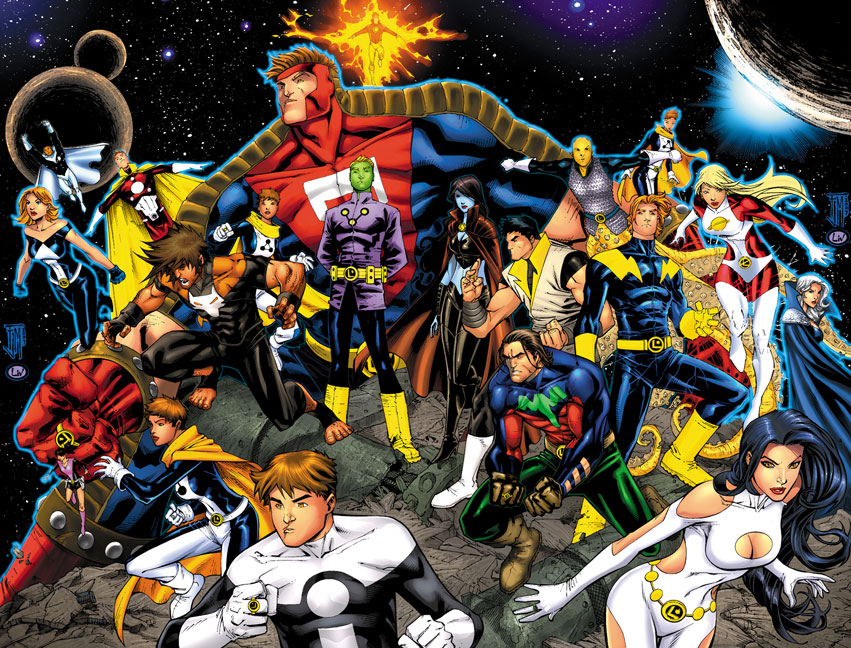
![[Linked Image]](http://img502.imageshack.us/my.php?image=saturngirlalt1ry9.jpg)