We've examined the
Elevens, tested the mettle of the
Twelves, and debated the
Eights.
Now is the time for Tens! Choose one per matchup -- no ties -- on your opinion of the cover merits alone. Click images to see larger versions1.
TEEN TITANS vs.
NEW TEEN TITANS
2.
PONYTAIL vs.
FRANKENSTEIN
3.
DATE WITH DEBBI vs.
CHILI
4.
NORMALMAN vs.
BATMAN & ROBIN ADVENTURES
1. TEEN TITANS. Neither is my favorite Titans cover. SATT wins for that Cardy perspective, plus Donna's ponytail! EDITED TO ADD: AND THAT SHADING! GIVES TEXTURE. (But the Robin Cycle doesn't look right.) I can't decide whether or not I like the NTT's pink/yellow target color scheme, but I've spent plenty of time thinking about it. Why?
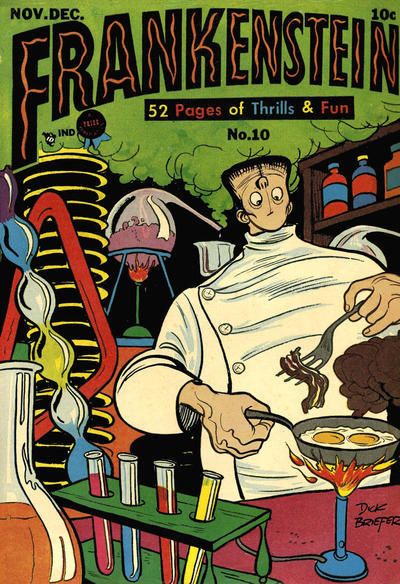
2. FRANKENSTEIN. The kids grooving to the new sounds (or maybe old sounds) is cute, but the lab setup has big charm. Plus bacon-n-eggs!
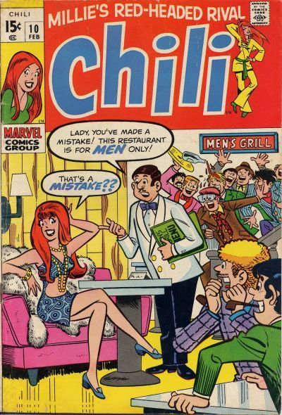
3. DATE WITH DEBBI. Although there's not much difference here!
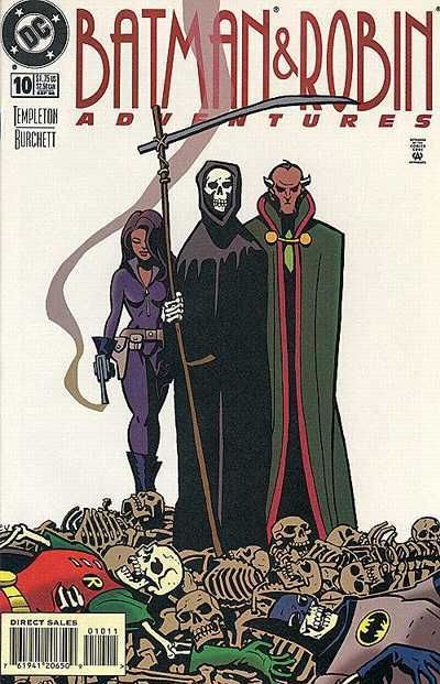
4. BATMAN & ROBIN ADVENTURES. Normalman might just be a little sassier than Death, but the B&RA crew is doing more than just standing around.
Yay!
1. New Teen Titans:
And we start with a real toughie. That Perez design is superb. The concentric circles take up the whole background of the cover. Their soft colouring is pleasing on the eye. The nature of the target draws the reader in naturally to the centre. The main cast (always looking good when it's Perez) are arced around that centre, following the circular motif. He doesn't just clump them together.
All of the cast are looking up, so the reader is then drawn upwards to the missile that has targeted them. It's behind the logo and intrudes just enough from the centre top to show you what it is. That centre top location is important. It moves the reader directly upwards from the centre of the target. The "Ground Zero" text is also arced round the circle, and reinforced both the target and the missile ideas. Someone has added the Terminator text which would also have been a draw to readers. It takes a little away form the overall design, but is reasonably small overall. Interestingly, he picks Cyborg as the front and centre character. So, plenty of craft there.
It's an all action shot cover in original Titans. That fireman helmet, flower eating Scorcher is too hot for the Titans to handle on perilous mountain trail-blazing
Scorcher completely dominates the centre of the cover. It reflects the confidence he has in his skills and is backed up by his huge smile. He's very well drawn. The Titans look like fish out of water, ably shown by poor Aqualad. A fish on a bicycle. Wonder Girl looks both shocked and surprised at Bat-Boy's inability on a bike. She sees the drop below. For the readers who can't, Cardy has helpfully drawn another nasty drop in the background. That's all that's needed and he knows not to clutter it up any further.
In a more character driven cover, we see that Kid Flash doesn't need a bike in the background. Where Cyborg is the centre of the Titans cover, Robin gets his little '60s pic on this one. Note that original Titans tells us the character names. By NTT we're expected to know. The Go-Go checks place the cover at a special (or at least collectible) moment in DC history.
In terms of action and excitement, the original Titans cover would win. Perhaps as a kid, I'd be more likely to pick it up off the shelf. But, NTT wins because of the strong design choice, and Perez looking to add some extra layers in there.
2. Frankenstein. Crumbs! A ponytail crossover from the previous pair! But that's the highlight of the cover, which only has the novelty value of dancing with a monster. Over in Frankie, we've got a bit of humour. Breakfast over a Bunsen. The red test tub has ketchup, but what's in the others? How's he going to eat it with no mouth? The cover gets points for having the lab clutter frame Frankie, and for having the escaping gas provide a well done backdrop to highlight the logo.
3. Debbi: Battle of the Red Tops! In more ways than one. Only at number 3 and we have a polka dot bonanza in Debbi. Debbi's smitten look is a nice contrast from the hunted, stalked expression on the guy. Perhaps he's aware that Debbi's mind isn't paying much attention to where there's a car coming or not. Hopefully, it something those two kids will work out, as no one is likely to help them across. Over in Chili, I'm wondering if she could have replaced Karate Kid in a company crossover. Below the logo, it's a bit dated with it's Men Only Grills. An upside down pipe isn't enough to compete.
4. Batman Adventures. There's nothing normal about that cravat/bow tie combo! That off centre stripe works well to make the trio prominent, rather than stranded in a snow storm. But over in Bats, we get a better drawn trio as the centre. Then you look down across the pile of skeletons (enforcing the smoking gun and Death). *Then* the two you recognise at the very bottom for some shock value. So, it's a cover that works both horizontally and vertically. Nice.
5.
BIG TOWN vs.
ALL-AMERICAN MEN OF WAR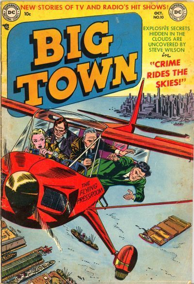
6.
DARK WOLF vs.
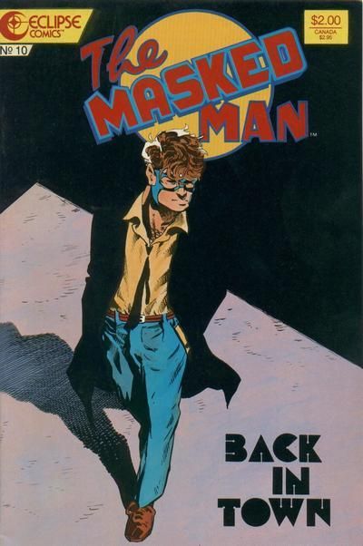
THE MASKED MAN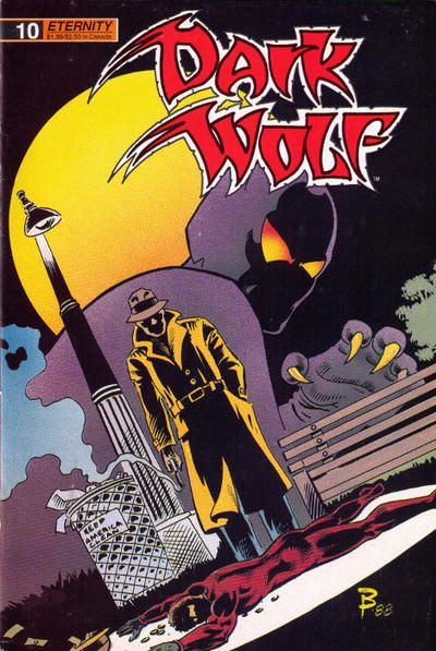
7.
SILVERBLADE vs.
THE BRAVE AND THE BOLD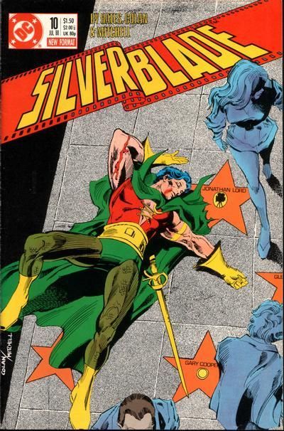
8.
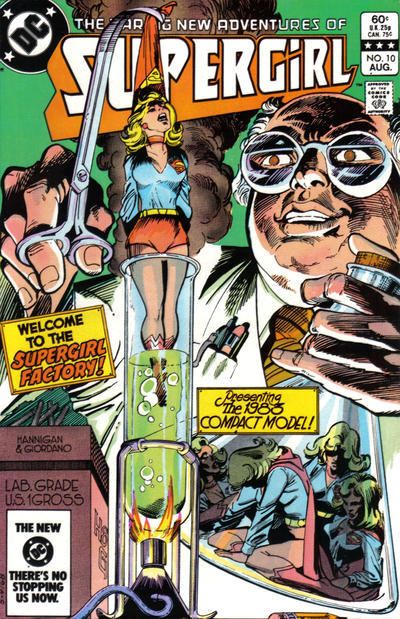
SUPERMAN vs.
SUPERGIRL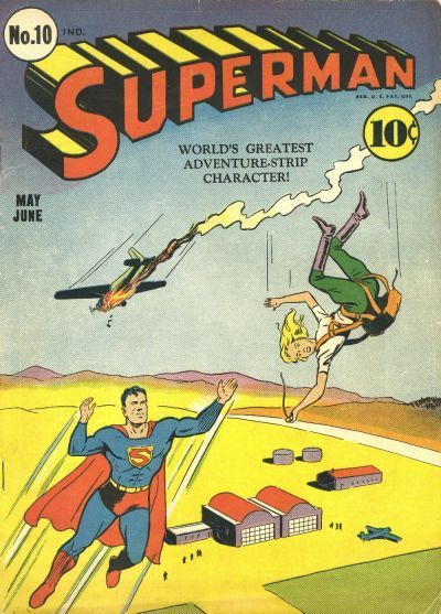
5. Big Town: Nice link between these two. But I'm going with Big Town for the extra background detail. It really is big town, and there's something pulpish about the title I like too.
6. Dark Wolf: Speaking of Pulp, there's a retro design to The Masked Man cover. Times were hard in The City, when a guy could only afford a mask and no costume. There was a moment in comics history where people were crying out for this sort of character. Unfortunately The Masked Man's mom sewed a name tag into all his clothes. His enemies hunted him down a week later. Dark Wolf gives us a crime along with our shadowy evening walk. The masked figure works well transitioning us from fore to mid to back ground making it a more interesting cover.
7. Silverblade: Who knew that the Silent Knight's secret was that he had giant manga eyes? Who knew that he was silent because he only spoke Japanese at the Round Table and got sick of no one understanding him? So, that leaves Silverblade. Not that it's a great cover, but I guess it shows who far a character can fall. The star, showing his secret ID, beside him is a decent touch.
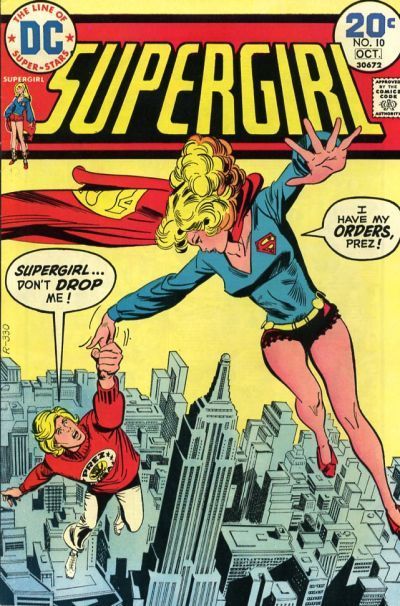
8. Superman Will Superman allow the girl to fall when he notices that it's not Lois? Oh hang on, I thought that Supergirl's orders were to save Prez, but that she didn't want to. Not the other way round. Bah! That means Superman wins. Note that the lady falling looks more of an adventurer than your standard damsel in distress. Well done Superman.
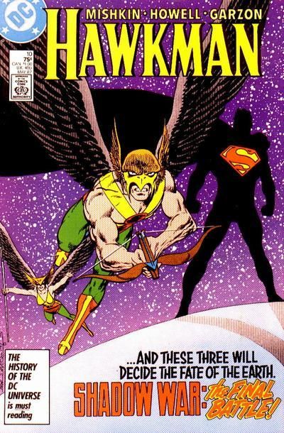
5. BIG TOWN. Shading/texture isn't a magic bullet. I like that BT's helicopter looks like it's about to fly by your left ear.
6. THE MASKED MAN. Dark Wolf is a bunch of standard Batman cover elements put together. So what? I don't like the logo either. The Masked Man gives more of the mood-attitude of the book rather than any specific plot points -- and I'm down with that.
7. SILVERBLADE because I'm curious about this story. I have no recollection of this comic. I don't like the logo font, though.
8. SUPERGIRL. The angle & framing. Superman looks like it could have been assembled from ColorForms.
9.
FLINCH vs.
THE SPIRIT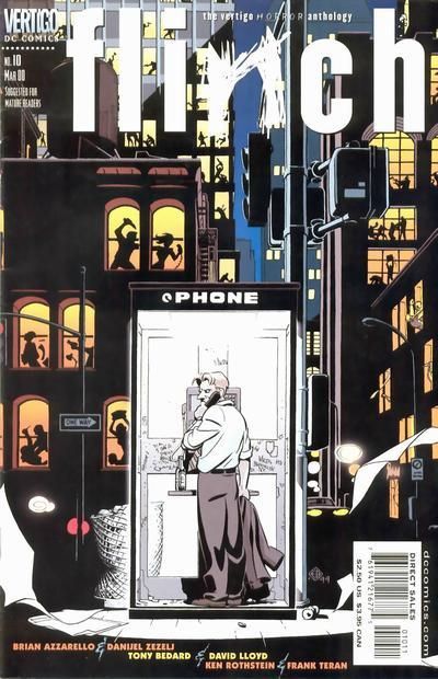
10.
SECRETS OF YOUNG BRIDES vs.
TRUE SECRETS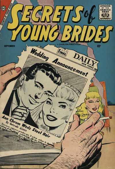
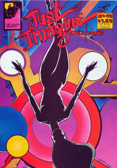
11.
THRILLER vs.
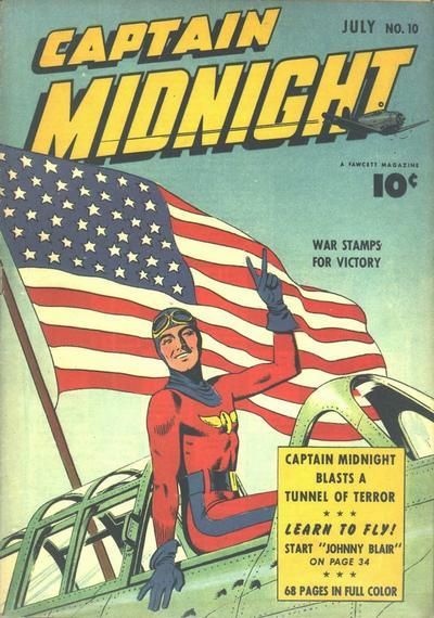
WATCHMEN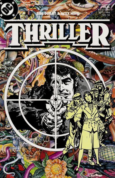
12.
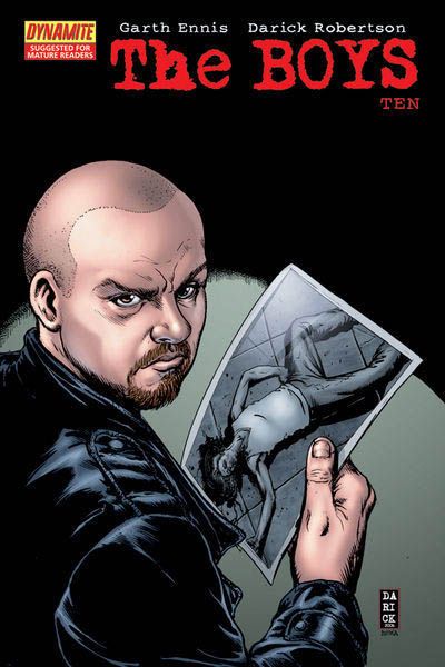
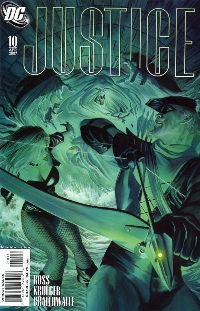
THE BOYS vs.
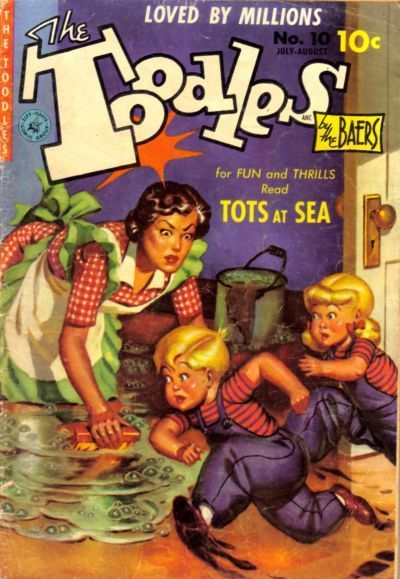
ALPHA FLIGHT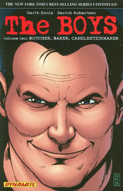
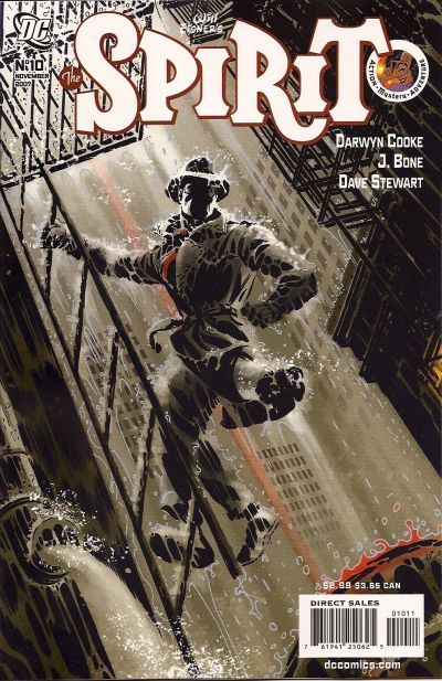
9. Flinch: It's not often I'd not be going for a Spirit cover. Especially one that's atmospheric enough that you can feel the weight of the Spirit's coat in the downpour, the water flooding his shoes and the cold, slick fire escape he's perched on. But looking at all the murders across the city in Flinch provides a great backdrop for the central image of the phone box.
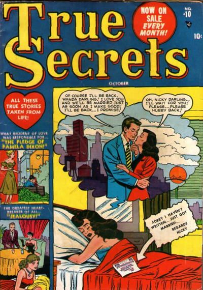
10. Secrets of Young Brides: The art isn't as good as I'd like on either of these too. So, let's look at the angst. True Secrets is pretty much a "sod off, you're dumped" for Wanda. Heart breaking, sure. but it doesn't have the Cape Fear tension of Secrets. A hate burning form the past like the guy's cigarette!
I vote for Steel Heir to replace Spider Girl in the LSV!
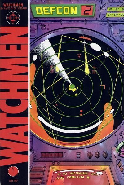
11. Thriller: Thriller #10. By which time the writer who said he'd never leave had left and the series was about to get canned. I don't think I've read an issue with Nino on the art chores. The cover is certainly nice. The background is so busy, but doesn't detract in any way from the tension of the crosshairs, the sniper or his opponents. While the draughtsmanship on the Watchmen is excellent, it's effectiveness is helped along if you know what stage the story had reached.
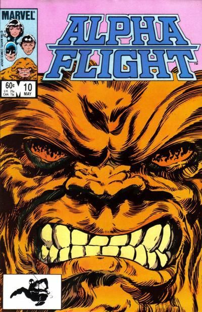
12. Alpha Flight. Enraged Sasquatches trumping Smug Gits is a comics tradition. One that continues again here.
9. THE SPIRIT. I like a rainy cover. (No points deducted because artistic license, but that Flinch phone booth is larger than any phone booth I've ever seen.
10. SECRETS OF YOUNG BRIDES. True Secrets is kinda tortured and WORDY. SOYB is almost wordless...and that newspaper could be in Greek and the idea would still come across. I like this one quite a bit.
11. THRILLER. The white over the colorful Carnivale-esque (??) background is doing it for me.
12. ALPHA FLIGHT. Although why is Sasquatch's head cut off by the logo? Does he have hat hair? Well bouf that shit up!
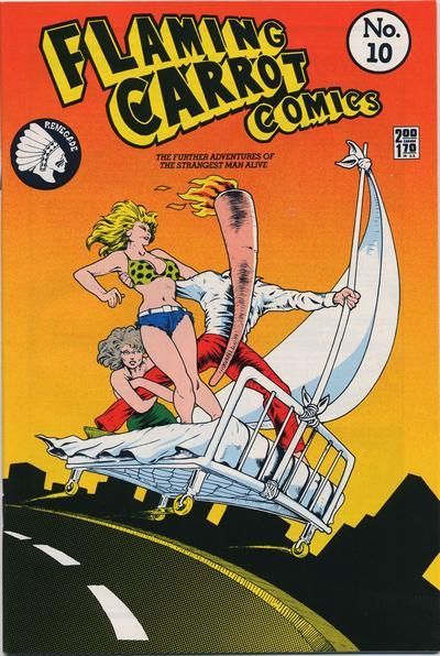
13.
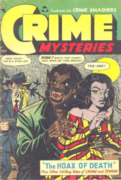
SMASH COMICS vs.
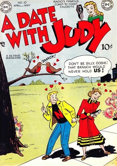
SILVER STREAK COMICS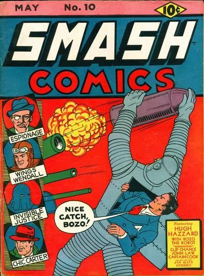
14.
THE ESTABLISHMENT vs.
NIGHT FORCE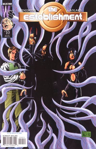
15.
FINDER vs.
STRANGERS IN PARADISE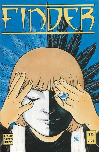
16.
DAZZLER vs.
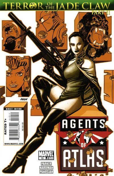
DOCTOR STRANGE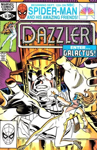
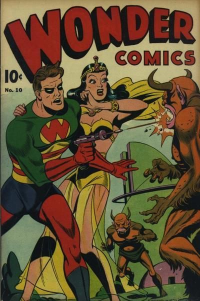
...No points deducted because artistic license, but that Flinch phone booth is larger than any phone booth I've ever seen.
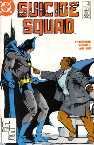
All Pratt makes a call... "Samaritans? Yeah, it's Al again. Yeah, I was fine. But I'm the victim of a drive-by taunting about the size of this phone booth. Now I'm sad again."
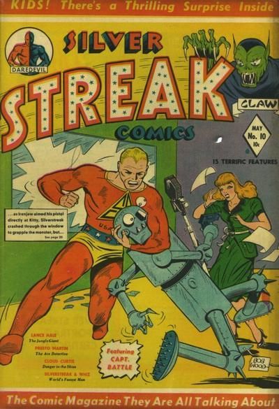
13. Never mind Al. At least you're not a robot. Not just hated by Coluans, but by the Whole Comics Industry! If they're not getting their eyes punched out by show off super streaks, they're getting called names like "Bozo". It's a win for
Smash as I try to figure out where its controls are, if Hugh Hazzard is using it as a suit. (I bet the front of Bozo has a pocket with an immaculate hankie too). I think that robot design was used again decades later - Big Guy and Rusty the Robot?
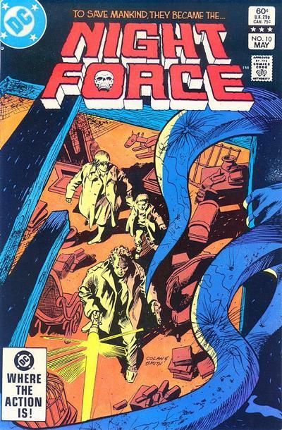
14. Night Force: I don't think I got past the first issue of the Establishment. A very tame version of the already neutered Authority. It's a group shot and someone has drawn some tentacles in front. Night Force never really seemed to get going in any incarnation. But here's the threat has a context and its prey are unaware. Good cover design allows the main characters to remain central even with the unusual perspective.
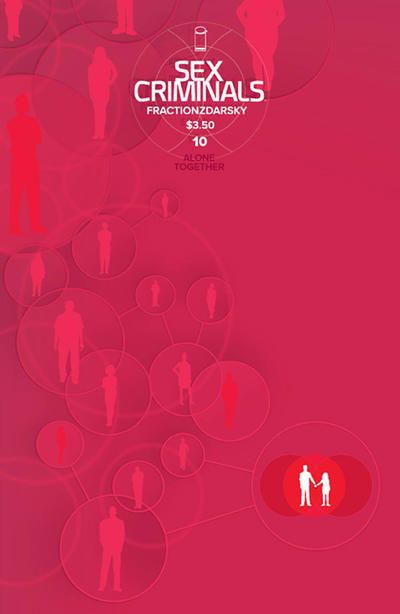
15. Finder. I bought the whole run of SiP, but that's twice I think I've voted for another cover. Nice logo and the duality is reinforced a few times. I like the hand/eye placement too.
16. Reasons why I don't read Marvel. Ridiculous over sized cosmic clowns. So it's Disco Skates vs Giant Jazz Hands or Wizard Dance Off of Eternity. Meh... Dazzler because seeing Galactus here is like Darkseid appearance in a burger joint over in Ambush Bug.
13. SMASH COMICS. The Silver Streak gun blends in, looks that poorly-attired man is harassing a derpy robot. Smash isn't the height of sophistication, but pulls together as a package.
14. NIGHT FORCE. A little suspense, thank you.
15. FINDER. I'm liking the black.white/blue tan(ish) color scheme.
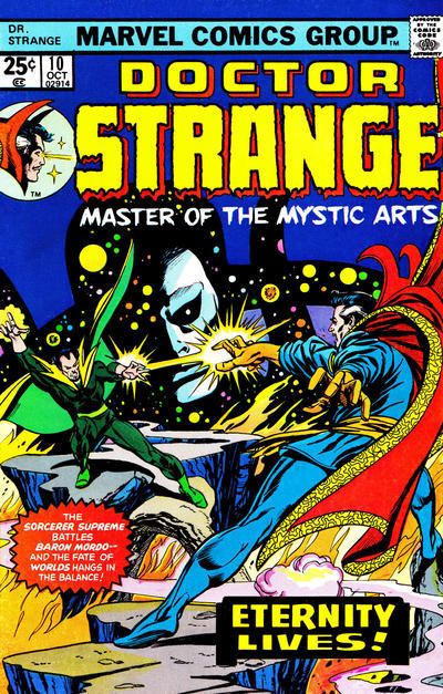
16. DOCTOR STRANGE. 'Cause Eternity looks good...like always.
17.
NEW TEEN TITANS (BAXTER) vs.
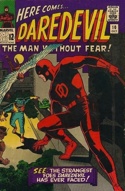
OMEGA MEN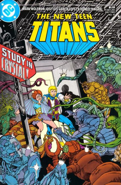
18.
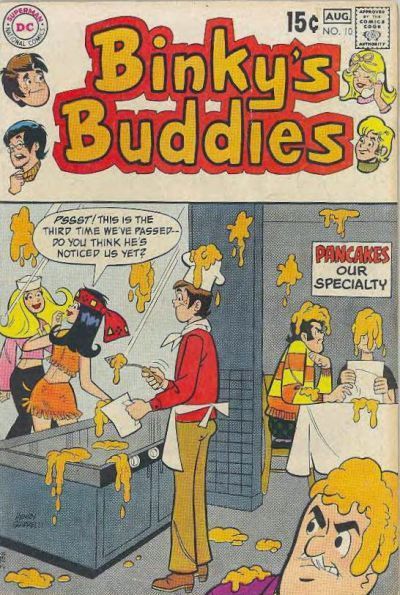
HUMPHREY vs.
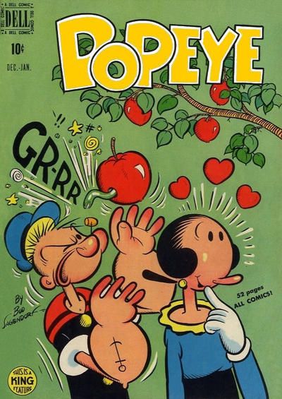
JOE PALOOKA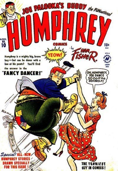
19.
LEADING COMICS vs.
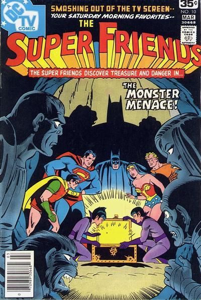
SUPER FRIENDS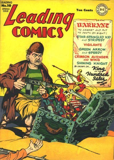
20.
WONDER WOMAN vs.
OUTSIDERS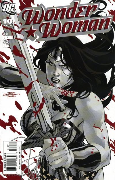
1. Teen Titans - these Titans ones are always hard but I really like how the action explodes right off the cover rather than deeper into it.
2. Ponytail - dancing always improves things
3 Debbi - if only for the polka-dot dress wearing crossing guard
4 Batman & Robin Adventures - this series was chalk full of terrific covers and this is definitely one
5. Big Town - with two people in peril it makes it more complex and I couldn't help but linger.
6. Dark Wolf - all about the angles here which work incredibly well
7. Silverblade - a classic superhero trope most famous via Infantino's Flash, but this is really well done here. The sidewalk framing it and the color versus black & white send it home.
8. Supergirl - wonderful cover: dynamic, colorful, Supergirl looks heroic and attractive, Prez being there has novelty value. Great.
9. Flinch - really tough choice. But that Flinch cover has me mesmerized.
10. Secrets of Young Brides - while the other cover feels like a total melodramatic cry-fest, this cover invokes a more serious tension and drama. Who is holding this? It feels rough and aggressive almost. Is this guy gonna kill that couple? I want to know.
11. Thriller - there's almost too much going on but I like it; the separation of the various elements is subtle but there.
12. Alpha Flight - I don't really like these extreme close up covers but I'll take savage anger over snark.
13. Silver Streak - I don't love either but I'll take the rawness and "ugliness" of SS over Bozo the Robot.
14. Nightforce - modern artists could learn from a master like Gene Colan. Lightning, shading, framing, dynamic angles, mis en scene. This one is far, far superior.
15. Cinder - SiP is simple but too simple. Cinder adds a little something with the hand / eye bit.
16. Dazzler - novelty value may not be as great as phenomenal art, but it's still valuable. Any conversation about Dazzler usually includes a reference to "that time she and Galactus...". I know I'd have bought it.
17. New Teen Titans - I like the "just go for it" approach with a plethora of aliens and colors. Also, the faces convey genuine panic and shock and it works.
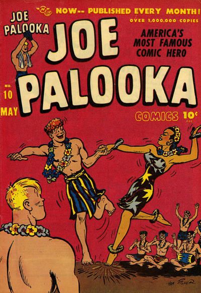
18. Joe Palooka
19. Super Friends - don't like either really but this one at least attempts some composition.
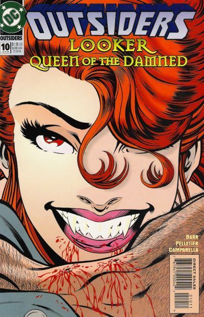
20. Outsiders - I just said I don't like these kinds of covers but I remember buying this one and enjoying it. Fangs and blood on a beloved character not seen in awhile had me more than curious.
17. Titans. Garcia Lopez captures Kole's terror and the horrors that her knock off Anton Arcane father has created superbly.
18. Humphrey. At least it goes for a gag.
19. Leading. Gosh! Just imagine if we had Seven Soldiers action figures. Imagine no more. But can they beat their arch foe -Mr-Coconut-Shell-Head? Over in Super friends the big three try to irradiate the Wonder Twins. 'I was just so sick of them,' said Batman to the arresting officer.
20. Wonder Woman. Her paintball cover is better than the dated looking Outsiders effort. Vampires indeed.
1. New Teen Titans - having the Titans centered makes for clearer action
2. Frankenstein
3. Chili
4. Normalman
5. Big Town
6. The Masked Man
7. Silverblade
8. Supergirl
9. Spirit. Love the pose.
10. True Secrets. The color helps.
11. Watchmen
12. Alpha Flight. More expression
13. Smash Comics
14. Night Force. Tentacle goodness but the protagonists are clearer
15. Strangers in Paradise
16. Dazzler
17. New Teen Titans and not just because I miss Kole
18. Joe Palooka
19. Super Friends
20. Wonder Woman
21.
ARCHIE'S MADHOUSE vs.
BUNNY
22.
ACTION GIRL vs.
AKIKO
23.
THE SPECTRE vs.
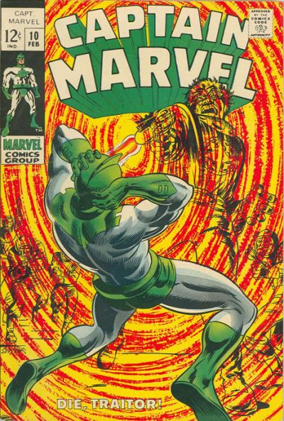
CAPTAIN MARVEL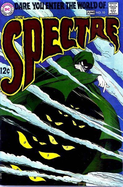
24.
MYSTERIES OF UNEXPLORED WORLDS vs.
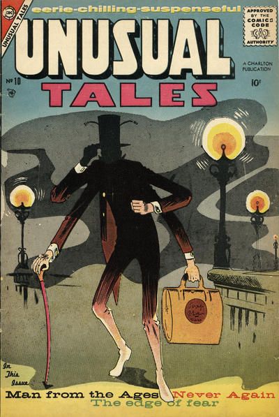
UNUSUAL TALES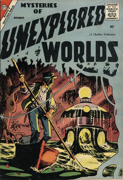
21. Bunny. The egghead cover is surprisingly off putting
22. Action Girl is cute
23. Captain Marvel
24. Mysteries of Unexplored
21. Bunny. For the artist drawing all those bubbles. It's as desperate looking as a Mad Mod Titans issue ish, luv.
22. Action Girl! 'coz..it's Action Girl! My new favoutie non-Legionnaire Legionnaire! uh.. the background colour goes nicely with her outfit? In other cover news.. yay Akiko! I have at least a couple of Akiko issues! I have no idea why! I have no idea what it was about! I can't stop using exclamation marks!
23. Spectre. Eyes in the cape! The Spectre: The friendly face (or at least eyes) of DC's god. Over at Marvel Jim Corrigan gets shot. "Eat that Corrigan!" oh wait...that isn't..ah, I've fallen for one of Teeds clever cover match ups. It's just lame Captain Marvel after all.
24. I can't decide! Too tough. Super-creepy alien ship, with alien shadow, appearing from the swamp depths (take that Swamp Thing!)or super-creepy possible insectoid person snatcher in a London fog (Take that...uh..Roachmill!)... Both cover logos are worked into the backgrounds well too. I'm going with Unexplored Worlds as that tree also works as a foreground too.
17. NEW TEEN TITANS. Colorful AND horrifying. And with the framing, YOU, dear reader, are one of the colorful horrors. Ha!
18. JOE PALOOKA. Fun jitterbugging with South Pacific (?) flavor. Can not figure out that BOINNNG 'sound effect' on Humphrey. Quasars?
19. I'd like Leading a lot more if the background got sorted out. I'm fine with abstract, but it seems this is meant to show a place -- a beach? -- the sand and the sky should not blend together. While Super Friends has that less-detailed art style, the composition quite good -- first you see the Twins and the glowing case, then the Big 3 +2, THEN their shadows from the glow. THEN the villains even though they're in front! SUPER FRIENDS.
20. WONDER WOMAN.
21. BUNNY. I'm a sucker for all the bubbles and color. There's something about Madhouse, though.
22. AKIKO for a lil more visual interest
23. While I can appreciate the unusual effect on CM, it's gotta be THE SPECTRE.
24. AW YEAH SILENT & CREEPY. On UT, look at how you get bits of background detail, but much is obscured in some odd fog(s). Then on the other one, you see the boatman's surprise at this strange and beautiful thing that has suddenly appeared. And that partial frame of the tree!! MYSTERIES OF UNEXPLORED WORLDS.
25.
MILLIE vs.
MOPSY
26.
LOVERS' LANE vs.
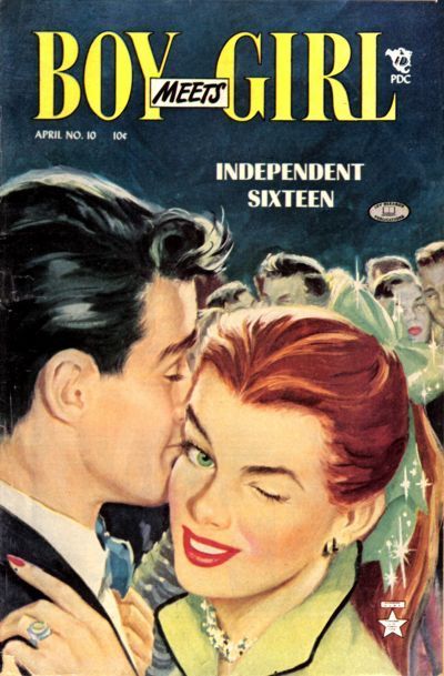
BOY MEETS GIRL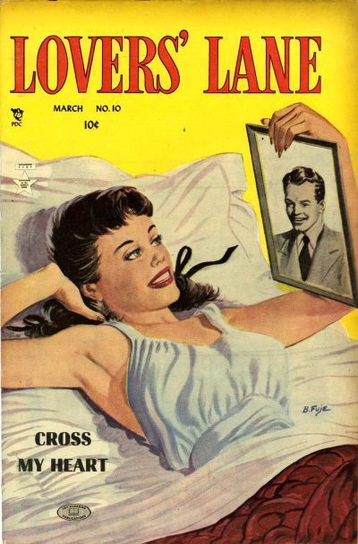
27.
KEN SHANNON vs.
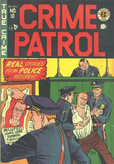
CRIME PATROL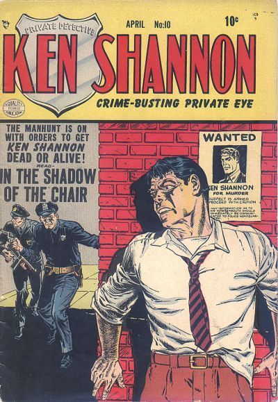
28.
MY LOVE vs.
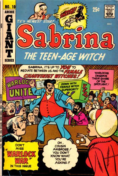
SABRINA THE TEEN-AGE WITCH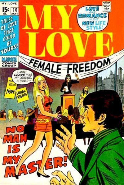
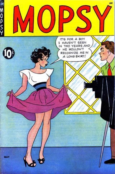
25. Mopsy, like the spread of the skirt
26. Boy Meets Girl, love the wink
27. Crime Patrol
28. Sabrina
25. Mopsy : I thought the boy on the smaller Millie cover had just received a ball to his ... but I see instead that his racket hand is probably concealing something else. Millie is oblivious. Which is why Mopsy wins. It's much more knowing.
26. Boy Meets Girl: These are your daughters! In Lover's Lane we don't see the other side of the bed where the bloke from the picture has just departed. Over in Boy meets Girl is the wink telling you what's going to happen later, or is she trying to pick up someone else? At that age! I'm scandalised! Boy meets
Girl wins because one of the sparkles makes it look as though a lady in the background is wearing a monocle.
27. Ken Shannon: It's all about vests. Shannon wears his, so he didn't catch a cold while he was on the run. Vestless man in Crime Patrol was picked up in a drug store trying to get cold remedy. Shannon was also helped by not looking a bit like his poster, but loses points by having his fingers wrap round the corner in view of the cops.
28. Sabrina: The art, jacket/shirt coordination, and angst on My Love is better. But it's a very mixed message. Sabrina is the funnier social commentary.
25. MOPSY. Yep, Mopsy is more clued-in.
26. BOY MEETS GIRL. The wink wins it! This is no milquetoast miss.
27. CRIME PATROL. The desk sargeant looks so tickled.
28. The visual aspects of My Love are strong, but I think I know where that story is going. To no surprise SABRINA has quality visuals, but I definitely want to know how the story will play out. Sabrina takes it for the set-up.
27. CRIME PATROL. The desk sargeant looks so tickled.
I was reading "great, I thought I'd never get to beat up a crook this shift." into it.
They all look pretty happy. It's like, "look at this poor sop struggling like crazy"...
1.
TEEN TITANS vs.
NEW TEEN TITANS 2.
PONYTAIL vs.
FRANKENSTEIN 3.
DATE WITH DEBBI vs.
CHILI 4.
NORMALMAN vs.
BATMAN & ROBIN ADVENTURES 5.
BIG TOWN vs.
ALL-AMERICAN MEN OF WAR 6.
DARK WOLF vs.
THE MASKED MAN 7.
SILVERBLADE vs.
THE BRAVE AND THE BOLD 8.
SUPERMAN vs.
SUPERGIRL
9.
FLINCH vs.
THE SPIRIT 10.
SECRETS OF YOUNG BRIDES vs.
TRUE SECRETS 11.
THRILLER vs.
WATCHMEN 12.
THE BOYS vs.
ALPHA FLIGHT 13.
SMASH COMICS vs.
SILVER STREAK COMICS 14.
THE ESTABLISHMENT vs.
NIGHT FORCE 15.
FINDER vs.
STRANGERS IN PARADISE 16.
DAZZLER vs.
DOCTOR STRANGE
17.
NEW TEEN TITANS (BAXTER) vs.
OMEGA MEN 18.
HUMPHREY vs.
JOE PALOOKA 19.
LEADING COMICS vs.
SUPER FRIENDS 20.
WONDER WOMAN vs.
OUTSIDERS 21.
ARCHIE'S MADHOUSE vs.
BUNNY 22.
ACTION GIRL vs.
AKIKO 23.
THE SPECTRE vs.
CAPTAIN MARVEL 24.
MYSTERIES OF UNEXPLORED WORLDS vs.
UNUSUAL TALES
I just remembered another reason I liked Batman Adventures for 4. Seeing the Dynamic Skeletons reminded me of a strip drawn by Steve Yeowell, where the central character ended up just like that.
29.
JUGHEAD vs.
HENRY ALDRICH
30.
REX MUNDI vs.
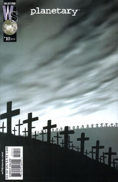
PLANETARY
31.
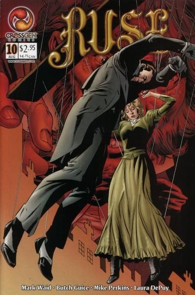
ZATANNA vs.
RUSE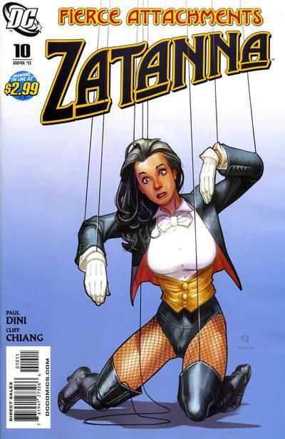
32.
FLASH COMICS vs.
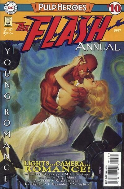
FLASH ANNUAL
25 Jughead, he is making me envious
26 Planetary, how haunting
27 Zatanna, great artistry
28 Flash Annual, more vivid
25. Henry Aldrich: He's doing a good job of Out Olsening Olsen. A funny cover, using just the right number of props to make it work to it's best. Jughead: dead at 30.
26. Planetary. I have quite a few issues of Rex Mundi. It had a really interesting alternate history going on. But it never really lived up to it's potential. It was using some Holy Blood/Holy Grail ideas in the backstory, and it never really recovered when that had another spell in the limelight bashing over it's more careful approach.
Although the Planetary cover is lots better with its haunbting mood, the story was a bit of a let down. That's when the book's cheap knock offs of the Fantastic Four are found to have destroyed life on a planet just to store their weapons. Yet all four are light weights in the latter part of the series.
27. Zatanna. The guys on Ruse have just been knocked out and strung up. Zatanna's the one with the dawning realisation that she's someone's marionette (cue Abba song).
28. Flash Comics: Modern Flash has more steroids pumped into his arm muscles than a dozen Russian Olympians (oooh, topical). Classic Flash is running on water, man. He's running on water. There's a real sense of danger from the cover and that Masthead is classic
29. HENRY ALDRICH. A Quasars? concept fo sho, but the art takes it. Look at the colors!
30. PLANETARY. No, a million is a tragedy. A grayscale version of the Weeping Window. (Or the other way around, really.)
31. ZATANNA. What thoth said.
32. FLASH COMICS. It's not after the thing, it is the thing.
33.
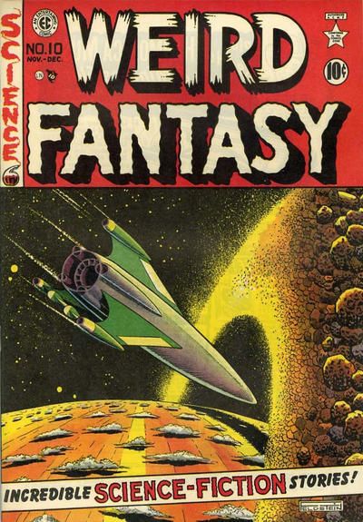
AMAZING MYSTERY FUNNIES vs.
WEIRD FANTASY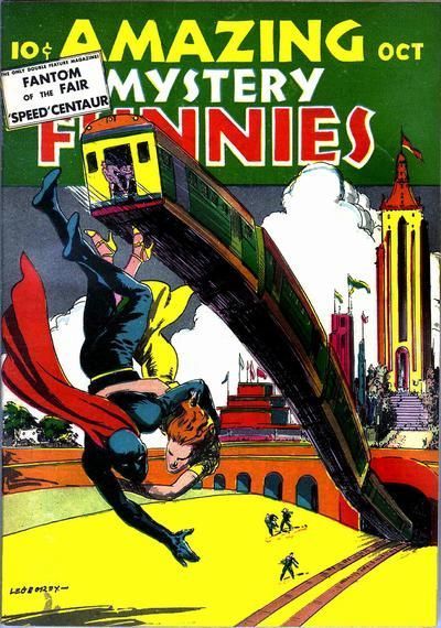
34.
INHUMANS vs.
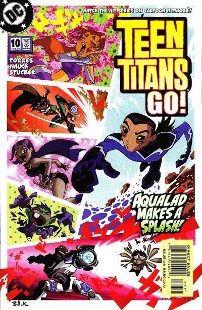
TEEN TITANS GO!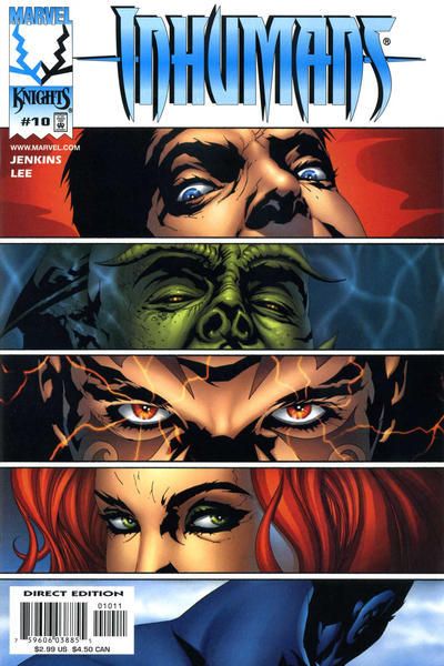
35.
BARBIE vs.
BARBIE FASHION
36.
DOLL MAN vs.
THE ATOM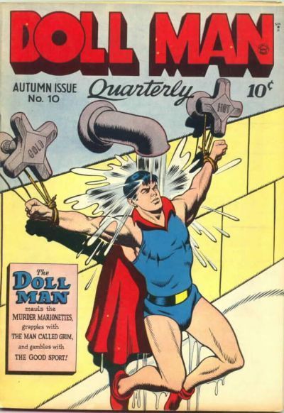
29. Amazing Mystery Funnies
30. Teen Titans Go
31. Barbie Fashion
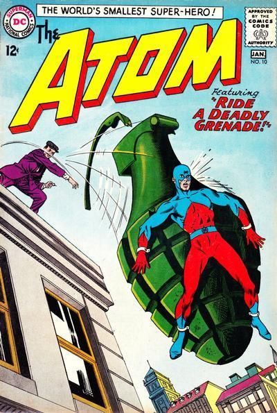
32. Doll Man
25.
MILLIE vs.
MOPSY 26.
LOVERS' LANE vs.
BOY MEETS GIRL 27.
KEN SHANNON vs.
CRIME PATROL 28.
MY LOVE vs.
SABRINA THE TEEN-AGE WITCH 25.
JUGHEAD vs.
HENRY ALDRICH 26.
REX MUNDI vs.
PLANETARY 27.
ZATANNA vs.
RUSE 28.
FLASH COMICS vs.
FLASH ANNUAL Looks like the numbering got duplicated.
33. it could be... I spend like whole seconds wonder where I'd seen the guy on the left before. Then I read the caption. Amazing Mystery Funnies reminds me of the Hawkman/ Showcase cover with the Hawks fighting a serpentine Byth at a tunnel entrance. But it's Weird Fantasy that wins due to the detail in the planetary rings.
34. Teen Titans Go! Crumbs! Is that Aqualad? I thought it was Nightwing. At least the titans are doing something more than wiggling their eyebrows on their cover. They guy at the bottom of the Inhimans cover deserves nothing for being in a huff.
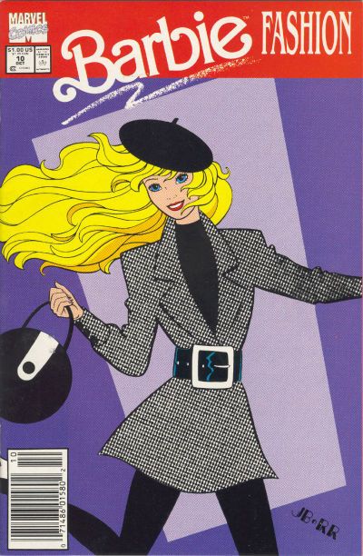
35. Barbie Fashion: Too many horror movies and Doctor Who versus the Autons means that I find both covers rather creepy.
Fortunately, all those romance covers have given me a keen insight into Comic Cover Fashion. And the clear winner is Barbie Fashion. Its timeless Eurocentric coordination provide both the tones for formal events with the flexibility and lightness for more fun Barbie evenings.
36. Atom: Alas, Doll Man is being tortured by American trained thugs from recent CIA years. That's just a variation on waterboarding. Back in the good old days, anything went in those sweaty backwaters where your tax dollars kept brutal dictators in power. Strapping your foe to a grenade certainly sends out a message to the rest of those rebels.
Looks like the numbering got duplicated.
Numeration goof fixed.
1. The old Teen Titans. So much to like here. The villain on a bike wearing a fireman's helmet, spiky brass knuckles and an iron cross! The look on Donna's face as Dick takes them over a cliff! Garth falling off a bicycle! Wally struggling to keep up! What's not to like?
2. Frankenstein. Because bacon and eggs.
3. Chili. Because it rhymes with Millie. Also, polka-dots hurt my eyes this early in the morning.
4. Normalman. Valentino doing Sim! Excellent (as were all the Normalman covers).
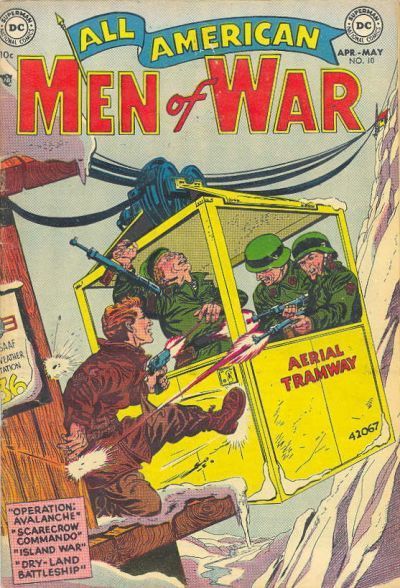
5. All-American Men Of War. Planes are old hat. Shooting at each other point-blank in a tram car, on the other hand....
6. Dark Wolf. So noir it almost hurts.
7. Silverblade. This one draws me in, makes me want to find out what's going on. My first impression of the B&B cover is "what is that big red thing?" Then I notice the eye slits and realize it's a middle ages KKK guy.
8. Superman. Even though there is more going in, Clark's cover seems less cluttered than cousin Kara's.
9. Flinch. At first I was drawn to the Spirit cover, but once I zoomed in to get a better look, the stuff going on in the background gave Flinch the edge. I wish there was a better way to enlarge these pics than waiting for photobucket to load, though.
10. Secrets of Young Brides. One picture really is worth far more than 45 words.
More later.
I DECLATE CHILI THE WINNER OF EVRYTHING! THUS SPEAKETH MLLASH!!
henry aldlrich and I are to be gay married
No, make that Jay garick ND I he's super in love with me
dang, doll MAN, QUIT IT YOU!!
Femle freedom, aure toots, but how bout sandwiches first and I need $20
I've alway love the alooker/vampire outsiders COVER bu have terrific mmories of that super friends issue
If you are NOT addled like Lash, feel free to join in, from the beginning or from whatever group you want.
Please include the # and the winning title -- no ties -- for each matchup.
37.
CATHOLIC COMICS vs.
AMERICAN VIRGIN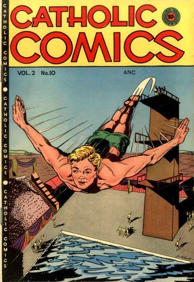
38.
DOCTOR WHO vs.
GEORGIE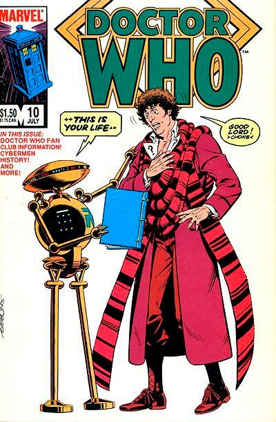
39.
BULLETMAN vs.
WOW COMICS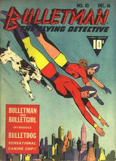
40.
PROMETHEA vs.
BAKER STREET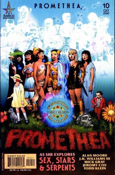
37. Catholic Comics
38. Doctor Who
39. Wow Comics
40. Promethea
33.
AMAZING MYSTERY FUNNIES vs.
WEIRD FANTASY 34.
INHUMANS vs.
TEEN TITANS GO! 35.
BARBIE vs.
BARBIE FASHION 36.
DOLL MAN vs.
THE ATOM 37.
CATHOLIC COMICS vs.
AMERICAN VIRGIN 38.
DOCTOR WHO vs.
GEORGIE 39.
BULLETMAN vs.
WOW COMICSTough choice...
40.
PROMETHEA vs.
BAKER STREET
If you are NOT addled like Lash,...
At least that didn't take long. Remember when he used to thump out the answers with his replacement hand like Mr Ed did with his hoof? That took ages.
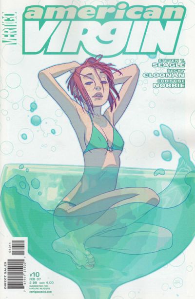
37. American Virgin: Young Timmy makes a desperate escape from Father O'Malley's attentions back on the board. No one in Timmy's school qualifies to make it into an issue of American Virgin. Not that this makes the Vertigo cover any less creepy. An underage looking girl in a burlesque martini glass...um... it's only getting a win because the liquid is better drawn. I'd have went with neither if I could.
38. Doctor Who: Can't beat Gibbons Doctor Who. There were a couple of gems in that series. There were a few stinkers too right enough. "Check" out Georgie in the last issue of his series, before his four co stars got the title changed to Teenage Pregnancy Monthly.
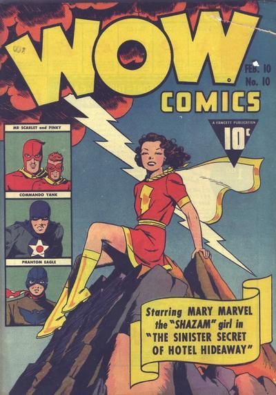
39. Wow: Now we're talking. Two great covers. Bulletman, Bulletgirl and Splat the Dog, who got into the cannon by mistake. Note the lack of helmet. But, as Lightning has just flashed and the thunder rolled outside as I type, it goes to Wow! You can get a sense of her invulnerability in the face of the storm.
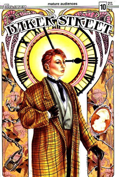
40. Promethea for the Rutles tribute. Gosh...hail flurries now...
41.
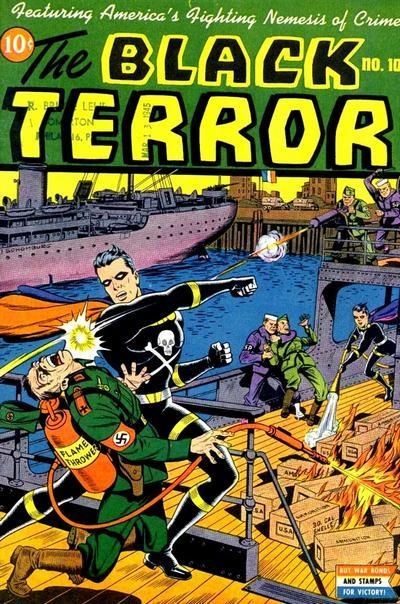
THE MARVEL FAMILY vs.
THE BLACK TERROR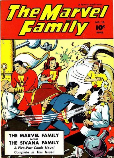
42.
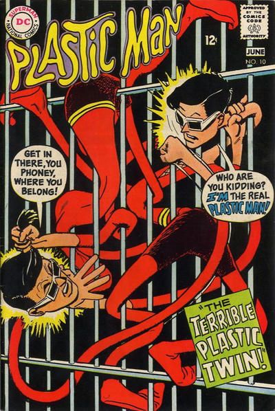
PLASTIC MAN (QUALITY) vs.
PLASTIC MAN (DC)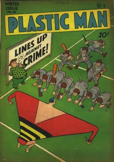
43.
SABRE vs.
JON SABLE, FREELANCE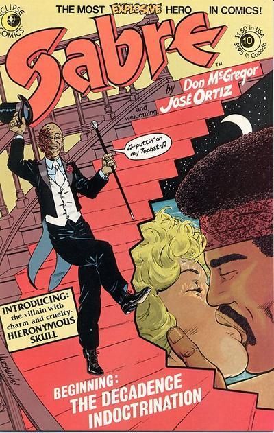
44.
LITTLE MAX vs.
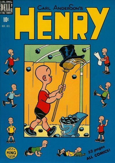
HENRY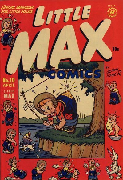
33. WEIRD FANTASY FO SHO. Look at that finishing. THe other has off-putting color combo.
34. TEEN TITANS GO!
35. BARBIE FASHION. Chic, plus passes the test of time. Like the colors.
36. DOLL MAN. The weirdness!
37. CATHOLIC COMICS. AV is pretty washed out. CC has that 3D-ish diver...we'll just ignore that his arc looks like he is going to overshoot the pool no matter WHICH way it is situated.
38. DOCTOR WHO. Default win. Georgie might have won with better finishing. In particular, that smudgy "floor" annoys me!!
39. WOW! That's a great action promo picture of the Bullets. But MARY!!! Pure charm, and just a great package with the sidebars & banner. Classic.
40. PROMETHEA.
41. THE BLACK TERROR. The colors grab me more.
42. PLASTIC MAN (QUALITY)! The lines/angles and colors MAKE you look! Simple, but not simple.
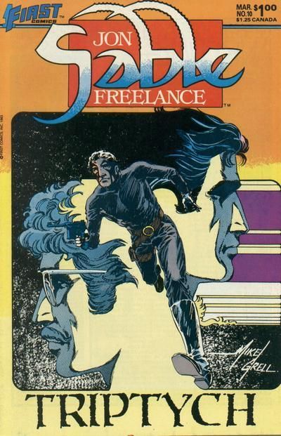
43. JON SABLE FREELANCE. Although I would have colored it differently.
44. HENRY. It took me awhile to figure this out. Depression humor! Social commentary! (Although I don't know if it was intended as much.)
If you are NOT addled like Lash, feel free to join in, from the beginning or from whatever group you want.
Please include the # and the winning title -- no ties -- for each matchup.
What of we ARE addled. Somewhat unlike Lash but still probably super addled with lots of addles. Some charming. Probably.
29.
JUGHEAD vs.
HENRY ALDRICH 30.
REX MUNDI vs.
PLANETARY 31.
ZATANNA vs.
RUSE 32.
FLASH COMICS vs.
FLASH ANNUAL That Jughead cover is totally me btw, I love burgers. and crowns.
[quote=Thriftshop Debutante]41.
THE MARVEL FAMILY vs.
THE BLACK TERROR 42.
PLASTIC MAN (QUALITY) vs.
PLASTIC MAN (DC) 43.
SABRE vs.
JON SABLE, FREELANCE 44.
LITTLE MAX vs.
HENRY Poor little Max.
Fun Fact: Peebs has always detested Plastic Man. Except for that butt shot in the other thread.
[quote=Thriftshop Debutante]33.
AMAZING MYSTERY FUNNIES vs.
WEIRD FANTASY 34.
INHUMANS vs.
TEEN TITANS GO! 35.
BARBIE vs.
BARBIE FASHION 36.
DOLL MAN vs.
THE ATOM The Atom cover is pretty good and the Teen Titans Go one as well but that Inhumans cover is snatch!
poor Doll Man, I hope that's not scalding water .. hahahahaha
ALL-NEW ALL-NOW RULES FOR STROKE VICTIMS, these changes very much approved by Teeds.
Just kinda say whatever the covers make you feel, teeds is cool with that, What's important is you don't have another stroke worrying about restrictive rules and such. (kindly smile)
And what about when Teeds reads your post and things start getting REAL, Trish?
PS/ I will definitely be going back and doing this the correct way (soon enough!). i'm consideeing it to be recovery therapY!
And what about when Teeds reads your post and things start getting REAL, Trish?
I'm afraid of this new REAL turn this thread might take ... I don't want to be held under luke warm water ...
hahahahahaha.
He hears that all the time!
Don't you have Twelves and Eights to do, Power Boy?
41. Black Terror: the Terror loses another side kick who tries to put out an ammunition fire with a small fire extinguisher. Meet the new side kick next month. Marvel Family loses a few points for the acid attack on Mary Marvel's face. Icky just to think about. Lots of fan favs in the Marvel cover, but there's much more going on over in Terror.
42. Plastic Man (DC) The quality one works on a humour, crime fighting (old school against thugs) and on a sports level. So that's three comics for one. But the DC one not only has better art, but it's awkward to draw plastic man v plastic man fights.
43. Sable: Sabre kills Fred Astaire over in his book, but loses all points for such a ponderous title. Only slightly less vague is Sable which wins for bothering to have the triptych as part of the cover composition, rather than just shoe horned in.
44. Henry: As cheeky as that scamp Max is, it completely lacks the social commentary combined with humour of Henry, even if the cover is more endearing.
1. CARDY, I DISLIKe THE COLORS Of THE BULLSEYE ON NTT, VERY HAPPY 7TH BIRTHDAY ETHAN
45.
GREEN LANTERN (GA) vs.
GREEN LANTERN (SA)
46.
AMAZING SPIDER-MAN vs.
SPIDEY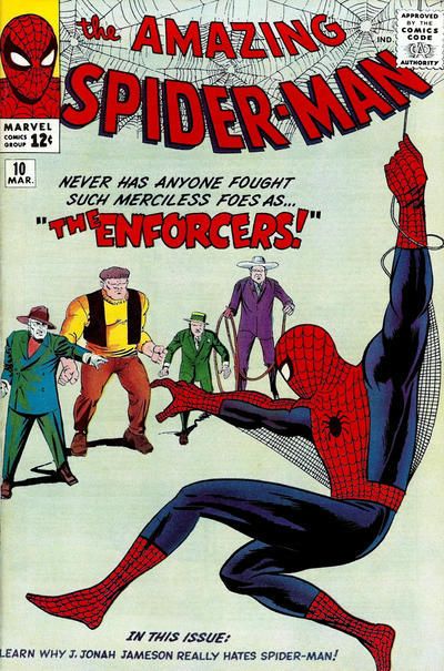

47.
HAWKMAN (SA) vs.
HAWKMAN (1980s)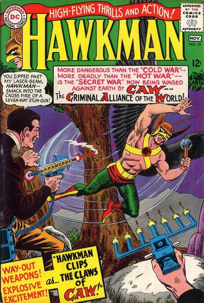
48.
AVENGERS vs.
AVENGERS ANNUAL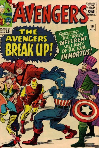
41. THE BLACK TERROR. His costume is pretty neat
42. PLASTIC MAN (DC). What a fun tangle
43. JON SABLE, FREELANCE. Love the costume too
44. Henry, who looks more like a real boy than a distorted animated puppet
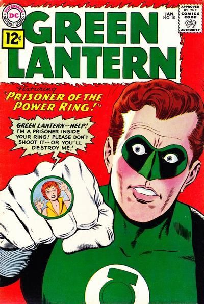
45. GREEN LANTERN (GA). At least only the villain looks weird. SA GL looks... looks... I can't even say it.
46. SPIDEY. Thar she blows!
47. HAWKMAN (1980s). Love the pose.
48. AVENGERS. Also love the poses.
45. Green Lantern (GA); Scott and Dickles fight the literally growing threat of beards! Keep America Clean-shaven! things decline rapidy as Hal Jordan is using blusher and has a face more like his evil Earth-3 Counterpart Power Ring.
46. Amazing Spidey: The Enforcers: So merciless even the backgronds are too afraid to show up. Very few points and some iffy lettering too. But it would seem that the Short Circus are a thing. A thing I'm not caring for. That+all magic issue gets even fewer points. Merlin's bought a new robe for the occasion which was nice.
47. Hawkman (1980s) The 60's version is over egging lots of things. In trying to capture the story, it shows too much dialogue. In showing how threatening the villains are, it gives them weapons that are too sci-fi. In trying to capture the essence of acronym based secret agencies, it comes up with a silly bird one for Hawkman. Superman gets more royalties if he appears in full light on covers, so they went with the budget silhouette instead. Shadow War was really tedious. Despite what the cover says, no one was paying any attention.
48. Avengers Annual: Breaking up is hard to do. Unless you are in the revolving door of the Avengers roster. How did they cram so much into the annual? It must have been going so fast it was trying out the bike it was putting up for a prize on the cover. Unlike Hawkman, the panel breakdowns work when giving a lot of detail.
2. PONYTAILdance covers always win
3. chili them gays ain't studying you! Oh I see you have successfully convinced them you are a drag queen. Good work!!
4. THE REAPER! My favorite bat-villain I know nothing about except his cool look
5. OUR TROOPS! poor ginger, you has the brain crazies too? you put gun down, we go watch ThE PRIce is RIGHT k? We laugh at stoopid reporters falling off plane! ha! ha! Them stoopid! NO no,NO troops, ginger am not the enemy, he has the much confused brain. put gun down ginger!!! (kicks ginger in the nads) Him am dropped gun now!
6. i like THE MASKED MAN's hair
7. SILVERBLADE VS orange sTARROS FOR THE WIN!
8. cONFUSED BRain supergirl your am orders are to kissyface Prez, not am kill him! He's the dopest!
9. flinch because spirit look hella nelly. Drag bar's the next block over, sister.
10. The prickery of nicky prevails on trUE SECRETS!
49.
OPERATION PERIL vs.
CHALLENGERS OF THE UNKNOWN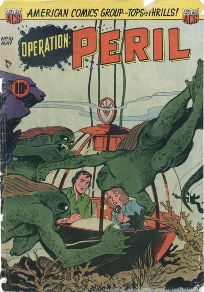

50.
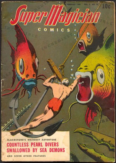
SEA DEVILS vs.
SUPER MAGICIAN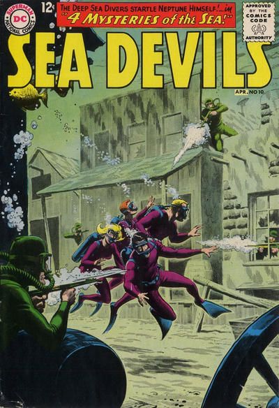
51.
HOUSE OF SECRETS vs.
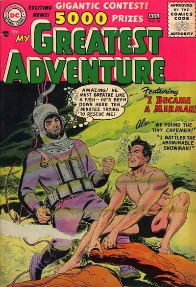
MY GREATEST ADVENTURE
52.
JOHNNY DYNAMITE vs.
BOY COMICS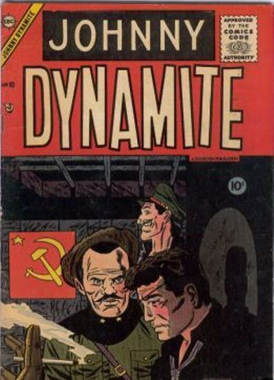
49. Challengers - cannot beat that mountain
50. Super Magician - action is clearer
51. House of Secrets - the way the hair flows, wow
52. Boy Comics is less meh
49. Operation Peril:
Man: Peril! Great Peril!
Woman: I don't think it is.
Man: Yes, it is! it's terrible peril!
Woman: Look, I'll just go out there and face the peril.
Man: No, it's too perilous!
While the Challs at least get leg room in their bathysphere, thanks to a larger DC cover budget, it's ruined by too many rum things going on. It should be called Unexpected Tales of Uncanny Mystery just to combine all the source material. Mechanical hands, undersea mountains, the lack of waterproof wanted posters leading to elaborate carvings. Too much. Peril just has the threat of being sued by Universal for nicking Black Lagoon characters.
50. Sea Devils: Budgets are also a problem for Blackstone. Like those '50s monster movies that used Iguanas and normal ants as giant creatures, they do the same trick with some goldfish the editor won at a fair. It's pretty well drawn though, with Blackstone have a lot of physical presence. Sea Devils nearly goes too far too. It's a Western shoot out underwater. High Noon where no one can see the sun. But the inker does some nice work with the shadowing and the faded effect for the background tips it into being a winner.
51. My Greatest Adventure: In House of Secrets, Purvis is terrified of his new condition. There's every chance he'll be the new Aqualad! Over in My Grating Adventure, the lead character has gone all Namor and seems to getting the swim of things. It wins for giving us an underwater scene, and not just a fish tank and some test tubes.
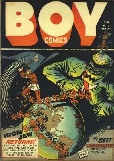
52. Boy Comics: Dynamite reports back to his soviet handlers. "I did it so I could smoke cigs on a cover too," said Johnny shortly before his execution. Over in Boy, Iron Jaw's hands are about to reveal that his suit all comes off with one motion. "It was an axe-ident," said Chopper Lad to the Comics Code Authority later that month regarding the decapitation.
53.
WEIRD MYSTERY TALES vs.
FANTASTIC ADVENTURES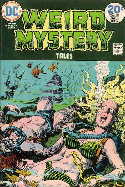

54.
FROGMAN vs.
THE FROGMEN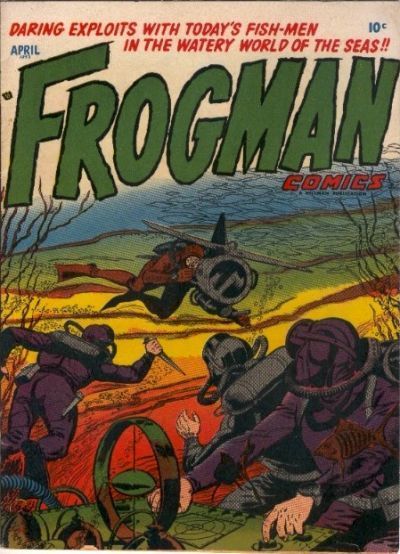
55.
THE CRUSADES vs.
THE OUTSIDERS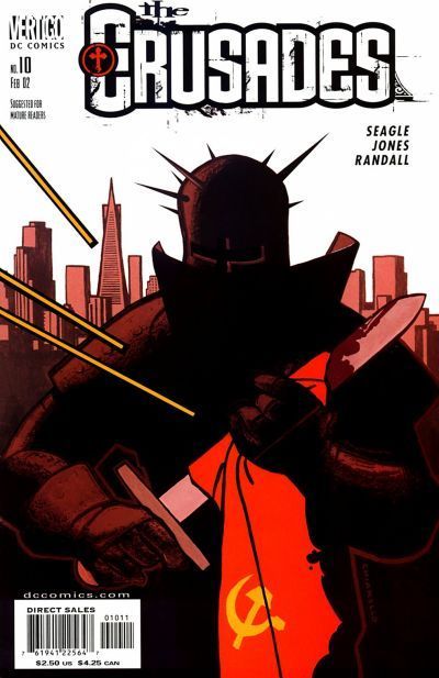

56.
NICK FURY, AGENT OF SHIELD vs.
THE TROUBLE WITH GIRLS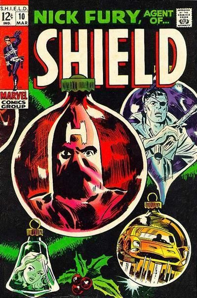
53. Weird Mystery Tales for being .ire chilling
54. The Frogmen, better color
55. The Outsiders, normally I prefer the ones without speech balloons but i like the oosing here
56. Nick Fury for not being all distorted
53. Weird Mystery. For a well drawn cover that captures the supernatural just deserts endings of it's EC predecessors. That's the last issue of Fantastic Tales. That Dynamite Loaded statement was no fib, and the entire editorial team were arrested following its publication.
54. Frogman Comics. Debbie wanted to date the star of Frogman Comics. But he was a bit green around the gills. Actually, he was a bit green everywhere. And that croaking...
Surely Frogmen is better than Frogman you say? Sure, but not when they've been given rocket packs that dilutes that pure Frogman Flipper Action We All Crave!
55. Outsiders: What, the Crusades guy couldn't find *anything* else other than a cheap political statement to wipe his short sword with? Bah! Outsiders would win anyway because of the unusual use of the logo in the villain's speech. The solid background colour sets off both that and the People's Heroes, who have pretty drab costumes.
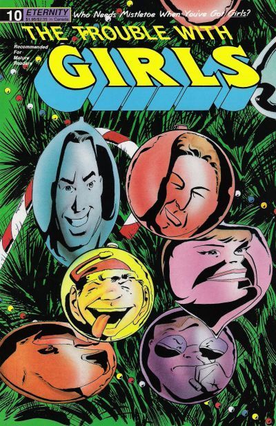
56. The Trouble With Girls: Ah, there's nothing that says Christmas more than your home being entered by a hooded guy with a H for Hatred scrawled across it. Girls is comfy enough in its run that it can happily put its cast on the cover baubles and know that there's a readership who will know who they are and smile. A little family of comics folk and readers, brought together in smiles at Christmas. It's sweet. But I don't hold that against it, and vote for it 'cause I think it's better drawn.
57.
C.O.W.L. vs.
JUST IMAGINE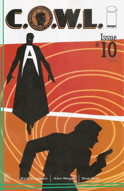
58.
SLEEPER vs.
THE BOYS
59.
ALL-STAR vs.
CAPTAIN MIDNIGHT
60.
21 DOWN vs.
DARING NEW ADVENTURES OF SUPERGIRL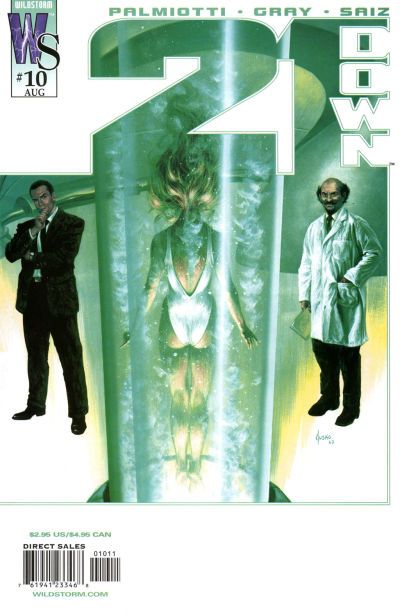
57. C.O.W.L
58. The Boys
59. All-Star
60. Supergirl
45. GREEN LANTERN (SA). Why are Alan and Doiby fighting a chia head?
46. SPIDEY! ASM pretty dull, even with the Sistine thing. What's your point, Spider-Man?
47. HAWKMAN (SA) Again a purple starfield...loses?? Yep, that nutty SA cover is an irrestible package.
48. AVENGERS ANNUAL. Kang's got that gold-dot curtain. Immortus just has his sparkling personality. Annual gives you plenty to chew on...too bad it had to be on a tomato-red/orange background.
49. OEPRATION PERIL. The Challs don't look underwater, which annoys me!
50. SEA DEVILS. The shape of the Devils!
51. MY GREATEST ADVENTURE. That bit of pink! Plus this one, the guy has gained something. On the other, that guy is losing -- even though appx. the same has happened to both?
52. JOHNNY DYNAMITE. While Boy Comics is quite the package and sign of the times, Johnny Dynamite looks both OF its time AND modern.
53. WEIRD MYSTERY. Far better visual package, plus suspense...we don't see any attackers, they seem to be drowning THEMSELVES. Why??
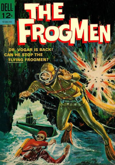
54. FROGMAN. One is enough, I guess. And I don't care much for those 60s-ish painted covers.
55. OUTSIDERS. Nutty shit. In #1, Titans getting bomb dropped on them. Here, People's Heroes dropping Pravda Bomb ON YOU.
56. NICK FURY. While I like the distortion of faces in the other cover -- that's what would happen in curved ornaments -- the placement is awful.
57. C.O.W.L. Both are undercooked. This one less so.
58. SLEEPER.
59. ALL-STAR. The angle! The flyer! Those crazy decorative pillars! Bright eye candy.
60. 21 DOWN.
11. WATCHMEN but I am intrigued to see THRILLER. THRILLER was the 80s comic I BOUGHT-- SOLEY BECAUSE-- IT seemed like you were SUPPOSED TO, and if you didn't you were missing something. in truth, you would only have missed muddled and pointless comic books. looking back I am glad I bought it because I had a serious in when AMBUSH BUG miniseeries got popular!
I got a case of the THRILLERS again in the 90s, buying many terrible VERTIGO comics and IMAGE titles... soley because... fans who didn't were made to feel inferior. I know it aounds crazy and impossible but in the severely limited outlets fans had for news and communication with each other, it was a regular THING to witness ads or articles that all but screamed VERTIGO AND IMAGE ARE THE BEST COMICS EVER AND NOT READING THEM MEANS YOU ARE A STUPID UNFUCKABLE BABY WITH A SHITTY DIAPER, so go read some HarVEY TITLES, YOU STUPID ASSHOLE, THEN KILL YOURSELF, this comic shop doesn't want or need your money and you should die.
I embellish slightly but I'm not wrong either.
Nowadays, i read and love what I like and everyone else can suck it, and reading bullshit i hated never got me a cute comics-loving boyfriend anyway. abut yeah, I hoped it would it my young days. Young people are stupid. Young Lash was anywaY!
12. AFLIGHT for sure, that mug is begging to be punched on THE BOYS
13. half of SILVER STREAK cover copy is not legible for me, but whatevdr it my sayI doubt it could top the multiple level unintentional hilarity of SMASH!
14. NIGHT FORCE was pretty much unreadable but Colon is worlds Above on his worst day, than whatever shitty artist that IMAGE OFFSPRING HIRED TO DO THAT likely-also-unreadable wannabe VERTIGO nonsense next to it, fuck that shit. Gene colon good, wildstorm BAD, nerds !!
15. fINDER?? more like ILLUMINATI COMICS, amirite? that evil shit can fuck off! sip ftw !!!!!!!!!!!!!!!!
10S OSCARS FOR MATCHUPS 1-14
FaVORITE MATCHUP FOR TITLES I'VE NEVER HEARD OF
DARK WOLF/THE MASKED MAN
GAYEST MATCHUP
FLINCH VS THE SPIRIT, IF I'D KNOWN THE SPIRIT WAS SO GAY I MIGHT HAVE READ SOME OF HIS COMICS.
BEST ACTRESS
WANDA, Nicky you dumb fuck. SHE WAS FAKING IT.
how else do you hink the comic finally went monthly?
16. I mean, lol. BEST COVER MATCHUP WITH MOST DISPARATE ARTISTS. LOLOZ!! here's 25 cents, Vinnie Colletta, have a Shasta on me, but to think you gonna get my vote over DR STRANGE by Gil kane? nOOOOOOOOOOOPE.Sorry, fella.
Dazzler, the first and worst x-MEN spinoff. Started off with cool enough stories and art but went downhill fast. I will grant the Bill S-whatefuckever covers laetr on th book are great but MARVEL tried to hide a lot of baaad comics in the 80s with stellar covers......
And once VINNIE Colletta was put on your comic, you knew officially the company NO LONGER GAVE A FUCK.... (NLGAF)
57. Just Imagine: Just Imagine...you're having a fight in a paint factory. The COWL cover should be cool . There was a time when gritty superhero comics weren't everywhere. A superhero turned villain still had some shock value, when done well. Here, we have both that (in silhouette no less) and an espionage/cop aspect too. Evil super heroes and spies. With a nicely coloured geometric background too. It should totally win. But gritty superheroes always look forced, because no one would actually wander around with an "A" for "@$$" on their chest. Besides, Ace Hart already did it. So, it's a win for the other one. Incidentally, I've read a few issues of COWL and it wasn't terrible. I just didn't have the first few to fully get into the series.
58. Sleeper: Typing of books trying to be gritty in a silly world of super heroes, it's The Boys (which I've read) and Sleeper (that I haven't). The Boys has a certain J'Accuse quality to it. But angling the logo on the cover of Sleeper to be part of the target gets the win. I think it's a target. It might be moths with cigarettes.
59. Captain Midnight: 500 years into the future of the JSA, and they still don't have a female member! The perspective is a bit wonky, but it really gets lots of points for trying. I'd like to give it the win. But the quality of art is far better over in Captain Midnight. It positively screams chest thumping patriotism. I'm more interested in how the plane is going to work in the tunnel of terror, and why someone with Midnight in their name wears such a colourful suit.
60. 21 Down: I just got Supergirl 10 a couple of weeks ago! Looking more closely at the cover here, the scientist looks a lot creepier and the poor Supergirls look to be in a lot more peril. 21 Down wins for having the logo work with the giant test tubes. I remember the days when you were healed form horrific superhero battles with a good night's rest and some Lemsip. Now it's all giant, fluid filled tubes in secret bunkers.
61.
CASES OF SHERLOCK HOLMES vs.
JUSTICE
62.
DOLLY vs.
THE TOODLES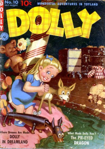
63.
IMPULSE vs.
DYNAMIC COMICS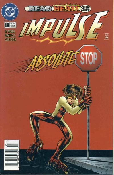
64.
GI JOE vs.
THE FURY OF FIRESTORM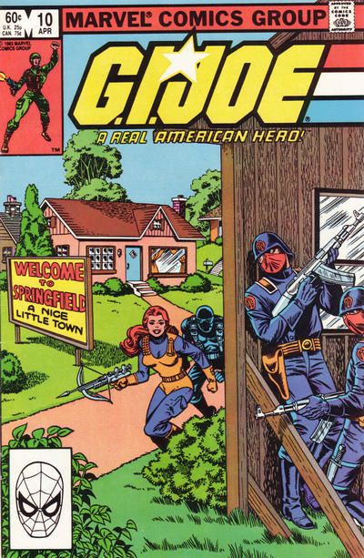
61. CASES OF SHERLOCK HOLMES - drama, danger, action AND mystery!
62. THE TOODLES - no uncanny valley eyes here
63. IMPULSE - just funnier
64. GI JOE - I think the figures are posed better
61. Justice: No point in doing a "someone's getting shafted" joke since Teeds is well ahead there. Sherlock loses points by having the hanky the same colour as the spear, giving this reader pause to wonder where the spear head was. The Carry On Inferno facial expressions lose it points too. Over in Justice we have a surprise attack in a claustrophobic location with two popular, but vulnerable characters. Top artist too.
62. Toodles: This month in Toodles read "Tots at Sea" Next month in Toodles read "Desert Tots" Then in June read "Tots removed by Social Services." She might be cleaning the floors, but that's no reason why the apron can't be the height of domestic fashion and those eyebrows can't be plucked. Dolly has that unsettling weird quality of child wish fulfilment. Why isn't the robot dog shorting out? What is that bear doing to that large candy cane? Is Dolly a robot too, or is that expression some sort of sugar addiction? Unsettling. But I shall never vote for a plaid logo! Never!
63. Dynamic: It's Impulse, not Frog Boy. How long are those legs. It's a nice red background and it's a fun way of getting the kid to slow down and build in the story title. But it still loses out to a signpost that lists all the anthology characters. Those two goons are in for trouble no matter which way they go!
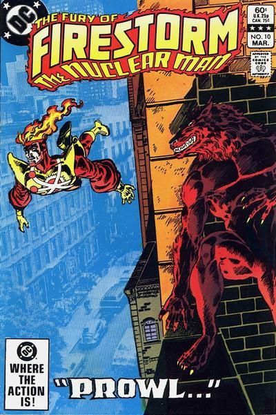
64. Firestorm: The woman with the crossbow seems overly happy to be walking into an ambush. Does the prop the villains are hiding behind indicate a blazing saddles fake town? If so, why do the other houses have sides and this one doesn't? No such building confusion over in Firestorm which uses an effective background to show the city. There's also the a more potent threat than a couple of ACME goons.
65.
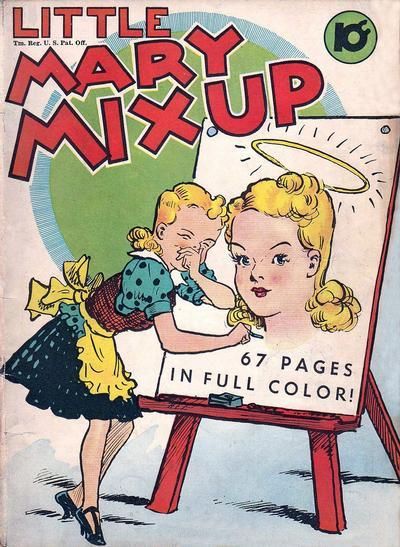
BLACK CAT vs.
SINGLE SERIES (LITTLE MARY MIXUP)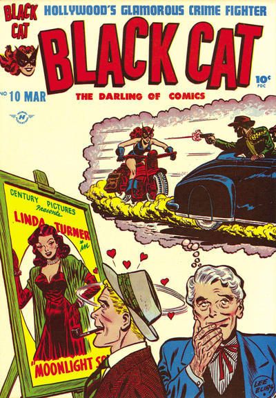
66.
WAR ROMANCES vs.
DARLING LOVE

67.
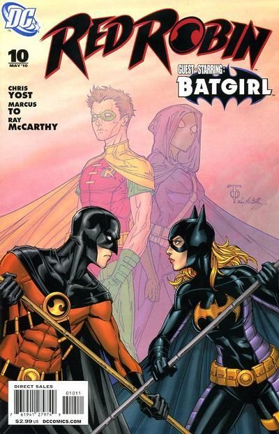
NEW COMICS vs.
RED ROBIN
68.
SMILIN' JACK vs.
GIRL GENIUS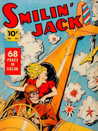

65. Little Mary Mixup
66. Darling Love
67. Red Robin
68. Girl Genius
69.
THE FUNNIES vs.
CRIMINALS ON THE RUN

70.
X-MEN vs.
FANTASTIC FOUR

71.
FRECKLES AND HIS FRIENDS vs.
ROMANTIC ADVENTURES
72.
COMIC CAVALCADE vs.
FLAMING CARROT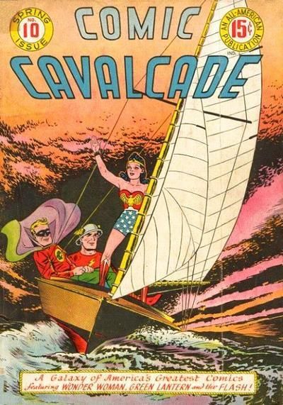
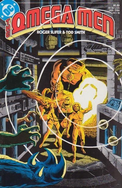
17. the lighting is better on OMEGA MEN
18. JOE PALOOKA is pure joy with a hint of angst? You not bes sad, Joey P, I sit with you, k. Chicks, amirite?
19. SUPER FRIENDS, no contest at all. And the issue itself is a childhood favorite
20. OUTSIDERS, no contest, and I was/am a HUGE fan of the 90s relaunch!!
65. Black Cat No wonder they brought in a comics code. I'm sickulated at witnessing one guys fetish or posters while another guy walks past. that guy sees a man in a hat and can't stop fantasising about another guy in a hat being chased while he drives. Filth! How old is Mary mix up. Are those heels?! I find her knowing evil streak unlikable, and no golden age art can save her.
66. War Romances: She's been stringing two guys along and now she's paying this piper fellow too fro a relationship?! No pity for Darling Love. Most relationships would lead a guy to leave the country. It's a little known fact that the Korean war was completely made up by men who just wanted some peace and quiet. Nice climate, friendly people and a chance for the men of the world to relax. That the "Korea sacrifice" in the title on War Romances, and it was nice of them to be hosts.
67. New Comics: So much hatred in a cover! So much anger! Those expressions focus the reader's attention. There's no need for any real background and the artist knows it. Easily gets the win.
Robin: Remember when we were children put in violent situations by mentally disturbed older folk?
Batgirl: So much better than us still doing it having been traumatised to continue a pointless cycle of violence.
Robin: I know! Remember when we actually stopped bad guys, rather than fighting each other on covers? I don't. That was Grayson back in the 1940s
Batgirl: No, I don't have any long term memory. That was when I realised the blackouts were from not being able to breath through my Spoiler mask.
68. Smilin' Jack: I used to worry about gettin' shot in the back during a dogfight. Now, I just pick up one of the local floozies from the bar at the airstrip and I'm safe as houses. Despite the squinty looking plane it gets the win over an anime style I'm just not that fond of. That's saying something for a cover that has an airship and a cat in it. Two sure fire winners normally.
21. BUBBLE-ICIOUS BUNNY BEATS BUBBLEHEADED ARCHIE
22. AIN'T NOBODY STUDYIN' MANGA SO ACTION GIRL
23. Both are terrific, i'm going to give the edge to CAPTAIN MARVEL because early cover fx.
24. difficult to decide as both are similar in a very good way. I personally give the edge to UNEXPLORED WORLDS, because 'I THINK I COULD BeaT UP THE Unusual Tales cover guy if pressed SO it's LESs CREEPY.
73.
FIRST KISS vs.
CRIME MYSTERIES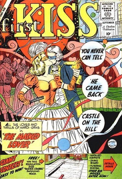
74.
LEAVE IT TO BINKY vs.
A DATE WITH JUDY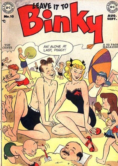
75.
POPPO OF THE POPCORN THEATRE vs.
MARGE'S TUBBY

76.
DON WINSLOW OF THE NAVY vs.
KATY KEENE PIN-UP PARADE

69. THE FUNNIES, as it is actually kind of funny
70. X-MEN - shirtless buff blonde man, yeah!
71. FRECKLES AND HIS FRIENDS - at least this one doesn't come with the lovesick tears of a pretty girl
72. COMIC CAVALCADE - oh the drama. and i have trouble liking a flaming carrot
73. FIRST KISS - more elegant
74. A DATE WITH JUDY - cute little love birds! The ones in the tree.
75. MARGE'S TUBBY - less words, more impact
76. KATY KEENE PIN-UP PARADE - I like Katy!
41.
THE MARVEL FAMILY vs.
THE BLACK TERROR 42.
PLASTIC MAN (QUALITY) vs.
PLASTIC MAN (DC) 43.
SABRE vs.
JON SABLE, FREELANCE 44.
LITTLE MAX vs.
HENRY 45.
GREEN LANTERN (GA) vs.
GREEN LANTERN (SA) 46.
AMAZING SPIDER-MAN vs.
SPIDEY 47.
HAWKMAN (SA) vs.
HAWKMAN (1980s) 48.
AVENGERS vs.
AVENGERS ANNUAL
49.
OPERATION PERIL vs.
CHALLENGERS OF THE UNKNOWN 50.
SEA DEVILS vs.
SUPER MAGICIAN 51.
HOUSE OF SECRETS vs.
MY GREATEST ADVENTURE 52.
JOHNNY DYNAMITE vs.
BOY COMICS 53.
WEIRD MYSTERY TALES vs.
FANTASTIC ADVENTURES 54.
FROGMAN vs.
THE FROGMEN 55.
THE CRUSADES vs.
THE OUTSIDERS 56.
NICK FURY, AGENT OF SHIELD vs.
THE TROUBLE WITH GIRLS
57.
C.O.W.L. vs.
JUST IMAGINE 58.
SLEEPER vs.
THE BOYS 59.
ALL-STAR vs.
CAPTAIN MIDNIGHT 60.
21 DOWN vs.
DARING NEW ADVENTURES OF SUPERGIRL 61.
CASES OF SHERLOCK HOLMES vs.
JUSTICE 62.
DOLLY vs.
THE TOODLES 63.
IMPULSE vs.
DYNAMIC COMICS 64.
GI JOE vs.
THE FURY OF FIRESTORM
65.
BLACK CAT vs.
SINGLE SERIES (LITTLE MARY MIXUP) 66.
WAR ROMANCES vs.
DARLING LOVE 67.
NEW COMICS vs.
RED ROBIN 68.
SMILIN' JACK vs.
GIRL GENIUS 69.
THE FUNNIES vs.
CRIMINALS ON THE RUN 70.
X-MEN vs.
FANTASTIC FOUR 71.
FRECKLES AND HIS FRIENDS vs.
ROMANTIC ADVENTURES 72.
COMIC CAVALCADE vs.
FLAMING CARROT
73.
FIRST KISS vs.
CRIME MYSTERIES 74.
LEAVE IT TO BINKY vs.
A DATE WITH JUDY 75.
POPPO OF THE POPCORN THEATRE vs.
MARGE'S TUBBY 76.
DON WINSLOW OF THE NAVY vs.
KATY KEENE PIN-UP PARADE
69. Criminals on the Run: Wow, the paper has the whole plan to capture me! I'll just read...no! I've set the paper on fire. Darn my pyromaniacial tendencies. Still, setting fire to old men is wrong. I'm sure it must be. So Crims (as it's known to us who learned how to commit crime through a subscription to it) wins by default.
70. FF: If that's unquestionably the most spectacular new character of the year, the nippleless Tarzan must be the only character they introduced that year. I wonder if his fuzzy shorts are made from Sabretooth hide after they died out from having stupidly long Marvel teeth. FF wins entirely for Reed's expression. I could go on about breaking the fourth wall or hero/villain switches but it's really that.
71. Romantic Adventures
Boy: You can't say I don't get around.
Girl: Me too. I've slept with everyone on this carousel.
Boy: >stony silence< not everyone.
Not a funny enough cover to beat the well drawn angst over on Romantic Adventures! A third wheel might be really useful if something goes wrong with the coaster. Otherwise she's a drip.
72. Great match up Teeds. Comic Cavalcade: Wonder Woman is the captain of that boat. Lantern is tanked on emerald martinis and the Flash is about to change into his bikini at super speed. I bought that Flaming Carrot issue. It's a whimsical idea. Bringing the bed with you when picking up chicks. No, wait a minute...that's not right...
73. Crime Mysteries: Where's the angst in First Kiss? Where's the drunken gutter sex of a mardi gras? nowheresville! Who wants a swimming pool shaped like Buster Crabbe anyway? Nope. The angst is all in a crime title selling it's soul for a few new readers by switching genres. Anything to keep the (were)wolf from the door.
74. Leave it to Binky: Just how I feel about beaches. A date with Judy is far too tame. What are they? Six?
75. Tubby: Watch concussed Poppo's violent new personality! I feel sorry for him. The kids are just laughing at his impending pain. Tubby ain't going to be Tubby for long. He's going to be thin. Thinly covering the walls of the room after the experiment.
76. Don Winslow: Winslow's buddies picked the slowest possible vehicles that they could find to provide reinforcements. "If this don't kill the joik, nothin' will. Oh, if only we could have gotten to him sooner General. Curse these slow tracked vehicles!" Not even my ankle fetish is strong enough to put up with outfits as ugly as Katy Keene's cover.
77.
SUPER COMICS vs.
SPEED COMICS

78.
ASTONISHING X-MEN vs.
POWERS

79.
2001: A SPACE ODYSSEY vs.
MARVEL PREMIERE

80.
SHOWCASE vs.
SUPERMAN'S GIRLFRIEND LOIS LANE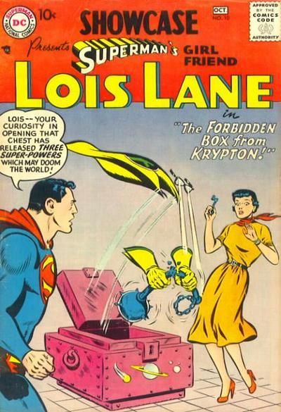
77. Super Comics
78. Powers
79. MARVEL PREMIERE
80. SUPERMAN'S GIRLFRIEND LOIS LANE
21. Bunny – love that groovy sixties party sense and style!
22. Akiko – didn’t really like either all that much but I like how the sketches in the background here play against the image and the logo
23.The Spectre – more color, more pop.
24. Unusual Tales – I like both of these old Charltons but the bigger background and Ditko-sensibilities of UT put it over the top for me. Both are really terrific, moody covers.
25. Mopsy – Both gags are sexy in a fun, young way. Mopsy’s cover though is simpler and gets it done with less clutter.
26. Boy Meets Girl – two covers I’ve never seen before but both that I like. I enjoy the dancing sequence better as it adds a little extra charm. Plus, both of those guys are obviously Cobalt Kid and that is often the response I get when dancing or when my picture is viewed.
27. Crime Patrol – I like this old EC one because while the other looks like the crook might be an innocent man on the run, the Crime Patrol cover looks more savage. The man looks like he really is the wanted criminal they’re looking for and that gives it added grit.
28. My Love – love, love, love that late 60’s / early 70’s fashion, and the “how does feminism intersect with young love?” question isn’t being laughed at here.
29. Jughead – a character is truly iconic when numerous images like this one sum up his entire modus operandi all at once.
30. Rex Mundi – I really like this cover: moody and you can really feel the chill in the air.
31. Zatanna – excellent cover—a modern version of a classic trope from the eras of old.
32. Flash Comics – just stunning
33. Amazing Mystery Funnies – while the Weird Fantasy cover is a classic, AMF is just super-interesting with its shadow work, the huge castle in the background and of course the train launching upwards and blocking out the logo. Plus it has one of my favorite obscure heroes, the Fantom of the Fair.
34. Teen Titans Go! – a cover I’ve never seen before, I love the explosive “pop” brought to an old cover-structure standby.
35. Barbie Fashion – this one just looks so weird and cold that it feels almost unnerving and sinister. Surely not what was intended, but I can’t help but think of Alan Moore writing this comic within, and the pages inside are designed to make you question all that you’ve seen before.
36. Doll Man – terrific idea: it’s innately hilarious and yet also contains Jesus Christ undertones.
37. American Virgin – super-stylized, it’s sexy, uncomfortable and artistic all at once.
38. Doctor Who – I don’t really like either honestly, but I like the coloring and shadowing on the Doctor’s scarf and coat.
39. Wow Comics – iconic image of Mary Marvel. She looks powerful and yet also like America’s Sweetheart all at the same time.
40. Promethea – stunning. Simply stunning.
11. WATCHMEN but I am intrigued to see THRILLER. THRILLER was the 80s comic I BOUGHT-- SOLEY BECAUSE-- IT seemed like you were SUPPOSED TO, and if you didn't you were missing something. in truth, you would only have missed muddled and pointless comic books. looking back I am glad I bought it because I had a serious in when AMBUSH BUG miniseeries got popular!
I got a case of the THRILLERS again in the 90s, buying many terrible VERTIGO comics and IMAGE titles... soley because... fans who didn't were made to feel inferior. I know it aounds crazy and impossible but in the severely limited outlets fans had for news and communication with each other, it was a regular THING to witness ads or articles that all but screamed VERTIGO AND IMAGE ARE THE BEST COMICS EVER AND NOT READING THEM MEANS YOU ARE A STUPID UNFUCKABLE BABY WITH A SHITTY DIAPER, so go read some HarVEY TITLES, YOU STUPID ASSHOLE, THEN KILL YOURSELF, this comic shop doesn't want or need your money and you should die.
I embellish slightly but I'm not wrong either.
Nowadays, i read and love what I like and everyone else can suck it, and reading bullshit i hated never got me a cute comics-loving boyfriend anyway. abut yeah, I hoped it would it my young days. Young people are stupid. Young Lash was anywaY!
This was also amplified by large comic book stores having ads within the comics themselves. You'd be reading a Marvel comic and there were ads for comics from other companies! And *those* ads absolutely did what you're describing above!
41. Black Terror – super-exciting cover full of cover and lush backgrounds.
42. Plastic Man (DC) – a really terrific example of DC’s covers in the late 60’s: lush color against dark backgrounds; sharp inks and edges; groovy logos; “bigger” viewpoints. I’ve grown to love the covers from this era more and more, especially by Infantino.
43. Jon Sable, Freelance – incredible Grell cover, obviously full of enthusiasm and love.
44. Little Max – the red frame works better than the blue.
45. Green Lantern (SA) – the Golden Age one is great and Vandal Savage looks terrifying, but something about the SA cover draws me in. A lot of it is nostalgia, as it was a favorite of mine as a kid and I used to always ask my Dad and Uncle to read me the Silver Age GL’s.
46. Amazing Spider-Man – iconic Spidey cover. Trivia time: Ditko had previously done a different cover, which I think is beautiful. Stan didn’t like it and wanted another one so Ditko did this one. And this one is damn brilliant, so it was a good call.
47. Hawkman (1980’s) – really beautiful cover with the stars, shaded Superman and angles presenting different sizes for the three characters.
48. Avengers – c’mon. Kirby and the ‘iconic original’ line-up where the Avengers are exploding out at the reader and yet the Wasp is flying back in towards the action? Who does that? Kirby, that’s who. You basically know where you’d be standing exactly if you were there.
49. Challengers of the Unknown – there’s too much awesome not to love it.
50. Sea Devils – talk about a series where the covers were simply to die for, even if the stories within were a little redundant. #10 is no exception. I will say Super Magician has a terrific cover too, though.
51. My Greatest Adventure – I love the power on display here, which comes across because of how different the two characters are in both pose and look (almost naked versus in old timey wetsuit). Plus the misty water adds additional tension.
52. Boy Comics – I don’t know Iron Jaw from a whole in the wall, but damned if he doesn’t look like the single worst villain in the history of literature right here.
53. Weird Mystery Tales – so much terror and so beautiful to behold. Fantastic.
54. The Frogmen – I’m a big fan of frogmen war stories because it was such a genre of the times. But what I like most about Dell’s “The Frogmen” is its groovy logo!
55. The Crusades – love the lighting, and just the right amount of blood to set you on edge.
56. Nick Fury, Agent of Shield – have a very Merry Hatemonger Christmas! It’s so ridiculous that its awesome.
57. Just Imagine – really love the colors popping in the background.
58. Sleeper – wonderfully done by Phillips in a way that makes you just need to know what’s inside.
59. All-Star Comics – not only do I love the way Hawkman is flying down all iconic-like, I just love when Bats and Supes join the JSA on the covers in the Silver Age.
60. Daring New Adventures of Supergirl – some of the linework is choppy and overly stylized, but damn if I don’t just love this cover.
81.
MS. MARVEL vs.
ALL-NEW ULTIMATES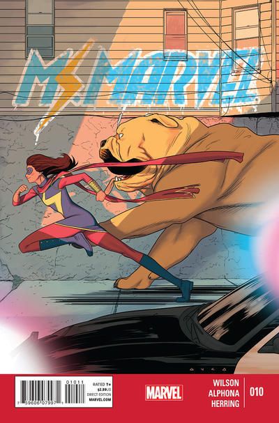
82.
AVENGERS vs.
JUSTICE LEAGUE INTERNATIONAL
83.
DOCTOR TOMORROW vs.
AGENTS OF ATLAS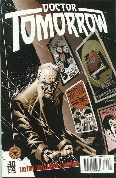
84.
MYSTERY COMICS vs.
WONDER COMICS
81 Ms Marvel
82 Avengers - they look so happy
83 Agents of Atlas
84 Wonder Comics
85.
SHAZAM vs.
SUICIDE SQUAD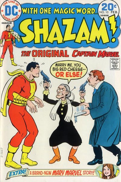
86.
THE FUNNIES vs.
FEATURE FUNNIES
87.
METAL MEN vs.
METAMORPHO
88.
LOVE AND ROMANCE vs.
SECRET ROMANCE
85. SUICIDE SQUAD - yeah, you tell Batman off!
86. FEATURE FUNNIES - explosions are cool
87. METAMORPHO - pretty colors
88. SECRET ROMANCE - less confusing. no hair getting in everyone's faces
77. Super Comics: The Dick Tracy pic tells uys that the artist has a decent knowledge of how a punch is thrown. In Speed, Shock's arm has just been drawn next to the insect's (soon to be replacing the wasps round at Lash's place) face. I'm not sure why the suburbless city is burning. Does the alien insect fart fire?
78. X-Men: Cassaday's art focuses the reader right at the source of the Prof's powers, and the colouring gives it a subtle feel of being mind controlled as a reader. Whatsherface over in Powers could really be anywhere. There's not really a feeling of threat, oor of a reason for her to be in the shadows.
79. 2001: Big questions here. The nature of the soul. Is a person more than a machine, nicely illustrated by having the head being held out by robotic arms. And a day trip to Hades just to add in some mainstream religious bearing to it too. Over in Strange it's another pic of Doc 'Tache blasting some tentacles with arcane powers.
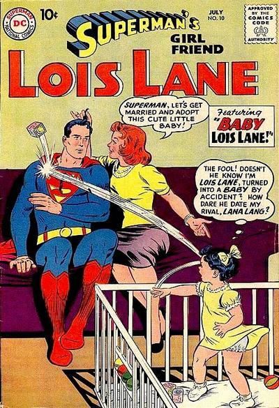
80. Lois Lane: Two good ones. The whole planet blows up but all it's nasty super weapons seem to have survived intact. So like Lois to open something with "forbidden" anywhere near it. I'm not sure what the mace was in there for. Perhaps Supes uses it as a fetish box too. We get the squirming of Supes at Lana's proposal combined with the comedy of baby Lois thinking he's a Super Cad. Both covers have excellent colouring. They fill the covers without detracting form the centrepiece.
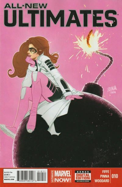
81. Ultimates: Neither really grab me. Both are well enough drawn, with nice colouring but they don't make me want to know more. girl running with LockJaw against girl musing on bomb. Could have been either. I'll go with Ultimates for having the better costume and the whole sitting on a bomb thing is a better concept.
82. Avengers: Crumbs I remember getting both of these. The Avengers story had their dead members return while the League story had them attack a Manhunters world as part of the Millennium event. The Avengers had clunky dialogue and the dull Grim Reaper and the League had G'Nort and a dull crossover event. Both had top artists, but Perez is the stronger of the two. As usual the detail such as on the balloons and the crowd get the win.
83. Agents of Atlas: Poor Doc Tomorrow. Once he was famous. Now he has the pose of a constipated old man caught short in a rainy alley. Atlas loses points for the boots they think an assassin would wear. But Sterankoesque floaty targets wins.
84. Mystery Comics: In the '80s being a vigilante meant being an obsessed loner with mental health issues. This is what they thought the grim golden age guys were like. But back in the actual Golden age, you could throw crooks to their deaths with a smile on your face. It was fun to be a vigilante. Wonder shows us that it's fine to shoot unarmed opponents in the face, 'cause they are different to us. A faceless other who all look alike. A tactic used by war propaganda for ages. If only he had smiled when he killed them, he might have won.
85. Shazam! Why the woman thinks Marvel can marry her to the pastor is a mystery but it's better than an intimidated looking Batman. It was an early example of him turning up just so that the main characters in that book could take him down a peg to make themselves look more important. Se Flash, Green Lantern ad nauseam... At least Ostrander tried to get a story out of it, I guess.
86. Feature Funnies: It has marginally better art and the gag is a bit stronger than the attempted murder over in The Funnies. The comics equivalent of desperate vaudeville acts in both of these, eking out a four colour living any way they can.
87. Metal Men: Element Girl was a crazy cookie in Metamorpho, but in the Contest of Covers she's no match for the chemistry bending effects of the Magnus' Metal Misfits.
88. Secret Romance. Both a little too modern and both have a certain lack of angstyness. Despite being a bit too purple, the outfit in Secret Romance is an easy winner. It beats the border of hearts.
88. SECRET ROMANCE - less confusing. no hair getting in everyone's faces
Spider Girl crossover?
If Sussa had been on the other cover, I would have chosen that!
61. JUSTICE. Cool over hot.
62. DOLLY by default, even though I think it's creepy. At least the idea of a candy-filled landscape is solid. Who the hell is The Toodles supposed to attract? Why would kids be interested in this no-gag image of kids about to get yelled at? Why would a parent be compelled to buy this for the kids?
63. IMPULSE. The speed lines on "Absolute" a great touch. I like the general idea of Dynamic, but I still haven't seen Dynamic art that I like.
64. FIRESTORM. The false city in the other is interesting, but the incorporation of the photo in the Firestorm art grans the eye.
65. SINGLE SERIES (LITTLE MARY MIXUP) even though it suffers without context. I don't know this character so I don't know exactly why it's "funny" but I prefer the art.
66. DARLING LOVE I guess. Not really that interested in either.
67. RED ROBIN I suppose. New Comics logo AMATEUR.
68. GIRL GENIUS -- although both are attractive (even if a little cray)
69. Criminals is garish -- and what a clunky way of conveying the information. But The Funnies is fading out and that annoys me. Garish and clunky it is. CRIMINALS ON THE RUN.
70. X-MEN. FF gots a little of the cray, but the varying scale + featureless background loses it.
71. ROMANTIC ADVENTURES. Just far better art, and that slight curve is a nice touch.
72. COMIC CAVALCADE.
73. FIRST KISS The colors and streamers do it for me.
74. LEAVE IT TO BINKY. Pretty much same quality of drawing and general cover idea. I'll go for the happy clutter of the "alone" cover.
75. TUBBY. Poppo don't even have a chance.
76. DON WINSLOW
77. SUPER although I did the Speed cray
78. ASTONISHING X-MEN 79. 2001: A SPACE ODYSSEY I agree with Thoth's assessments
80. I prefer the disembodied hand -- but not the big red header. LOIS LANE
81. Pretty evenly matched. Both attractive enough, but neither are a huge WOW. I suppose ULTIMATES because it makes me curious why that person is so nonchalant.
82. JLI, I suppose. That jagged rainbow radiance tips it.
83. DOCTOR TOMORROW. I'm buying the moodiness.
84. WONDER COMICS just drives me nuts. It looks like something that was made 'today' to be a critical prop & plot point in a movie or TV show. Mystery Comics needs a re-coloring pronto.
85. No t really into either. SUICIDE SQUAD I suppose
86. FEATURE FUNNIES. A much better complete package. Take notes, The Funnies.
87. METAL MEN
88. LOVE AND ROMANCE Secret Romance's sequence not great. Plus I like that L&R gal looks ANNOYED
89.
HAWKEYE vs.
SEX CRIMINALS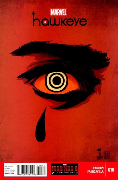
90.
TALES OF THE MYSTERIOUS TRAVELER vs.
LOVE DIARY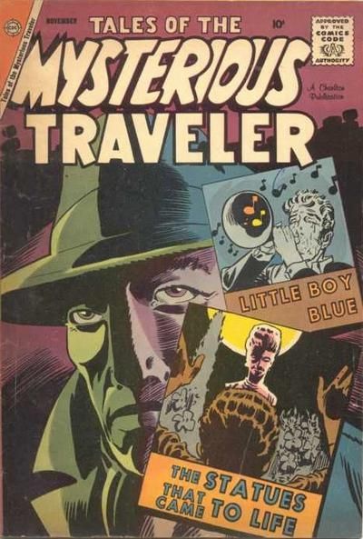
91.
MILITARY COMICS vs.
HORRIFIC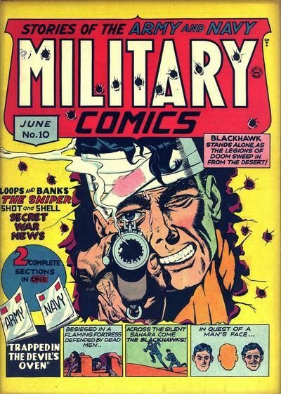
92.
JUSTICE LEAGUE EUROPE vs.
JACK OF FABLES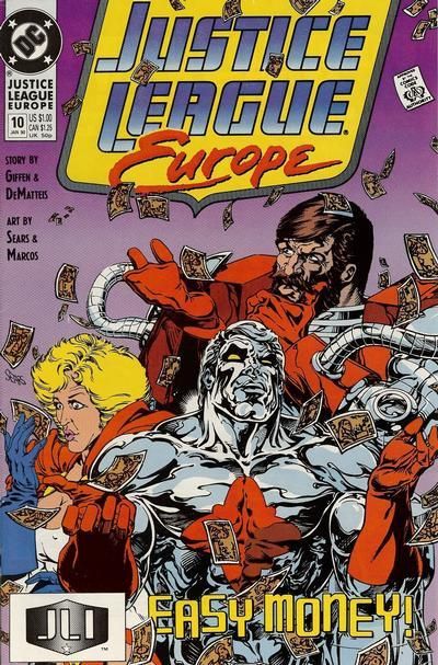
93.
HOWDY DOODY vs.
MAGILLA GORILLA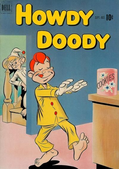
94.
BATMAN vs.
SENSATION COMICS
95.
SECRETS OF LOVE AND MARRIAGE vs.
LOVE EXPERIENCES
96.
LIBERTY COMICS vs.
ROLY-POLY COMICS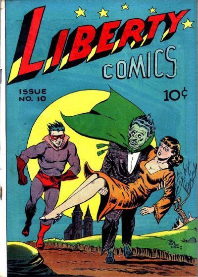
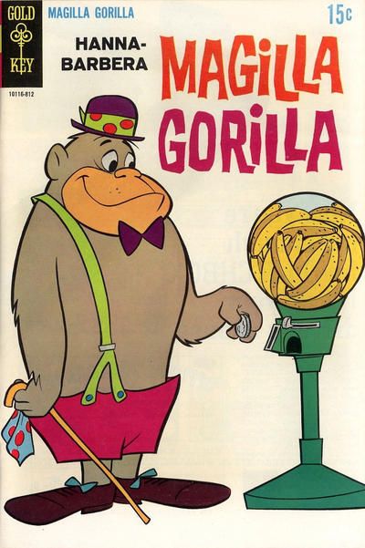
93. MAGILLA GORILLA - who looks less punchable
94. Sensation Comics - I want my superheroes to do something, dang it, not just stand there!
95. Love Experiences - the other one looks like she's about to give mouth to mouth'
'
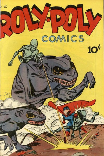
96. Roly-Poly Comics - weird alien thingies on weird monster thingies is a winning combination
NOTE OT IBBS: You might have missed out one of Teeds posts!
89. Sex Criminals: Putting the Eye into Bullseye. But combining the Crims art with the story title of "Together Alone" clicks nicely. Pinks aren't usually a colour choice for comics so some points there too.
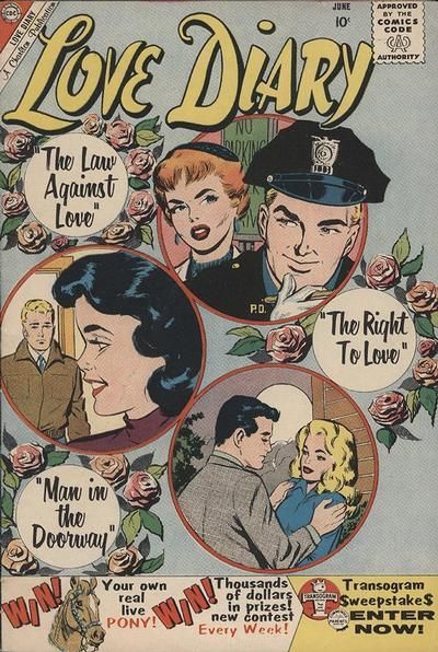
90. Mysterious Traveller: Note that the win a pony! competition is a lure to get you into the sequel of "The Law Against Love." All the couples seem a bit dull and I'm not really interested in their love lives. Not that the Giffen-like traveller (like an Indy Phantom Stranger) is much better. But it has Little Boy Blue on the cover, who would go on to defeat Doctor Light. Statues coming to life reminds me of Martian Manhunter. Perhaps that's who the Traveller is.
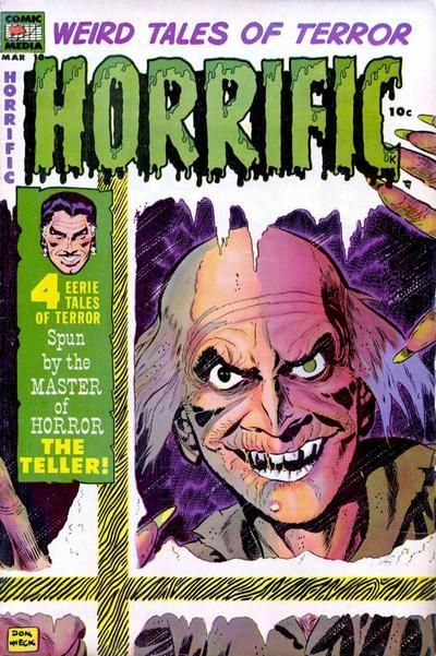
91. Horrific: It wins for the dripping logo. It tries to make the background to the log/ ice or condensation on the window but doesn't quite pull it off. But Military just throws everything at the cover. Does this panel interest you? No? What about this one? Or this random word? Loops and Banks and Shot and Shell are two golden age creative teams that are remembered only dimly today?
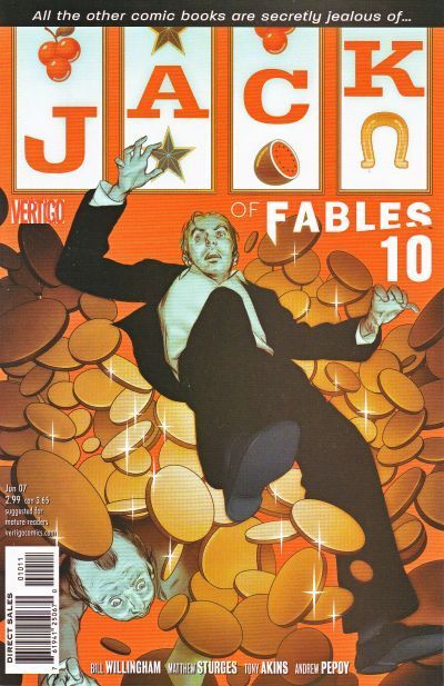
92. I don't remember this JLE cover, but I must have it around somewhere. Sears art hasn't dated well for me. Too many muscles. I thought they were little Starros falling but that was another story. Fables would win anyway for combining the logo into the cover art. Nice use of the flow of money form the slot machine sweeping the characters along.
93. Magilla Gorilla: I just want to see how it works. You don't get to see the next panel of Howdy Doody, where he discovers the rat trap placed inside the jar.
94. Hey! You ain't Doll Man! Get yer own schtick! An' quit smilin'! Youse are grim avengers of the night! Wonder Woman art is not as good, but she's not breaking the fourth wall and it's good to see her in full a blown comic action scene on a cover.
95. L&M: The man in L&M and the Woman in LE may actually be dead. Probably not much more life in any of the stories inside either. L&M wins because I can imagine being at the beach instead of reading it. But the lady's swimwear should match the floral logo. Or have Polka Dots obviously.
96. Gosh! Liberty Comics! Where Asthmatic Man can give chase to Skinny Out of Breath Man! Hear the damsel say "You know, put me down and I can just walk. I'm too big for you to carry." What a mag! Other than the great title - because who doesn't like some Roly Poly? - it has demonic undead creatures with ray gins on alien steeds. And Doll Man! who must have been in the huff after Bats stole his gimmick back in 94. Roly Poly wins!
NOTE OT IBBS: You might have missed out one of Teeds posts!
Thanks thothy!!
89. Hawkeye - keeps the cover from being too monotonous
90.Love Diary
91.Military Comics - less creepy
92. Justice League Europe - not at all biased by my liking for the team
97.
DAREDEVIL vs.
WEB OF SPIDER-MAN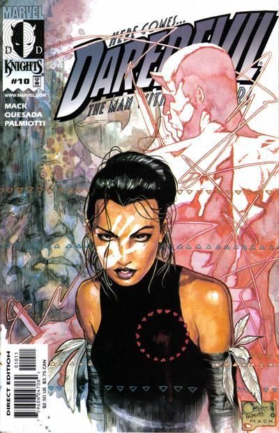
98.
SPIDER-WOMAN vs.
DAREDEVIL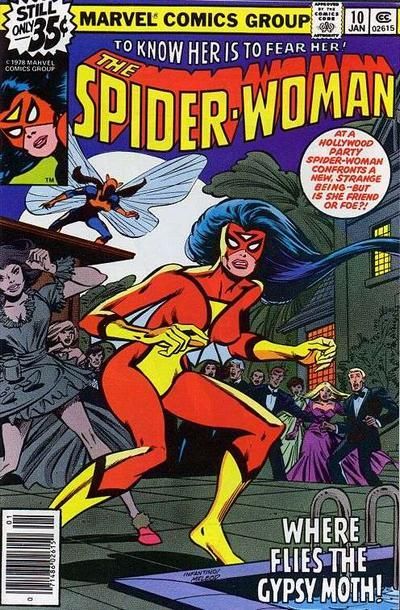
99.
THE MANY LOVES OF DOBIE GILLIS vs.
BINKY'S BUDDIES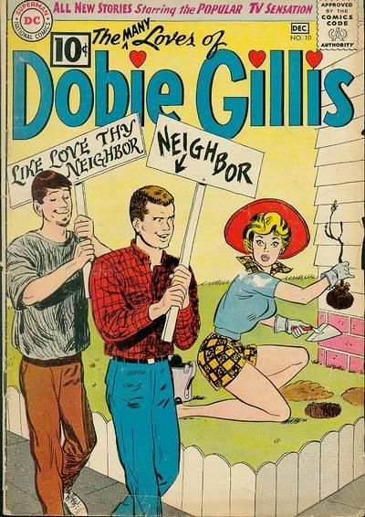
100.
MARGE'S LITTLE LULU vs.
POPEYE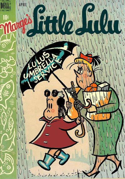
97. Daredevil - Echo is looking great
98. Spider-Woman - Spidey is looking great
99. 99. THE MANY LOVES OF DOBIE GILLIS - nice unique faces
100. MARGE'S LITTLE LULU - better gag IMO
97. Daredevil: From the company that gives us Astonishing, Uncanny, Amazing etc. all they could think of for Daredevil was "Here Comes"? "Here comes Daredevil to the checkout with his shopping." "Here comes Daredevil with his laundry." Dull. Dominic Fortune is never winning this for endangering the cat on the Spidey cover. And he has silly boots. And if I wanted to see someone being shot at in an alley, I'd be watching Captain Scarlet.
98. Spider Woman: "Where flies the Gypsy Moth?" Why into this giant Bug Zapper I got Reed to build. Bye Moth! Nice of them to give us the setting and the storyline on a cover caption. If the pic didn't convince me not to bother, that would. Oh, Daredevil has always had the "Here Comes..." thing? Shows how many issues of his book I've bought. Despite the low bar set by Spidey, his villains are even less interesting. Spidey-Woman wins.
99. Doiby: All I'm getting from the Doiby cover is that the two guys are a couple. Foreground guy is signed as neighbour and other guy has a sign declaring his love for him. Well done DC for showing an early Pride march. As much as I'd love to follow the ambulances to the burn units in Binky, the art is quite a bit better on Doiby so it gets the win.
100. Both covers show important consumer issues. In Lulu we see a clear example of paying for services that don't work, either through taxes, or in this case, through private enterprise. Over in Popeye, we learn all about quality control in the food industry. Inside, Popeye gets his stomach pumped, and we learn all about food hygiene and not eating food covered in pesticides. Also that balance between killing the worms, providing food and protecting the environment. Two fine upstanding comics. So it comes down to wondering what Olive has fallen in love with off cover, and the little fishes on Lulu. It's ....little fishes. Well done Lulu!
100. Both covers show important consumer issues. In Lulu we see a clear example of paying for services that don't work, either through taxes, or in this case, through private enterprise.
#10. Use economics terms to provide a descriptive caption for the following cartoon image.
(10 points)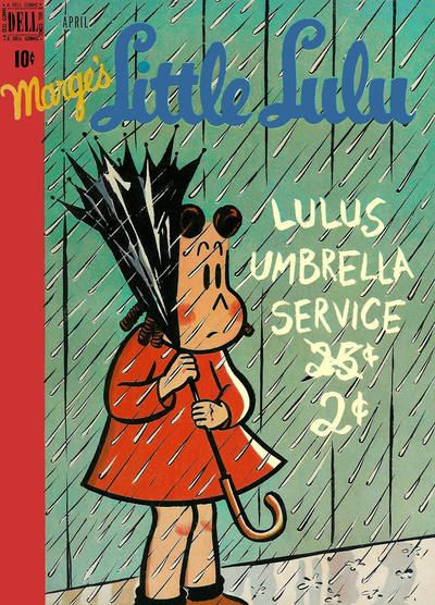 Extra credit: name the cause and effect of the Invisible Hands moonlighting in the entertainment industry.
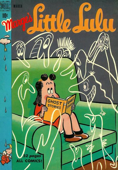
97. WEB OF SPIDER-MAN. I like the look of the tattered poster, and how its light blue background sets off Dominic Fortune.
98. DAREDEVIL.
99. THE MANY LOVES OF DOBIE GILLIS. No pancakes were harmed in the making of this cover!
100. MARGE'S LITTLE LULU. Top notch! While the art on Popeye is quality and the badass worm is kinda chucklesome, why is this a cover?
89. HAWKEYE. Maybe I'd appreciate the SC more if I'd read the issue?
90. LOVE DIARY. I don't nec. like split focus covers such as this, but it comes together for me.
91. HORRIFIC. It looks like a modern comic done in the vintage style. Military Comics more like Kitchen Sink Comics.
92. JACK OF FABLES. Love the logo. The two-armed scoundrel vs. the one-armed bandit! Great stuff.
93. MAGILLA GORILLA. Funny how something so simple as a banana vending machine just WORKS.
94. SENSATION. Diagonal Diana laying in the smackdown.
95. LOVE EXPERIENCES. The cushions look cozy and I like the color scheme.
96. Good grief. I think we can file these under "more enthusiasm than talent". That Liberty logo is annoying me with its amateurishness. ROLY-POLY by default.
101.
FREEDOM FIGHTERS vs.
GHOSTS
102.
X-STATIX vs.
CLIVE BARKER'S NEXT TESTAMENT
103.
CRACK COMICS vs.
HIT COMICS
104.
SKELETON KEY vs.
LITTLE SCROWLIE
1o1. Freedom Fighters
102. X-Statix
103. Hit comics
104. Skeleton Key
101: Ghosts: The angle of the art allows for a foreground paw print, our protagonists; a haunted mansion and an apparition above it. Oh, and the logo. A lot to capture the reader's attention without any clutter. Freedom Fighters is just an action shot that could be anywhere, with any group. That was the thing with them. They never found a niche or a style. Seeing Doll Man in a bird cage reminds me of something in an Alan Moore Twilight of the Gods type thing. My memory tells me he had Doll Man as a sort of Bird thing. Connected to this story?
102. X-Statix. New Testament is more intricate, but it lacks any point or ability to draw in a reader's curiosity. Statix captures a lot more of a character's life. I don't know who the "she" is that's back. But you get some idea from the things around her.
103. Crack. A plethora of great Golden Age characters across both titles. But Crack gets the win for having Condor use the logo to swing from.
104. Scrowlie: Toughie. Skeleton Key has the better framing of the central characters. It also tells more of a story with that central panel. But Scrowlie's logo seems to be much more a part of the art. Little touches in the clothing and other characters show better art, and certainly something a bit different storywise. The pattern above the logo is also a nice touch, comparable with Key's framing. While it's not as effective, it gets points for being a little different too.
105.
LEGION OF SUPER-HEROES vs.
INFINITY INC.
106.
LEGION OF SUPER-HEROES vs.
'MAZING MAN
107.
MY LITTLE MARGIE'S BOYFRIENDS vs.
SCRIBBLY
108.
JUSTICE LEAGUE OF AMERICA vs.
AQUAMAN
109.
CAPTAIN MARVEL vs.
SUPERIOR SPIDER-MAN
110.
AMERICAN FLAGG vs.
FUN AND GAMES
111.
MASTER COMICS vs.
MARY MARVEL
112.
HAWKWORLD vs.
REX LIBRIS
105. INFINITY INC. - sad to say, more compelling
106. 106. LEGION OF SUPER-HEROES - also more compelling
107.
107. MY LITTLE MARGIE'S BOYFRIENDS
108. 108. JUSTICE LEAGUE OF AMERICA
109. CAPTAIN MARVEL
110. . FUN AND GAMES
111. MARY MARVEL
112. HAWKWORLD
25, MILLI, now with extra MMMMMMMMMMMM.
26.BOT MEETS GIrL
27. PRESIDENT STRIPPER!!! (MY LOVE)
28. flash TOPS ZATANNA beCAUSE IT's EXCIING YET HARMLESS
105. We had Lightle v Ordway before I think, and Ordway was a clear winner. This time...Ordway is a clear winner again. The Legion cover tells you what some of the story is about. But like the overuse of layering on the cover, it's all a little vague. It's elements don't really combine to grab me. Invisible Kid's face over a shuttle. Why? Why is Sun Boy flying around? What do they add? Over in Infinity, we get heroes gone bad in recreation of a classic golden age cover. There are a lot of characters on there, but Ordway cleverly keeps them in tiers, with the triumphant gloating villain taking centre spot. Ordway's grasp of physicality once again trumps Lightle too.
106. 'Mazing Man: His expression is just priceless. There's a little part of me that's wondering why he's not getting arresting for obstructing the rescue effort. But it's a small, mean part that never read 'Mazing Man which is all about the fun. Look at the little water pistol! The Legion cover does show Roxxas on the rampage, so it's effective in letting you know what's in the book. But it doesn't rise to more than that.
107. Toughie. Two nice covers. Form the well rendered swan on Margie to the lost in love premise of Scribbly. Although the art in Margie is better I'm concerned about the title. Is "My little Margie" indicating that it's Margie's parent who's telling us about her. If so, why is that parent allowing her to go off with so many boys? There's no point in backing a book that's only going to get taken into care by the state. So, I'm going with Scribbly.
108. Justice League of America: This is one of my dad's favourites from when he was a kid. He was a pleased man when he bought me a copy of it, after I started reading them. It's a classic cover, that's so crisply drawn you don't need a background at all. The eyes focus on the hero finger puppets. Personally, I've always pictured them squirming while they're on there. Then you notice Faust's really evil expression and the detail on his outfit. There's still room for a pun in the dialogue along with the ominous threat.
I don't think I've seen that Aquaman cover before. It certainly gets in a nice sense of scale between the combatants. But this is one that could probably have used some extra detail. And Water Imps (5th Dimensional Morrison fodder?) just can't compete with Faust.
109. Captain Marvel: If Hal Jordan had gender realignment, this would be the cover. Marvel is looking wistfully up at the stars. Sure, the cover has planes, but that wouldn't be enough. Marvel knows that she used to be able to fly to those stars. But can she any longer? The loss in her face would suggest not. On the other hand, she could just be wondering how long that logo is likely to stay up there, and how many planes it will damage when it falls. Spidey has pointy fingers, but I don't know if it's just a costume change or if I'm supposed to know it's really the Scorpion or something in there. So it loses more points than Marvel.
110. American Flagg: All you need is a pencil...now take it in your hand and tell the news vendor to "give me DC or I poke your eyes out." Marvel Fun and Games: A DC Marketing Publication. Another Flagg cover with some more buxom women on it. This month, their implants have helium in them, allowing that whole platform to float with the logo. But Chaykin is on a different level here, with our without the helium filled boobs, and it's an easy win.
111. Mary Marvel: Bulletman's plunging neckline and suggestive look, while holding a lot of bondage chains, probably made the book popular with a lot of unexpected readers. Mary Marvel is very much the centre piece of her cover, despite the mayhem going on around her. After Freckles suffers serious injuries on the cover, Mary attaches the rocket pack to her wheelchair. Fun abounds! For another couple of panels. But who knew a coffin could travel so fast when rockets were attached? I miss the short comics career of Freckles.
112. Rex Libris: I quite like Rex Libris. So, there's nothing I like more than being TAUNTED BY THE COVER OF AN ISSUE I DON'T HAVE! WHEN WAS THAT ONE OUT?! BAH! Well, there's a cock, a bull and a librarian all on the cover. So, it's a pretty literal interpretation of the story title. The Hawks makes it's point about not conforming to super hero stereotypes. But, despite this continuity nightmare of a title, they would still appear in every event including War of the Gods. I mean War of the Gods! Yuck! Sell Outs. Rex wins because there's not enough blue sky and countryside on comic covers.
101. FREEDOM FIGHTERS. PL's ray thingie looks cool.
102. X-STATIX. While the other "bedspread" is a little more visually interesting, I've done that sitting-on-the-bed-with-stuff around-you thing. I like the occasional non-action moment on a cover.
103. CRACK COMICS. I agree about the swinging-from-logo, and a more attractive total package.
104. LITTLE SCROWLIE. I like the style and color scheme more.
105. LSH. I guess. It's kind of odd, though.
106. LSH. Although I'm fond of 'Maze, look at how your eye is drawn into the cover first with Mekt, then the flames, then the back of Roxxas. He ain't stopping for no cover, he's got stuff to do.
107. SCRIBBLY. I've seen the joke plenty of times. but what the heck. It's cute.
108. AQUAMAN. I know JLA is famous and I certainly can'y deny it's well done, but it just doesn't do anything for me.
109. CAPTAIN MARVEL.
110. AMERICAN FLAGG. There's a story. The other is a gag.
111. MASTER COMICS. That flight path over Mary's shoulder is not possible.
112. REX LIBRIS. BIG CHICKEN, Y'ALL!
One last double-header to cap off the Tens!
113.
WORLD'S FINEST COMICS vs.
WONDER WOMAN
114.
TINY TITANS vs.
BATMAN ADVENTURES

115.
TESSIE THE TYPIST vs.
WILLIE
116.
MS. TREE SPECIAL vs.
AMETHYST PRINCESS OF GEMWORLD
117.
SECRET WARS vs.
CRISIS ON INFINITE EARTHS
118.
TOO MUCH COFFEE MAN vs.
X-MEN LEGACY

119.
THE WITCHING HOUR vs.
BATMAN: DARK VICTORY
120.
PICTURE NEWS (DICK QUICK) vs.
SHE-HULK
113. Wonder Woman: World's Finest looks to be a collection of cut outs from other covers. The guy who did it gets some points for getting Bats and Supes to look at the logo. So Wonder Woman wins as it's original looking. There's a certain game of chase going on in the WW cover too, judging by the expressions. Considering the skin tight villain outfit, it's more like an invasion from Uranus.
114. Batman Adventures. World's Funnest is a nice line, and it's really targeting very young kids. BadAd wins on art alone, although I could mention the wallpaper and the next panel where the cat asks where it's dinner is or at least could it have a toy and not a stupid jewel.
115. Willie: Boy falling on butt isn't a gag in itself, and the perspective of Tessie's legs is wrong. I guess in Willie, it's a relative taking the shot. Presumably to blackmail Tessie who looks way to old for the nervous kid. Were they both Marvel comics or is another "remarkable coincidence" and not pinching?
116. Amethyst: The art is better on Ms Tree and there's a sense of regret/loss from the character in the bottom right. There's a war/vet theme that suggests some of the story too. Nothing wrong with the design either. But Amethyst really shows a lost soul struggling against whatever darkness is in her life. Since it's Amethyst, this could be across two worlds. She was also blind from the Crisis, so that might be involved too. The black and purple colour scheme gets it the win. Incidentally, as I skipped over comic titles as a kid, I didn't figure out what Ms. Tree Special meant for a while. I blame the "special" throwing me off.
117. Crisis: The world's mightiest heroes are powerless in a battle between the universe's two most powerful entities. DC's god shows up to give a thumbs up or down at the end of the fight... and hopefully to crush whiny Pariah. All at the dawn of time and by Perez. Not much more you could add to that.
As a young kid, lots of battle drawings would have damaged costumes, to show the ferocity of the battle. The damage would not really reflect any possible source for the injury nor would it have corresponding injuries to the bodies beneath. Some folks haven't really grown out of that.
118. X-Legacy: Two powerful images. TMCM shows the giant caffeine addiction monkey/ oppressive life and the shadow it casts over the central character's unfit lifestyle (see posture and body shape). But over in X-Legacy you get the feeling that humanity has found a way to "cure" all those pesky mutants. It's also an obvious conformity analogy. Although I'm not too keen on the text, the use of the pill as a doorway gets the win.
119. Witching Hour: Those Dark Victory covers must look really nice together. More than the minimalist design I like the use of a normal looking guy in the futuristic suit. But it's just blown away by the Adams cover on Witching hour. From the silhouette with the murderous eyes, through the narrator opening the doors of the mansion as she will the story to the terror in the old man's face. Is it a bride or spirit from now, or is it something from his murderous past? How could you not want to find out?
120. Dick Quick: The quality of art is much better on She-Hulk and it's the old villain taking offence at the hero on the cover gimmick. But Mr Quick, as I call him to avoid chuckling, gives us career highlights as well as his eye on the (first) prize personality. Watch out Olsen!
Great thread as always Teeds! Thank you!
THE REAL 27. CRIME PATROL --because the cops sre enjoying neting the shit outta tht lleged criminal
the real 28. MY LOVE
29. Colton Haynes as JUGHEAD defeats Henry Aldrich but I like both gags.
30. both are dreary/depessing which is i assume the point. PLANETARY would be the one i'd be more likely to pick up for curiosity's sake
31. RUSE has more interesting detail
32. FLASH comics, that's a great g.a. cover
113.
WONDER WOMAN!!! AWESOME. And even if it wasn't, that WF is no great shakes.
114. Aww, Kid Babs and Kid Kara are the cutest! I'd feed them all the cookies they wanted, and super-treats for the super kitty & pup too. But look at Selina's expression, and the cat's.
BATMAN ADVENTURES!115.
WILLIE. Tessie cover not funny, just a pratfall. So what? That black background makes Willie's cover pop, although it IS rather odd -- what kind of porch-swing paparazzi did they have in the 1940s?
116.
AMETHYST. DAYUM.
117.
SECRET WARS. Because Spectre's "come at me bro" pose looks dorky. YEAH I SAID IT. Also they need more pants. Doom's a little short on that front too, but he gets the win.
118.
X-MEN LEGACY.119. Dark Victory is excellent, but
THE WITCHING HOUR is OUTSTANDING. One of the best covers in this whole glockenspiel.
120.
SHE-HULK. Dick Quick jokes?
Been there, done that. Titania's expression wins it!
33. comics for whores!! Such indeceny!AMAZING MYSTERY FUNNIES because it makes me LOLZ hardest and you're all sluts.
34 . INHUMANS! Jae Lee is a a big favorite of mine.
35. BARBIE getting physical, animal!
36. DOLL MAN so true amirite ladies? he's ADORBLES. poor sopping wet little thing, come warm yourself under my shirt, or something!
37. a shame-filled nice catholic boy is diving right for me! hooray!! what we're going to do will cost you a few Hail Marys!
38. GEORGIE because of the cast in bubbles
39. I already have this weird preference for Bulletgirl covers but throw in Bulletdog and it is all over. Sorry Mary.
40. I'd be more curious about PROMETHEA
55. OUTSIDERS. Nutty shit. In #1, Titans getting bomb dropped on them. Here, People's Heroes dropping Pravda Bomb ON YOU.
wow ambassador, you have really spoiled us in bonuses.

"Some night, when we know each other better, you'll find out what it is..and it may surprise you!"
A moon... A girl... A gender switch...co-starring Ayla Ranzz
See how you like it Buzzy! Go for it Popsy!

How did Constipation Kid save the Legion, when they were trapped inside a Space Whale? Read on in The Hidden Tryouts!
Spaceman. Back in the days when you knew what you were getting in a comic. Like Frogman. Or Frogmen. Or Spacefrogs. Proper comics.
'Cause Colu doesn't have a navy, obviously.
"...and this bullet went right into her cranium, orphaning all her kids. Ha ha ha!" Yup, putting the "Funnies" back into "Keen Detective" was sure to be a hit!
So many questions about this one...
If you're looking for the crook who arranges getaways, isn't "Packy" always going to be the first person you go to?
Do the cases contain the body parts from Packy's crimes, hence the various countries?
The guy in the doorway looks very similar to Packy. Is this his brother Leany? Could Packy kill Leany, put the parts in the cases and take his place?
I do love all those "this comic is dedicated to the preventions of crime" and to help prevent crime, we must show it in all its lurid glory! captions.
Li'l depressed boy always seems to have a a pretty decent social group around him. Camping, movies and a girlfriend. Could it be the title of his book that weighs him down?
Peas, potatoes and pumpkin pie. IT Girl looks firmly at The Buffet Table of Doom! just off cover.
Look Anne, you look like you're having a swell time there at the pick up joint. But here are your choices. You're going to stick with a guy wearing a bow tie, Anne. He'll be wearing that bow tie for as long as you know him, and you will hate him for it. On the other hand, your would be rescuer has a ghastly neckerchief thing going on. It's never been in fashion, and any kids you have will be ruthlessly mocked for their dreadful sense of design. That he's called "Skipper" should really have kept you away from him in the first place. There are other towns Anne. Other sleazy, cheap pick up joints for you to get recklessly drunk in. Go to them now Anne. Go now, before it's too late.
I hate seeing a human stare back at me while I'm getting ready in the morning. I empathise totally with this cover.
[thoth lad's comments on this one have been censored. Sorry we couldn't get to any of the earlier ones]

Abby pleaded with the kind, old flower seller to sod off while she was feeling up Swamp Thing.
Ooooh. Alt+Legion!
Astroarchaeologist Rexx Mah-Sonn discovered that the Egyptian Gods had visited Neptune before they reached Earth. Now he uses his control over his every atom as Morpho Man.
Many creatures are drawn to the energy of our Sun. Some choose to take human form. Dirka Burroughs (Sol Girl) keeps the colonists of Mercury safe from hostile creatures, while her costume keeps them safe from her combustible powers.
Nothing lives on Saturn. And that's just what Lyle Norg, the Invisible Kid wants everyone to keep believing.
[removes connection between the Mallors and the shadows of Uranus gags for fear of Fickles revenge] - but it's Shadow Kid
They moved through the angles of spacetime from their home on Colu to spread intelligent life across the galaxy. The forearmed, four eyed plant people of Yuggoth. Here, we know Yuggoth as Pluto and we know their ambassador as Querl Hol-Land: Brain Boy
Together these six (well five, now that someone's bumped off the Martian Deerstalker and his Magic Hat) have joined together to fight crime. Even if that meant teleporting innocent, backwards guys and screwing with them until they get a confession.
Could this guy be the killer? Was he given the tie by Zazalla, the Queen Bee? Is he Adam Strange or even the Spaceman from Dell comics? Well, I'm not telling you. So there.
61. Justice – really great painted cover that showcases the action, which is hard to do on painted covers, while also giving it the grandiose look that the painting effect is trying to achieve.
62. The Toodles – Dolly just looks crazy creepy so Toodles wins by default.
63. Dynamic Comics – I like the usage of the signs to showcase the various features inside, and I especially like the big hulky guy in the red turtle neck, who looks like the ultimate 40’s roughneck.
64. Fury of Firestorm – when I was a little kid, before I even actually read comics, I would look at cover after cover of my Dad’s collection, mesmerized by what I saw. My two favorite DC’s to do that with were Flash and Firestorm. This Firestorm cover just enthralled me and IIRC, scared me too! So I have some nostalgia for it.
65. Black Cat – though perhaps not fully successful, I appreciate what the artists are trying to do on the Black Cat cover.
66. Darling Love – just because I want to see why she’s marrying a man she HATES. Whether revenge or no other options…still a pretty big misstep, no?
67. Red Robin – it’s from an era when I had stopped following my once-beloved Tim Drake and Stephanie Brown, but it makes me miss them all the more.
68. Smiling Jack – when the aviator genre was still high profile and could nicely mix with the mystery man genre.
69. Criminals – a pyromaniac attacking forests and national parks is just menacing enough, and just innocent enough, to peek my interest.
70. X-Men – love, love, love this Kirby Ka-Zar first appearance, and the cover is all on action and color. This is one of my favorites of the original X-Men run.
71. Romantic Adventures – more glamorous, more serious, and the lead looks like Cobalt Kid. What’s not to like?
72. Flaming Carrot – the cover art was always terrific on this series and I always wanted to read it when I was a kid.
73. First Kiss – such detail and such an interesting depiction. Terrific!
74. Leave it to Binky – they’re both cute, but the first one at the beach is something a lot teenage couples can relate to. What’s worse than being surrounded by adults and little kids?
75. Poppo of the Popcorn Theater – I’ve never even heard of this series before!
76. Doug Winslow of the Navy – Katy Keene’s dress is nice but Doug Winslow is a man’s man fighting an enemy with everything he has…including a shovel!
77. Speed Comics – Golden Age batshit craziness. Oh the Golden Age

78. Astonishing X-Men – head shots like this are boring generally so something needs to make them stand out. The X-Men one does that by making it extra weird and realistic. It looks like it should be in the movie Scanners.
79. 2001: A Space Odyssey – just love the simplicity and weirdness to it all.
80 Superman’s Girlfriend Lois Lane – baby Lois hurling a giant diamond snags this one!
81. All-New Ultimates – a series I don’t collect, but I really enjoy that cover. It’s the concept of the “old fashioned bomb” and the background coloring I think that works for me.
82. Justice League International – a really beautiful Maguire cover. Those early JLI days were just incredibly awesome.
83. Agents of Atlas – a tough one because both are good but neither is truly great. But I think I like the coloring in AoA, and the placement of the logo in the bottom right.
84. Blue Ribbon Mystery Comics – love the look of Mr. Justice.
85. Suicide Squad – in the late 80’s, DC still knew how to really put out a dynamic cover. This one, totally simple, nails the exact response it was looking for in me.
86. Feature Funnies – if only because it has one of my favorite obscure heroes, the Clock.
87. Metamorpho – this was always my favorite Metamorpho cover as a kid because of Stingaree, who I immediately knew even then was a Scorpion (Spider-Man villain) rip-off. Yet, it also features Element Girl, something that only DC would have. So its kind of a DC / Marvel mash-up in terms of style.
88. Secret Romance – less copy on the cover, nice placement including placement of the story title.
89. Hawkeye
90. Tales of the Mysterious Traveler – early Ditko at his best.
91. weird Tales of the Horrific – that’s one crazy looking old dude.
92. Jack of Fables, if only because Bart Sears art style sometimes just doesn’t work for me, and this JLE cover is one of those times.
93. Magilla Gorilla – hard not to love Magilla for his name, suspenders, bow tie and hat. Even better: a banana dispenser.
94. Batman – love this cover.
95. Secrets of Love and Marriage – beach setting with vibrant blue background; the girl is on top and being the aggressor; and the logo has a really sensual “L”. Love it.
96. Liberty Comics – both covers have very bare backgrounds but Liberty Comics includes a wonderful light yellow over-sized moon which makes it pop.
97. Web of Spider-Man – this may be have been the toughest of the second half of covers because the David Mack intro of Echo is a really terrific cover. But I love the Chaykin layout of the ripped, black costume Spidey poster with his Mary Sue in the foreground.
98. Daredevil – love, love, love this Wally Wood cover. As ridiculous as the goofy villains are, there is no topping the Wood-drawn red costume.
BONUS COBIE COMMENT: My Dad just bought a new near-mint copy of Daredevil #7 on ebay because ours was looking a little worse for wear. It’s really stunning and looks like it came out yesterday. It’s also the single best Silver Age Daredevil story of them all, and I probably read it so many times that I’m the reason our old copy was all beat up.
99. Binky’s Buddies – I generally don’t like the ‘wannabe Decarlo Archie’ style, but this cover has a terrific gag and is youthful & fun at the same time. It works.
100. Little Lulu – I would never chose Lulu over Popeye, but there’s no denying this is a great cover. The rainy background, which looks blue-ish, versus the green side frame and the lack of color under Lulu’s umbrella work terrific. Plus, they are walking to the left of the page, which is usually not the case and makes it look more dynamic.
41. MARVEL FAMILY!
42. plas (dc) that's great!
43. Both are fun but Grell ftw (Sable)
44. good matchup, I find the sweetness of LITTLE MAX more appealing, plus better to me art.
45. GL G.A. defeats dorkfaced S.A.
46. SUPER-STORIES more fun
47. 1980s. the s.a. is kind lame
48. annual! what a classic!!
49. OPERTION PERIL EARNS MY 10 CENTS, I JUsT GOTTA KNOW aBOUT THOSE sea-VaMPIRES!!
50. SEA DEVILS (Early issues) will prob win every time but SUPER MAGICIAN sure is interesting.
51. MY GAYEST ADVENTURE you mean, because those two are obvs heading to Lake BootyBang...
52. BOY COMICs, pretty great!
53. WEIRD MYSTERY, i'm a sucker for the DC half-cover reprint line
54. FROGMEN, Dell often did good job on covers
55. THE OUTSIDERS, great fun!
56. BOTH ARE so good but I JUST LIKE THe BALL sHAPED shield ornaments best
57. JUST IMAGINE but neither are great.
58. SLEEPER, The Boys guy annoys me.
59. ALL STAR for sure both I love the other too.
60. herlpless mini supegirl in tubes ftw!!!!!!!!!!!! I've got you, my itty bitty pretty!!!
61. JUSTICE.... BLUE, THE COLOR SUIT IT
62. TOODLES WITH TOTS
63. IMPULSE
64. FIRESTORM looks truly dangerous
101. Ghosts - as much as Freedom Fighters is a series I'd rather read, the cover here, positioned on a slant with the viewer at ground level, is incredibly dynamic and escalates the tension nicely.
102. X-Statix - there's just more personality and character here from the thoughtful expression to the realistic background. "Zen" characters in comics have been played out since 1940.
103. Hit Comics - for the sheer power being displayed in the chaos.
104. Skeleton Key - I both like and dislike each one for different reasons, but something about the borders on SK wins it.
105. Legion of Super-Heroes - the Infinity Inc one is full of color and the novelty of the pre-crisis JSA, but here less is more wins the day. LSH has a great background, cool floating head and dynamic Wildfire up in front which just draws your attention.
106. Legion of Super-Heroes - at first this cover feels ugly and too busy, but as you look at it you see the intricate detail, and the hellish pathway leading to Roxxas. And if you've read the issue 20 times like so many of us, it has even more appeal.
107. Scribbly - if only because it evokes such a pleasant scene. It strikes up my own memories at first and then I notice there's a whole treating winter like summer gag going on as an added bonus.
108. Aquaman - JLA #10 is a classic cover but I never liked it as a kid because you can't see the heroes very well. Meanwhile Aquaman is more dynamic and colorful.
109. Captain Marvel - despite the absolutely cringe inducing haircut, it's a beautiful cover with her gazing at the stars.
110. American Flag - basically wins by default because Fun and Games is so wretched its Hulk one-liner.
111. Master Comics - was there a repeat here? I'll take Master then for its motion towards the reader and interesting dam background.
112. Rex Libris - because it seems whacky and beautiful at the same time. Meanwhile, the in-joke being made in Hawkworld was barely funny in the 90's and doesn't hold up now.
113. Worlds Finest - a rare Green Arrow cover appearance! Meanwhile, WW battles a guy in a thong?
114. Tiny Titans - Balthazar and Franco are terrific.
115. Tessie the Typist - nice legs win the day!
116. Amethyst - beautiful, moody coloring and shadowing meet Perez? Yes please.
117. Crisis - this cover, like #12 and most of the series, mesmerized me as a kid. Could I name them all? No, I could not. I never figured out who Space Ranger was until the Internet existed.
118. X-Men Legacy - very clever. Very British.
119. The Witching Hour - look at that color! Shadowing! Horror on the man's face! Eyes on the woman entering! Truly a renaissance era of horror covers.
120. She-Hulk - through to be honest, I don't love either.
Bonus:
Love that Moon Girl Romance cover! Also Batman: the Long Halloween with Catwoman and fireworks.
Meanwhile Rex sure fought a lot of bears. Better than a T-Rex and nuclear explosion though. (A lil Rex in-joke).
DC Super-Stars #10, with the JLA playing the SSOSV in baseball is a favorite--a gift from my brother-in-law a few years ago, which I never knew existed.