|
0 members (),
68
Murran Spies, and
1
robot. |
|
Key:
Admin,
Global Mod,
Mod
|
|
 Previous Thread Previous Thread |
|
Next Thread 
|
|
 Re: The New Teen Titans 1980-1984: cover commentary
|
Joined: Jul 2005
Posts: 17,872
More Polyanna than Poison Ivy
|

More Polyanna than Poison Ivy
Joined: Jul 2005
Posts: 17,872 |
Maybe the Flash cover gal is angry because she bet on the opposing team. 
|
|
|
 Re: The New Teen Titans 1980-1984: cover commentary
|
Joined: Jul 2003
Posts: 3,613
in season
|
OP

in season
Joined: Jul 2003
Posts: 3,613 |
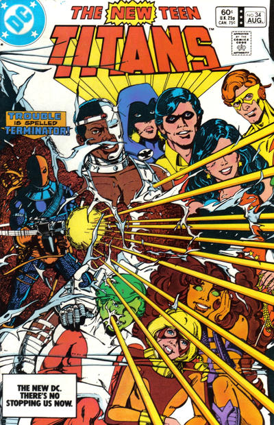
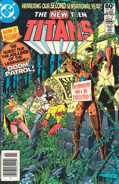
  34: Slade blows apart the 'happy family' Titans picture although they don't know it but now we do13: I also like the darkness although it doesn't quite match up. Beyond the thicket it looks like daylight, and even if the canopy of trees is very dense, would it be that dark? Also, for all the details of the foliage, the Titans' faces are somewhat nondescript, with Robin coming out cartoony. I knew almost nothing about the Doom Patrol, so there was no emotional or nostalgic impact on that score.
|
|
|
 Re: The New Teen Titans 1980-1984: cover commentary
|
Joined: Jul 2003
Posts: 3,613
in season
|
OP

in season
Joined: Jul 2003
Posts: 3,613 |
|
|
|
 Re: The New Teen Titans 1980-1984: cover commentary
|
Joined: Dec 2003
Posts: 6,364
Wanderer
|

Wanderer
Joined: Dec 2003
Posts: 6,364 |
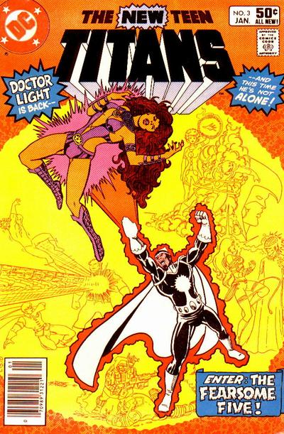
I love the yellow and orange on the Dr Light cover. That must have really stood out on the newsstand.
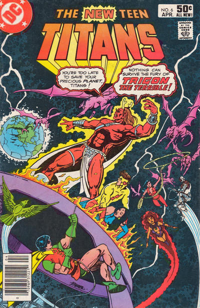
The Trigon one is a bit busy for me. It's hard to know where to direct the eye. I like the way Wally seems to be protecting Raven though. I always forget that those two had sort of a thing going at one time. That relationship was like a shooting star - bright and intense for a brief moment and then hard to remember once it was over.
|
|
|
 Re: The New Teen Titans 1980-1984: cover commentary
|
Joined: Jul 2003
Posts: 3,613
in season
|
OP

in season
Joined: Jul 2003
Posts: 3,613 |
3: Blac, I agree that the yellow/orange really makes the cover stand out. It's not a common cover color combo, and not one that is necessarily a favorite of mine, but it is striking. This is the only black logo, and even though orange/black tends to go Halloweeny, it looks good. The line drawings are subtle but add a lot --- imagine the cover without them and it becomes too plain, I think.
6: Another interesting color thing, although I'm not sure if interesting = good or bad. When I pulled the image I thought it was a scan of a shopworn cover, showing wear in the way that dark covers do. Then I got out my hard copy and realized no, that's the gray cloudiness or energy or whatever.
|
|
|
 Re: The New Teen Titans 1980-1984: cover commentary
|
Joined: Jul 2003
Posts: 3,613
in season
|
OP

in season
Joined: Jul 2003
Posts: 3,613 |
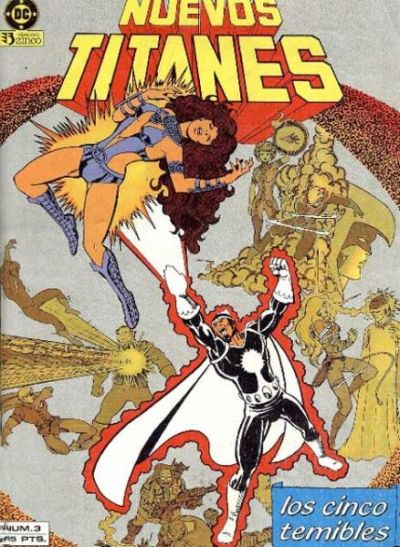
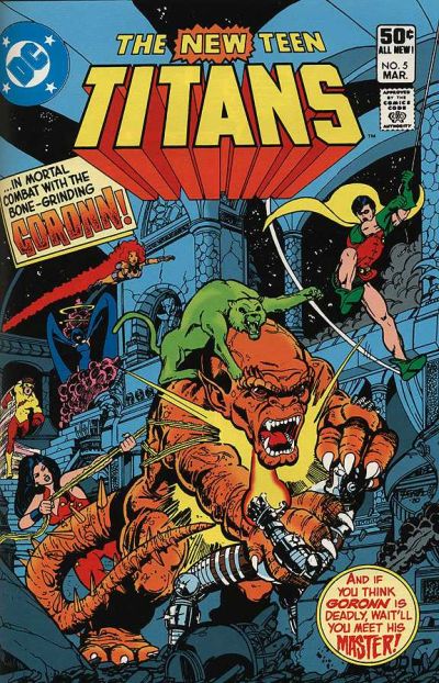
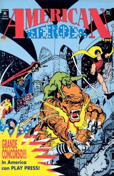
Regarding #3's color choices: see the original and a reprint with some changes to the art  
|
|
|
 Re: The New Teen Titans 1980-1984: cover commentary
|
Joined: Jul 2003
Posts: 3,613
in season
|
OP

in season
Joined: Jul 2003
Posts: 3,613 |
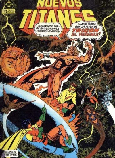
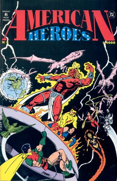
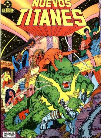
Here's the same for #6. Great Hera! It looks like space is choked with moss.  
|
|
|
 Re: The New Teen Titans 1980-1984: cover commentary
|
Joined: Dec 2003
Posts: 6,364
Wanderer
|

Wanderer
Joined: Dec 2003
Posts: 6,364 |
Wow! I had no idea they changed the colours in foreign editions of comics. I wonder what... Romeo Tanghal (was that the NTT colorist?) thought of that.
As for these versions - the new Spanish version of #3 is UG.LY! Hate it.
I sort of don't mind the orange/brown background on #6 but Trigon really should have stayed his own red color since he's meant to be the main focus and shouldn't be melting into the background.
|
|
|
 Re: The New Teen Titans 1980-1984: cover commentary
|
Joined: Jul 2005
Posts: 17,872
More Polyanna than Poison Ivy
|

More Polyanna than Poison Ivy
Joined: Jul 2005
Posts: 17,872 |
Blacula, the NTT colorist was usually Adrienne Roy. Romeo Tanghal was George Perez's NTT inker.
|
|
|
 Re: The New Teen Titans 1980-1984: cover commentary
|
Joined: Dec 2003
Posts: 6,364
Wanderer
|

Wanderer
Joined: Dec 2003
Posts: 6,364 |
That's right! Thanks FL. I had all those names floating around in my head but couldn't remember who did what.
|
|
|
 Re: The New Teen Titans 1980-1984: cover commentary
|
Joined: Nov 2004
Posts: 10,929
Time Trapper
|

Time Trapper
Joined: Nov 2004
Posts: 10,929 |
Originally posted by Leap Year Lord:  I LOVE this cover ... as a kid it blew my mind ... that the cover was ripping off. Made it feel so much more real. And ... the action INSIDE was also mind blowing, the fight scenes were so clever.
|
|
|
 Re: The New Teen Titans 1980-1984: cover commentary
|
Joined: Jul 2003
Posts: 3,613
in season
|
OP

in season
Joined: Jul 2003
Posts: 3,613 |
|
|
|
 Re: The New Teen Titans 1980-1984: cover commentary
|
Joined: Jul 2003
Posts: 3,613
in season
|
OP

in season
Joined: Jul 2003
Posts: 3,613 |
|
|
|
 Re: The New Teen Titans 1980-1984: cover commentary
|
Joined: Dec 2003
Posts: 6,364
Wanderer
|

Wanderer
Joined: Dec 2003
Posts: 6,364 |
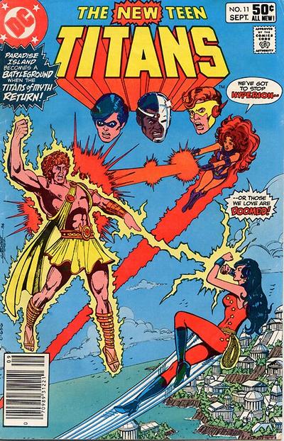
Hmmm. Both great covers but they don't stand out to me the way others by Perez do.
I think I'd have to say I prefer the Hyperion one because I'm a sucker for floating heads (though the fact that Wally's is slightly off-line bugs).
|
|
|
 Re: The New Teen Titans 1980-1984: cover commentary
|
Joined: Aug 2006
Posts: 9,055
Long live the Legion!
|

Long live the Legion!
Joined: Aug 2006
Posts: 9,055 |
Definitely the first one. It's got Paradise Island as a backdrop, and Kory and Donna fighting to 'save the ones they love' (which, presumably, are the boys watching from off-panel, making the boys the 'damsels in distress,' which is always fun!). The second one does benefit from having the entire team present, even if, typically for a cover, the speedster, the fastest flier and the teleporter are, as usual, in the back, not having caught up with the lumbering cyborg or the teen acrobat... What good is being able to run at a significant fraction of the speed of light if the kid who swings on a rope always gets there first? 
|
|
|
 Re: The New Teen Titans 1980-1984: cover commentary
|
Joined: Jul 2003
Posts: 3,613
in season
|
OP

in season
Joined: Jul 2003
Posts: 3,613 |
I don't have any criticisms of these two, but I don't LOVE either one, either. I prefer the more detailed background of #5 ----somewhat like #13, which is also semi-"dark). I don't care that much for floating heads.
Did Hyperion and Trigon go to the same Villain Posing College?
|
|
|
 Re: The New Teen Titans 1980-1984: cover commentary
|
Joined: Aug 2006
Posts: 9,055
Long live the Legion!
|

Long live the Legion!
Joined: Aug 2006
Posts: 9,055 |
Originally posted by Leap Year Lord: Did Hyperion and Trigon go to the same Villain Posing College? Same outfit, more or less, too. Strappy thing across chest, mostly to hold the cape on. Some flowy cloth over the junk. Sandals. You'd think being a god would come with a wardrobe allowance. I wonder if Trigon the Terrible is related to Hagar the Horrible? Or possibly Iago the Inadmissible?
|
|
|
 Re: The New Teen Titans 1980-1984: cover commentary
|
Joined: Nov 2004
Posts: 10,929
Time Trapper
|

Time Trapper
Joined: Nov 2004
Posts: 10,929 |
Villains hate wearing underpants! why? Because they're EVIL! They probably like to start sentences with because as well!!! (and use excessive !!!!!!!!!! )
|
|
|
 Re: The New Teen Titans 1980-1984: cover commentary
|
Joined: Jul 2003
Posts: 3,613
in season
|
OP

in season
Joined: Jul 2003
Posts: 3,613 |
I took another look at #5. I like the way the curved decorative beams give shape to the cover and frame the logo. I'm liking this one more.
|
|
|
 Re: The New Teen Titans 1980-1984: cover commentary
|
Joined: Jul 2003
Posts: 3,613
in season
|
OP

in season
Joined: Jul 2003
Posts: 3,613 |
These have already been up, of course...just wanted to see the detailed, 'semi-dark' ones side by side.  
|
|
|
 Re: The New Teen Titans 1980-1984: cover commentary
|
Joined: Jul 2003
Posts: 3,613
in season
|
OP

in season
Joined: Jul 2003
Posts: 3,613 |
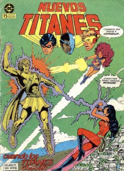
  Great Hera! I haven't cared for the previous examples of changes in other editions, but I figured it was a matter of personal taste in color. But this is a JUST A MESS. Hyperion looks like a gold statue and why the HELL is the sky green??
|
|
|
 Re: The New Teen Titans 1980-1984: cover commentary
|
Joined: Jul 2003
Posts: 3,613
in season
|
OP

in season
Joined: Jul 2003
Posts: 3,613 |
|
|
|
 Re: The New Teen Titans 1980-1984: cover commentary
|
Joined: Aug 2006
Posts: 9,055
Long live the Legion!
|

Long live the Legion!
Joined: Aug 2006
Posts: 9,055 |
Ooh, Nuevos Garfield can turn into orange cats, and not just green cats! Cool!
Foreshadowing of the NuDCU version of Beast Boy, who is reddish-orange? Or plaigerism! Dun, dun, dun-dun!
What the heck is Cyborg shooting out of his hand? He doesn't have energy blasters, just that sonic hand attachment thing... Huh.
Dark-haired Starfire is neat. I think I like the dark contrail better!
As for the previous cover, yellow Hyperion's lavender lightning is..., well, it just is. Yanno?
|
|
|
 Re: The New Teen Titans 1980-1984: cover commentary
|
Joined: Aug 2006
Posts: 9,055
Long live the Legion!
|

Long live the Legion!
Joined: Aug 2006
Posts: 9,055 |
Double post. Ignore the little man behind the curtain.
|
|
|
 Re: The New Teen Titans 1980-1984: cover commentary
|
Joined: Nov 2004
Posts: 10,929
Time Trapper
|

Time Trapper
Joined: Nov 2004
Posts: 10,929 |
Cyborg used to have a finger laser ... not sure if all of his fingers can fire blasts. maybe.  Great Hera! I haven't cared for the previous examples of changes in other editions, but I figured it was a matter of personal taste in color. But this is a JUST A MESS. Hyperion looks like a gold statue and why the HELL is the sky green??[/QB] The sky is only green for the top 90% of the page ... which is even more bizarre ... also I think Paradise Island needs to deal with their pollution problem as they have turned the ocean BROWN!?!
|
|
|
|
Forums14
Topics21,060
Posts1,049,832
Legionnaires1,731
| |
Most Online53,886
Jan 7th, 2024
|
|
|
Posts: 88
Joined: November 2003
|
|
|
|


 Previous Thread


