|
0 Legionnaires (),
32
Murran Spies, and
5
Spider Guild Agents. |
|
Key:
Admin,
Global Mod,
Mod
|
|
 Previous Thread Previous Thread |
|
Next Thread 
|
|
Print Thread  |
|
|
Joined: Jul 2003
Posts: 10,154
Terrifyingly On-Topic.
|
|
Terrifyingly On-Topic.
Joined: Jul 2003
Posts: 10,154 |
29. HUMAN TORCH. Ol' triangular-head Namor!!
30. SPIDER-WOMAN. ASM elements go together OK, but not GREAT. Also, SW has better yellow.
31. TV TEENS. Both of these are nothing to get excited about ideawise: friends chatting around a pool. But I am wild for Mopsy's minimalist coloring, especially the red swimsuit next to the pink/mauve, and then the B&W logo.
32. AMETHYST. While I like the colorful shards with the strong B&W on the Challs cover, I don't care for the image.
|
|
|
|
|
Joined: Jul 2003
Posts: 10,154
Terrifyingly On-Topic.
|
|
Terrifyingly On-Topic.
Joined: Jul 2003
Posts: 10,154 |
33. SOLO vs. BAKER STREET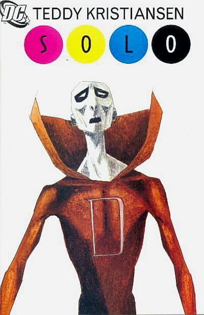 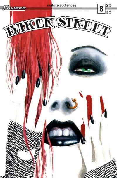 34. DAREDEVIL vs. AVENGERS 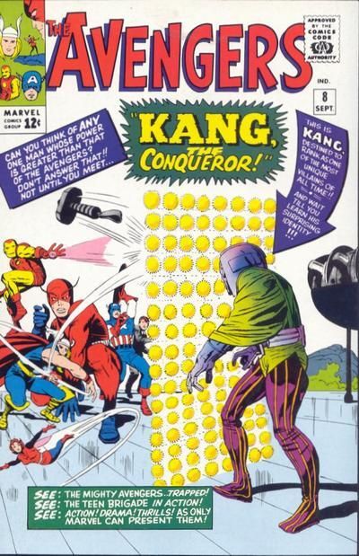 35. FLASH GORDON vs. DARK VICTORY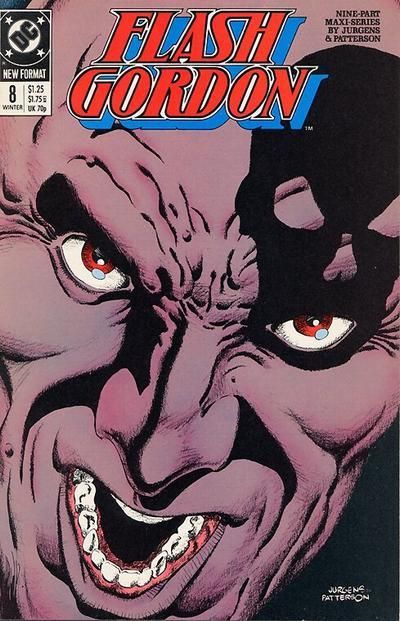 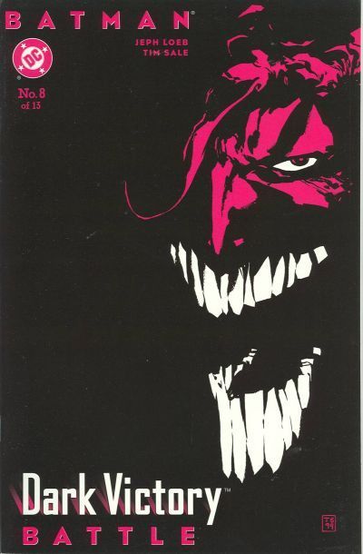 36. WEST COAST AVENGERS vs. TROUBLEMAKERS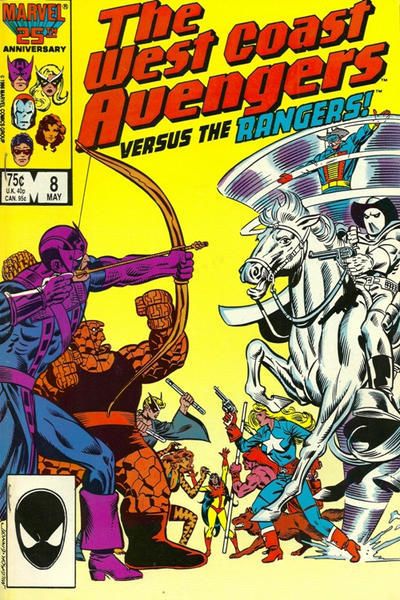 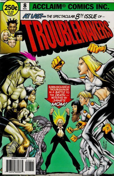
|
|
|
|
|
Joined: Jul 2003
Posts: 33,081
Time Trapper
|
|
Time Trapper
Joined: Jul 2003
Posts: 33,081 |
33. BAKER STREET
34. I'm into both but that Stilt-Man angle may be overtaking Kang's polka dots. DAREDEVIL.
35. FLASH GORDON. Joker is painfully distorted for me
36. I love both but the unknown-ness of TROUBLEMAKERS is pulling me in! Like the new hot boy in town (pushes old hot boy aside to go meet him)!!
|
|
|
|
|
Joined: Jul 2003
Posts: 10,154
Terrifyingly On-Topic.
|
|
Terrifyingly On-Topic.
Joined: Jul 2003
Posts: 10,154 |
33. BAKER STREET!
34. DAREDEVIL!!! No mistake, Avengers is great: colorful and Kang's gold dot curtain drives me nuts. But Daredevil's subtle colors knock me out. The mostly-gray background sets off red DD. Brown subtitle text with the red main? Little green and yellow touches? Weird, but works. Colors +Stilt-perspective = awesome. I didn't know this cover before and it's a new favorite.
35. DARK VICTORY. Creepy is the watchword, right? WELL HERE YA GO.
36. I don't hate homages, but I can't get excited over lifts, either. The WCA homage is slightly more subtle, but I like the colors of TROUBLEMAKERS more.
|
|
|
|
|
Joined: Jul 2003
Posts: 33,081
Time Trapper
|
|
Time Trapper
Joined: Jul 2003
Posts: 33,081 |
Yeah that DAREDEVIL cover is simple magnificence.
|
|
|
|
|
Joined: Jul 2014
Posts: 6,692
Humanoid from the Deep
|
|
Humanoid from the Deep
Joined: Jul 2014
Posts: 6,692 |
29. The Human Torch - Namor's pinhead wins this one for me!
30. Amazing Spider-man - Jessica Drew's ugly new costume ruins the other cover
31. TV Teens (Mopsy) - dialogue balloons make this cover more engaging
32. Amethyst - the CoU cover is more interesting, but the lack of cover makes it less appealing to the eye
Keep up with what I've been watching lately! "Where have you gone, Joe DiMaggio? Our nation turns its lonely eyes to you."
|
|
|
|
|
Joined: Jul 2014
Posts: 6,692
Humanoid from the Deep
|
|
Humanoid from the Deep
Joined: Jul 2014
Posts: 6,692 |
33. Solo - blood on white backgrounds is SO overdone
34. Avengers - brighter colors, more words
35. Flash Gordon- the Joker's face is too distorted in the other cover
36. West Coast Avengers- brighter colors
Keep up with what I've been watching lately! "Where have you gone, Joe DiMaggio? Our nation turns its lonely eyes to you."
|
|
|
|
|
Joined: Jul 2003
Posts: 10,154
Terrifyingly On-Topic.
|
|
Terrifyingly On-Topic.
Joined: Jul 2003
Posts: 10,154 |
37. CAPTAIN MARVEL vs. X-FACTOR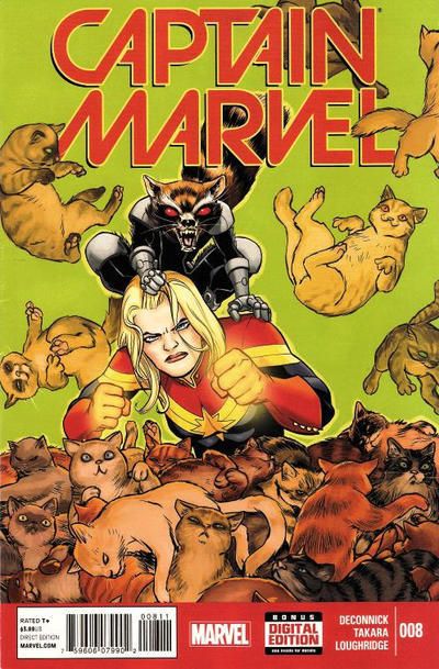 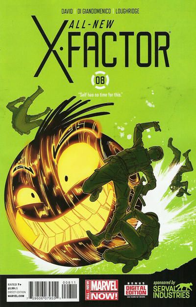 38. HAWKMAN vs. SEA DEVILS 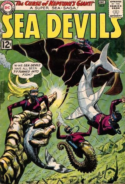 39. ROM vs. DEAD BOY DETECTIVES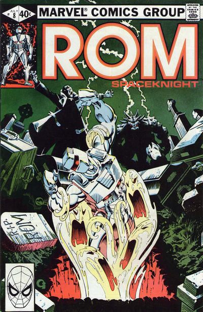 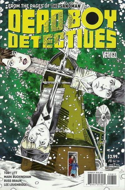 40. AIR vs. TALES OF THE UNEXPECTED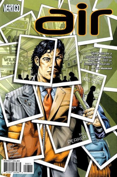 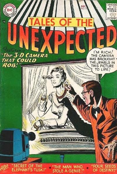
|
|
|
|
|
Joined: Jul 2003
Posts: 40,900
Trap Timer
|
|
Trap Timer
Joined: Jul 2003
Posts: 40,900 |
33. SOLO -- Love this take on Deadman!
34. DAREDEVIL -- This cover rocks! Good thing Daredevil isn't afraid of heights! Meanwhile, the Avengers cover would be much improved by some taunting, ala Brainiac's first appearance!
35. DARK VICTORY -- Not digging either, but this at least has mood.
36. TROUBLEMAKERS -- At last!
|
|
|
|
|
Joined: Jul 2003
Posts: 40,900
Trap Timer
|
|
Trap Timer
Joined: Jul 2003
Posts: 40,900 |
37. CAPTAIN MARVEL -- It's raining cats and... er... just cats!
38. SEA DEVILS -- I hate being turned into a giant fish!
39. ROM -- Rising from the grave for the win!
40. TALES OF THE UNEXPECTED -- I totes want to read this story!
|
|
|
|
|
Joined: Jul 2003
Posts: 33,081
Time Trapper
|
|
Time Trapper
Joined: Jul 2003
Posts: 33,081 |
37. Cats! CAPTAIN MARVEL
38. SEA DEVILS covers are the LOIS LANE of ...their genre!
39. Silly robot ROM, you ain't supposed to die!
40. Air? A title Soon to be followed by EARTH, WATER, FIRE, THINGS, and STUFF no doubt. Bah! I scoff at your boring title. THIS fan still needs to be wooed. Don't slap a (pronounced extra sarcastically and drawn out) *VER-TI-GO* logo on you and expect ME to slobber all over you, poser. That said, your cover is solid and a lot more interesting than TotU.
|
|
|
|
|
Joined: Jul 2003
Posts: 9,915
Wanderer
|
|
Wanderer
Joined: Jul 2003
Posts: 9,915 |
33. SOLO vs. BAKER STREET 34. DAREDEVIL vs. AVENGERS 35. FLASH GORDON vs. DARK VICTORY 36. WEST COAST AVENGERS vs. TROUBLEMAKERS 37. CAPTAIN MARVEL vs. X-FACTOR 38. HAWKMAN vs. SEA DEVILS 39. ROM vs. DEAD BOY DETECTIVES 40. AIR vs. TALES OF THE UNEXPECTED
|
|
|
|
|
Joined: Oct 2003
Posts: 86,093
Unseen, not unheard
|
|
Unseen, not unheard
Joined: Oct 2003
Posts: 86,093 |
33. BAKER STREET - not a fan of overly gaunt Deadman
34. . AVENGERS - pretty colooooors
35. DARK VICTORY - creepier guy on cover
36. TROUBLEMAKERS - more "eve" billing given to people on the cover
|
|
|
|
|
Joined: Oct 2003
Posts: 86,093
Unseen, not unheard
|
|
Unseen, not unheard
Joined: Oct 2003
Posts: 86,093 |
37. 37. CAPTAIN MARVEL - nice kitties!
38. HAWKMAN - there goes his favorite mace!
39. DEAD BOY DETECTIVES - the windmills are a nice touch
40. AIR - very creative
|
|
|
|
|
Joined: Jul 2003
Posts: 10,154
Terrifyingly On-Topic.
|
|
Terrifyingly On-Topic.
Joined: Jul 2003
Posts: 10,154 |
37. X-FACTOR. Teeds-Self has time for this Wacky Warlock cover.
38. SEA DEVILS!
39. DEAD BOY DETECTIVES. Dragged-into-the-grave is old hat. DBD -- I might just pick that up to see what it's about. How often do you see windmills on comic covers?
40. TALES OF THE UNEXPECTED. Better green!
|
|
|
|
|
Joined: Jul 2003
Posts: 10,154
Terrifyingly On-Topic.
|
|
Terrifyingly On-Topic.
Joined: Jul 2003
Posts: 10,154 |
41. SHOWCASE vs. THE SPECTRE 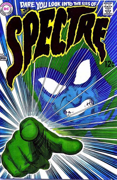 42. BLACK ORCHID vs. PROMETHEA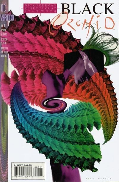 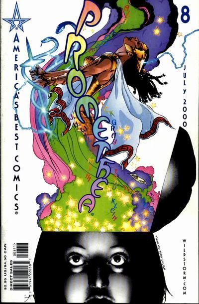 43. MY LOVE LIFE vs. MY STORY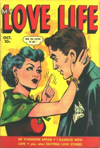 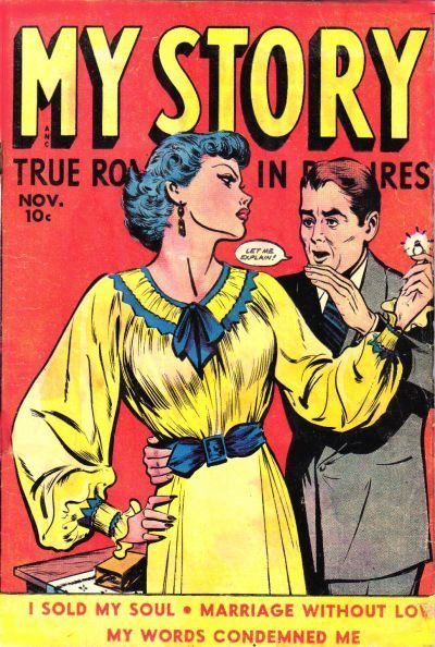 44. THE COMICS vs. THE FUNNIES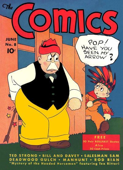 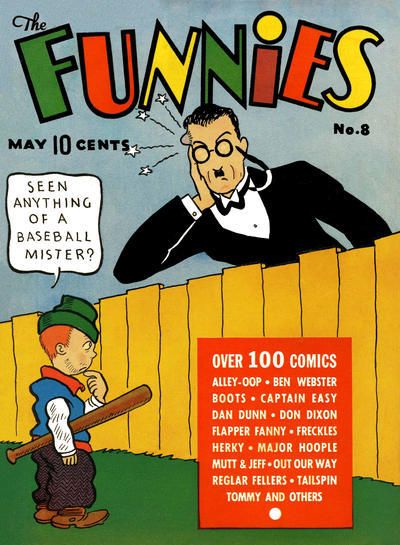
|
|
|
|
|
Joined: Jul 2003
Posts: 40,900
Trap Timer
|
|
Trap Timer
Joined: Jul 2003
Posts: 40,900 |
41. SHOWCASE -- Love the green background here!
42. BLACK ORCHID
43. LOVE LIFE -- Because it's better to have to listen than to have to explain!
44. THE FUNNIES -- For the hat!
|
|
|
|
|
Joined: Jul 2003
Posts: 10,154
Terrifyingly On-Topic.
|
|
Terrifyingly On-Topic.
Joined: Jul 2003
Posts: 10,154 |
41. You lose, Mr. Allen. THE SPECTRE is Hall of Fame.
42. PROMETHEA!
43. MY LOVE LIFE.
44. THE FUNNIES. 'Cause dude is hanging aorund the back yard in a tux.
|
|
|
|
|
Joined: Jul 2014
Posts: 6,692
Humanoid from the Deep
|
|
Humanoid from the Deep
Joined: Jul 2014
Posts: 6,692 |
37. Captain Marvel - so many cats!
38. Hawman - that giant in the golden mask looks like an interesting guy
39. ROM Space Knight - those ghosts dragging the protagonist down with them looks like some spooky stuff
40. Tales of the Unexpected - the Air cover is just WAY too boring
41. The Spectre- the Spectre pointing at me grabs my attention
42. Promethea- the stuff coming out of her is really acid trippy and colorful
43. Love Life - better use of dialogue
44. The Comics - he has an arrow up his butt!
Keep up with what I've been watching lately! "Where have you gone, Joe DiMaggio? Our nation turns its lonely eyes to you."
|
|
|
|
|
Joined: Jul 2003
Posts: 16,863
Time Trapper
|
|
Time Trapper
Joined: Jul 2003
Posts: 16,863 |
41. The Spectre - the pointing at the viewer is very attention-grabbing, also the blue & green is appealing
42. Promethea, although both are trippy covers, Black Orchid is a tad disturbing
43. Love Life - don't mess with that chick. And more pointing!
44. The Funnies - looks like a young Mr. Lodge, and how could you not want to learn more about Flapper Fanny and Freckles Herky?
Holy Cats of Egypt!
|
|
|
|
|
Joined: Jul 2003
Posts: 10,154
Terrifyingly On-Topic.
|
|
Terrifyingly On-Topic.
Joined: Jul 2003
Posts: 10,154 |
45. THE THING vs. TOMORROW STORIES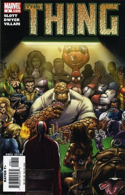 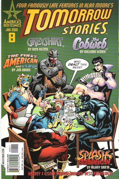 46. LSH (BAXTER) vs. LSH (TMK) 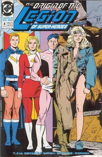 47. BLACK CAT vs. GREAT ACTION COMICS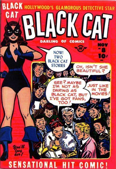 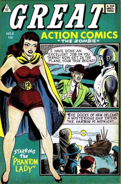 48. COOKIE vs. HUMOR COMICS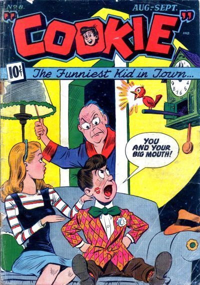 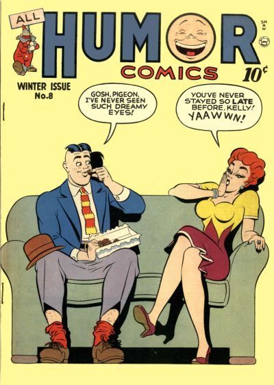
|
|
|
|
|
Joined: Sep 2013
Posts: 31,872
Tempus Fugitive
|
|
Tempus Fugitive
Joined: Sep 2013
Posts: 31,872 |
25. Angel Love. Worse than Darkseid. More Terrible than Aunty Monitor... Mary Beth! Although I have a number of Flaming Carrot comics, and liked them well enough at the time, I fear the Woot! may not have dated well.
26. Scoop. I've never been able to quite work out the expression on Scoop Comics #8 Traumatised resignation is what I come up with. It's a look that's seen a lot, and there's more on the way judging by the shadows. If I see another fang toothed, fetish carrying melting wax faced open brain cover...
27. Miss Beverley Hills. Scribbly is funny, but Bev has the laughs with some dreams in there too.
28. Amazing Mystery Funnies. The cover of Detective Funnies shows the origin of The Broken Skull. LW could do a whole thread on Wood Police. But there's something a little sad about seeing what a Circe cursed Comet was up to while waiting for Supergirl.
29. Star Spangled. The Guardian could easily make that leap. But he's endangering those kids because it's Golden Age Funny! The Human Torch cover has lots of military vehicles, missing the opportunity to endanger kids on the bridge. I wonder how long the Sub Mariner worked on his anti flame fluid rather than, you know, just picking up a few fire extinguishers.
30. Spider Woman. Just better art (incurs wrath of Marvel blasphemy laws). Just why is it a tribute to teen agers? There's no glue sniffing, alcohol abuse or teenage pregnancy on the cover at all! My Main ID, Set, has also mentioned Ripley.
31. Mopsy. Typing of teenage pregnancy, there's something unsettlingly lecherous about Freckles. Mopsy is at least a little more subtle about it.
32. Amethyst. There's too much going on in the Challs cover. Giant hourglasses, monsters, colour bits, flying folk...meh.
33. Baker Street. I think we should be spared an Emo Boston Brand. You get possessed, and never...stop...whining...
34. Avengers. Ah, when Stilt Man could grace a cover without laughter. Over in Hyperbole Land..."and wait till you learn his surprising identity!" Is it Carol Danvers husband/son you sick Marvel folk? It is and I get a prize? Oh, it's a Stilt Man comic... Angle of Daredevil cover is nice, but special effects and Kang costume win.
35. Batman. Flash just has a face with a tattoo. So Bats wins on design pretty easily here.
36. Troublemakers. Wow. Entire casts that I could care less about. 'Makers wins as there's always the chance the Guardian will turn up to endanger them. Oh and the mom character is more interesting than Firebird.
37. X-Factor. Two good covers. While it must have taken ages to draw all the kitties, they're all on catnip as they are very docile looking. Warlock looks like he's having a blast, and that should draw in some readers.
38. Sea Devils. The Hawk cover is more dramatic. He looks in real trouble there. But the Devils cover grows on you quickly as the creepy transformations kick in. Plus it's good to see stammers being shown as fine on comic covers.
39. Deadboy Detectives. Haunted windmills wins, even if all four sails aren't covered. It's a simpler, starker cover than ROM but gets it's point across better.
40. Tales of the Unexpected. Inside he gets punched out by the 3-d woman who is missing her jewels. Air loses points for the desperate cover buy me quote.
"...not having to believe in a thing to be interested in it and not having to explain a thing to appreciate the wonder of it."
|
|
|
|
|
Joined: Jul 2014
Posts: 6,692
Humanoid from the Deep
|
|
Humanoid from the Deep
Joined: Jul 2014
Posts: 6,692 |
45. Tomorrow Stories - the greater variety of characters makes me want to find out who they all are 46. TMK LSH - this one was REALLY hard, but the contrast between Swan and Giffen's art symbolized that run really well 47. Great Action Comics - Phantom Lady!  48. Cookie - that cockblocking clock is a hoot!
Keep up with what I've been watching lately! "Where have you gone, Joe DiMaggio? Our nation turns its lonely eyes to you."
|
|
|
|
|
Joined: Jul 2003
Posts: 40,900
Trap Timer
|
|
Trap Timer
Joined: Jul 2003
Posts: 40,900 |
45. TOMORROW STORIES -- Intriguing unknown characters beats "let's throw in the entire Marvel Universe"!
46. TMK LSH -- The Lightle cover is solid, but this one is total awesomeness!
47. Ooh, the cruelty! Making me choose between Linda Turner and Sandra Knight! Well, BLACK CAT wins because this is one of those weirdly colored minor publisher versions of Phantom Lady.
48. HUMOR COMICS -- Funnier gag, plus the girl not looking like a fourteen year old making it less creepy!
|
|
|
|
|
Joined: Jul 2003
Posts: 10,154
Terrifyingly On-Topic.
|
|
Terrifyingly On-Topic.
Joined: Jul 2003
Posts: 10,154 |
45. TOMORROW STORIES. Less crowded -- even with all the logos! Plus green!
46. LSH BAXTER. Colorful! Pink & purple lurking over the custom logo job!
47. BLACK CAT. Great American Comics not awful, but kind of lackluster. Phantom Lady, basic? Get outta here.
48. HUMOR COMICS. In spite of that awful color combo on the dress!
|
|
|
|
Forums14
Topics21,117
Posts1,053,709
Legionnaires1,732
| |
Most Online53,886
Jan 7th, 2024
|
|
|
Posts: 324
Joined: July 2003
|
|
|
|