|
0 members (),
118
Murran Spies, and
3
robots. |
|
Key:
Admin,
Global Mod,
Mod
|
|
 Previous Thread Previous Thread |
|
Next Thread 
|
|
 The Tops in Tens!
|
Joined: Jul 2003
Posts: 10,145
Terrifyingly On-Topic.
|
OP

Terrifyingly On-Topic.
Joined: Jul 2003
Posts: 10,145 |
We've examined the Elevens, tested the mettle of the Twelves, and debated the Eights. Now is the time for Tens! Choose one per matchup -- no ties -- on your opinion of the cover merits alone. Click images to see larger versions1. TEEN TITANS vs. NEW TEEN TITANS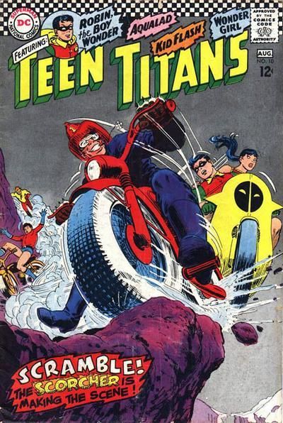 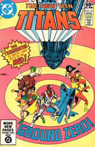 2. PONYTAIL vs. FRANKENSTEIN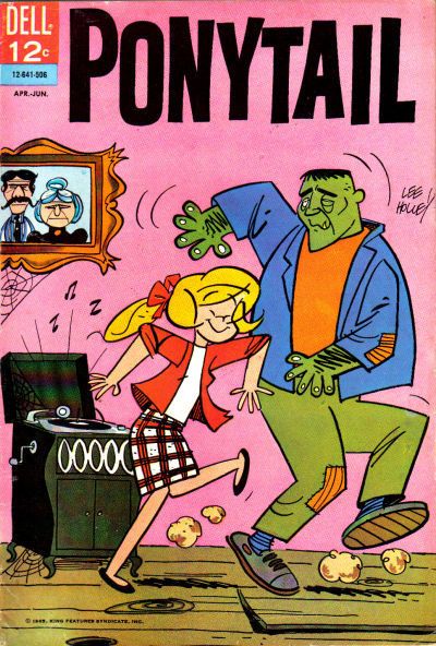 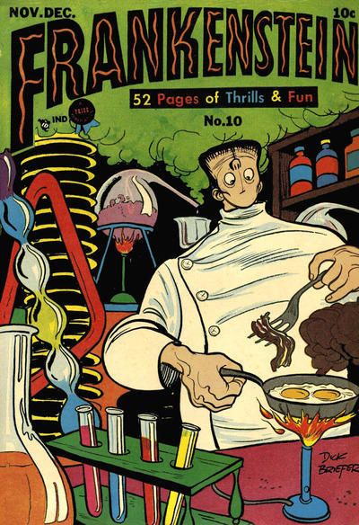 3. DATE WITH DEBBI vs. CHILI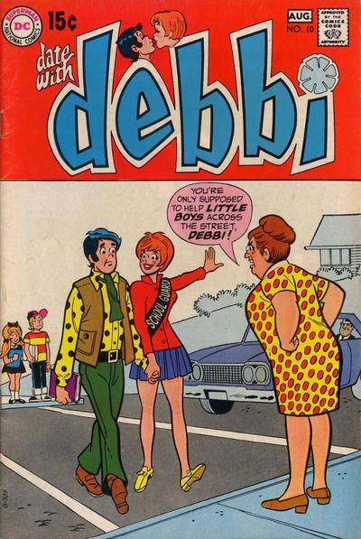 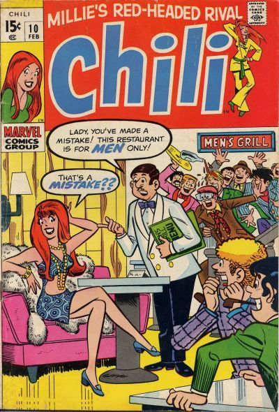 4. NORMALMAN vs. BATMAN & ROBIN ADVENTURES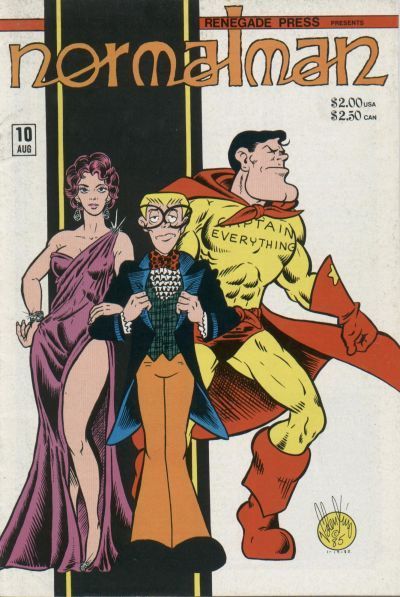 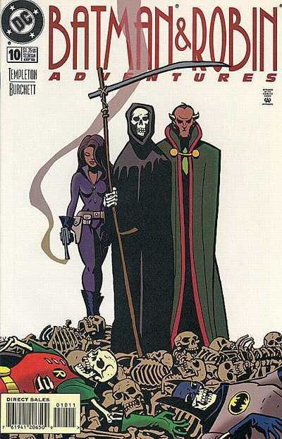
|
|
|
Re: The Tops in Tens!
|
Joined: Jul 2003
Posts: 10,145
Terrifyingly On-Topic.
|
|
OP
Terrifyingly On-Topic.
Joined: Jul 2003
Posts: 10,145 |
1. TEEN TITANS. Neither is my favorite Titans cover. SATT wins for that Cardy perspective, plus Donna's ponytail! EDITED TO ADD: AND THAT SHADING! GIVES TEXTURE. (But the Robin Cycle doesn't look right.) I can't decide whether or not I like the NTT's pink/yellow target color scheme, but I've spent plenty of time thinking about it. Why?
2. FRANKENSTEIN. The kids grooving to the new sounds (or maybe old sounds) is cute, but the lab setup has big charm. Plus bacon-n-eggs!
3. DATE WITH DEBBI. Although there's not much difference here!
4. BATMAN & ROBIN ADVENTURES. Normalman might just be a little sassier than Death, but the B&RA crew is doing more than just standing around.
|
|
|
Re: The Tops in Tens!
|
Joined: Sep 2013
Posts: 31,441
Tempus Fugitive
|
|
Tempus Fugitive
Joined: Sep 2013
Posts: 31,441 |
Yay!
1. New Teen Titans:
And we start with a real toughie. That Perez design is superb. The concentric circles take up the whole background of the cover. Their soft colouring is pleasing on the eye. The nature of the target draws the reader in naturally to the centre. The main cast (always looking good when it's Perez) are arced around that centre, following the circular motif. He doesn't just clump them together.
All of the cast are looking up, so the reader is then drawn upwards to the missile that has targeted them. It's behind the logo and intrudes just enough from the centre top to show you what it is. That centre top location is important. It moves the reader directly upwards from the centre of the target. The "Ground Zero" text is also arced round the circle, and reinforced both the target and the missile ideas. Someone has added the Terminator text which would also have been a draw to readers. It takes a little away form the overall design, but is reasonably small overall. Interestingly, he picks Cyborg as the front and centre character. So, plenty of craft there.
It's an all action shot cover in original Titans. That fireman helmet, flower eating Scorcher is too hot for the Titans to handle on perilous mountain trail-blazing
Scorcher completely dominates the centre of the cover. It reflects the confidence he has in his skills and is backed up by his huge smile. He's very well drawn. The Titans look like fish out of water, ably shown by poor Aqualad. A fish on a bicycle. Wonder Girl looks both shocked and surprised at Bat-Boy's inability on a bike. She sees the drop below. For the readers who can't, Cardy has helpfully drawn another nasty drop in the background. That's all that's needed and he knows not to clutter it up any further.
In a more character driven cover, we see that Kid Flash doesn't need a bike in the background. Where Cyborg is the centre of the Titans cover, Robin gets his little '60s pic on this one. Note that original Titans tells us the character names. By NTT we're expected to know. The Go-Go checks place the cover at a special (or at least collectible) moment in DC history.
In terms of action and excitement, the original Titans cover would win. Perhaps as a kid, I'd be more likely to pick it up off the shelf. But, NTT wins because of the strong design choice, and Perez looking to add some extra layers in there.
2. Frankenstein. Crumbs! A ponytail crossover from the previous pair! But that's the highlight of the cover, which only has the novelty value of dancing with a monster. Over in Frankie, we've got a bit of humour. Breakfast over a Bunsen. The red test tub has ketchup, but what's in the others? How's he going to eat it with no mouth? The cover gets points for having the lab clutter frame Frankie, and for having the escaping gas provide a well done backdrop to highlight the logo.
3. Debbi: Battle of the Red Tops! In more ways than one. Only at number 3 and we have a polka dot bonanza in Debbi. Debbi's smitten look is a nice contrast from the hunted, stalked expression on the guy. Perhaps he's aware that Debbi's mind isn't paying much attention to where there's a car coming or not. Hopefully, it something those two kids will work out, as no one is likely to help them across. Over in Chili, I'm wondering if she could have replaced Karate Kid in a company crossover. Below the logo, it's a bit dated with it's Men Only Grills. An upside down pipe isn't enough to compete.
4. Batman Adventures. There's nothing normal about that cravat/bow tie combo! That off centre stripe works well to make the trio prominent, rather than stranded in a snow storm. But over in Bats, we get a better drawn trio as the centre. Then you look down across the pile of skeletons (enforcing the smoking gun and Death). *Then* the two you recognise at the very bottom for some shock value. So, it's a cover that works both horizontally and vertically. Nice.
"...not having to believe in a thing to be interested in it and not having to explain a thing to appreciate the wonder of it."
|
|
|
Re: The Tops in Tens!
|
Joined: Jul 2003
Posts: 10,145
Terrifyingly On-Topic.
|
|
OP
Terrifyingly On-Topic.
Joined: Jul 2003
Posts: 10,145 |
5. BIG TOWN vs. ALL-AMERICAN MEN OF WAR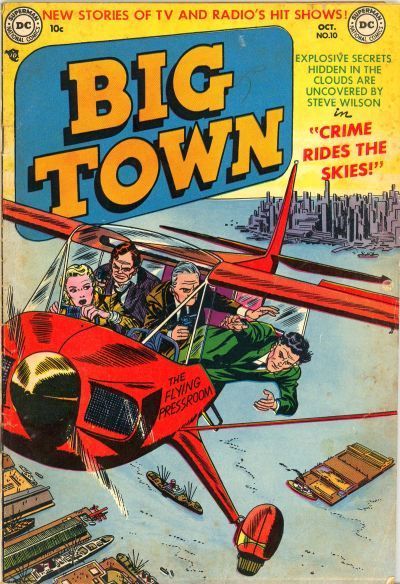  6. DARK WOLF vs. THE MASKED MAN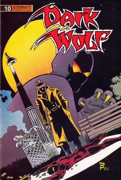 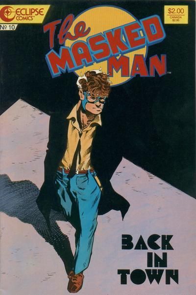 7. SILVERBLADE vs. THE BRAVE AND THE BOLD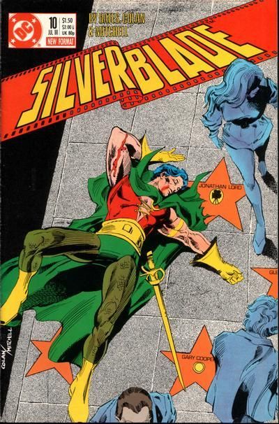 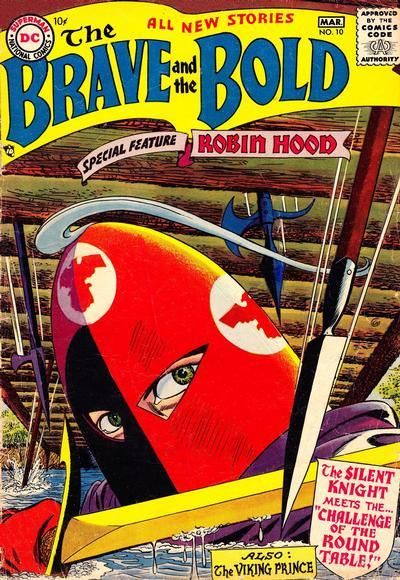 8. SUPERMAN vs. SUPERGIRL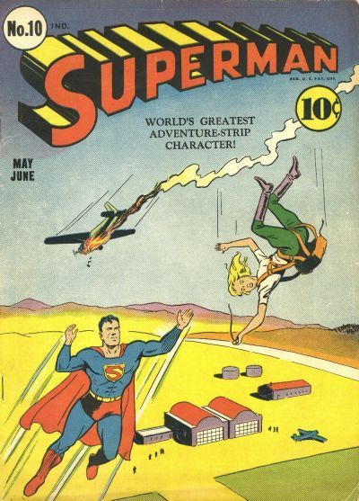 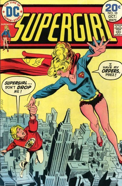
|
|
|
Re: The Tops in Tens!
|
Joined: Sep 2013
Posts: 31,441
Tempus Fugitive
|
|
Tempus Fugitive
Joined: Sep 2013
Posts: 31,441 |
5. Big Town: Nice link between these two. But I'm going with Big Town for the extra background detail. It really is big town, and there's something pulpish about the title I like too.
6. Dark Wolf: Speaking of Pulp, there's a retro design to The Masked Man cover. Times were hard in The City, when a guy could only afford a mask and no costume. There was a moment in comics history where people were crying out for this sort of character. Unfortunately The Masked Man's mom sewed a name tag into all his clothes. His enemies hunted him down a week later. Dark Wolf gives us a crime along with our shadowy evening walk. The masked figure works well transitioning us from fore to mid to back ground making it a more interesting cover.
7. Silverblade: Who knew that the Silent Knight's secret was that he had giant manga eyes? Who knew that he was silent because he only spoke Japanese at the Round Table and got sick of no one understanding him? So, that leaves Silverblade. Not that it's a great cover, but I guess it shows who far a character can fall. The star, showing his secret ID, beside him is a decent touch.
8. Superman Will Superman allow the girl to fall when he notices that it's not Lois? Oh hang on, I thought that Supergirl's orders were to save Prez, but that she didn't want to. Not the other way round. Bah! That means Superman wins. Note that the lady falling looks more of an adventurer than your standard damsel in distress. Well done Superman.
"...not having to believe in a thing to be interested in it and not having to explain a thing to appreciate the wonder of it."
|
|
|
Re: The Tops in Tens!
|
Joined: Jul 2003
Posts: 10,145
Terrifyingly On-Topic.
|
|
OP
Terrifyingly On-Topic.
Joined: Jul 2003
Posts: 10,145 |
5. BIG TOWN. Shading/texture isn't a magic bullet. I like that BT's helicopter looks like it's about to fly by your left ear.
6. THE MASKED MAN. Dark Wolf is a bunch of standard Batman cover elements put together. So what? I don't like the logo either. The Masked Man gives more of the mood-attitude of the book rather than any specific plot points -- and I'm down with that.
7. SILVERBLADE because I'm curious about this story. I have no recollection of this comic. I don't like the logo font, though.
8. SUPERGIRL. The angle & framing. Superman looks like it could have been assembled from ColorForms.
|
|
|
Re: The Tops in Tens!
|
Joined: Jul 2003
Posts: 10,145
Terrifyingly On-Topic.
|
|
OP
Terrifyingly On-Topic.
Joined: Jul 2003
Posts: 10,145 |
9. FLINCH vs. THE SPIRIT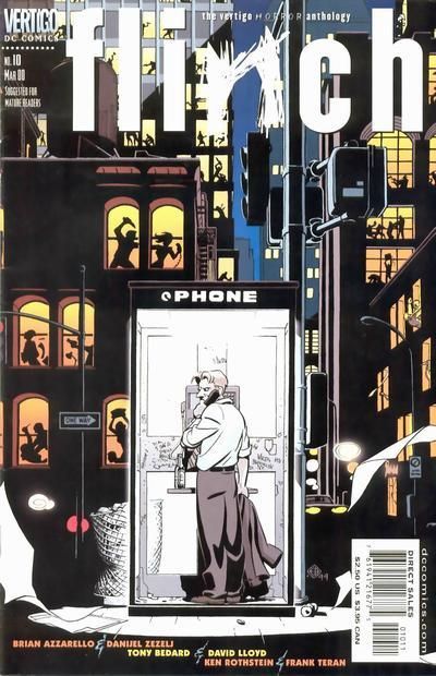 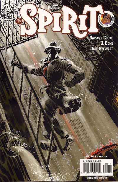 10. SECRETS OF YOUNG BRIDES vs. TRUE SECRETS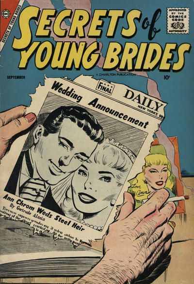 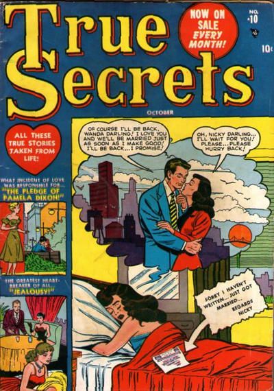 11. THRILLER vs. WATCHMEN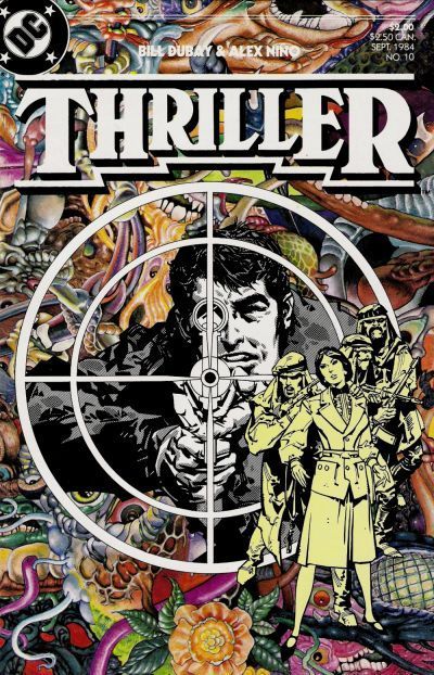 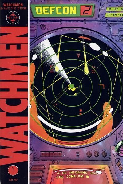 12. THE BOYS vs. ALPHA FLIGHT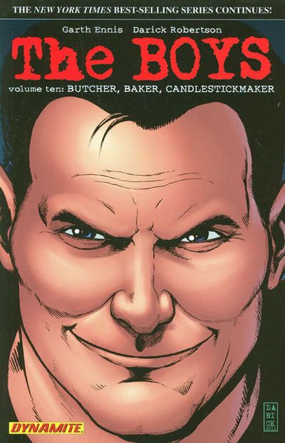 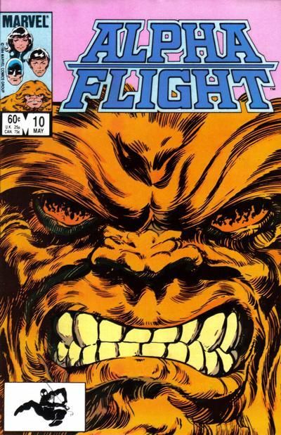
|
|
|
Re: The Tops in Tens!
|
Joined: Sep 2013
Posts: 31,441
Tempus Fugitive
|
|
Tempus Fugitive
Joined: Sep 2013
Posts: 31,441 |
9. Flinch: It's not often I'd not be going for a Spirit cover. Especially one that's atmospheric enough that you can feel the weight of the Spirit's coat in the downpour, the water flooding his shoes and the cold, slick fire escape he's perched on. But looking at all the murders across the city in Flinch provides a great backdrop for the central image of the phone box.
10. Secrets of Young Brides: The art isn't as good as I'd like on either of these too. So, let's look at the angst. True Secrets is pretty much a "sod off, you're dumped" for Wanda. Heart breaking, sure. but it doesn't have the Cape Fear tension of Secrets. A hate burning form the past like the guy's cigarette!
I vote for Steel Heir to replace Spider Girl in the LSV!
11. Thriller: Thriller #10. By which time the writer who said he'd never leave had left and the series was about to get canned. I don't think I've read an issue with Nino on the art chores. The cover is certainly nice. The background is so busy, but doesn't detract in any way from the tension of the crosshairs, the sniper or his opponents. While the draughtsmanship on the Watchmen is excellent, it's effectiveness is helped along if you know what stage the story had reached.
12. Alpha Flight. Enraged Sasquatches trumping Smug Gits is a comics tradition. One that continues again here.
"...not having to believe in a thing to be interested in it and not having to explain a thing to appreciate the wonder of it."
|
|
|
Re: The Tops in Tens!
|
Joined: Jul 2003
Posts: 10,145
Terrifyingly On-Topic.
|
|
OP
Terrifyingly On-Topic.
Joined: Jul 2003
Posts: 10,145 |
9. THE SPIRIT. I like a rainy cover. (No points deducted because artistic license, but that Flinch phone booth is larger than any phone booth I've ever seen.
10. SECRETS OF YOUNG BRIDES. True Secrets is kinda tortured and WORDY. SOYB is almost wordless...and that newspaper could be in Greek and the idea would still come across. I like this one quite a bit.
11. THRILLER. The white over the colorful Carnivale-esque (??) background is doing it for me.
12. ALPHA FLIGHT. Although why is Sasquatch's head cut off by the logo? Does he have hat hair? Well bouf that shit up!
|
|
|
Re: The Tops in Tens!
|
Joined: Jul 2003
Posts: 10,145
Terrifyingly On-Topic.
|
|
OP
Terrifyingly On-Topic.
Joined: Jul 2003
Posts: 10,145 |
13. SMASH COMICS vs. SILVER STREAK COMICS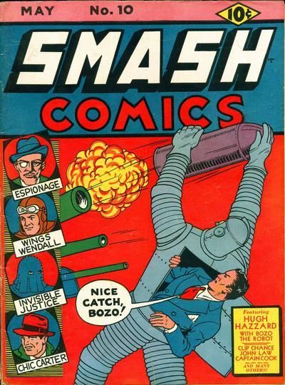 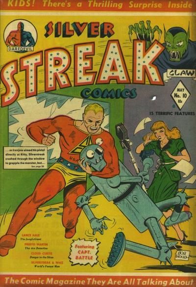 14. THE ESTABLISHMENT vs. NIGHT FORCE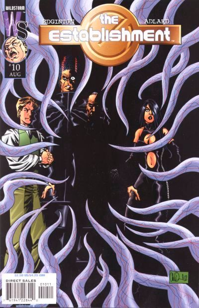 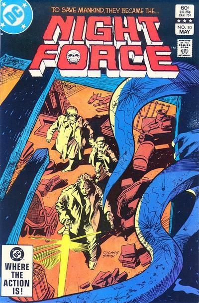 15. FINDER vs. STRANGERS IN PARADISE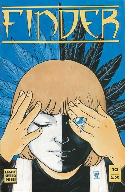 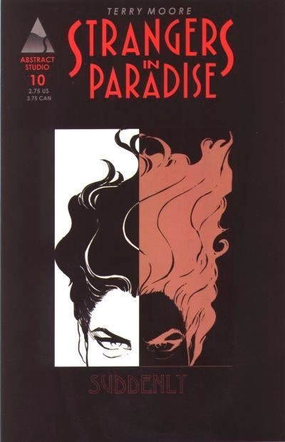 16. DAZZLER vs. DOCTOR STRANGE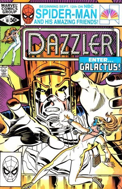 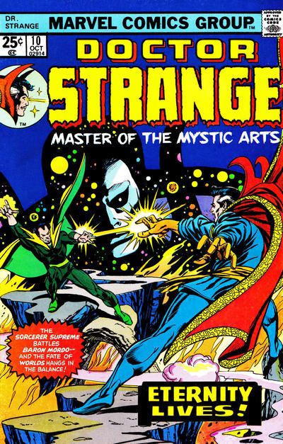
|
|
|
Re: The Tops in Tens!
|
Joined: Sep 2013
Posts: 31,441
Tempus Fugitive
|
|
Tempus Fugitive
Joined: Sep 2013
Posts: 31,441 |
...No points deducted because artistic license, but that Flinch phone booth is larger than any phone booth I've ever seen. All Pratt makes a call... "Samaritans? Yeah, it's Al again. Yeah, I was fine. But I'm the victim of a drive-by taunting about the size of this phone booth. Now I'm sad again." 13. Never mind Al. At least you're not a robot. Not just hated by Coluans, but by the Whole Comics Industry! If they're not getting their eyes punched out by show off super streaks, they're getting called names like "Bozo". It's a win for Smash as I try to figure out where its controls are, if Hugh Hazzard is using it as a suit. (I bet the front of Bozo has a pocket with an immaculate hankie too). I think that robot design was used again decades later - Big Guy and Rusty the Robot? 14. Night Force: I don't think I got past the first issue of the Establishment. A very tame version of the already neutered Authority. It's a group shot and someone has drawn some tentacles in front. Night Force never really seemed to get going in any incarnation. But here's the threat has a context and its prey are unaware. Good cover design allows the main characters to remain central even with the unusual perspective. 15. Finder. I bought the whole run of SiP, but that's twice I think I've voted for another cover. Nice logo and the duality is reinforced a few times. I like the hand/eye placement too. 16. Reasons why I don't read Marvel. Ridiculous over sized cosmic clowns. So it's Disco Skates vs Giant Jazz Hands or Wizard Dance Off of Eternity. Meh... Dazzler because seeing Galactus here is like Darkseid appearance in a burger joint over in Ambush Bug.
"...not having to believe in a thing to be interested in it and not having to explain a thing to appreciate the wonder of it."
|
|
|
Re: The Tops in Tens!
|
Joined: Jul 2003
Posts: 10,145
Terrifyingly On-Topic.
|
|
OP
Terrifyingly On-Topic.
Joined: Jul 2003
Posts: 10,145 |
13. SMASH COMICS. The Silver Streak gun blends in, looks that poorly-attired man is harassing a derpy robot. Smash isn't the height of sophistication, but pulls together as a package.
14. NIGHT FORCE. A little suspense, thank you.
15. FINDER. I'm liking the black.white/blue tan(ish) color scheme.
16. DOCTOR STRANGE. 'Cause Eternity looks good...like always.
|
|
|
Re: The Tops in Tens!
|
Joined: Jul 2003
Posts: 10,145
Terrifyingly On-Topic.
|
|
OP
Terrifyingly On-Topic.
Joined: Jul 2003
Posts: 10,145 |
17. NEW TEEN TITANS (BAXTER) vs. OMEGA MEN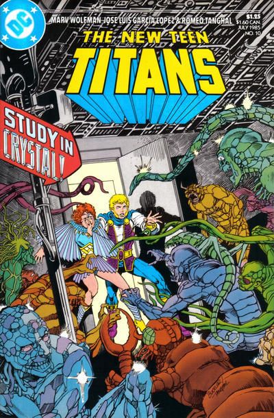 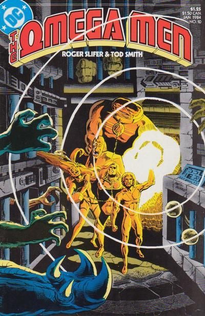 18. HUMPHREY vs. JOE PALOOKA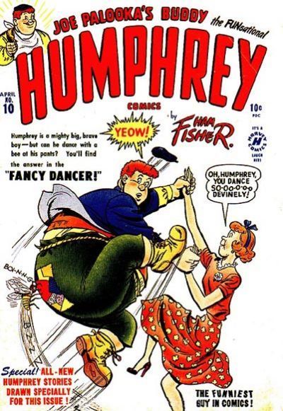 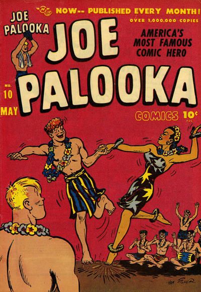 19. LEADING COMICS vs. SUPER FRIENDS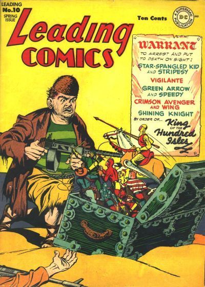 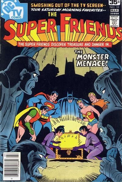 20. WONDER WOMAN vs. OUTSIDERS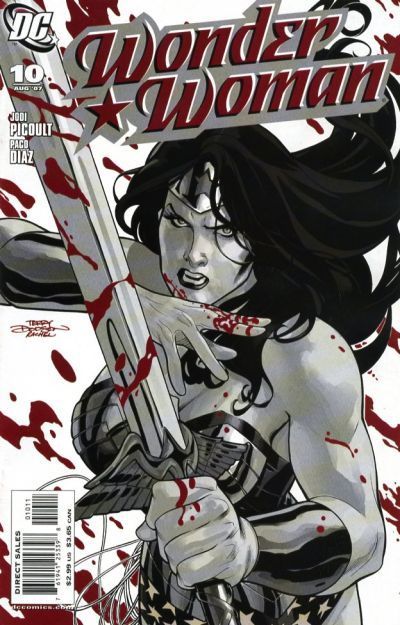 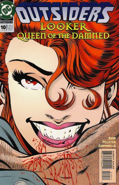
|
|
|
Re: The Tops in Tens!
|
Joined: Sep 2003
Posts: 34,634
Bold Flavors
|
|
Bold Flavors
Joined: Sep 2003
Posts: 34,634 |
1. Teen Titans - these Titans ones are always hard but I really like how the action explodes right off the cover rather than deeper into it.
2. Ponytail - dancing always improves things
3 Debbi - if only for the polka-dot dress wearing crossing guard
4 Batman & Robin Adventures - this series was chalk full of terrific covers and this is definitely one
5. Big Town - with two people in peril it makes it more complex and I couldn't help but linger.
6. Dark Wolf - all about the angles here which work incredibly well
7. Silverblade - a classic superhero trope most famous via Infantino's Flash, but this is really well done here. The sidewalk framing it and the color versus black & white send it home.
8. Supergirl - wonderful cover: dynamic, colorful, Supergirl looks heroic and attractive, Prez being there has novelty value. Great.
9. Flinch - really tough choice. But that Flinch cover has me mesmerized.
10. Secrets of Young Brides - while the other cover feels like a total melodramatic cry-fest, this cover invokes a more serious tension and drama. Who is holding this? It feels rough and aggressive almost. Is this guy gonna kill that couple? I want to know.
|
|
|
Re: The Tops in Tens!
|
Joined: Sep 2003
Posts: 34,634
Bold Flavors
|
|
Bold Flavors
Joined: Sep 2003
Posts: 34,634 |
11. Thriller - there's almost too much going on but I like it; the separation of the various elements is subtle but there.
12. Alpha Flight - I don't really like these extreme close up covers but I'll take savage anger over snark.
13. Silver Streak - I don't love either but I'll take the rawness and "ugliness" of SS over Bozo the Robot.
14. Nightforce - modern artists could learn from a master like Gene Colan. Lightning, shading, framing, dynamic angles, mis en scene. This one is far, far superior.
15. Cinder - SiP is simple but too simple. Cinder adds a little something with the hand / eye bit.
16. Dazzler - novelty value may not be as great as phenomenal art, but it's still valuable. Any conversation about Dazzler usually includes a reference to "that time she and Galactus...". I know I'd have bought it.
17. New Teen Titans - I like the "just go for it" approach with a plethora of aliens and colors. Also, the faces convey genuine panic and shock and it works.
18. Joe Palooka
19. Super Friends - don't like either really but this one at least attempts some composition.
20. Outsiders - I just said I don't like these kinds of covers but I remember buying this one and enjoying it. Fangs and blood on a beloved character not seen in awhile had me more than curious.
|
|
|
Re: The Tops in Tens!
|
Joined: Sep 2013
Posts: 31,441
Tempus Fugitive
|
|
Tempus Fugitive
Joined: Sep 2013
Posts: 31,441 |
17. Titans. Garcia Lopez captures Kole's terror and the horrors that her knock off Anton Arcane father has created superbly.
18. Humphrey. At least it goes for a gag.
19. Leading. Gosh! Just imagine if we had Seven Soldiers action figures. Imagine no more. But can they beat their arch foe -Mr-Coconut-Shell-Head? Over in Super friends the big three try to irradiate the Wonder Twins. 'I was just so sick of them,' said Batman to the arresting officer.
20. Wonder Woman. Her paintball cover is better than the dated looking Outsiders effort. Vampires indeed.
"...not having to believe in a thing to be interested in it and not having to explain a thing to appreciate the wonder of it."
|
|
|
Re: The Tops in Tens!
|
Joined: Oct 2003
Posts: 83,423
Unseen, not unheard
|
|
Unseen, not unheard
Joined: Oct 2003
Posts: 83,423 |
1. New Teen Titans - having the Titans centered makes for clearer action
2. Frankenstein
3. Chili
4. Normalman
|
|
|
Re: The Tops in Tens!
|
Joined: Oct 2003
Posts: 83,423
Unseen, not unheard
|
|
Unseen, not unheard
Joined: Oct 2003
Posts: 83,423 |
5. Big Town
6. The Masked Man
7. Silverblade
8. Supergirl
|
|
|
Re: The Tops in Tens!
|
Joined: Oct 2003
Posts: 83,423
Unseen, not unheard
|
|
Unseen, not unheard
Joined: Oct 2003
Posts: 83,423 |
9. Spirit. Love the pose.
10. True Secrets. The color helps.
11. Watchmen
12. Alpha Flight. More expression
|
|
|
Re: The Tops in Tens!
|
Joined: Oct 2003
Posts: 83,423
Unseen, not unheard
|
|
Unseen, not unheard
Joined: Oct 2003
Posts: 83,423 |
13. Smash Comics
14. Night Force. Tentacle goodness but the protagonists are clearer
15. Strangers in Paradise
16. Dazzler
|
|
|
Re: The Tops in Tens!
|
Joined: Oct 2003
Posts: 83,423
Unseen, not unheard
|
|
Unseen, not unheard
Joined: Oct 2003
Posts: 83,423 |
17. New Teen Titans and not just because I miss Kole
18. Joe Palooka
19. Super Friends
20. Wonder Woman
|
|
|
Re: The Tops in Tens!
|
Joined: Jul 2003
Posts: 10,145
Terrifyingly On-Topic.
|
|
OP
Terrifyingly On-Topic.
Joined: Jul 2003
Posts: 10,145 |
21. ARCHIE'S MADHOUSE vs. BUNNY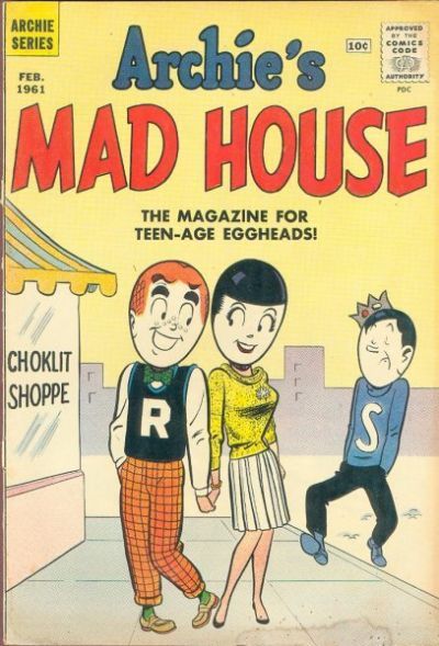 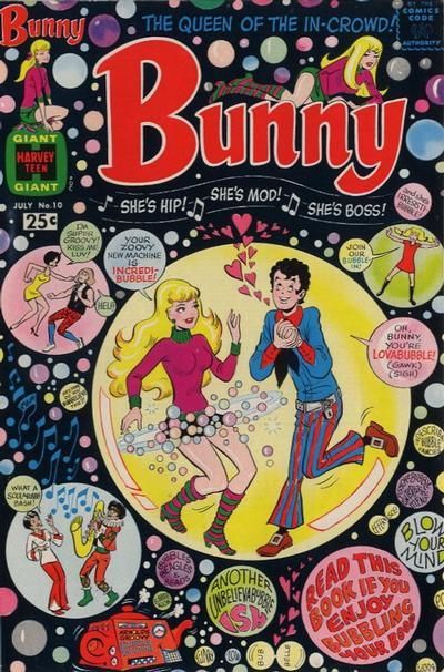 22. ACTION GIRL vs. AKIKO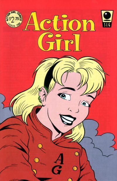 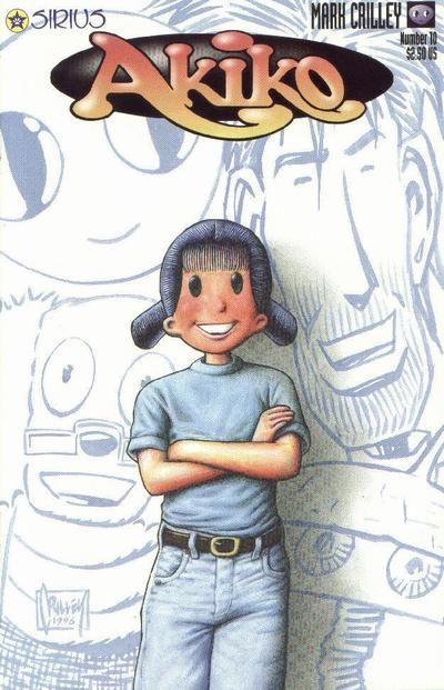 23. THE SPECTRE vs. CAPTAIN MARVEL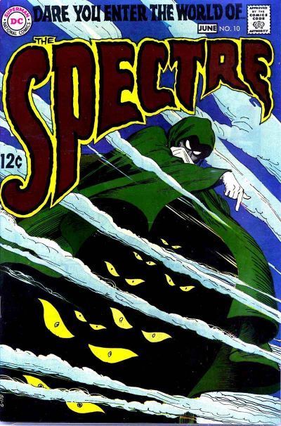 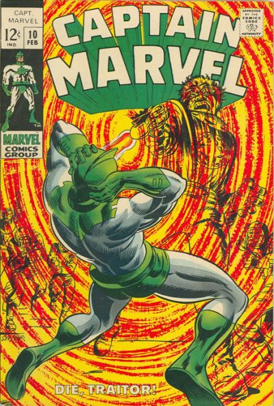 24. MYSTERIES OF UNEXPLORED WORLDS vs. UNUSUAL TALES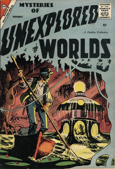 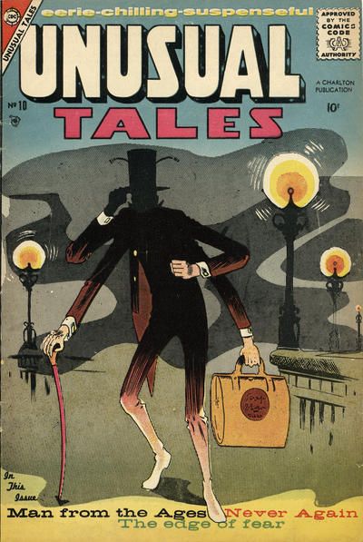
|
|
|
Re: The Tops in Tens!
|
Joined: Oct 2003
Posts: 83,423
Unseen, not unheard
|
|
Unseen, not unheard
Joined: Oct 2003
Posts: 83,423 |
21. Bunny. The egghead cover is surprisingly off putting
22. Action Girl is cute
23. Captain Marvel
24. Mysteries of Unexplored
|
|
|
Re: The Tops in Tens!
|
Joined: Sep 2013
Posts: 31,441
Tempus Fugitive
|
|
Tempus Fugitive
Joined: Sep 2013
Posts: 31,441 |
21. Bunny. For the artist drawing all those bubbles. It's as desperate looking as a Mad Mod Titans issue ish, luv.
22. Action Girl! 'coz..it's Action Girl! My new favoutie non-Legionnaire Legionnaire! uh.. the background colour goes nicely with her outfit? In other cover news.. yay Akiko! I have at least a couple of Akiko issues! I have no idea why! I have no idea what it was about! I can't stop using exclamation marks!
23. Spectre. Eyes in the cape! The Spectre: The friendly face (or at least eyes) of DC's god. Over at Marvel Jim Corrigan gets shot. "Eat that Corrigan!" oh wait...that isn't..ah, I've fallen for one of Teeds clever cover match ups. It's just lame Captain Marvel after all.
24. I can't decide! Too tough. Super-creepy alien ship, with alien shadow, appearing from the swamp depths (take that Swamp Thing!)or super-creepy possible insectoid person snatcher in a London fog (Take that...uh..Roachmill!)... Both cover logos are worked into the backgrounds well too. I'm going with Unexplored Worlds as that tree also works as a foreground too.
"...not having to believe in a thing to be interested in it and not having to explain a thing to appreciate the wonder of it."
|
|
|
Re: The Tops in Tens!
|
Joined: Jul 2003
Posts: 10,145
Terrifyingly On-Topic.
|
|
OP
Terrifyingly On-Topic.
Joined: Jul 2003
Posts: 10,145 |
17. NEW TEEN TITANS. Colorful AND horrifying. And with the framing, YOU, dear reader, are one of the colorful horrors. Ha!
18. JOE PALOOKA. Fun jitterbugging with South Pacific (?) flavor. Can not figure out that BOINNNG 'sound effect' on Humphrey. Quasars?
19. I'd like Leading a lot more if the background got sorted out. I'm fine with abstract, but it seems this is meant to show a place -- a beach? -- the sand and the sky should not blend together. While Super Friends has that less-detailed art style, the composition quite good -- first you see the Twins and the glowing case, then the Big 3 +2, THEN their shadows from the glow. THEN the villains even though they're in front! SUPER FRIENDS.
20. WONDER WOMAN.
21. BUNNY. I'm a sucker for all the bubbles and color. There's something about Madhouse, though.
22. AKIKO for a lil more visual interest
23. While I can appreciate the unusual effect on CM, it's gotta be THE SPECTRE.
24. AW YEAH SILENT & CREEPY. On UT, look at how you get bits of background detail, but much is obscured in some odd fog(s). Then on the other one, you see the boatman's surprise at this strange and beautiful thing that has suddenly appeared. And that partial frame of the tree!! MYSTERIES OF UNEXPLORED WORLDS.
|
|
|
|
Forums14
Topics21,020
Posts1,044,981
Legionnaires1,729
| |
Most Online53,886
Jan 7th, 2024
|
|
|
There are no members with birthdays on this day. |
|
|
Posts: 403
Joined: March 2012
|
|
|
|