posted
I actually managed to get two of these issues in a row of the Trigon story the first time around ... my access to comics as a kid seems inconsistent in retrospect.
Some of, if not, THE best art ever is on the front and insides of these issues ... I probably copied the scenes from these 1000 times, if not more, and still ... not as good as GP.
From: Ninja Land | Registered: Nov 2004
| IP: Logged |
I mentioned at the top of the thread that the blue "background" was very memorable for me, and I didn't remember it was Raven's cloak.
I think the yellow of the logo works nicely with the blue, but again...I wish the secondary logo color wasn't red!
Tara's head turning around was also memorable to me.
The Titans do not look concerned enough here!
I always thought that cloak thing was weird ... it looks cool but ... since GP always draws so real ... hyperreal ... the cloak just flattening out into the top of the cover just ... is strange to me ... my eyes do not compute from the hyper real to the abstract ...
From: Ninja Land | Registered: Nov 2004
| IP: Logged |
quote:Originally posted by Thriftshop Debutante: I can only speak for myself, but I read the "everyone has their own criteria" post as different strokes* for different folks/it's all good.
Maybe so, but I'm not sure why it was felt that I needed reminding of that fact.
In my experience the only times a person is told that "everyone has their own opinions" is when either -
A) they are a child and are unsure of how human interactions work; or B) they are an adult on a message board who's just written something another person has taken offence to, so that person reminds them of A).
Anyway, I'm over it. Moving on...
Saw this after I made the above post. Thanks...
You forgot another possibility. Maybe the person had just found out that the bones in their foot are collapsing in on itself the day before, and had been sent home from their job that day...possibly for the duration of the healing process. Maybe I was just trying to distract myself by coming on here and made a few random posts to get my mind off of things. Like the fact that if the treatment that they are doing on my foot does not work, I am looking at loosing it within a few years,
So sorry if it somehow offended you. This will be the last time I comment on it. It will also be the last time I say anything about one of your posts for a while.
What I wrote did not personally insult you. You crossed that line. So I will keep my childish responses and leave you the hell alone.
Dev - Em -
I'm sorry if I reacted too harshly to your post. And I'm sorry about your foot.
It seems like there is some misinterpretation all round here - you don't see how I can have taken offence to your post; and I don't see how you can have been personally insulted by what I wrote to TD, or what line it was that I crossed.
I definitely do apologise for not giving you the benefit of the doubt though.
I hope your foot gets better.
From: Australia | Registered: Dec 2003
| IP: Logged |
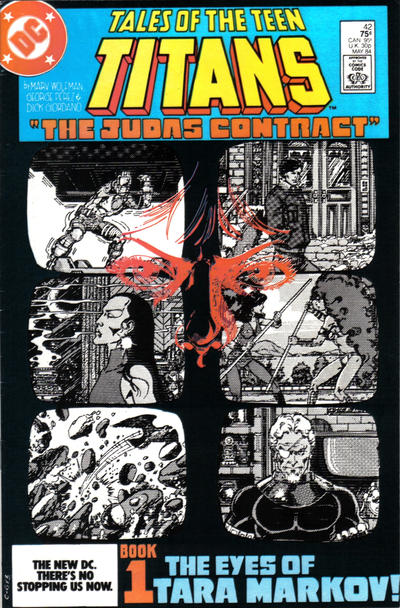
I didn't comment on the image of Tara on Book 1, which sounds about right for me. If you has asked me (before I purposely started staring at the covers for this thread) I could have described it fairly accurately: the six b/w grainy "monitor screens", the blue box at top, "The Eyes of Tara Markov!". I'd remember, but probably mention last, the partial, sketchy reflection of Tara -- not unlike how I am faintly reflected in my computer screen right now. It's a representation of her true motives -- definitely present, but not easily seen.
I like that Slade is one of the 6 images. He should be, as he is a major player here. Also: in the most literal sense Tara sees him, of course (the scene of the "image grab" is inside), but is she also watching him? We find out at the end of the issue that she wouldn't be the only one.
Registered: Jul 2003
| IP: Logged |
posted
I respond most to the Part 1 cover. The view-screens are very SLIVER and the title: "THE EYES OF TARA MARKOV!" is suitably creepy.
Tara violated the Titans in many awful ways.
This was really an historic storyarc. I hate that it is hard for me to get over Wolfman's missteps (Terry Long, Azrael, hating Duela Dent, a little thing called 'Crisis on Infinite Earths', etc) and allow myself to enjoy his TITANS run but there's no doubt Perez was at the top of his game in these days.
Of course, I am viewing the covers through my own lens (heh): as someone who had been reading for awhile so knew the story and players when buying the issues off the stands. (I arrived at the party around the same time as Terra, BTW. Hmmm.....) Also, I've known these covers since 1984. This doesn't change the covers at all but might have an impact on how I perceive them.
My vote for the cover most likely to attract someone who was/is unfamiliar with the Titans: Book 1. There are questions to be answered! These people (and, uh, a bird...?) are being watched, but why? Oh, wait, there's a reflection -- who is that??
And that turquoise really does pop next to the black.
Registered: Jul 2003
| IP: Logged |
posted
This is one of this rare stories that changes everything about a series. Nothing is ever truly the same--the characters, and even more, the tone of the series. The covers suitably have a grandiose feel of importance. Something major is going down.
From: If you don't want my peaches, honey... | Registered: Sep 2003
| IP: Logged |


 Hyperpath: Email this page to someone!
 Printer-friendly view of this topic | Subscribe To Topic