posted
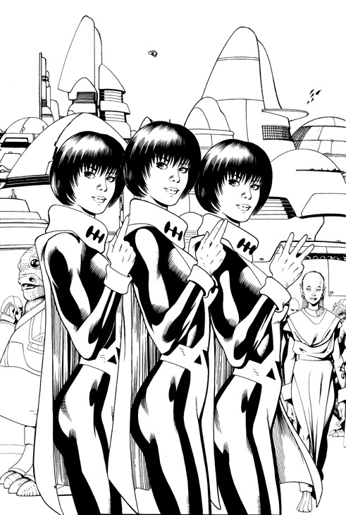
Hi All Once again, thanks to Nightcrawler, here are the black and white versions of #3's cover. Two variations and my suggestion as to where it should be cropped. Hope you like them!
posted
oooh, nice. Lu looks very good here. Kinda sweet but there's something in her eyes that lets you know she isn't a push over at all. I also like the weeny little group of flying figures in the background.
And I know others have already said it, but thank you Barry for posting stuff like this here. It's great to get a peek at the creative process and . I think, makes us fans feel that we're involved on so many levels. Makes me feel all special.
-------------------- Truth and Justice shall Prevail! (Unless Tamper Lad Screws it up...)
From: Manchester, UK | Registered: Jul 2003
| IP: Logged |
posted
Beautiful stuff as always - it's always lovely to see artwork without the colours every now and then just to appreciate the clean beauty of uncoloured works.
posted
I love these B&W previews. Thanks Barry! They help me catch little details I don't get in the color versions, like the above mentioned Legionnaires. I had to go back and look at the colored version to see them there. Much more distinct in your uncolored version.
From: Utah | Registered: Jul 2003
| IP: Logged |
posted
It's too bad that alien with the batwings got cropped out. I noticed him right away in that larger version. I also really like the architecture of the 31st century you've developed. Can't wait to see your alien architecture designs as well.
Thanks for sharing Barry
From: New York, NY | Registered: Jul 2003
| IP: Logged |
posted
You just wait until the comic comes out and we disect it panel by panel and character by character I think I spotted some things in the b/w preview but I'll have to wait for color to be sure.
Thanks Barry, that'll be added to the gallery of you're previews sometime today.


 Hyperpath: Email this page to someone!
 Printer-friendly view of this topic | Subscribe To Topic


![[Smile]](smile.gif)


![[Big Grin]](biggrin.gif)
![[Wink]](wink.gif)


