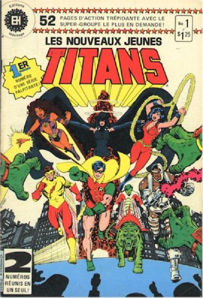
Let's inspect the covers of the hugely popular early-to-mid-80s Wolfram/Perez The New Teen Titans (volume 1). There are 40 monthly issues and 2 annuals.
The minor twist? There will be two random covers up at a time -- I've generated a number list to determine order of appearance.
Feel free to discuss the story inside, judge covers solely by their merit as standalone images (or not), recount personal stories concerning the covers/issues, remark upon the similarities or differences between the 2 covers or the entire group, or do the ever-popular WHICH ONE IS BETTER?
[ June 12, 2012, 04:23 PM: Message edited by: Leap Year Lord ]
Posted by Leap Year Lord on :
Click to enlarge!
Posted by Set on :
Omega Men! Woo. I always loved the Vega system, and it's complex internal cosmology/mythology!
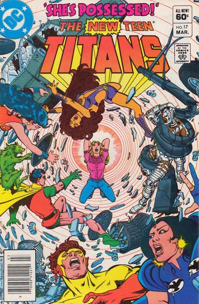
Interesting that the puff of smoke surrounding the teleporting Raven is red, and not her usual black.
And that's just so typical of a Teen Titan cover. Everyone is running forward, and Kid Flash, is, inexplicably, not running any faster than Robin. What good is super-speed if he can never get to the action before Robin?
(I know, I know, cover composition requires it, but still, it bugs me.)
Posted by Leap Year Lord on :
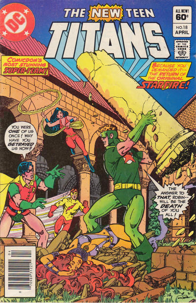
As was touched on a bit in the Judas Contract cover thread, Perez's Titans covers tended to be realistic, single-scene action shots. But make no mistake, there were stylized/abstract covers (or elements) too, and both of these qualify. 17 has no background, and 24 is a kind-of standard pinup "motion" shot with stylized, dramatic bookends.
Ten or twelve years ago, I snagged an extra copy of 17 from a bargain box. I may or may not have re-read the story, but there was something about the cover that had me keeping it on top of the pile until I later filed the lot away. I think it might have been the colors. The white background not only helps to highlight Frances but to set off the colors. Also, there's a reason that shirt (and the title) is pink and not red (Robin, WG), blue (Raven), or orange/purple (Starfire).
Several---but, again, not all---of the covers in the first few years had dialogue. Not here...wouldn't suit these two.
The 'bookends' of 24 are very striking, as is the white borders vs. black starfield-middle contrast. The motion shot, as I call it, is handsome but not very interesting to me. It's a promo shot with some Omega Men thrown in. Rehash of #1.
Posted by Set on :
Perez's art can be funny sometimes. When Raven went evil, her hairline receded and her eyebrows went all 'Spock,' and it's the same between Koriand'r and Komand'r. The 'good' one has a shorter nose and 'normal' eyebrows and a normal hairline, but Komand'r is eeeviiil, so she has to have the receding hairline and the eyebrows that go all the way up.
Phobia, of the Masters of Evil, had the same 'evil' face.
I suspect at least part of the shock of Terra's betrayal was that Perez didn't draw her with a his typical angular 'evil woman' face.
Posted by Blacula on :
^ I seem to remember an article where Perez said that Terra was specifically designed to appear cute and unthreatening so as to increase the shock of her later betrayal. Hence, the button-nose, buck-teeth, freckles, short stature, short blonde hair - everything about her was meant to invoke girl-next-door innocence.
---
Of these two covers, I prefer the Frances one. I love the pink concentric lines forcing you to focus on her at the centre of the cover, despite all the clutter and distraction surrounding her. The only thing I would change would be to move Startire a little bit higher since she's kinda crowding Frances' personal space where she is.
The Omega Men cover is nice too of course. Perez is probably the only artist I can think of who has never drawn something I haven't liked - especially during this period.
I wasn't a big fan of this Omega Men story though, from memory (it has been FOREVER since I read the Wolfman/Perez run so I have forgotten lots about it). But I remember that the Titans killed sentient aliens in this story (the Gordanians I think) and that never sat right with me.
It seems quaint to think of a time when heroes didn't kill but this was during it and I didn't like the rationale that 'it was war so they did what they had to do'. Super-heroes are meant to be better than that IMO. (That was another reason I wasn't a big fan of the Flash/Blackhawks issue of JMS' otherwise superlative Brave and Bold run.)
I get what Set is saying about Perez' 'evil female' facial features but looking at those profiles of Starfire and Blackfire and thinking back to Terra mentioned above just reminds me of how good Perez was at varying the facial features of his characters. Talents like that are what set him far above an artist like Barry Kitson for example who, though a nice artist, had one male face and one female face and about two different hairstyles to put on top of them.
Posted by Blacula on :
quote:Originally posted by Set: And that's just so typical of a Teen Titan cover. Everyone is running forward, and Kid Flash, is, inexplicably, not running any faster than Robin. What good is super-speed if he can never get to the action before Robin?
(I know, I know, cover composition requires it, but still, it bugs me.)
Just because a character can get to the action quicker than their teammates doesn't mean it's always wise to do so.
I've played Dungeons and Dragons long enough to know that those characters who run off and leave the safety of the group do so at their extreme peril.
Posted by Leap Year Lord on :
Posted by Set on :
quote:Originally posted by Blacula: Just because a character can get to the action quicker than their teammates doesn't mean it's always wise to do so.
I've played Dungeons and Dragons long enough to know that those characters who run off and leave the safety of the group do so at their extreme peril.
Oh, I totally agree, I just think it's funky how cover composition always requires Kid Flash (or the Flash) to be running at super-speed to catch up to where Robin or Cyborg (or Batman or Aquaman) already got to without super-speed.
Same with Raven, who always seems to be teleporting to just behind everyone else, as if it takes her longer to teleport somewhere than it takes everyone else to walk there.
I hear ya on the D&D though. In a game where the encounters are balanced to be a challenge for your entire group, running off alone is asking to be killed! (One reason why I've never been a fan of game mechanics that end up separating the group, like a flier or amphibious character in a party that doesn't all have that capability, or astral projectors, or cyber-deckers, or stealth-based characters, whatever.)
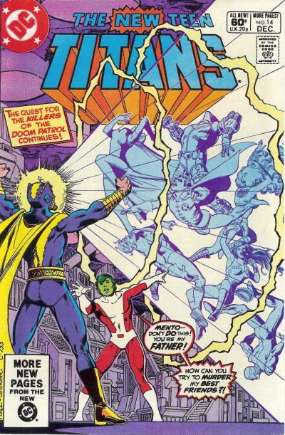
As for the cover above, I like the cover with Mento better. It's got some action and drama going on. The four faces of the new Masters of Evil doesn't really offer me anything.
[ June 12, 2012, 02:16 PM: Message edited by: Set ]
Posted by Leap Year Lord on :
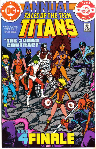
I can't help but compare 14 to the Judas Contract annual (which is Tales, not NTT, and has already been covered)
The "silent" annual cover is more compelling to me. I realize you can't really convey the DAD part in gestures, but there you go.
Posted by Power Boy on :
That crazy Mento ... It's like having Dr. Light as your father.
Posted by Power Boy on :
quote:Originally posted by Leap Year Lord: Click to enlarge!
This cover kicks nass!!!!
Posted by Leap Year Lord on :
quote:Originally posted by Power Boy: That crazy Mento ... It's like having Dr. Light as your father.
I was thinking of how Tiny Titans Raven is always mortified by her upbeat, Ned Flanders-esque (except that one thing) dad.
Posted by Leap Year Lord on :
29: this is the only cover to have a green DC Bullet -- three are black, and the rest are either red or blue. The green here can't be a coincidence, given the central character's costume. Did the colorist always pick the bullet color --- anyone know?
I had forgotten that Plasmus was on this cover. You'd think that looking like dude-shaped 200-pound lump of strawberry Tangy Taffy that had been left out in the sun would make one memorable, but not always.
The figurative "villains looming large" cover is common enough.
Posted by Leap Year Lord on :
Posted by Set on :
It's interesting how little the new Masters of Evil really 'stuck,' compared to, say, the Fearsome Five (Shimmer and Mammoth, or, at least, interpretations of them, as well as Psimon, can be seen in the new Young Justice cartoon, and Gizmo and a version of Jinx in the Teen Titans cartoon).
Plasmus showed up in the Teen Titans cartoon, but as more of a Clayface IV type character.
Phobia, Houngan and Warp just never seemed to gain any traction.
Posted by cleome45 on :
quote:Originally posted by Set: Perez's art can be funny sometimes. When Raven went evil, her hairline receded and her eyebrows went all 'Spock,' and it's the same between Koriand'r and Komand'r. The 'good' one has a shorter nose and 'normal' eyebrows and a normal hairline, but Komand'r is eeeviiil, so she has to have the receding hairline and the eyebrows that go all the way up.
Phobia, of the Masters of Evil, had the same 'evil' face.
I suspect at least part of the shock of Terra's betrayal was that Perez didn't draw her with a his typical angular 'evil woman' face.
And Teh Evol is also indicated by Komand'r's lack of a cute little WASPy uptilted nose. (Man, did that used to bug me back in the day!)
Posted by Leap Year Lord on :
quote:Originally posted by Set: It's interesting how little the new Masters of Evil really 'stuck,' compared to, say, the Fearsome Five...
Yeah, especially their name. They were the Brotherhood of Evil. (Masters = Marvel)
OK, I now know that the BOE name comes from the Silver Age and heaven knows I love me some SA, but COME ON. Who would call themselves the Brotherhood (or Masters) of Evil? Fearsome Five...maybe, okay.
Posted by cleome45 on :
[snip]
quote:Originally posted by Blacula:
...It seems quaint to think of a time when heroes didn't kill but this was during it and I didn't like the rationale that 'it was war so they did what they had to do'. Super-heroes are meant to be better than that IMO. (That was another reason I wasn't a big fan of the Flash/Blackhawks issue of JMS' otherwise superlative Brave and Bold run.)
OM itself had a great deal of gratuitous violence right from the start. Giffen said in some interview that he was trying to avoid the "ballet... beautiful" violence associated with Frank Miller's Daredevil. But his approach wasn't any more appealing to me than Miller's. It seemed more hokey than realistic.
One critic also complained of how Giffen and Slifer excessively ridiculed Broot's people for their pacifism, hammering the ridicule way beyond the pale in a scene where Broot's infant baby literally had his head blasted off. (DC has always loved the little children, hasn't it?) I agree that it was pretty obnoxious. There was a lot of self-congratulatory "edgy" junk like that, which made me drop the book about three issues in.
quote:...how good Perez was at varying the facial features of his characters. Talents like that are what set him far above an artist like Barry Kitson for example who, though a nice artist, had one male face and one female face and about two different hairstyles to put on top of them.
Well, he was better than most. Still, it's kind of irksome that because of the ugly woman = evil woman trope, he had to vary the faces of two characters who by rights could have plausibly looked much more similar than they did.
Posted by Set on :
quote:Originally posted by cleome45: And Teh Evol is also indicated by Komand'r's lack of a cute little WASPy uptilted nose. (Man, did that used to bug me back in the day!)
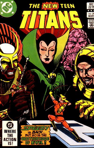
I love, love, love the Speedy cover. Roy Harper was my favorite character back then so to see him come back and handle himself against this really scary team was a real thrill for me.
I love the composition of the cover too. The villains looming large over the heroes may be a trope but I can't think of any off the top of my head so it seems original to me. I love the use of the heavy shadows too - it really makes the other colors pop.
Speaking of colors - I really like the choice on the Mento cover to color everyone but him and Changeling in light blue. It's an interesting choice and probably what makes that cover pop too.
As for this round -
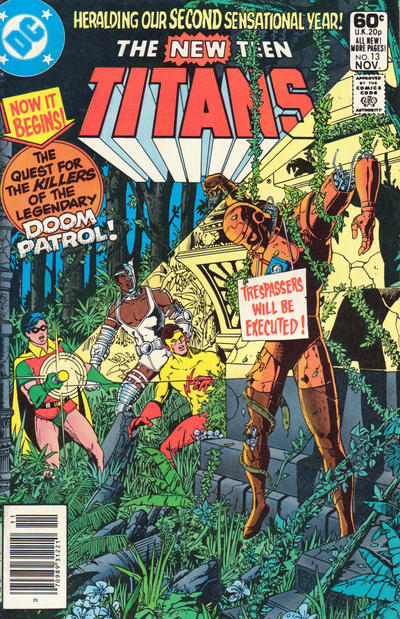
Oooohhh tough to decide. Probably two of the best overs in the run. I think I like the Robotman cover better because of the awesome sense of atmosphere it creates - the jungle at night setting, the decrepit temple or whatever that is, the torchlight falling on a disturbing scene - all give a sense that our three Titans are in a strange and scary situation. Plus the level of detail Perez puts into that jungle foliage is incredible.
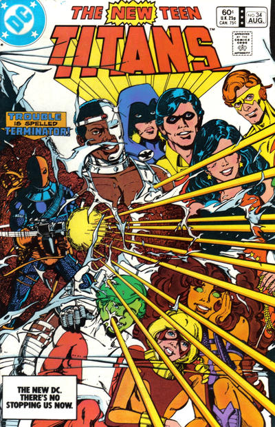
The Deathstroke cover is great too. Who doesn't love a nice happy scene being wrecked by the psycho villain?
Posted by Blacula on :
quote:Originally posted by cleome45:
quote:...how good Perez was at varying the facial features of his characters. Talents like that are what set him far above an artist like Barry Kitson for example who, though a nice artist, had one male face and one female face and about two different hairstyles to put on top of them.
Well, he was better than most. Still, it's kind of irksome that because of the ugly woman = evil woman trope, he had to vary the faces of two characters who by rights could have plausibly looked much more similar than they did. [/QB]
I definitely concede this point - for sisters, they really do look nothing alike. I wonder how differently Blackfire would have been received/portrayed if she had been Starfire's twin, and therefore didn't have Perez's "evil" features to inform much of her character?
Posted by Blacula on :
quote:Originally posted by Set: It's interesting how little the new Masters of Evil really 'stuck,' compared to, say, the Fearsome Five (Shimmer and Mammoth, or, at least, interpretations of them, as well as Psimon, can be seen in the new Young Justice cartoon, and Gizmo and a version of Jinx in the Teen Titans cartoon).
Plasmus showed up in the Teen Titans cartoon, but as more of a Clayface IV type character.
Phobia, Houngan and Warp just never seemed to gain any traction.
To me, the BoE always seemed like they'd stepped straight out of a horror comic into the Titans pages. Something about this team (as much as I love them - and I think their designs are some of the best Perez ever did) really disturbed me.
I wonder if that's why other writers have trouble finding a place for them? They seem a little cruel and ruthless for the more or less straight-forward super-hero world of the 80s.
Posted by Leap Year Lord on :
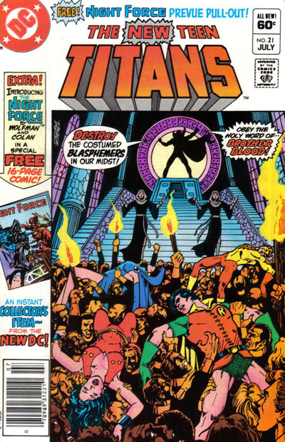
Another lady looming large while wearing green (with gold at the throat). I haven't read the issue, and the GCBD doesn't explain who the Flash cover gal is. The fist is probably "Bah! Curses!" but could be "Go Flash, get 'em!" The eyebrows however...yeah, those look like evil eyebrows.
I don't think there are any eyebrows as crazy-evil as Phobia, though.
Posted by Fanfic Lady on :
Maybe the Flash cover gal is angry because she bet on the opposing team.
Posted by Leap Year Lord on :
34: Slade blows apart the 'happy family' Titans picture although they don't know it but now we do
13: I also like the darkness although it doesn't quite match up. Beyond the thicket it looks like daylight, and even if the canopy of trees is very dense, would it be that dark? Also, for all the details of the foliage, the Titans' faces are somewhat nondescript, with Robin coming out cartoony.
I knew almost nothing about the Doom Patrol, so there was no emotional or nostalgic impact on that score.
Posted by Leap Year Lord on :
Posted by Blacula on :
I love the yellow and orange on the Dr Light cover. That must have really stood out on the newsstand.
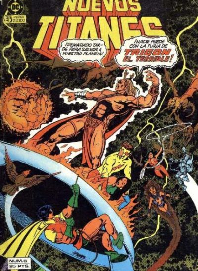
The Trigon one is a bit busy for me. It's hard to know where to direct the eye. I like the way Wally seems to be protecting Raven though. I always forget that those two had sort of a thing going at one time. That relationship was like a shooting star - bright and intense for a brief moment and then hard to remember once it was over.
Posted by Leap Year Lord on :
3: Blac, I agree that the yellow/orange really makes the cover stand out. It's not a common cover color combo, and not one that is necessarily a favorite of mine, but it is striking. This is the only black logo, and even though orange/black tends to go Halloweeny, it looks good. The line drawings are subtle but add a lot --- imagine the cover without them and it becomes too plain, I think.
6: Another interesting color thing, although I'm not sure if interesting = good or bad. When I pulled the image I thought it was a scan of a shopworn cover, showing wear in the way that dark covers do. Then I got out my hard copy and realized no, that's the gray cloudiness or energy or whatever.
Posted by Leap Year Lord on :
Regarding #3's color choices: see the original and a reprint with some changes to the art
Posted by Leap Year Lord on :
Here's the same for #6. Great Hera! It looks like space is choked with moss.
Posted by Blacula on :
Wow! I had no idea they changed the colours in foreign editions of comics. I wonder what... Romeo Tanghal (was that the NTT colorist?) thought of that.
As for these versions - the new Spanish version of #3 is UG.LY! Hate it.
I sort of don't mind the orange/brown background on #6 but Trigon really should have stayed his own red color since he's meant to be the main focus and shouldn't be melting into the background.
Posted by Fanfic Lady on :
Blacula, the NTT colorist was usually Adrienne Roy. Romeo Tanghal was George Perez's NTT inker.
Posted by Blacula on :
That's right! Thanks FL. I had all those names floating around in my head but couldn't remember who did what.
Posted by Power Boy on :
quote:Originally posted by Leap Year Lord:
I LOVE this cover ... as a kid it blew my mind ... that the cover was ripping off. Made it feel so much more real.
And ... the action INSIDE was also mind blowing, the fight scenes were so clever.
Posted by Leap Year Lord on :
Posted by Leap Year Lord on :
Posted by Blacula on :
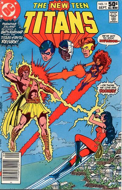
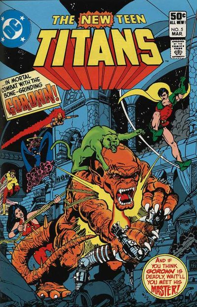
Hmmm. Both great covers but they don't stand out to me the way others by Perez do.
I think I'd have to say I prefer the Hyperion one because I'm a sucker for floating heads (though the fact that Wally's is slightly off-line bugs).
Posted by Set on :
Definitely the first one. It's got Paradise Island as a backdrop, and Kory and Donna fighting to 'save the ones they love' (which, presumably, are the boys watching from off-panel, making the boys the 'damsels in distress,' which is always fun!).
The second one does benefit from having the entire team present, even if, typically for a cover, the speedster, the fastest flier and the teleporter are, as usual, in the back, not having caught up with the lumbering cyborg or the teen acrobat...
What good is being able to run at a significant fraction of the speed of light if the kid who swings on a rope always gets there first? Posted by Leap Year Lord on :
I don't have any criticisms of these two, but I don't LOVE either one, either. I prefer the more detailed background of #5 ----somewhat like #13, which is also semi-"dark). I don't care that much for floating heads.
Did Hyperion and Trigon go to the same Villain Posing College?
Posted by Set on :
quote:Originally posted by Leap Year Lord: Did Hyperion and Trigon go to the same Villain Posing College?
Same outfit, more or less, too. Strappy thing across chest, mostly to hold the cape on. Some flowy cloth over the junk. Sandals.
You'd think being a god would come with a wardrobe allowance.
I wonder if Trigon the Terrible is related to Hagar the Horrible? Or possibly Iago the Inadmissible?
[ August 31, 2012, 04:51 AM: Message edited by: Set ]
Posted by Power Boy on :
Villains hate wearing underpants! why? Because they're EVIL! They probably like to start sentences with because as well!!! (and use excessive !!!!!!!!!! )
Posted by Leap Year Lord on :
I took another look at #5. I like the way the curved decorative beams give shape to the cover and frame the logo. I'm liking this one more.
Posted by Leap Year Lord on :
These have already been up, of course...just wanted to see the detailed, 'semi-dark' ones side by side.
Posted by Leap Year Lord on :
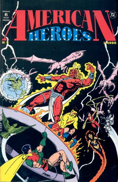
Great Hera! I haven't cared for the previous examples of changes in other editions, but I figured it was a matter of personal taste in color. But this is a JUST A MESS. Hyperion looks like a gold statue and why the HELL is the sky green??
Posted by Leap Year Lord on :
Posted by Set on :
Ooh, Nuevos Garfield can turn into orange cats, and not just green cats! Cool!
Foreshadowing of the NuDCU version of Beast Boy, who is reddish-orange? Or plaigerism! Dun, dun, dun-dun!
What the heck is Cyborg shooting out of his hand? He doesn't have energy blasters, just that sonic hand attachment thing... Huh.
Dark-haired Starfire is neat. I think I like the dark contrail better!
As for the previous cover, yellow Hyperion's lavender lightning is..., well, it just is. Yanno?
Posted by Set on :
Double post. Ignore the little man behind the curtain.
Posted by Power Boy on :
Cyborg used to have a finger laser ... not sure if all of his fingers can fire blasts. maybe.
quote:
Great Hera! I haven't cared for the previous examples of changes in other editions, but I figured it was a matter of personal taste in color. But this is a JUST A MESS. Hyperion looks like a gold statue and why the HELL is the sky green??[/QB]
The sky is only green for the top 90% of the page ... which is even more bizarre ... also I think Paradise Island needs to deal with their pollution problem as they have turned the ocean BROWN!?!
Posted by Jerry on :
All that, but they always seem to get Kid Flash's color scheme right. Sign of a "classic" costume?
Posted by superboymddjr on :
quote:Originally posted by Set: Ooh, Nuevos Garfield can turn into orange cats, and not just green cats! Cool!
Foreshadowing of the NuDCU version of Beast Boy, who is reddish-orange? Or plaigerism! Dun, dun, dun-dun!
Dark-haired Starfire is neat. I think I like the dark contrail better!
scroll back a little more and you will see the NTT #6 - they showed Changeling's red too...hmmm I dont know about the spanish covers...but I wonder if it is how he is being colored as red throughout the spanish books??
Posted by Leap Year Lord on :
Posted by Set on :
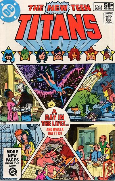
The box with the 'More New Pages from the new DC!' blurb on the #8 cover isn't quite big enough to block the view of He Who Shall Not Be Named, and therefore I hate it.
Hmm, Kory's hair was darker than I remember on that 1st issue. Must be that darn Nuevos Titans time-travel retcon thing again!
Posted by Leap Year Lord on :
As I've mentioned before, when I run across the house ads that feature the cover of #1 (against a black background, I think?) I stop and stare at it.
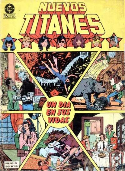
While looking at #8 to compose my comments, I realize that I can't remember what happens in the issue. This is one of the issues that I picked up long after I started reading Titans.
Posted by Quislet, Esq on :
#8 what I remember from the issue (with the cover jogging my memory) Terry Long is introduced with Donna introducing him to Starfire. Starfire does save the kid from being run over by a Central Park cab. Cyborg gets dumped by his pre-accident girlfriend and ends up meeting the kids with prosthetics & Sarah Sims. Changeling after talking with Cyborg chases away some punks trying to strip his expensive car. Raven uses her soul self to check out a local university, discovers terrorists planting bombs around campus, gathers them up, and races back to have her soul selfjoin with her body in the minute limit. She doesn't make it, but manages to avoid the dire results that she was told would happen. Wally has dinner with his parents (pre-Manhunter dad & alcholic mom) and his dad has him carve the roast seeing as he is now a man.
Posted by Jerry on :
Sigh. I feel sorry for everyone who missed buying issue #1 fresh off the stands on the day it was released. One of the high points in the life of a comic reader. Seriously.
Posted by Leap Year Lord on :
I can still buy #1 for the first time, anyway; I still don't own a copy. I *read* it fairly early on in a mass market paperback book that reprinted 1-3 (chopped up page-wise, black and white).
The back cover features the Titans' heads against stars, like #8.
Posted by Leap Year Lord on :
Posted by Jerry on :
Thank goodness Terra lost that head gear!
Posted by Blacula on :
quote:Originally posted by Leap Year Lord: I can still buy #1 for the first time, anyway; I still don't own a copy. I *read* it fairly early on in a mass market paperback book that reprinted 1-3 (chopped up page-wise, black and white).
The back cover features the Titans' heads against stars, like #8.
That book was my very first exposure to the Titans! Gosh - I had completely forgotten about it. I wonder where it is now?
My first exposure to pretty much the entire DCU was in black and white like that book actually, because that's how Australia reprinted DC comics. They did it totally randomly too so you might buy a comic that had the Titans on the cover and then you'd get an Omega Men or Atari Force or something as a back-up? Or you'd buy a JLA issue and there would be a Flash or Wonder Woman back-up. Murray Comics (as they were known here) were over-sized.
What's ironic is that I read and enjoyed so much of the DCU in black and white back then but now colour is so important to me - I would never buy one of those Showcase Essentials for example. Funny how things change.
Posted by Leap Year Lord on :
Gotta back up a little bit...
Well, OK. The French version is virtually identical. Nuevos' gray background isn't bad, but the buildings should not be the same color.
No, no, Nuevos!! Posted by Leap Year Lord on :
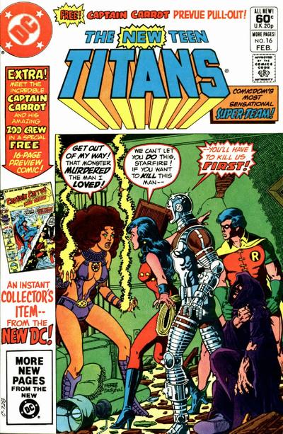
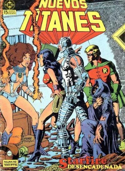
16: So DC siphoned 15-20% off the cover of their HOTTEST property to promote Captain Carrot. At least it wasn't MASK.
Shoved over + the "you'll have to go through us" = one of the least notable covers for me.
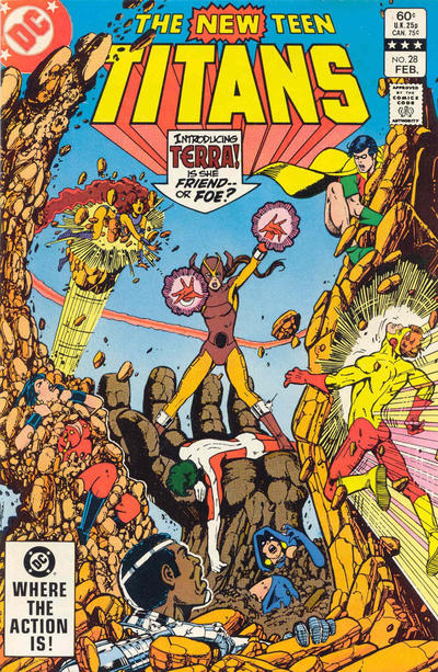
28. Yep, that first Terra costume had to go. I thought the ponytail thing was interesting...not the look, but the misdirection.
Another nice-looking cover, but not a particular favorite.
Lash, did ya see the Hero In Hand?
Posted by Leap Year Lord on :
Posted by Leap Year Lord on :
Posted by Dev - Em on :
Wait...what? Robins Blond elsewhere? Interesting.
Posted by Leap Year Lord on :

![[Smile]](smile.gif)
![[Poverty Lad]](graemlins/PovertyLad.gif)
![[Beast Boy - Gar Logan]](graemlins/BeastBoyII.gif)