|
0 members (),
38
Murran Spies, and
8
robots. |
|
Key:
Admin,
Global Mod,
Mod
|
|
 Previous Thread Previous Thread |
|
Next Thread 
|
|
 Folie à Twenty-Twos!
|
Joined: Jul 2003
Posts: 10,145
Terrifyingly On-Topic.
|
OP

Terrifyingly On-Topic.
Joined: Jul 2003
Posts: 10,145 |
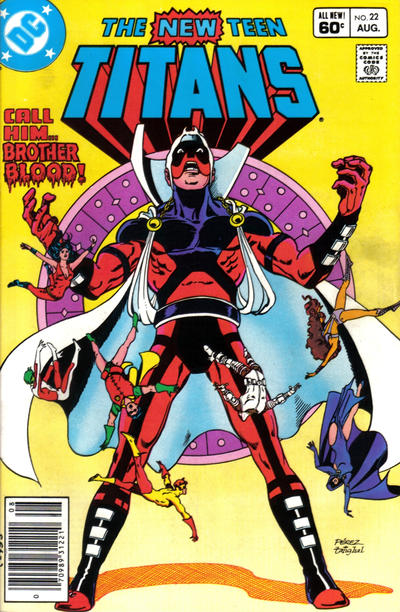
COVER MADNESS! Choose one per matchup -- no ties -- on your opinion of the cover merits alone. Click images to see larger versionsPrevious editions, for perusal and/or catch-up: Elevens, Twelves, Eights, Tens, Twenty-Nines, Eighteens, Fifteens, Fives, Nines, Seventeens, Nineteens, Sixteens, Sixes, Twenties1. TEEN TITANS vs. NEW TEEN TITANS   2. BIG TOWN vs. HOWDY DOODY   3. LEGION OF SUPER-HEROES vs. ELEKTRA   4. TRUE LIFE SECRETS vs. PICTORIAL ROMANCES  
|
|
|
Re: Folie à Twenty-Twos!
|
Joined: Dec 2009
Posts: 5,852
Independent Scholar
|
|
Independent Scholar
Joined: Dec 2009
Posts: 5,852 |
1. TEEN TITANS
2. BIG TOWN
3. LEGION OF SUPER-HEROES
4. TRUE LIFE SECRETS
Still "Fickles" to my friends.
|
|
|
Re: Folie à Twenty-Twos!
|
Joined: May 2013
Posts: 6,591
Wanderer
|
|
Wanderer
Joined: May 2013
Posts: 6,591 |
1. NEW TEEN TITANS - love the dramatic pose and the Titans relatively smaller and falling back
2. BIG TOWN - make me mildly curious to read it
3. ELECTRA - I want to vote LSH which is a good cover, but the pose and background and overall depth and detail of Elektra appeals to me more
4. PICTORIAL ROMANCES - neither are a big draw for me but number one feels fairly standard and I want to know what happens in number two, even if I hope it results in both characters getting their comeuppance.
|
|
|
Re: Folie à Twenty-Twos!
|
Joined: Jul 2003
Posts: 10,145
Terrifyingly On-Topic.
|
|
OP
Terrifyingly On-Topic.
Joined: Jul 2003
Posts: 10,145 |
5. X-MEN THE HIDDEN YEARS vs. FANTASTIC FOUR   6. FEATURE COMICS vs. THE FUNNIES   7. ANIMAL ANTICS vs. FUNNY FOLKS   8. HIT COMICS vs. BIG SHOT COMICS  
|
|
|
Re: Folie à Twenty-Twos!
|
Joined: Dec 2009
Posts: 5,852
Independent Scholar
|
|
Independent Scholar
Joined: Dec 2009
Posts: 5,852 |
5. X-MEN THE HIDDEN YEARS
6. THE FUNNIES
7. FUNNY FOLKS
8. HIT COMICS
Still "Fickles" to my friends.
|
|
|
Re: Folie à Twenty-Twos!
|
Joined: Jul 2003
Posts: 9,870
Wanderer
|
|
Wanderer
Joined: Jul 2003
Posts: 9,870 |
1. TEEN TITANS vs. NEW TEEN TITANS 2. BIG TOWN vs. HOWDY DOODY 3. LEGION OF SUPER-HEROES vs. ELECTRA 4. TRUE LIFE SECRETS vs. PICTORIAL ROMANCES 5. X-MEN THE HIDDEN YEARS vs. FANTASTIC FOUR 6. FEATURE COMICS vs. THE FUNNIES 7. ANIMAL ANTICS vs. FUNNY FOLKS 8. HIT COMICS vs. BIG SHOT COMICS
|
|
|
Re: Folie à Twenty-Twos!
|
Joined: Sep 2013
Posts: 31,456
Tempus Fugitive
|
|
Tempus Fugitive
Joined: Sep 2013
Posts: 31,456 |
1. Teen Titans. There's a story hook to it, that the fall of the New Teen Titans can't match. Nice vertical split between the worlds on original flavour titans too.
2. Big Town. Clever of the criminal mastermind to have been hiding out in the sports section of that newspaper all along. It's a Bee for effort for Howdy.
3. Electra for all the extra detail, that doesn't overwhelm the character. The steam rising to allow space for the story title gets points.
4. Pictorial. The domestic tension of the three of them living together, and probably all looking to bump the other two off at some point.
5. Fantastic Four. It looks like she was fired rather than the usual FF quitting. But there's more of a story, and family drama, than the X-Folks trundling off into a Sunfire effect.
6. The funnies. Nice to see the female character play the gag.
7. Funny Folks. While the other cover is good, Folks wins as it not only shows the guy trying to re-enact being at the game, but also that he never pays to get in.
8. Big Shot. For a bite already have been taken out of our lead, but also for the snow on the logo and it's angle offset against the slope the characters are on.
"...not having to believe in a thing to be interested in it and not having to explain a thing to appreciate the wonder of it."
|
|
|
Re: Folie à Twenty-Twos!
|
Joined: May 2013
Posts: 6,591
Wanderer
|
|
Wanderer
Joined: May 2013
Posts: 6,591 |
5. X-MEN THE HIDDEN YEARS - I was temoted to give it to F4 because the cover says something whereas the X-Men doesn't, but artistically the X-Men wins out.
6. THE FUNNIES - standing back I prefer Feature as Funnies seems a bit bland but it does a much better job of portraying the joke. Also I don't want that cop on my beat.
7. FUNNY FOLKS - for the better joke. Made me snort.
8. HIT COMICS - great visual imagery (and bonus points for that image on "Hit" comics.
|
|
|
Re: Folie à Twenty-Twos!
|
Joined: Jul 2003
Posts: 10,145
Terrifyingly On-Topic.
|
|
OP
Terrifyingly On-Topic.
Joined: Jul 2003
Posts: 10,145 |
1. TEEN TITANS. NTT is well-done -- bonus points for BB's Big Dot motif. But TT is exciting! The contrast between the 2 sides, the logo slashing through at an angle! The right kind of extra. PS on the NTT: 2. BIG TOWN. The bee blends in on HD, making him look like a crazed butterfly guy. Odd. 3. ELEKTRA. I don't like either central figure, but the pearlescent effect of E's white costume stands out, and that credenza or whatever. Hmm, now I'm thinking about how back when I was getting into comics in the 80s that I didn't anticipate talking to people on computers about fictional furniture. I think Elektra was dead at the time, which leads us to.... 4. There's just too much to unpack on True Life Secrets, even apart form the Charlton tendency to apply makeup like a six-year-old. Not that PICTORIAL ROMANCES is a default win, oh no. That's MATT BAKER!! And you want to read that story!! Both comics are in the public domain and can be read at the Digital Comic Museum: True life Secrets Pictorial Romances. Do the covers reflect the contents? Well....
|
|
|
Re: Folie à Twenty-Twos!
|
Joined: Jul 2003
Posts: 10,145
Terrifyingly On-Topic.
|
|
OP
Terrifyingly On-Topic.
Joined: Jul 2003
Posts: 10,145 |
5. Yep, I'm giving it to FANTASTIC FOUR over the X-men though FF is pullling an X-men ( 138). I like the colors more. 6. FEATURE COMICS. The more-or-less same gag isn't much. Feature gives you a package to look at, anyway. 7. ANIMAL ANTICS.8. BIG SHOT by default. I don't like the figure style on Hit.
|
|
|
Re: Folie à Twenty-Twos!
|
Joined: Jul 2003
Posts: 10,145
Terrifyingly On-Topic.
|
|
OP
Terrifyingly On-Topic.
Joined: Jul 2003
Posts: 10,145 |
9. LOVELESS vs. DAZZLER   10. LEGION OF SUPER-HEROES vs. GODLAND   11. X-FACTOR vs. GANG BUSTERS   12. DOOM PATROL vs. BOOSTER GOLD  
|
|
|
Re: Folie à Twenty-Twos!
|
Joined: May 2013
Posts: 6,591
Wanderer
|
|
Wanderer
Joined: May 2013
Posts: 6,591 |
9. DAZZLER - just perosnal taste. Dazzler is pretty standard and Loveless is innovative but it just doesn't appeal to me.
10. LEGION OF SUPER-HEROES - Great mix of faces. Godland is okay but that's all.
11. GANG BUSTERS - I was going to go with X-Factor even though it isn't one of my favourite Walt Simonson covers but then I saw the story Gang Busters was telling so well.
12. DOOM PATROL - tough one, both great covers. Pretty much a coin toss but Doom Patrol is perhaps a little more intriguing
|
|
|
Re: Folie à Twenty-Twos!
|
Joined: Jul 2003
Posts: 10,145
Terrifyingly On-Topic.
|
|
OP
Terrifyingly On-Topic.
Joined: Jul 2003
Posts: 10,145 |
9. DAZZLER. I think I'm in the same general space as stile. I probably like the art on Loveless better, but I like the bright-n-shiny on the (nothing special) Dazzler cover more at the moment.
10. GODLAND. I don't know what the LSH cover is trying to tell me AND I'VE READ IT.
11. X-FACTOR. Them funky-flexin phalanges!
12. Despite the fact that of the two I'd probably read Doom Patrol, BOOSTER GOLD image is sharper.
|
|
|
Re: Folie à Twenty-Twos!
|
Joined: Dec 2009
Posts: 5,852
Independent Scholar
|
|
Independent Scholar
Joined: Dec 2009
Posts: 5,852 |
9. DAZZLER
10. GODLAND
11. X-FACTOR
12. DOOM PATROL
Still "Fickles" to my friends.
|
|
|
 Re: Folie à Twenty-Twos!
|
Joined: Jul 2003
Posts: 12,947
Don't Stop Peelieving
|
|
Don't Stop Peelieving
Joined: Jul 2003
Posts: 12,947 |
Sidebar: Not having easy access to my copy of the Baxter LSH 22 (see: Lazy Hippie), who is the character slice shown between Universo and Dawnstar???
|
|
|
Re: Folie à Twenty-Twos!
|
Joined: Jul 2003
Posts: 40,330
Trap Timer
|
|
Trap Timer
Joined: Jul 2003
Posts: 40,330 |
Sidebar: Not having easy access to my copy of the Baxter LSH 22 (see: Lazy Hippie), who is the character slice shown between Universo and Dawnstar??? That's super-memorable Legion villain The Restorer!
|
|
|
 Re: Folie à Twenty-Twos!
|
Joined: Jul 2003
Posts: 12,947
Don't Stop Peelieving
|
|
Don't Stop Peelieving
Joined: Jul 2003
Posts: 12,947 |
...Yeah, I got nothing. Definitely not a character I remember.  Thanks, though! 
|
|
|
Re: Folie à Twenty-Twos!
|
Joined: Sep 2013
Posts: 31,456
Tempus Fugitive
|
|
Tempus Fugitive
Joined: Sep 2013
Posts: 31,456 |
9. Loveless. Cons on the run, an escape car ready. But at each others throats. Is it over loot? Escape plans? More of a story than some costumes hitting each other (although it was referenced when they were both on the team together).
10. Godhead. A mammoth Kirby artefact in space is going to have some cosmic backstory. Legion cover not at all bad though.
11. Gangbusters. Crime's fingerman has a giant finger. Watch Gim Allon secure election victory for his mom, through any means necessary.
12. Doom Patrol. Cliff's head is reflective, while Termy's is not. Plus the resigned pose compared to acme action one.
"...not having to believe in a thing to be interested in it and not having to explain a thing to appreciate the wonder of it."
|
|
|
Re: Folie à Twenty-Twos!
|
Joined: Sep 2013
Posts: 31,456
Tempus Fugitive
|
|
Tempus Fugitive
Joined: Sep 2013
Posts: 31,456 |
...Yeah, I got nothing. Definitely not a character I remember. Thanks, though! You remember. Rokk brings back lots of damaged 20th century furniture back after fighting Brimstone in Legends, and passes it all to The Restorer in an all non action issue of Baxter Legion.
"...not having to believe in a thing to be interested in it and not having to explain a thing to appreciate the wonder of it."
|
|
|
Re: Folie à Twenty-Twos!
|
Joined: Jul 2003
Posts: 40,330
Trap Timer
|
|
Trap Timer
Joined: Jul 2003
Posts: 40,330 |
...Yeah, I got nothing. Definitely not a character I remember. Thanks, though! You remember. Rokk brings back lots of damaged 20th century furniture back after fighting Brimstone in Legends, and passes it all to The Restorer in an all non action issue of Baxter Legion. That sounds more interesting than the actual story!
|
|
|
Re: Folie à Twenty-Twos!
|
Joined: Jul 2003
Posts: 10,145
Terrifyingly On-Topic.
|
|
OP
Terrifyingly On-Topic.
Joined: Jul 2003
Posts: 10,145 |
Were the real clues here all along?
|
|
|
Re: Folie à Twenty-Twos!
|
Joined: Jul 2003
Posts: 10,145
Terrifyingly On-Topic.
|
|
OP
Terrifyingly On-Topic.
Joined: Jul 2003
Posts: 10,145 |
And what about this guy : 
|
|
|
Re: Folie à Twenty-Twos!
|
Joined: Jul 2003
Posts: 10,145
Terrifyingly On-Topic.
|
|
OP
Terrifyingly On-Topic.
Joined: Jul 2003
Posts: 10,145 |
13. MAGIC COMICS vs. DON WINSLOW OF THE NAVY   14. OZARK IKE vs. CHILI   15. WORLD'S FINEST COMICS vs. COMIC CAVALCADE   16. MY LITTLE MARGIE vs. KATY KEENE FASHION BOOK  
|
|
|
Re: Folie à Twenty-Twos!
|
Joined: Jul 2003
Posts: 9,870
Wanderer
|
|
Wanderer
Joined: Jul 2003
Posts: 9,870 |
9. LOVELESS vs. DAZZLER 10. LEGION OF SUPER-HEROES vs. GODLAND 11. X-FACTOR vs. GANG BUSTERS 12. DOOM PATROL vs. BOOSTER GOLD 13. MAGIC COMICS vs. DON WINSLOW OF THE NAVY 14. OZARK IKE vs. CHILI 15. WORLD'S FINEST COMICS vs. COMIC CAVALCADE 16. MY LITTLE MARGIE vs. KATY KEENE FASHION BOOK
|
|
|
Re: Folie à Twenty-Twos!
|
Joined: Dec 2009
Posts: 5,852
Independent Scholar
|
|
Independent Scholar
Joined: Dec 2009
Posts: 5,852 |
13. MAGIC COMICS
14. OZARK IKE
15. COMIC CAVALCADE
16. KATY KEENE FASHION BOOK
Still "Fickles" to my friends.
|
|
|
Re: Folie à Twenty-Twos!
|
Joined: Sep 2013
Posts: 31,456
Tempus Fugitive
|
|
Tempus Fugitive
Joined: Sep 2013
Posts: 31,456 |
13. Don Winslow. The rope logo and the smoke looks at least a bit like smoke.
14. Ozark Ike. It has charm while Chili clearly needs to spend time on the hussy thread.
15. Comic Cavalcade. A solid gag, although Supes, Bats and Endangered Child Lad comparing their autographs of Leigon Worlders brings back memories. Oddly, they aren't my memories.
16. Katy Keene. There's a poem on it. Also the chance that her legs aren't long enough to touch the ground on the cover. That means there's sci fi action when she flies off on the hoverboard that's under there, with the fashion samples.
"...not having to believe in a thing to be interested in it and not having to explain a thing to appreciate the wonder of it."
|
|
|
Re: Folie à Twenty-Twos!
|
Joined: May 2013
Posts: 6,591
Wanderer
|
|
Wanderer
Joined: May 2013
Posts: 6,591 |
13. DON WINSLOW OF THE NAVY Reasonable dynamic cover for its age. The other is just confusing to me - but I suppose that's appropriate to magic.
14. OZARK IKE Mildly amusing and still acceptable today. Chilli doesn't look that great to modern eyes.
15. COMIC CAVALCADE Both not bad. Took me a minute to get the autographs bit on WFC but I like how there is more going on in CC and the kids looking amazed at the heroes while they enjoy the show.
16. KATY KEENE FASHION BOOK Not being a big fashion guy, I prefer the joke in Margie, but considering the audience they are trying to attract I think KK does a better job.
|
|
|
Re: Folie à Twenty-Twos!
|
Joined: Jul 2003
Posts: 10,145
Terrifyingly On-Topic.
|
|
OP
Terrifyingly On-Topic.
Joined: Jul 2003
Posts: 10,145 |
13. Hey, who picks this crap? DON WINSLOW makes sense, anyway.
14. OZARK IKE.
15. COMIC CAVALCADE. Cute!
16. MY LITTLE MARGIE because I prefer the dress!
|
|
|
Re: Folie à Twenty-Twos!
|
Joined: Jul 2003
Posts: 10,145
Terrifyingly On-Topic.
|
|
OP
Terrifyingly On-Topic.
Joined: Jul 2003
Posts: 10,145 |
17. SUPERMAN (1943) vs. SUPERMAN (1988)   18. SENSATION COMICS vs. PLANET COMICS   19. AQUAMAN vs. PLASTIC MAN   20. DEADLY CLASS vs. OUTCAST  
|
|
|
Re: Folie à Twenty-Twos!
|
Joined: Dec 2009
Posts: 5,852
Independent Scholar
|
|
Independent Scholar
Joined: Dec 2009
Posts: 5,852 |
17. SUPERMAN (1943)
18. SENSATION COMICS
19. AQUAMAN
20. OUTCAST
Still "Fickles" to my friends.
|
|
|
Re: Folie à Twenty-Twos!
|
Joined: Sep 2013
Posts: 31,456
Tempus Fugitive
|
|
Tempus Fugitive
Joined: Sep 2013
Posts: 31,456 |
17. Superman of the forties. The Kryptonite glow of the later figure, yet still wearing a Supes costume and a hood is interesting. But Teeds has taught me the value of that golden age cover genre of characters as puppet masters. I quite like the art and the S on the crime wrestling outfit.
18. Sensation. Planet has the standard damsel-alien-hero-other planet-ray gun components, but I'm not taken with the art. Sensation wins points for the tentacle creating a border around the inset. And how does this underwater scene connect with The Cheetah's Paws? That, and a classic logo for the win.
19. Plastic Man. Arthur is going to be shocked when both Meras make him dedded for being really boring. I prefer the Aqua-art, but there's something about the Plas' close up face off that gets the win.
20. Outcast. Nice logo, good snowy art and there's something odd in those footprints. Elsewhere moody, cool kids bore me senseless, hopefully not resulting in me being buried in a future cover.
"...not having to believe in a thing to be interested in it and not having to explain a thing to appreciate the wonder of it."
|
|
|
Re: Folie à Twenty-Twos!
|
Joined: May 2013
Posts: 6,591
Wanderer
|
|
Wanderer
Joined: May 2013
Posts: 6,591 |
17. SUPERMAN (1988) This one was pretty tricky. That is a classic Byrne cover and I was collecting at the time so own it. The style of it is also excellent. I will not comment on the story because this is covers alone. OTOH the Forties cover is quite clever and different from most. Seeing Superman playing puppet master to gangsters beating each other up (and thoroughly enjoying himself to boot) is something I have never seen before. In the end I went with the Eighties purely for personal nostalgia.
18. SENSATION COMICS Cool design with the multiple images and the octopus arms forming part of the bubble frame.
19. PLASTIC MAN AM is interesting enough but fairly standard but PM is intriguing with how it draws the two doubles.
20. OUTCAST Both good covers but the style of the figure walking into the distance with his footprints in the snow becoming demonic really grips you, or at least it grips me).
|
|
|
Re: Folie à Twenty-Twos!
|
Joined: Jul 2003
Posts: 9,870
Wanderer
|
|
Wanderer
Joined: Jul 2003
Posts: 9,870 |
17. SUPERMAN (1943) vs. SUPERMAN (1988) 18. SENSATION COMICS vs. PLANET COMICS 19. AQUAMAN vs. PLASTIC MAN 20. DEADLY CLASS vs. OUTCAST
|
|
|
Re: Folie à Twenty-Twos!
|
Joined: Jul 2003
Posts: 10,145
Terrifyingly On-Topic.
|
|
OP
Terrifyingly On-Topic.
Joined: Jul 2003
Posts: 10,145 |
17. SUPERMAN (1988) has intrigue and a great limited palette! GA Supes may or may not have anything to do with the contents, is kinda dingy in comparison -- it's no Sensation.. Speaking of... 18. SENSATION COMICS!. I don't think I understand exactly what's going on here, but I don't care. That octopus! The Planet art style is mildly unpleasant. 19. AQUAMAN. Mera + Mera > 2 Eels. 20. We've seen similar concept/s before. I like the uncommon pink DC background with the monochrome, and the figure style. But once you more than glance at OUTCAST's footprints....
|
|
|
Re: Folie à Twenty-Twos!
|
Joined: Jul 2003
Posts: 10,145
Terrifyingly On-Topic.
|
|
OP
Terrifyingly On-Topic.
Joined: Jul 2003
Posts: 10,145 |
21. QUASAR vs. THE THING   22. MOON KNIGHT vs. BLUE DEVIL   23. ANIMOSITY vs. REVIVAL   24. EAST OF WEST vs. FAIREST  
|
|
|
Re: Folie à Twenty-Twos!
|
Joined: Sep 2013
Posts: 31,456
Tempus Fugitive
|
|
Tempus Fugitive
Joined: Sep 2013
Posts: 31,456 |
21. Tougher than it looks. I'm troubled by the small circumference of that planetoid on The Thing. Too small for an atmosphere? If so, how can he be speaking? Perhaps he wrote out giant word balloons with his final breaths, and they hover there in the vacuum. Quasar gets points for having Death replace the normal figure in the bottom left of Marvel covers. But Thing wins due to having some cover angst.
22. Blue Devil. Ties in the cover art with the story. Also gives you the nod that it's a humourous title. Moon Knight is safe. The thugs are about to argue over why one of them gets a sophisticated machine gun, while the others just have sticks. Interesting that Knighty has such a large mirror. Do all super heroes have one, so they can check their costumes before going out to avenge the night? Whoever needs to avenge any part of the day is a bit odd.
23. Revival. More haunting than paw blobs.
24. Fairest. East of West is nicely designed. But it's not touching the I Was A Gun Moll For The Rat King story on the other cover. Nice to see Shawn McManus there too.
"...not having to believe in a thing to be interested in it and not having to explain a thing to appreciate the wonder of it."
|
|
|
Re: Folie à Twenty-Twos!
|
Joined: May 2013
Posts: 6,591
Wanderer
|
|
Wanderer
Joined: May 2013
Posts: 6,591 |
21. THE THING The art rally emphasises the felling of being alone
22. MOON KNIGHT BD is mildly funny and the money flying out at the reader is good but the goons stepping out of the mirrors from the top down perspective really grabs you
23. REVIVAL I didn't seethe paw print at first but the deer's staring eyes get to me
24. FAIREST Rats! Why did it have it be rats! They have always been a bit scary since reading 1984, and they're use here is creepy.
|
|
|
Re: Folie à Twenty-Twos!
|
Joined: Dec 2009
Posts: 5,852
Independent Scholar
|
|
Independent Scholar
Joined: Dec 2009
Posts: 5,852 |
21. QUASAR
22. MOON KNIGHT
23. ANIMOSITY
24. FAIREST
Still "Fickles" to my friends.
|
|
|
Re: Folie à Twenty-Twos!
|
Joined: Jul 2003
Posts: 10,145
Terrifyingly On-Topic.
|
|
OP
Terrifyingly On-Topic.
Joined: Jul 2003
Posts: 10,145 |
21. QUASAR. The background is sharp! 22. BLUE DEVIL looks fun and the coins coming at ya are great. Over on Moon Knight, the WTF is the lack of WTF. It's a Sienkiewicz rather than a SIENKIEWICZ. 23. REVIVAL. More of a default. I can't say it doesn't have something, but I have a feeling I've seen the concept before. 24. Speaking of previously seen concepts: 5.52. FAIREST.
|
|
|
Re: Folie à Twenty-Twos!
|
Joined: Jul 2003
Posts: 10,145
Terrifyingly On-Topic.
|
|
OP
Terrifyingly On-Topic.
Joined: Jul 2003
Posts: 10,145 |
25. WONDER WOMAN vs. BOY COMMANDOS   26. GEORGIE AND JUDY vs. PATSY WALKER   27. NOVA vs. THE INVINCIBLE IRON MAN   28. SPREAD vs. THE BEAUTY  
|
|
|
Re: Folie à Twenty-Twos!
|
Joined: Jul 2003
Posts: 9,870
Wanderer
|
|
Wanderer
Joined: Jul 2003
Posts: 9,870 |
21. QUASAR vs. THE THING 22. MOON KNIGHT vs. BLUE DEVIL 23. ANIMOSITY vs. REVIVAL 24. EAST OF WEST vs. FAIREST 25. WONDER WOMAN vs. BOY COMMANDOS 26. GEORGIE AND JUDY vs. PATSY WALKER 27. NOVA vs. THE INVINCIBLE IRON MAN 28. SPREAD vs. THE BEAUTY
|
|
|
Re: Folie à Twenty-Twos!
|
Joined: May 2013
Posts: 6,591
Wanderer
|
|
Wanderer
Joined: May 2013
Posts: 6,591 |
25. BOY COMMANDOS WW is ok but average whereas the use of the chess board and threat is more interesting to me.
26. PATSY WALKER This is bascially a tie but PW appeals slightly more - for colour? arrangement? the kids managed to get together? something.
27. NOVA Interesting recruitment poster idea wheras I don't know what is going on with the abstract IM. I would probably pick IM if it were up against an average super-hero cover.
28. SPREAD Neither really appeal to me but there is a little humour in Spread.
|
|
|
Re: Folie à Twenty-Twos!
|
Joined: Dec 2009
Posts: 5,852
Independent Scholar
|
|
Independent Scholar
Joined: Dec 2009
Posts: 5,852 |
25. WONDER WOMAN
26. PATSY WALKER
27. NOVA
28. THE BEAUTY
Still "Fickles" to my friends.
|
|
|
Re: Folie à Twenty-Twos!
|
Joined: Jul 2003
Posts: 10,145
Terrifyingly On-Topic.
|
|
OP
Terrifyingly On-Topic.
Joined: Jul 2003
Posts: 10,145 |
25. WONDER WOMAN although it's not HG Peter's most exciting cover. BC coloring is harsh, offputting. ( GCD says the BC cover is by CURT SWAN and I just don't see it.) 26. GEORGIE AND JUDY because I prefer the red to the yellow. 27. IRON MAN28. THE BEAUTY. I'd likely pick off both off the rack to check them out, though.
|
|
|
Re: Folie à Twenty-Twos!
|
Joined: Jul 2003
Posts: 10,145
Terrifyingly On-Topic.
|
|
OP
Terrifyingly On-Topic.
Joined: Jul 2003
Posts: 10,145 |
29. KERRY DRAKE DETECTIVE CASES vs. X-MEN   30. ASTRO CITY vs. BLACK SCIENCE  31. ALL-FLASH vs. JEANIE   32. LOVE LETTERS vs. LOVE DIARY  
|
|
|
Re: Folie à Twenty-Twos!
|
Joined: Jul 2003
Posts: 9,870
Wanderer
|
|
Wanderer
Joined: Jul 2003
Posts: 9,870 |
29. KERRY DRAKE DETECTIVE CASES vs. X-MEN 30. ASTRO CITY vs. BLACK SCIENCE 31. ALL-FLASH vs. JEANIE 32. LOVE LETTERS vs. LOVE DIARY
|
|
|
Re: Folie à Twenty-Twos!
|
Joined: Dec 2009
Posts: 5,852
Independent Scholar
|
|
Independent Scholar
Joined: Dec 2009
Posts: 5,852 |
29. KERRY DRAKE DETECTIVE CASES
30. ASTRO CITY
31. JEANIE
32. LOVE LETTERS
Still "Fickles" to my friends.
|
|
|
Re: Folie à Twenty-Twos!
|
Joined: May 2013
Posts: 6,591
Wanderer
|
|
Wanderer
Joined: May 2013
Posts: 6,591 |
29. KERRY DRAKE DETECTIVE CASES I know it has been done many times but this leaping through the page is still more interesting than the very standard X-Men cover.
30. BLACK SCIENCE AC is beautifully painted but just too much red.
31. ALL-FLASH I just don't get Jeannie. Are they playing a (very expensive) practical joke on her dad, or are they stealing his actual money tree or what?
32. LOVE DIARY Wow. What a coincidence that two different magazines both use one of two mirror identical twins. Amazing. "Who am I" and "My Hidden Past" indeed.
|
|
|
Re: Folie à Twenty-Twos!
|
Joined: Jul 2003
Posts: 10,145
Terrifyingly On-Topic.
|
|
OP
Terrifyingly On-Topic.
Joined: Jul 2003
Posts: 10,145 |
29. KERRY DRAKE DETECTIVE CASES gives us names on the dramatic personae. Over in X-men, they gots "yesteryear's most sensational supervillains!" Yeah, sure thing, pal. 30. ASTRO CITY is what it says on the cover, but we know that's retired Gim & Yera on Ventura, right? Right? Can't say the other isn't eyecatching -- the empress wants to be seen (but will not grant audience). 31. JEANIE even though the gag is muddled.  32. 32. I typically do not use majority-photo covers in these matchups, but I think you can see why I made an exception here. (Not that this is exceptional, mind you.) Although I might like the LD image a touch better, the LOVE LETTERS logo is great and gives it the win.
|
|
|
Re: Folie à Twenty-Twos!
|
Joined: Jul 2003
Posts: 10,145
Terrifyingly On-Topic.
|
|
OP
Terrifyingly On-Topic.
Joined: Jul 2003
Posts: 10,145 |
33. BLUE BEETLE vs. DOCTOR WHO  34. GENERATION X vs. JUSTICE   35. SPOOKY vs. THE SWORD   36. AIR vs. GOTHAM CITY SIRENS  
|
|
|
Re: Folie à Twenty-Twos!
|
Joined: May 2013
Posts: 6,591
Wanderer
|
|
Wanderer
Joined: May 2013
Posts: 6,591 |
33. DOCTOR WHO Pretty even but it's the Doctor!
34. JUSTICE Give me a hug Daddy!
35. THE SWORD Nice posing
36. AIR Both good, just something about Air appeals to me.
|
|
|
Re: Folie à Twenty-Twos!
|
Joined: Dec 2009
Posts: 5,852
Independent Scholar
|
|
Independent Scholar
Joined: Dec 2009
Posts: 5,852 |
33. DOCTOR WHO
34. JUSTICE
35. SPOOKY
36. AIR
Still "Fickles" to my friends.
|
|
|
Re: Folie à Twenty-Twos!
|
Joined: Sep 2013
Posts: 31,456
Tempus Fugitive
|
|
Tempus Fugitive
Joined: Sep 2013
Posts: 31,456 |
25. Wonder Woman. Really for the rocket, and a bit less so for the Stone Boy cameo on the cover. Crazy Quilt ain't no Despero.
26. George and Judy. The father is an active participant in the gag, rather than being stuck in another room.
27. Iron Man. Had Nova's recruitment poster worked with the issue's logo, it would have been a win. But it doesn't and they get in each other's way. Iron Man is very well designed. The palette almost too mechanical and competer generated. But considering the protagonist, it's fitting.
28. Spread. Body horror laughs here, rather than the zombie pose in the other one.
29. Kerry Drake. It's a DIck Tracey knock off, but I like to think his random shot has just dedded an innocent bystander.
30. Astro City. Durla welcomes brave United Planets heroes! Elsewhere, the Queen realised that she should have went to the toilet before beginning the climb of the Most Impractical Stariway in the Galaxy.
31. Jeanie. The Flash has better gags, but Jeanie has better gams.
32. That time Lu took up modelling. Love Letters. You get 4 stories rather than get asked questions about a single tale.
33. Doctor Who. I'll take the Stockbridge Horror and time torpedoes over the "quite amusing", thanks.
34. Generation X. Nice split cover with interesting art. Elsewhere, Justice waits to kill another child on the alien planet he's landed on.
35. The Sword. i'm not that taken by the art on it, but it looks to be action packed, and does at least include a sword on the cover. I be demanded sentient storms attacking ghost children inside sppoky, and feel that this was instead just a cover gag.
36. Gotham City Sirens. Angelic/demonic wings and a sense of exhaustion/ defeat in the pose (oh, just realised it's supposed to be Catwoman). Reminds me a little of Ghost in the Shell manga. The other cover loses points for having the character in amongst all those clouds, but still casting a shadow on the floor.
"...not having to believe in a thing to be interested in it and not having to explain a thing to appreciate the wonder of it."
|
|
|
Re: Folie à Twenty-Twos!
|
Joined: Jul 2003
Posts: 10,145
Terrifyingly On-Topic.
|
|
OP
Terrifyingly On-Topic.
Joined: Jul 2003
Posts: 10,145 |
33. BLUE BEETLE. Honestly, sentients. Amusing over distressing!
34. GENERATION X. Quietly creepy!
35. SPOOKY.
36. GOTHAM CITY SIRENS but I didn't know who this was either, had to look it up. (Missed the whip.) Probably wouldn't pick up either.
|
|
|
Re: Folie à Twenty-Twos!
|
Joined: Jul 2003
Posts: 10,145
Terrifyingly On-Topic.
|
|
OP
Terrifyingly On-Topic.
Joined: Jul 2003
Posts: 10,145 |
37. SHAZAM vs. FROM BEYOND THE UNKNOWN   38. ARCHIE'S MADHOUSE vs. PLOP   39. UNITED COMICS (FRITZI RITZ) vs. RUSTY   40. MICRONAUTS vs. DOLL MAN  
|
|
|
Re: Folie à Twenty-Twos!
|
Joined: Jul 2003
Posts: 9,870
Wanderer
|
|
Wanderer
Joined: Jul 2003
Posts: 9,870 |
33. BLUE BEETLE vs. DOCTOR WHO 34. GENERATION X vs. JUSTICE 35. SPOOKY vs. THE SWORD 36. AIR vs. GOTHAM CITY SIRENS 37. SHAZAM vs. FROM BEYOND THE UNKNOWN 38. ARCHIE'S MADHOUSE vs. PLOP 39. UNITED COMICS (FRITZI RITZ) vs. RUSTY 40. MICRONAUTS vs. DOLL MAN
|
|
|
Re: Folie à Twenty-Twos!
|
Joined: Sep 2013
Posts: 31,456
Tempus Fugitive
|
|
Tempus Fugitive
Joined: Sep 2013
Posts: 31,456 |
37. From Beyond The Unknown. Shazam is a cracking cover, with that hit from Kull really being felt. But Unknown combines nice composites with the excellent alien dread of 1950s monster films.
38. Plop. Mad House has a decent gag about when robots rule the Earth gag. But Plop subverts reality and suddenly spires can be fruit or parasols or fairground rides. A classic.
39. Rusty. Fritzi would work better if the guy was doing a rope trick, rather than fight club style self wrestling. Rusty has a fun self improvement gag, while also tapping into a common dream of people forgetting to dress when going to work. The next issue of Rusty had her family held hostage by Doctor Destiny. Johnny being Johnny Thunder was also a surprise twist.
40. Micronauts. Much more for the detail and the look of fear on the driver's face, than the not nice yellow truck (a green lantern villain crossover). There's something great about Doll Man fighting a rogues gallery of miniature foes, one of whom is kidnapping children in model aircraft. That's got to be a tough one for the investigating officers.
"...not having to believe in a thing to be interested in it and not having to explain a thing to appreciate the wonder of it."
|
|
|
Re: Folie à Twenty-Twos!
|
Joined: Dec 2009
Posts: 5,852
Independent Scholar
|
|
Independent Scholar
Joined: Dec 2009
Posts: 5,852 |
37. FROM BEYOND THE UNKNOWN
38. PLOP
39. FRITZI RITZ
40. MICRONAUTS
Still "Fickles" to my friends.
|
|
|
Re: Folie à Twenty-Twos!
|
Joined: May 2013
Posts: 6,591
Wanderer
|
|
Wanderer
Joined: May 2013
Posts: 6,591 |
37. FROM BEYOND THE UNKNOWN Shazam is Ok but the giants in FBTU really feel like giants with their casual reach and lift.
38. PLOP Mild humour vs better humour
39. UNITED COMICS (FRITZI RITZ) For a moment I thought this was breaking the fourth wall but then I saw the other and ... I forget!
40. DOLL MAN MN is a bit too cramped but DM makes good use and display of the size difference between the costumed battlers and the "little"girl.
|
|
|
Re: Folie à Twenty-Twos!
|
Joined: Jul 2003
Posts: 10,145
Terrifyingly On-Topic.
|
|
OP
Terrifyingly On-Topic.
Joined: Jul 2003
Posts: 10,145 |
37. SHAZAM although it kinda seems like the bat shouldn't have cleare the building 38. PLOP! Co-sign thothy. (As for AMH -- guess who debuted in the issue but is not on the cover!) 39. RUSTY I guess40. MICRONAUTS. Doll Man gets on my nerve. The city doesn't give scale so the helipcopter, Doll Man, and Villain Guy look standard size but that kid looks like an oversized doll? Irritating.
|
|
|
Re: Folie à Twenty-Twos!
|
Joined: Jul 2003
Posts: 10,145
Terrifyingly On-Topic.
|
|
OP
Terrifyingly On-Topic.
Joined: Jul 2003
Posts: 10,145 |
41. PHANTOM LADY vs. RANGERS COMICS   42. WALY DISNEY SUPER GOOF vs. LEADING COMICS   43. THE KILROYS vs. A DATE WITH JUDY   44. HOT STUFF SIZZLERS vs. DAREDEVIL  
|
|
|
Re: Folie à Twenty-Twos!
|
Joined: Sep 2013
Posts: 31,456
Tempus Fugitive
|
|
Tempus Fugitive
Joined: Sep 2013
Posts: 31,456 |
41. Hi Jeanie from #31! Hey! None of these legs belongs to her after all! Phantom Lady gets the win (and symapthy for the broken arm). Partly due to her actually having a device that might see her survive the scene. But mainly because Firehair doesn't have fiery hair: See Wildfire, Firebrand and DC's own Firehair.
42. Leading. It gives us the delusion as well as the dight gag.
43. Kilroys. Now, a date with judy is sweet, but look at the face full of hatred on the passenger over in Kilroys! Sheer hate combined with a gag gets the win.
44. Daredevil. Hot Stuff's meeting withe the steamroller is a bit random. Over in Daredevil, it's part of a sinister villain's plan. Daredevil also gets points for good old golden age child endangerment and sterotyping the homeless. I still don;t understand how Daredevil could walk, without stabbing himself on those belt spikes.
"...not having to believe in a thing to be interested in it and not having to explain a thing to appreciate the wonder of it."
|
|
|
Re: Folie à Twenty-Twos!
|
Joined: Jul 2003
Posts: 9,870
Wanderer
|
|
Wanderer
Joined: Jul 2003
Posts: 9,870 |
41. PHANTOM LADY vs. RANGERS COMICS 42. WALY DISNEY SUPER GOOF vs. LEADING COMICS 43. THE KILROYS vs. A DATE WITH JUDY 44. HOT STUFF SIZZLERS vs. DAREDEVIL
|
|
|
Re: Folie à Twenty-Twos!
|
Joined: Jul 2003
Posts: 10,145
Terrifyingly On-Topic.
|
|
OP
Terrifyingly On-Topic.
Joined: Jul 2003
Posts: 10,145 |
41. I like PL's ray thingie, but prefer the overall brightness of RANGERS COMICS
42. SUPER GOOF for TAKING UP SPACE.
43. A DATE WITH JUDY.
44. HOT STUFF, although the Daredevil cover text is priceless.
|
|
|
Re: Folie à Twenty-Twos!
|
Joined: Jul 2003
Posts: 10,145
Terrifyingly On-Topic.
|
|
OP
Terrifyingly On-Topic.
Joined: Jul 2003
Posts: 10,145 |
45. HOUSE OF MYSTERY vs. THE VAULT OF HORROR   46. ACTION COMICS vs. ALL-AMERICAN COMICS   47. SMASH COMICS vs. THE MIGHTY THOR  48. MOON GIRL AND DEVIL DINOSAUR vs. STAR-SPANGLED COMICS  
|
|
|
Re: Folie à Twenty-Twos!
|
Joined: Jul 2003
Posts: 10,145
Terrifyingly On-Topic.
|
|
OP
Terrifyingly On-Topic.
Joined: Jul 2003
Posts: 10,145 |
45. HOUSE OF MYSTERY. Use of space.
46. ALL-AMERICAN. Flow.
47. MIGHTY THOR for fresh style.
48. MG + DD. are cute in the drawing-within-a-drawing, where SSG has those unpleasant faces.
|
|
|
Re: Folie à Twenty-Twos!
|
Joined: Sep 2013
Posts: 31,456
Tempus Fugitive
|
|
Tempus Fugitive
Joined: Sep 2013
Posts: 31,456 |
41. I like PL's ray thingie, but prefer the overall brightness of RANGERS COMICS
42. SUPER GOOF for TAKING UP SPACE.
43. A DATE WITH JUDY.
44. HOT STUFF, although the Daredevil cover text is priceless. Crumbs! Zero from four matches with yours truly! 45. House of Mystery. Vault gets some points for building from the novel, but House has a guy haunted by the man he moidered. Chilling (tee hee). Bonus points for the Crisis crossover skies. 46. Action. Nice to see Alan Scott not bother with his ring, but the perspective is wonky. Action has a nice set piece. 47. Smash. Lots of supporting characters I want to read. Points for Bozo for risking being short circuited in this watery cover. Thor has a scary villain, but not clear what's going on. 48. Star Spangled. The simple things the cast would do for laughs. Moon Girl is well done, but has it's central character is basically saying her book is for 4 year olds.
"...not having to believe in a thing to be interested in it and not having to explain a thing to appreciate the wonder of it."
|
|
|
Re: Folie à Twenty-Twos!
|
Joined: Jul 2003
Posts: 10,145
Terrifyingly On-Topic.
|
|
OP
Terrifyingly On-Topic.
Joined: Jul 2003
Posts: 10,145 |
49. BATGIRL vs. GREEN ARROW  50. JUSTICE LEAGUE ODYSSEY vs. THE SPECTRE   51. GROO vs. WEB OF SPIDER-MAN   52. THE HAND OF FATE vs. BAFFLING MYSTERIES  
|
|
|
Re: Folie à Twenty-Twos!
|
Joined: Sep 2013
Posts: 31,456
Tempus Fugitive
|
|
Tempus Fugitive
Joined: Sep 2013
Posts: 31,456 |
49. Batgirl. The sense of being trapped in the mind is well done, with the little Batgirl, the maze and hypno effects for good measure.
Elsewhere, all new GA with all new armoured booties, meets all new Count vertigo, in an all new DCU that will be replaced by an all newer one shortly.
50. Gosh. Not only do they have swirly, black hole themes, they both have Lantern themes, since this is the Hal/Spectre. Both are good. I like the positioning of the swirl on Spectre, that flat red and the story potential of the arms - did they rescue him or throw him in? But I'm giving it to Odyssey. The cover text gives it an updated Silver Age feel.
51. Another toughie. That's a dramatic Spidey shot, with the nice perspective, building details and cool costume. But Groo is facing down an army, who may actually be hiding from him. Extra points for the always funny logo box. Groo also has cool costume Spidey too. A win for Groo.
52. That time when Jim Corrigan got his paws on a time bubble. Although it gives away a lot of the story, the art quality of Fate, gets the win. Baffling has the more exciting story, but they over egged the number of folks, either listening or being miniaturised off to their Doom.
"...not having to believe in a thing to be interested in it and not having to explain a thing to appreciate the wonder of it."
|
|
|
Re: Folie à Twenty-Twos!
|
Joined: Jul 2003
Posts: 10,145
Terrifyingly On-Topic.
|
|
OP
Terrifyingly On-Topic.
Joined: Jul 2003
Posts: 10,145 |
49. BATGIRL.50. JLO. The foot! Reminds me of this excellent one. 51. GROO. Spidey buildings look odd to me. 52. While I gotta love Baffling Mysteries -- it's much with the muchness -- it kinda gives away the game on the cover. I am legit intrigued by HAND OF FATE.
|
|
|
Re: Folie à Twenty-Twos!
|
Joined: Jul 2003
Posts: 9,870
Wanderer
|
|
Wanderer
Joined: Jul 2003
Posts: 9,870 |
45. HOUSE OF MYSTERY vs. THE VAULT OF HORROR 46. ACTION COMICS vs. ALL-AMERICAN COMICS 47. SMASH COMICS vs. THE MIGHTY THOR 48. MOON GIRL AND DEVIL DINOSAUR vs. STAR-SPANGLED COMICS 49. BATGIRL vs. GREEN ARROW 50. JUSTICE LEAGUE ODYSSEY vs. THE SPECTRE 51. GROO vs. WEB OF SPIDER-MAN 52. THE HAND OF FATE vs. BAFFLING MYSTERIES
|
|
|
Re: Folie à Twenty-Twos!
|
Joined: Sep 2013
Posts: 31,456
Tempus Fugitive
|
|
Tempus Fugitive
Joined: Sep 2013
Posts: 31,456 |
49. BATGIRL.50. JLO. The foot! Reminds me of this excellent one. 51. GROO. Spidey buildings look odd to me. 52. While I gotta love Baffling Mysteries -- it's much with the muchness -- it kinda gives away the game on the cover. I am legit intrigued by HAND OF FATE. Yay! A 4 in 4 match! Which probably means a delay to the next 4 going up, while you get your doctor's appointment sorted. 
"...not having to believe in a thing to be interested in it and not having to explain a thing to appreciate the wonder of it."
|
|
|
Re: Folie à Twenty-Twos!
|
Joined: Jul 2003
Posts: 10,145
Terrifyingly On-Topic.
|
|
OP
Terrifyingly On-Topic.
Joined: Jul 2003
Posts: 10,145 |
53. ARCHIE'S PALS N GALS vs. MARGE'S LITTLE LULU   54. PETER PANDA vs. OUR GANG COMICS  55. MARY MARVEL vs. RICHIE RICH AND JACKIE JOKERS   56. SPIDEY vs. AMAZING SPIDER-MAN ANNUAL  
|
|
|
Re: Folie à Twenty-Twos!
|
Joined: Sep 2013
Posts: 31,456
Tempus Fugitive
|
|
Tempus Fugitive
Joined: Sep 2013
Posts: 31,456 |
53. Little Lulu. Perservering and optimistic depsite the evidence. A nice gag. Archi is decent too, but Lulu gets the visual gag in quicker.
54. I'ts not the look of hate from Kilroy #43, but it is a look of firm disaproval, giving Our Gang the win. Pepetuating the well known hatred between Mice and Pandas just seems wrong to me.
55. Richie Rich. For the combo visual and verbal one, two. But the art in Mary Marvel is of its usual high standard.
56. Toughie. In Amazing Spidey both Mr Parker spidey senses and Daredevils radar sense (if that's a thing) are going off because of the blatant drug connections to this new character. Over in Spidey he doesn't seem to have a background building to swing from as Ms Marvel makes a debut. the other guy looks to be super creepy, with those elongated suction fingers. Did Spidey have a villain called Stalker Man? Yuck. There's a battle for cover crammed with most blurb, but no real winner. It's down to Spidey having the better flight of its central character agianst the better background of Amazing. Spidey gets it. The building one would win, but I'm keen to see Stalker Man removed from the marvel universe streets.
"...not having to believe in a thing to be interested in it and not having to explain a thing to appreciate the wonder of it."
|
|
|
Re: Folie à Twenty-Twos!
|
Joined: Jul 2003
Posts: 10,145
Terrifyingly On-Topic.
|
|
OP
Terrifyingly On-Topic.
Joined: Jul 2003
Posts: 10,145 |
53.MARGE'S LITTLE LULU Agree with thoth. Wonder why the thin left-hand column doesn't have the extra drawings per usual?
54. PETER PANDA. Colors!
55. MARY MARVEL.
56. ASM ANNUAL. Background!
|
|
|
Re: Folie à Twenty-Twos!
|
Joined: Jul 2003
Posts: 10,145
Terrifyingly On-Topic.
|
|
OP
Terrifyingly On-Topic.
Joined: Jul 2003
Posts: 10,145 |
57. WHIZ COMICS vs. FIRESTORM   58. BATMAN GOTHAM KNIGHTS vs. SUGAR & SPIKE   59. UNDERDOG vs. LITTLE DOT   60. JUSTICE LEAGUE EUROPE vs. DARK MYSTERIES  
|
|
|
Re: Folie à Twenty-Twos!
|
Joined: Jul 2003
Posts: 9,870
Wanderer
|
|
Wanderer
Joined: Jul 2003
Posts: 9,870 |
53. ARCHIE'S PALS N GALS vs. MARGE'S LITTLE LULU 54. PETER PANDA vs. OUR GANG COMICS 55. MARY MARVEL vs. RICHIE RICH AND JACKIE JOKERS 56. SPIDEY vs. AMAZING SPIDER-MAN ANNUAL 57. WHIZ COMICS vs. FIRESTORM 58. BATMAN GOTHAM KNIGHTS vs. SUGAR & SPIKE 59. UNDERDOG vs. LITTLE DOT 60. JUSTICE LEAGUE EUROPE vs. DARK MYSTERIES
|
|
|
Re: Folie à Twenty-Twos!
|
Joined: Sep 2013
Posts: 31,456
Tempus Fugitive
|
|
Tempus Fugitive
Joined: Sep 2013
Posts: 31,456 |
57. Neither of them are doing much for a story other than a caption. The lightning bolt outline's Cap's origins as much as the figures on Stormy's cover. Although I like Conway's Firestorm, Cap wins for the better quality rendering.
58. Batman. If only for the Joker/ Ant Man crossover it promises.
59. Little Dot. Underdog is decent, but nothing like showing your kids use toy firearms on older comic book covers.
60. Dark Mysteries. Any of those cats could kill him at any moment. All of them are choosing to play with their flustered prey first.
"...not having to believe in a thing to be interested in it and not having to explain a thing to appreciate the wonder of it."
|
|
|
Re: Folie à Twenty-Twos!
|
Joined: Jul 2003
Posts: 10,145
Terrifyingly On-Topic.
|
|
OP
Terrifyingly On-Topic.
Joined: Jul 2003
Posts: 10,145 |
57. WHIZ COMICS. Like Firehawk's aesthetic though.
58. GOTHAM KNIGHTS. Weirdness!
59. LITTLE DOT. Those waffles know what they did.
60. JLE. Well, I didn't BUY it. I'm saving fictional feline lives here!
|
|
|
Re: Folie à Twenty-Twos!
|
Joined: Jul 2003
Posts: 10,145
Terrifyingly On-Topic.
|
|
OP
Terrifyingly On-Topic.
Joined: Jul 2003
Posts: 10,145 |
61. MAD vs. MIND MGMT   62. THE BATMAN ADVENTURES vs. WOLFF & BYRD, COUNSELORS OF THE MACABRE   63. THE FIGHTING YANK vs. GREEN LANTERN  64. THE WITCHING HOUR vs. ZOT!  
|
|
|
Re: Folie à Twenty-Twos!
|
Joined: Sep 2013
Posts: 31,456
Tempus Fugitive
|
|
Tempus Fugitive
Joined: Sep 2013
Posts: 31,456 |
61. Mad. The other cover is only a step away from the source. Mad subverts the source and is an easy winner.
62. Wolff & Byrd. I've not read any, but that animated Bats look is the nicer of the art. But it's a Batvillain with a gun, so not much new there. The other cover has a twist out of one of the '50s ACG comics, with the central characters defending the creatures. Much more interesting.
63. I can't even remember the name of the heroine on this one. She was part of a massive cast in Terra Obscura and probably Project Superpowers. I'm just glad Fighting Yank is saving the dinosaur from her. There might be some time travel involved, and I'd have probably gone for that one if I was younger. But there's some odd humour behind how Doiby ended up being spanked by a tree. So, I'm going with Green Lantern and didn't mention Green Lantern's problem with wood once.
64. Witching Hour. Normally Zot would walk this. And the shadowing doesn't quite work on the Witching Hour to really get all its points. But the concept of the reader not seeing the killer's face, because the book's logo dileberately blocks it, is different and gets the win.
"...not having to believe in a thing to be interested in it and not having to explain a thing to appreciate the wonder of it."
|
|
|
Re: Folie à Twenty-Twos!
|
Joined: Jul 2003
Posts: 10,145
Terrifyingly On-Topic.
|
|
OP
Terrifyingly On-Topic.
Joined: Jul 2003
Posts: 10,145 |
61. MAD. It's madder!
62. Co-sign thothy's points (Bats art is superior; W&B concept is far more interesting) but come to a different conclusion. BATMAN ADVENTURES.
63. GREEN LANTERN. WTFery! (And that's Miss Masque.)
64. WITCHING HOUR. What thoth said.
|
|
|
Re: Folie à Twenty-Twos!
|
Joined: Sep 2013
Posts: 31,456
Tempus Fugitive
|
|
Tempus Fugitive
Joined: Sep 2013
Posts: 31,456 |
63. GREEN LANTERN. WTFery! (And that's Miss Masque.) Thanks!
"...not having to believe in a thing to be interested in it and not having to explain a thing to appreciate the wonder of it."
|
|
|
Re: Folie à Twenty-Twos!
|
Joined: Jul 2003
Posts: 9,870
Wanderer
|
|
Wanderer
Joined: Jul 2003
Posts: 9,870 |
61. MAD vs. MIND MGMT 62. THE BATMAN ADVENTURES vs. WOLFF & BYRD, COUNSELORS OF THE MACABRE 63. THE FIGHTING YANK vs. GREEN LANTERN 64. THE WITCHING HOUR vs. ZOT!
|
|
|
Re: Folie à Twenty-Twos!
|
Joined: Jul 2003
Posts: 10,145
Terrifyingly On-Topic.
|
|
OP
Terrifyingly On-Topic.
Joined: Jul 2003
Posts: 10,145 |
65. AMAZING SPIDER-GIRL vs. JOURNEY INTO MYSTERY   66. FAMOUS FUNNIES vs. HOMER THE HAPPY GHOST   67. GREEN LANTERN vs. POLICE COMICS   68. HERBIE vs. SHOWCASE  
|
|
|
Re: Folie à Twenty-Twos!
|
Joined: Jul 2003
Posts: 9,870
Wanderer
|
|
Wanderer
Joined: Jul 2003
Posts: 9,870 |
65. AMAZING SPIDER-GIRL vs. JOURNEY INTO MYSTERY 66. FAMOUS FUNNIES vs. HOMER THE HAPPY GHOST 67. GREEN LANTERN vs. POLICE COMICS 68. HERBIE vs. SHOWCASE
|
|
|
Re: Folie à Twenty-Twos!
|
Joined: Sep 2013
Posts: 31,456
Tempus Fugitive
|
|
Tempus Fugitive
Joined: Sep 2013
Posts: 31,456 |
65. Journey into Mystery. There's picking up sticks, and then there's the sticks picking themselves up and chasing you. Spidey is well enough drawn, but loses points for hinting it's telekinesis causing the car travel.
66. Famous funnies. I nearly put Homer, as he's too cool for séances. But funnies has the physical gag, as well as the insight into human nature.
67. Green Lantern. Like Homer, Plas is very cool. And there's the pun in the text. That's usually a win, but Kane's art, and the height involved in Hal's crisis, gets my points.
68. Well, I'm not likely to cave into a particular artist on a cover again, any time so...oh, hi Mr Kane! It's a classic one too. It gets points for a vehicle flying above a city in the way that 65's Spidey cover didn't. Showcase for the win. Herbie gets some consolation points for poop.
"...not having to believe in a thing to be interested in it and not having to explain a thing to appreciate the wonder of it."
|
|
|
Re: Folie à Twenty-Twos!
|
Joined: Jul 2003
Posts: 10,145
Terrifyingly On-Topic.
|
|
OP
Terrifyingly On-Topic.
Joined: Jul 2003
Posts: 10,145 |
65. JOURNEY INTO MYSTERY. Less slick, but weirder.
66. HOMER.
67. POLICE COMICS. GL far ahead at setting up the story, but PC color story!!!
68. SHOWCASE. It's how Hal fills the space, and seems to be right in front of you.
|
|
|
Re: Folie à Twenty-Twos!
|
Joined: Jul 2003
Posts: 10,145
Terrifyingly On-Topic.
|
|
OP
Terrifyingly On-Topic.
Joined: Jul 2003
Posts: 10,145 |
69. NEW TEEN TITANS vs. BATTLESTAR GALACTICA   70. TEEN-AGE LOVE vs. ROMANTIC MARRIAGE   71. NEW MUTANTS vs. LAZARUS   72. THE SPECTRE vs. PHANTOM STRANGER  
|
|
|
Re: Folie à Twenty-Twos!
|
Joined: Sep 2013
Posts: 31,456
Tempus Fugitive
|
|
Tempus Fugitive
Joined: Sep 2013
Posts: 31,456 |
69. Titans: The way the iamges combine to form a T shape, under the Titans Logo (which loses a couple of points for not quite being above the panels. The central figures just stray into the other two panels, connecting them all. The little bits onf unobtrusive story blurb, giving them unique identities, while combining them as a whole. Oh, and Perez gets points. Tha galactica one is very good too. The central figure takes up the left side and, like titans, connects the sub stories. But they don't form a shape, in the way the titans cover does.
70. Romantic Marriage. Teenage has the more interesting central image, with it's lesser quality art being an advantage. Both teenagers are about to be dedded from the walking tree from number 63, giving it a horrror/ humour angle too. But Romantic has the much better story titles with dangerous flirtation being perfect for LW.
71. New Mutants. Lazarus is very well designed with lovely art. I really like how that central middle horizontal isn't centred. It's just offset a bit. But Mutants using the glasses frame as a platform is excellent. I've been a fan of little character silhouettes, since JLA did something similar decades ago in an internal panel.
72. Phantom Stranger. The Spectre's head is slightly off centre and menancing, getting it points. But the creature in Phants is at an offkilter angle, and you can really feel it's shambling walk though the squelchy ground to the ancient house.
"...not having to believe in a thing to be interested in it and not having to explain a thing to appreciate the wonder of it."
|
|
|
Re: Folie à Twenty-Twos!
|
Joined: Jul 2003
Posts: 10,145
Terrifyingly On-Topic.
|
|
OP
Terrifyingly On-Topic.
Joined: Jul 2003
Posts: 10,145 |
69. BATTLESTAR GALACTICA. I appreciate many of the elements on NTT, but BG is a lil more intriguing, esp with the somewhat offbeat coloring.
70. ROMANTIC MARRIAGE. But what's the with foliage-loving peeper paparazzi?
71. NEW MUTANTS. Co-sign thoth.
72. PHANTOM STRANGER. The titled image does a lot (although the "even" PS then seems clunky).
|
|
|
Re: Folie à Twenty-Twos!
|
Joined: Jul 2003
Posts: 10,145
Terrifyingly On-Topic.
|
|
OP
Terrifyingly On-Topic.
Joined: Jul 2003
Posts: 10,145 |
73. HAWKEYE vs. IMPULSE   74. SPIDER-MAN/DEADPOOL vs. ALF   75. MILITARY COMICS vs. BATMAN   76. PROMETHEA vs. PUNISHER  
|
|
|
Re: Folie à Twenty-Twos!
|
Joined: Sep 2013
Posts: 31,456
Tempus Fugitive
|
|
Tempus Fugitive
Joined: Sep 2013
Posts: 31,456 |
73. Hawkeye. Both good covers, but the hard working hero aspect of Hawkeye gets the win.
74. Alf. Yup, the pun wins it, as the other cover doesn;t do much for me.
75. Bart Hawk began to realise why the other Blackhawks insisted he put the large yellow target on his chest. Later he'd give it to GA Bats to take into the Silver Age. Bats gets the win for Alfred's pose in the spotlight. I'ts your turn to shine, Alf...not not you from number 74. The other Alf...
76. Punisher for the interesting perspective and the skull shape in the tree. I couldn;t give many points to Promethea, as I was too busy apologising and backing away.
"...not having to believe in a thing to be interested in it and not having to explain a thing to appreciate the wonder of it."
|
|
|
Re: Folie à Twenty-Twos!
|
Joined: Jul 2003
Posts: 10,145
Terrifyingly On-Topic.
|
|
OP
Terrifyingly On-Topic.
Joined: Jul 2003
Posts: 10,145 |
73. HAWKEYE. Agree with thoth.
74. ALF. Again, agree. I have a hard time telling exactly what is going on over on SM/DP.
75. I wonder how many 1940s kids were besides themselves with joy that their idol Alfred the butler was featured on the cover? Military art is nice, but how thrilling is it, really? BATMAN for nuttiness.
76. Cosmic bathing or the dirt nap? OK, Punisher is sharp, but I'm going with the rather pleasantly fizzy PROMETHEA.
|
|
|
Re: Folie à Twenty-Twos!
|
Joined: Jul 2003
Posts: 10,145
Terrifyingly On-Topic.
|
|
OP
Terrifyingly On-Topic.
Joined: Jul 2003
Posts: 10,145 |
77. DETECTIVE COMICS vs. SPIDER-GWEN   78. CAPTAIN MIDNIGHT vs. LOW   79. WHAT IF? vs. THE UNBELIEVABLE GWENPOOL   80. MYSTERY IN SPACE vs. THE INVISIBLES  
|
|
|
Re: Folie à Twenty-Twos!
|
Joined: Sep 2013
Posts: 31,456
Tempus Fugitive
|
|
Tempus Fugitive
Joined: Sep 2013
Posts: 31,456 |
77. Detective Comics. While the Crimson Avenger's cloak might get in the way of him moving, Gwen's hood stops her from seeing properly. The outfit in Detective is back when mystery men converted existing items into a costume and that shows in a good way. I like the contrast between Avenger's city at night for his time, and Gwen's shiny, bright modern city.
78. Captain Midnight. Although the Chosen seem to be very much like the endless clones thrown into The Ultimates or The Authority, there's some sort of story there. Once I make out all the background figures in Low, I'm not really sure of any connection they have with the central character on the cover. Lots of space for even a story title on there.
79. What If? It's so sure of the quality of the tale, it answers it's own premis on the cover, and build up the story even more. Gwenpool has some humour, with the little Doom Doll. But it won't have the epic story of Doom vs Mephisto.
80. A super tough one. That's another excellent Bolland cover. The Earth as a bomb is really well done, as are the hands and wrists of the 4 central characters (possibly even placed by seniority in the cell). But Look at the head gear on Mystery. The engineers needed to communicate with the crew, so they had little earpieces. They became those wings. So as not to look like a roman god/ Golden Age Flash someone has added the top fin. Now they can not only communicate, but they are aerodynamic for walking to the space shops. So many points for the future fashion. *Then* there's the story of what's happened to their planet. Was it always like that? Is it a Bizarro crossover? Even more points for the sweep of the cabin neatly underlining the logo, and giving it a solid background. Mystery in Space for the win.
"...not having to believe in a thing to be interested in it and not having to explain a thing to appreciate the wonder of it."
|
|
|
Re: Folie à Twenty-Twos!
|
Joined: Jul 2003
Posts: 9,870
Wanderer
|
|
Wanderer
Joined: Jul 2003
Posts: 9,870 |
69. NEW TEEN TITANS vs. BATTLESTAR GALACTICA 70. TEEN-AGE LOVE vs. ROMANTIC MARRIAGE 71. NEW MUTANTS vs. LAZARUS 72. THE SPECTRE vs. PHANTOM STRANGER 73. HAWKEYE vs. IMPULSE 74. SPIDER-MAN/DEADPOOL vs. ALF 75. MILITARY COMICS vs. BATMAN 76. PROMETHEA vs. PUNISHER
|
|
|
Re: Folie à Twenty-Twos!
|
Joined: Jul 2003
Posts: 9,870
Wanderer
|
|
Wanderer
Joined: Jul 2003
Posts: 9,870 |
77. DETECTIVE COMICS vs. SPIDER-GWEN 78. CAPTAIN MIDNIGHT vs. LOW 79. WHAT IF? vs. THE UNBELIEVABLE GWENPOOL 80. MYSTERY IN SPACE vs. THE INVISIBLES
|
|
|
Re: Folie à Twenty-Twos!
|
Joined: Jul 2003
Posts: 10,145
Terrifyingly On-Topic.
|
|
OP
Terrifyingly On-Topic.
Joined: Jul 2003
Posts: 10,145 |
77. SPIDER-GWEN. Detective is hardly the roughest of GA art, but what is up with that topography?
78. CAPTAIN MIDNIGHT. The style, the use of white space.
79. UNBELIEVABLE GWENPOOL. It's never Mephisto!
80. THE INVISIBLES. Why are the colors on MIS dull? I don't judge on imperfections or aging in scans but still. The Invisibles isn't a particularly colorful colorful cover so maybe it's cover gloss that makes me prefer it. Also another shoutout to that logo.
|
|
|
Re: Folie à Twenty-Twos!
|
Joined: Jul 2003
Posts: 10,145
Terrifyingly On-Topic.
|
|
OP
Terrifyingly On-Topic.
Joined: Jul 2003
Posts: 10,145 |
81. SINGLE SERIES (IRON VIC) vs. WONDERWORLD COMICS   82. DAREDEVIL vs. AMAZING SPIDER-MAN   83. LOVELORN vs. SUPERMAN'S GIRLFRIEND LOIS LANE   84. RACKET SQUAD IN ACTION vs. STRANGE ADVENTURES  
|
|
|
Re: Folie à Twenty-Twos!
|
Joined: Jul 2003
Posts: 9,870
Wanderer
|
|
Wanderer
Joined: Jul 2003
Posts: 9,870 |
81. SINGLE SERIES (IRON VIC) vs. WONDERWORLD COMICS 82. DAREDEVIL vs. AMAZING SPIDER-MAN 83. LOVELORN vs. SUPERMAN'S GIRLFRIEND LOIS LANE 84. RACKET SQUAD IN ACTION vs. STRANGE ADVENTURES
|
|
|
Re: Folie à Twenty-Twos!
|
Joined: Sep 2013
Posts: 31,456
Tempus Fugitive
|
|
Tempus Fugitive
Joined: Sep 2013
Posts: 31,456 |
81. Not much to choose between them. Lots of flat colours. There's horizontal middle line created by the shells, as The Flame beats up one of the allies and goes rogue with them. Then there's the centering of Vic against the moon. I actually though that was the end of a drainpipe and miniatured Iron Vic was fighting off Micro Goons. Vic gets points for the night and moon to provide a nice backdrop to the logo. But Wonderworld is the cooler title, and it sets more of a scene than being mugged on a beach. Wonderworld gets the win.
82. Daredevil. An interesting perspective from the villain/ critter's point of view. Spidey is too busy: a looming shadow and a spidey signal is conflicting.
83. Lois Lane. Classic cover showing Clark having to put up with people guessing his identity over decades. In later years, SuperGramps would wonder why he created robots to torment himself like that. Who is that smiling onlooking couple who appear on so many of these romance covers? Boy: "Oh look Babs and Tim have finally gotten together. Isn't that devine?." Girl: "I hope she's not snorted all her inheritance up her nose, as he's that's all he's after." They annoy me.
84. Strange Adventures. More chance of handy otherdimesnional intervention than that of law enforcement on a train. Good luck, pal. I've read that Strange Adventure tittle. The actual mystery turns out to be how the lady on the cover manages to breathe with such a thin waist and neck. Strange has a nice cover split of characters/ blackboard and hands/ logo, with the board angled nicely to go half way across the vertical. Nicely constructed.
"...not having to believe in a thing to be interested in it and not having to explain a thing to appreciate the wonder of it."
|
|
|
Re: Folie à Twenty-Twos!
|
Joined: Jul 2003
Posts: 10,145
Terrifyingly On-Topic.
|
|
OP
Terrifyingly On-Topic.
Joined: Jul 2003
Posts: 10,145 |
81. WONDERWORLD. Neither close to masterful. WW for the flyn' cape.
82. DAREDEVIL. Perspective!
83. LOVELORN although I wish the streamers/balloons went behind/above the title.
84. STRANGE ADVENTURES. Wacky! (But again with the dulled colors.)
|
|
|
Re: Folie à Twenty-Twos!
|
Joined: Jul 2003
Posts: 10,145
Terrifyingly On-Topic.
|
|
OP
Terrifyingly On-Topic.
Joined: Jul 2003
Posts: 10,145 |
|
|
|
Re: Folie à Twenty-Twos!
|
Joined: Jul 2003
Posts: 10,145
Terrifyingly On-Topic.
|
|
OP
Terrifyingly On-Topic.
Joined: Jul 2003
Posts: 10,145 |
85. UNCANNY TALES vs. MR. MUSCLES   86. TIPPY TEEN vs. GIRLS   87. DEADPOOL vs. X-MEN LEGACY   88. HOT STUFF vs. HARLEY QUINN  
|
|
|
Re: Folie à Twenty-Twos!
|
Joined: Sep 2013
Posts: 31,456
Tempus Fugitive
|
|
Tempus Fugitive
Joined: Sep 2013
Posts: 31,456 |
Nooooes! So sooooon! Loved these as always Teeds. 85. Uncanny. I'm a sucker for these. The covers were often so good at grabbing the attention with a weird, or in this case uncanny, premise. "You're half the man he is" takes on sinister overtones from this cover. Elsewhere Mr Muscles provides a pose that will later inspire Flex Mentallo, before going off to tell Ozymandius about how the world could be so much better. He's not doing much on the actual cover though. 86. Tippy Teen. There's a gag, and Mr Muscles can be seen in a tarzan outfit in the background. He really is behind all comic plots. Girls would have got more points if that lightbulb was spaced away from the logo/ incorporated into it. Nice art, but maybe not as creepy without the context. 87. Deadpool. The damaged Ivobots could make for a sinister story. Ego-Force is a little vague on the story details and doesn't have the try-out feel that it should have. 88. Hot Stuff. Points for the logo and the malevolent expression. Quite nasty looking for a kids comic. The devil in his slippers looks a bit of a sap over on Harley.
"...not having to believe in a thing to be interested in it and not having to explain a thing to appreciate the wonder of it."
|
|
|
Re: Folie à Twenty-Twos!
|
Joined: Jul 2003
Posts: 10,145
Terrifyingly On-Topic.
|
|
OP
Terrifyingly On-Topic.
Joined: Jul 2003
Posts: 10,145 |
85. UNCANNY TALES. Why yes, I'll take the wacky!
86. TIPPY TEEN. A gag AND Leonard Nimoy.
87. X-MEN LEGACY.
88. Of course Harley would pick Old Nick's lap over Saint Nick! HQ is fun but I gotta give it to the color-saturated HOT STUFF showing the pretender how it's done.
|
|
|
Re: Folie à Twenty-Twos!
|
Joined: Jul 2003
Posts: 10,145
Terrifyingly On-Topic.
|
|
OP
Terrifyingly On-Topic.
Joined: Jul 2003
Posts: 10,145 |
|
|
|
Re: Folie à Twenty-Twos!
|
Joined: Jul 2003
Posts: 10,145
Terrifyingly On-Topic.
|
|
OP
Terrifyingly On-Topic.
Joined: Jul 2003
Posts: 10,145 |
|
|
|
Re: Folie à Twenty-Twos!
|
Joined: Jul 2003
Posts: 10,145
Terrifyingly On-Topic.
|
|
OP
Terrifyingly On-Topic.
Joined: Jul 2003
Posts: 10,145 |
|
|
|
Re: Folie à Twenty-Twos!
|
Joined: Jul 2003
Posts: 9,870
Wanderer
|
|
Wanderer
Joined: Jul 2003
Posts: 9,870 |
85. UNCANNY TALES vs. MR. MUSCLES 86. TIPPY TEEN vs. GIRLS 87. DEADPOOL vs. X-MEN LEGACY 88. HOT STUFF vs. HARLEY QUINN
|
|
|
Re: Folie à Twenty-Twos!
|
Joined: Sep 2013
Posts: 31,456
Tempus Fugitive
|
|
Tempus Fugitive
Joined: Sep 2013
Posts: 31,456 |
Lots of classic cover extras too. Thanks Teeds.
"...not having to believe in a thing to be interested in it and not having to explain a thing to appreciate the wonder of it."
|
|
|
|
Forums14
Topics21,021
Posts1,045,189
Legionnaires1,729
| |
Most Online53,886
Jan 7th, 2024
|
|
|
There are no members with birthdays on this day. |
|
|
Posts: 36
Joined: January 2005
|
|
|
|