posted
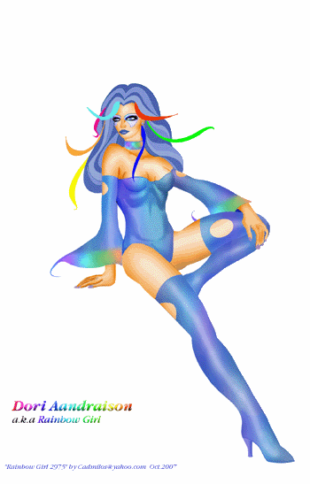
Thank you Sketchy! I seem to like skimpy costumes, but I don't see them as skimpy really. Just...futuristic, I guess. And colorful. That's how Grell and Cockrum's seemed to me. Sexy, to be sure, but not tastelessly sexy.
I think the anatomy is better in this one. Now if I could only learn how to draw hands without them looking gnarled, I'd be a happy man.
From: Somewhere in the Multiverse | Registered: Apr 2006
| IP: Logged |
posted
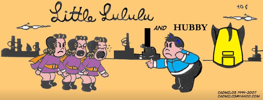
I really like your costume designs as "my" legion was the Cockrum/Grell everybody wore as little as possible S/LSH legion. Not because that's when I'm from but because when I got into the legion they didn't really have a book and I bought close to a complete run of those issues for 25 to 33 cents each. Also, I am interested to know if you have heard of the Scott McCloud "Little LuLu Game?
-------------------- Advantagious!!!!! and also Advantagious!!!!!!
From: Zephyrhills Fl | Registered: Oct 2007
| IP: Logged |
posted
Oh! Thank you so much for your feedback Yury Naal!!
Feedback is more than welcome always as I can't really judge my designs and "artwork" (except that they have pretty colors).
I haven't heard of the "Little Lulu Game". Could you tell me more, please? I love Little Lulu and Scott McCloud's books are among my favorites, especially Understanding Comics.
From: Somewhere in the Multiverse | Registered: Apr 2006
| IP: Logged |
posted
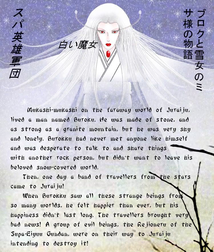
Here's a page from a project I'm working on currently for the Magic and Fantasy Gallery. It's an illustrated story combining the Legion and a Japanese fairytale/folklore story about the Yuki-Onna (Snow Woman). I've had a lot of help with the Japanese phrases from some friends. This page is just a "teaser" of sorts, the 3d page from a total of 11 or 12. I'm working on the 5th page now. I'd really like some feedback as it's the most complex Legion fan work I've ever started and hope I'll finish it soon. It's great fun anyway.
The phrases in Japanese and the Japanese words in Latin letters mean:
Top left: Su-Pa Eiyuu Gundan = "Legion" of Super-Heroes
Top middle: Shiroi Majo = White Witch
Top right: Buroku to yuki onna no Misa-sama no monogatari = The Story of Buroku and Lady Mysa, the yuki-onna.
Mukashi-mukashi = Time past, time past = Once upon a time
posted
This is good stuff, Dain. The Little Lulu parodies are hilarious. And the rest, including the above, are gorgeous.
-------------------- The Semi-Great Gildersleeve - writing, super-heroes, and this 'n' that
From: The Stasis Zone | Registered: Jul 2003
| IP: Logged |
posted
I'm really grateful for your comment, He Who Wanders (I'm grateful for Yury Naal's comment, as well)! Thank you!
I was beginning to feel it was kind of pointless to post anything. It takes a lot of hard work for me to do complicated stuff like the Yuki-onna story. Whiny me, I guess...
From: Somewhere in the Multiverse | Registered: Apr 2006
| IP: Logged |
quote:Originally posted by Dain: Little "Lululu" and "Hubby". Another tribute to Little Lulu and Tubby (my most favorite comic after the Legion). This was a black-and-white sketch for APA-LSH back in 1994. I don't have the original anymore so I scanned the photocopied sketch from the APA-LSH mailing, corrected a few details and added some color in Photoshop. The result isn't very good - scanned photocopies aren't the best to work with - but I kinda like it.
Caliente, which White Witch are you referring too?
Oh, it's not talent. It's more like enthusiasm and love for the Legion and costume design. OK, and hard, but chaotic, work.
From: Somewhere in the Multiverse | Registered: Apr 2006
| IP: Logged |
posted
Heheheh, after making so many skimpy costumes I guess it was high time to make a Legionnaire dressed in a kimono!
Hmmm, I'm working on a page now that features "Yume no Onna" (Dream Girl/Woman) also dressed in a Chinese princess costume/Japanese kimono. Or will it be "undressed" in a kimono in Nura's case?
From: Somewhere in the Multiverse | Registered: Apr 2006
| IP: Logged |
posted
Wow, that Japanese White Witch is stunning, Dain. And I can't wait to see your Chinese Dream Girl. Great stuff.
From: Vancouver, BC, Canada | Registered: Jul 2003
| IP: Logged |
posted
Dain, I'm on a break at work, and away from my own projects, so I found a moment to respond to your request for feedback.
First of all, I'm totally excited to see your complete project. It sounds really interesting.
That picture of Mysa, serving as the frame to your writing, is just beautiful. She looks mysterious and mystical. Great composition. The colors are cold and brisk, which I'm sure you intended. Then, you have her bright red features creating a spotlight. I think it's very successful, overall, and my following critiques are definitely minor finesse points...
The text seems to be getting dangerously close to the bottom of the page. I'd experiment with raising the entire body of copy a line or two, and see what fits best. Try creating margins that you never break, for the sake of consistency, of format.
Are you able to manipulate that Asian writing? It might look nice if it was less digital looking. Maybe blurred a tad? Also, could it be just a smidge larger?
As for Mysa, your style and proportions look great to me. Her expression is great. One thing that I notice is that it's a really sharp line, where her waist band begins. It almost looks like she's standing behind something. Maybe if that line was rounded or softened it would look less jarring.
The snow flakes look pretty digital. It'd be nice if they were softer, more natural looking.
I don't know how you generate your original linework, but my advice is to play with line-weights. For example, if the lines that create her nose had a more organic, softer look, that'd be nice. Her hair is lovely, but also looks like it is floating out from underneath a helmet. Could you even accent this with individual wisps of hair? There's almost a "tentacle" look now.
Actually, could you talk about your process a little bit? Is this 100% digital or do you scan in linework and manipulate it?
I hope you know my comments are only there to be helpful. I don't think I know everything there is to know about creating art. I have plenty to work on with my own art. I'm just glad you're posting this stuff. It's great fun!
Sketchy, I'm really happy that you took the time to respond. I know how busy you are and I'm grateful that you are always so supportive to what I do. I really appreciate it!!!
I'll keep in mind everything you suggested and will try to apply it. The line on her chest annoyed me too. It was a weird effect of many "layers" in the image. I can change the English letters of course, and I can make the Japanese characters bigger and softer/more blurry but can't change the font. They are images, not letters. My friends who speak Japanese wrote all that text for me and then I made screen caps and applied them in the main image. My Japanese is way too poor yet to even think of trying to sort through thousands of Kanji.
My cartoon sketches are all pencil and the color. When I do more "realistic" work the process is: I first make several little sketches trying to get a "mental image" of what the composition will be. I sometimes use reference photos (look and sketch, not trace). Then I sketch the main image in pencil, without many details, scan it and go from there. I can't ink for the life of me, so I use vectors and the Photoshop pen tool for lines on the scanned image.
[ October 29, 2007, 07:32 PM: Message edited by: Dain ]
From: Somewhere in the Multiverse | Registered: Apr 2006
| IP: Logged |


 Hyperpath: Email this page to someone!
 Printer-friendly view of this topic | Subscribe To Topic


![[Rainbow Girl]](graemlins/RainbowGirl.gif)

![[Smile]](smile.gif)
![[Big Grin]](biggrin.gif)
![[Wink]](wink.gif)
![[Razz]](tongue.gif)


