posted
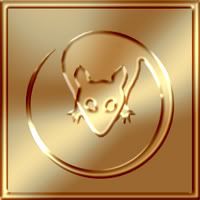
OK, as promised, the next batch are two LMBers with Egyptian connections (the first sharing his name with an Egyptian god, and the second hailing from ancient Egypt - along with Stoopid Cat and Numnuts the Incomprehensible... eh... it's a long story... ask Abin Quank about it):
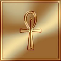
Set and Stu (formerly Iron Rat):
Set's logo is a combination of his namesake's two symbols - the Ankh overlayed by the Was Scepter.
Since this update took a while, how about an appropriate bonus image? Here is the original Legion podcaster:
-------------------- See Here for the latest update on the 2013 Chicago Gathering (now including tentative attendance list)
Registered: Feb 2008
| IP: Logged |
-------------------- See Here for the latest update on the 2013 Chicago Gathering (now including tentative attendance list)
Registered: Feb 2008
| IP: Logged |
posted
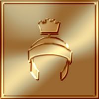
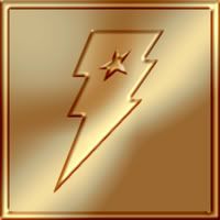
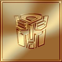
OK, tonight we're featuring three "Kids" and, appropriately, all three feature cartoon elements in their symbols. We have Kid Charlemagne, Kid Marvel, and Kid Prime:
Kid C, following his avatar, I've represented by Marvin the Martian's Roman helmet (Charlemagne was a Roman Emperor, I suppose, but I'm guessing he never wore one of these. )
Kid Marvel's logo that he designed for himself is the Captain Marvel lightning bolt (his character uses the power of Shazam). Unfortunately, though, it looks exactly like the logo for Lightning Lad, so I augmented it by adding the symbol that Joe uses for Kid Marvel's alter ego, Joeboy Harvestar, which is the star design from the cartoon Jem and the Holograms. I think it works pretty well because it contains the idea of one identity contained in another, and also suggests Kid M's facial look, with the bolt over his eye.
Kid Prime, of course, uses Optimus Prime as his avatar, but, as with pevious logos, that got fairly detailed once I started adding the different layers, so I opted for the more streamlined general Autobot logo.
Up next: We travel to Kal-El's planet... and blow it to Kingdom Come.
-------------------- See Here for the latest update on the 2013 Chicago Gathering (now including tentative attendance list)
Registered: Feb 2008
| IP: Logged |
Set
There's not a word yet, for old friends who've just met.
posted
Awesome, thanks for the symbol!
The ellipse for Awkward Pause Boy is funny!
Registered: Aug 2006
| IP: Logged |
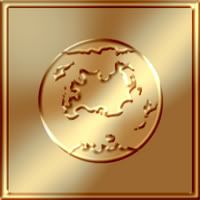
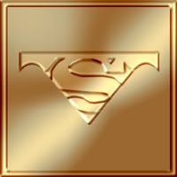
Up next we have two Superman inspired fellows, Krypton Kid and Superboy MDDJR:
For Superboy, I tried to do a take on the Kingdom Come Superboy that he uses for his avatar (not the KC Superman, which is actually a bit easier). The difficulty with abstracting that design, though, is the fact that it uses the "Archie" Legion convention of the solid color down the middle, with the two bars of color on either side. If I took it directly, it wound up just looking like a Superboy T-shirt, so I scaled it back, cutting it off on the bottom of the S, and including just the edge of the top where it starts to blend into the cape. The net effect, I think, is that I was left with the S logo sitting on a shape which begins to suggest the "M" in "MDDJR" (which I'm assuming must be our Superboy's real world initials?)
Krypton Kid simply uses a map of Krypton from the Silver Age (which really gave the Photoshop lasso tool a workout. )
Up next: This thread heats up... no... it cools down... stop... you're both right.
-------------------- See Here for the latest update on the 2013 Chicago Gathering (now including tentative attendance list)
Registered: Feb 2008
| IP: Logged |
posted
Thanks, supes! I'm glad you like it. I was worried it might be a bit too simple but, as I say, I kept trying different designs for the KC look, and they all kept looking like a torso in a T-shirt.
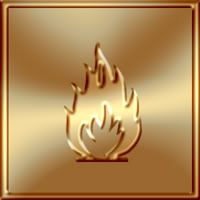
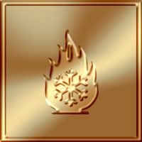
OK, fairly simple additions this time out, as our hot, cold, and hot/cold LMBers get their symbols from a few direct lifts from some industrial hazard signs.
We have Caliente, Frio, and Icefire:
Cali's is the hazard sign for "Flammable", her chilly sister's is the sign for "Extreme Cold" and Icefire, of course, combines the two.
After I did this batch, I looked over the user list again and realized that we actually have our own Polar Boy, as well (though it looks like he's been fairly absent these past few years), so... bonus symbol, again a lift from the LSH:
Up next: the LMB heads to the big city for a stroll... but will they walk with a purpose, or just wander about?
-------------------- See Here for the latest update on the 2013 Chicago Gathering (now including tentative attendance list)
Registered: Feb 2008
| IP: Logged |
quote:Originally posted by Exnihil: Up next: the LMB heads to the big city for a stroll... but will they walk with a purpose, or just wander about?
Oooh! Ooh! Ooh! It looks like it's my turn.
-------------------- The Semi-Great Gildersleeve - writing, super-heroes, and this 'n' that
From: The Stasis Zone | Registered: Jul 2003
| IP: Logged |
posted
Hee-hee... I know, I'm just the master of subtlety, aren't I?
-------------------- See Here for the latest update on the 2013 Chicago Gathering (now including tentative attendance list)
Registered: Feb 2008
| IP: Logged |
posted
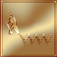
This morning our update includes three new logos for He Who LSHes (formerly He Who Wanders), Mattropolis, and Walk With Crowds:
He Who was possibly the most difficult one I've done so far - not in the execution, but in the initial design. I was just stumped in how to abstract that concept. I know that Huey had earlier suggested a M'Onel connection, but that didn't seem visually intuitive enough.
When I was doing the Cali and Frio logos last round, though, I was looking at a bunch of road sign logos and got the idea of a replicated "Walk" logo for Walk With Crowds. Then it occured to me that that might be the solution for He Who, as well.
I used a variant "Walk" logo for hiking, and added a dotted wandering path behind him (I had the "Jeffy" gag from "Family Circus" in mind). The path is obviously a double-W, and the combination of the staff and the hiker's right leg, crossed by the left leg, suggests the "H".
HWW's drove me batty but, looking at it posted, I think it's actually one of my favorites so far. I reallly like the way the light effect seems to focus on his back foot meeting the path and almost makes it look like he's walking away.
For Mattropolis, I wanted to do a city skyline in the subtle form of an M. Although I did do that, I have to admit it's not fully what I had in mind. I wanted the buildings to be fully connected, without the spaces in between; and I wanted to dot them with a series of irregular windows to suggest lights at night. That design looked really good as a flat image, but when I began adding the embossing effect, so much of the detail was lost. It wound up looking like a chewed up computer punchcard. So I redid Matty's with less detail than I wanted. It still looks nice, I think, just not as nice as I had imagined.
Up next: The LMB goes Hollywood.
-------------------- See Here for the latest update on the 2013 Chicago Gathering (now including tentative attendance list)
Registered: Feb 2008
| IP: Logged |
posted
Literally laughed out loud with the one for Awkward Pause Boy. These are clever and well done.
From: Manhattan, NY | Registered: May 2011
| IP: Logged |
quote:Originally posted by Exnihil: This morning our update includes three new logos for He Who LSHes (formerly He Who Wanders), Mattropolis, and Walk With Crowds:
H
Love it!
When I first saw it, I thought you had me wandering around on a pogo stick! But either that or a cane is fine.
I also love how you worked in "HWW". Very clever.
Thanks, Ex.
-------------------- The Semi-Great Gildersleeve - writing, super-heroes, and this 'n' that
From: The Stasis Zone | Registered: Jul 2003
| IP: Logged |


 Hyperpath: Email this page to someone!
 Printer-friendly view of this topic | Subscribe To Topic


![[Smile]](smile.gif)


![[Hug]](graemlins/hug.gif)

![[Big Grin]](biggrin.gif)
![[Eek!]](eek.gif)


![[Frown]](frown.gif)
![[LOL]](graemlins/lol.gif)


