quote:Originally posted by He Who LSHes: I like Eryk's, too, though it doesn't look like an E to me.
It's an interlac "E", remember.
I dig it!
Cool, the vote has been cast - the column stays.
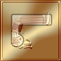
That being said, though, given the couple of comments saying that the overall design more resembled a "C" than an Interlac "E", I went back and did a compare and you guys are absolutely right:
It looks like I overestimated the cap placement to invoke the "bulb" of the E. Not bad for eyeballing, but you're right... the eye "knows" that it's wrong. I think I'll do a revise to bring it in closer (as well as sharpen up a few of the more blurry parts where some detail was lost) to better get what I was going for.
Thanks for all the feedback, everybody!
-------------------- See Here for the latest update on the 2013 Chicago Gathering (now including tentative attendance list)
Registered: Feb 2008
| IP: Logged |
posted
If you're wondering why I'm posting at 3:30 in the morning... I'm managing a software release for work this weekend, so right now I'm on "Sri Lankan" time. So... how better to spend that dead time between system startup and QA kickoff than to mess around on LW?
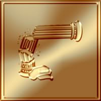
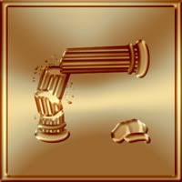
So I revisited the EDE one, trying to fix the overall shape to make it look less like a "C," but as I was trying out different positions and scales for the cap, it occured to me that it didn't have to be at the base of the column at all and, in fact, probably shouldn't be. The before and after versions:
BEFORE:
AFTER:
I think this relatively small change actually does quite a bit to improve the design:
- Firstly, it just balances the composition better, filling more of the dead space.
- It makes the design much more dynamic; instead of just being a static component, the cap is now part of the action, moments away from getting crushed.
- By moving it out of the light source, more detail is preserved as the shadows enhance the lines of the cap (I did play around a bit with the center portion of the cap to try to maximize this).
- The suggested shape of the Interlac "E" is now clearer (the cap not being needed at all to create the "bulb," as the columns base accomplishes the same thing).
- In fact, by separating it into two shapes, it could now almost be read as an "E" and a period - a slight nod to the fact that while "Calamity King's" real name is just "E. Davis Ester" it took our Ester to create the name "Eryk".
So, as I say, not much of an overall change, but enough to make quite an improvement. Thanks SuperboyMMDJR and He Who LSHes for your constructive criticism; it really helped.
-------------------- See Here for the latest update on the 2013 Chicago Gathering (now including tentative attendance list)
Registered: Feb 2008
| IP: Logged |
posted
wow...that works better! I like the bottom one better....yeah it makes sense...as the column would fall over your head....bonk!
From: Hayward, CA | Registered: Jul 2003
| IP: Logged |
One notable difference is in the idea being implied by each design (intended or not). In the first design, the hat seems to be causing the pillar to collapse. In the second design, the hat is about to become a victim.
I like the subtle humor of the latter.
-------------------- The Semi-Great Gildersleeve - writing, super-heroes, and this 'n' that
From: The Stasis Zone | Registered: Jul 2003
| IP: Logged |
posted
Thanks for the Mystery Lad message board symbol, Exnihil-- it looks great. I have to wonder what you would've come up with for Tsarin, though? I've toyed with returning to that posting ID, now that an Element Lad I can connect with is back in print (barely, unfortunately-- maybe the lack of panel space for Jan is the reason I haven't 'squeezed the trigger').
From: Knoxville, TN | Registered: Jul 2003
| IP: Logged |
posted
Yep, the second EDE design does it! The first one I didn't understand at all without the explanation. The second one tells a dynamic story even for newcomers who don't know what it signifies.
Great job on all of these, Ex!
-------------------- "Been killed--didn't like it." (Duplicate Damsel, Legion of Super-Heroes #10)
From: Groga | Registered: Aug 2003
| IP: Logged |
quote:Originally posted by Candlelight: With my eyesight, the first hat looked like a brain to me.
heh...well with MY eyesight, when the interlac letter was superimposed with the column and hat, *gasp* it looked like a __XXXXXXXXXXXXX__, when you sit back far back. (see the lines on the column made it look like its capillaries veins...get the picture?)
quote:Originally posted by Candlelight: I'd love to see Ex's take on Tsarin, too, ML.
Well, the obvious would be a hunk of Tsarin crystal, I guess. Tsarin's back-story was that he was a Tromian who was left in a near-death state by Roxxas on Trom. When Jan (the 'real' Element Lad) transmuted his 'corpse' into Tsarin crystal, that did something that gradually healed him. I forget the specifics, but he ended up in the LMBP-verse, where he spent lots of time in his lab watching holovids of the exploits of the 'real' LSH (and presumably other dimensional/timeline versions, too). When reboot Jan went insane and killed Monstress and Lightning Lad, Tsarin shattered and has been presumed dead ever since. Mystery Lad has shown up in a few shared stories, I believe, but I didn't write him- so I don't know if his 'mystery' is connected to Tsarin at all.
At one time, I thought about being Tsarin 5, since Tsarin was the scientist guy, but never took that very far.
Ex- finish your 100 (or however many) first- give everyone else the fun of seeing their LMBP persona in message board symbol glory. Then, if you go back and tackle tertiary characters, maybe consider Tsarin.
From: Knoxville, TN | Registered: Jul 2003
| IP: Logged |
quote:Originally posted by Mystery Lad: Thanks for the Mystery Lad message board symbol, Exnihil-- it looks great. I have to wonder what you would've come up with for Tsarin, though?
Wonder no longer... in a bizarre coincidence, the very next wave will center on three LMBers who all start with the letter "T" - one of whom uses the same symbol that I would have used for you had you still gone by "Tsarin". Even odder is the fact that, alphabetically, he will fall in the same place in the group shot.
If ever you do go back to your original handle, I'd be interested in seeing the in-story meeting between you... and Tromium.
-------------------- See Here for the latest update on the 2013 Chicago Gathering (now including tentative attendance list)
Registered: Feb 2008
| IP: Logged |
posted
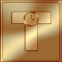
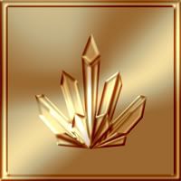
As promised, a Triple T this time out with: Tamper Lad, Time Teller Lad, and Tromium:
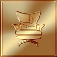
Tamper Lad is the resident evil genius of Legion World (says so right on his establishment, the Evil Genius Supper Club), though we never actually see him do anything evil. Apparently he has a tacit agreement with the Office of Security to give them pointers on things that evil geniuses might exploit and, in return, they surreptitiously slip him info on exploitable weaknesses of Earth! I envision Tamper Lad as very much a Bond villain, playing Baccarat, stroking a Persian cat, and absolutely sitting in a Blofeld-like swivel chair... perfect for evil reveals. I added the 3-boot Brainy pattern to the buttons in honor of his avatar.
Time Teller Lad is Rockhopper Lad's young protege, Tim Temp. By Rocky's request (many moons ago... sorry for the delay, Rocky), Tim uses an Hourman II inspired symbol as designed for his costume by Sketch Lad, HERE.
I'm afraid I don't actually know Tromium, but, as discussed above, I used a crystalline design in honor of the Tsarins (Tromite memorial markers). Should Mystery Lad ever reveal himself as the long lost LMBer, Tsarin, one could only image there must be some connection between these two (he said... stoking the roleplaying fires.)
Up next: The jaws that bite, the claws that catch, and the... uh... whatever it is that cows do.
-------------------- See Here for the latest update on the 2013 Chicago Gathering (now including tentative attendance list)
Registered: Feb 2008
| IP: Logged |
posted
Thanks, Ex. It's awesome! Tim's logo (mainly because it really does derive from Todd McFarlane's design for Rick Tyler's original outfit) really does need the Roman "T" rather than and Interlac character as was seen in many others. Besides, Tim's fascination with time makes him very fond of old-fashioned things.
quote:Originally posted by Exnihil: Up next: The jaws that bite, the claws that catch, and the... uh... whatever it is that cows do.
I believe they moo and give milk.
-------------------- The only character in all of literature who has been described as "badnass" while using the phrase "vile miscreant."
From: The Pyngwyn Colonies of Planet Hyustyn | Registered: Aug 2005
| IP: Logged |
posted
Just got a glimpse of the last dozen symbol designs which included mine! *choke*
I think they are all fantastic the design elements are genius and the look is super classy. Me personally, I'm thinking of taking up wearing a bowtie...
-------------------- "My dance card was getting fuller than a contestant's at a Jandan shurg-off." - Exnihil, The Lost Klordny
From: Frederick, MD | Registered: Aug 2003
| IP: Logged |


 Hyperpath: Email this page to someone!
 Printer-friendly view of this topic | Subscribe To Topic


![[Smile]](smile.gif)

![[Shudder]](graemlins/shudder.gif)
![[Embarrassed]](redface.gif)
![[Yes]](graemlins/nod.gif)
![[Big Grin]](biggrin.gif)
![[Wink]](wink.gif)


